Accessibility-insights-web: Reports in Web and Android tools have links that can't be distinguished from surrounding text
Describe the bug
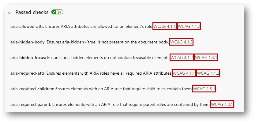
In the Web and Android reports, some links can't be visually distinguished from surrounding text.
In both Web and Android reports:
- For rules that pass or N/A, the links to WCAG success criteria
In Web reports:
- Links in the footer to http://aka.ms/AccessibilityInsights
Expected behavior
Links must have a distinct visual style (e.g., bold, italics, underlined) or a contrast ratio of at least 3:1 when compared to non-link text.
Screenshots

Are you willing to submit a PR?
No
Did you search for similar existing issues?
Yes
 LiLoDavis
All 6 comments
This issue has been marked as ready for team triage; we will triage it in our weekly review and update the issue. Thank you for contributing to Accessibility Insights!
![msftbot[bot] picture](https://avatars.githubusercontent.com/in/26612?v=4&s=40) msftbot[bot]
on 7 Oct 2020
msftbot[bot]
on 7 Oct 2020
Per conversation with Peter, lets fix this but we might need to change our blue color for links, since it doesnt pass with grey text (like the web footer or the how to check cards)
 ferBonnin
on 12 Oct 2020
ferBonnin
on 12 Oct 2020
This issue requires additional investigation by the Accessibility Insights team. When the issue is ready to be triaged again, we will update the issue with the investigation result and add "status: ready for triage". Thank you for contributing to Accessibility Insights!
msftbot[bot]
on 12 Oct 2020
@LiLoDavis could you please take a look at possible fixes here? Our blue color for links is not 3:1 against the grey text we use in some places (footer and cards in fastPass). Should we change that light grey or make the blue link slightly darker?
ferBonnin
on 12 Oct 2020
@ferBonnin I recommend making the grey darker. I wasn't able to find a darker blue that passes. Changing the gray (currently #4c4c4c) to #222222 looks good to me and has a contrast ratio of 3.027:1 compared to the links.
LiLoDavis
on 13 Oct 2020
@LiLoDavis The fix is in canary!
 pownkel
on 5 Nov 2020
pownkel
on 5 Nov 2020
Related issues
LiLoDavis
·
3Comments
ferBonnin
·
10Comments
 mhulse
·
4Comments
mhulse
·
4Comments
 gatosocal
·
9Comments
gatosocal
·
9Comments
 jechols
·
4Comments
jechols
·
4Comments
Most helpful comment
@LiLoDavis The fix is in canary!