Zulip-desktop: Tray icon when income new messages
- Operating System:
- [x] Windows
- [ ] Linux/Ubutnu
- [ ] macOS
- Clear steps to reproduce the issue:
Normal icon and icon when incoming new message not strong different.
For example in Skype when new message in icon bright number and good see that incoming new message. Attached two screenshots for example. - Relevant error messages and/or screenshots:


 mynoheart
All 14 comments
I don't know how to make that icon strong since we're dynamically creating the icon using canvas. When you don't have any unread count, we use the standard Zulip logo (that's why it looks good compared to what you see when you have the unread counts). I'll see if we could improve this.
 akashnimare
on 10 Jul 2018
akashnimare
on 10 Jul 2018
I think that better do bright color message count. For example red, as it do Telegram.

mynoheart
on 10 Jul 2018
The current color scheme looks good to me though we could try other font + color combination and make it better.
akashnimare
on 6 Apr 2019
@akashnimare can i work on this to make it red
 rrhythmsharma
on 8 Apr 2019
rrhythmsharma
on 8 Apr 2019
@zulipbot claim
 saurabhkanswal
on 27 Sep 2019
saurabhkanswal
on 27 Sep 2019
Welcome to Zulip, @saurabhkanswal! We just sent you an invite to collaborate on this repository at https://github.com/zulip/zulip-desktop/invitations. Please accept this invite in order to claim this issue and begin a fun, rewarding experience contributing to Zulip!
Here's some tips to get you off to a good start:
- Join me on the Zulip developers' server, to get help, chat about this issue, and meet the other developers.
- Unwatch this repository, so that you don't get 100 emails a day.
As you work on this issue, you'll also want to refer to the Zulip code contribution guide, as well as the rest of the developer documentation on that site.
See you on the other side (that is, the pull request side)!
 zulipbot
on 27 Sep 2019
zulipbot
on 27 Sep 2019
@akashnimare can i work on this to make it red
@rrhythmsharma are you working on this issue? if yes let me know, i will un-assign myself. sorry i didn't saw your comment.
saurabhkanswal
on 27 Sep 2019
@saurabhkanswal, No I am not working on it, Discuss this with Akash nimare before start working on this here https://chat.zulip.org , I don't think so community currently want this change, try some other issues :)
rrhythmsharma
on 27 Sep 2019
@saurabhkanswal I can help you in finding the right issues to work on. Let me know if you're interested.
akashnimare
on 27 Sep 2019
@akashnimare sure, i love to work with new issue.
saurabhkanswal
on 29 Sep 2019
I also see this issue important. What about inverting the colors, to stay with the original colors?
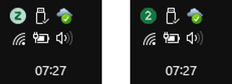
And I think that the information that "there is at least one new message" is much more important than "how many new messages are there".
 radeknh
on 30 Apr 2020
radeknh
on 30 Apr 2020
I think inverting the colors is pretty confusing.
I agree we should fix this; the current Windows tray approach of replacing our branding with a number is confusing; we could just go with a red dot over it if we don't have space to show a number.
 timabbott
on 30 Apr 2020
timabbott
on 30 Apr 2020
Looks like a good project ! Taking this issue :)
 aryanshridhar
on 8 Sep 2020
aryanshridhar
on 8 Sep 2020
Hey , @akashnimare , Should this be done for only Windows or others Operating Systems too .
aryanshridhar
on 9 Sep 2020
Related issues
 vsvipul
·
11Comments
vsvipul
·
11Comments
 abhigyank
·
3Comments
abhigyank
·
3Comments
 Mentalone
·
10Comments
Mentalone
·
10Comments
 dylnuge
·
5Comments
dylnuge
·
5Comments
 syncopated
·
3Comments
syncopated
·
3Comments