Zulip-desktop: design: Improve "Add Server" page for new users.
I think the "Add server" page is currently a bit confusing for new users.
Some suggestions:
- [X] Replace the "Enter the URL of your .." placeholder text with
A line above the input area: "Login or registration URL for your Zulip organization"
Placeholder text: "https://example.zulipchat.com/login"
(on our end, we should then accept the URL whether it ends in nothing, /, /login, or /register, and ideally take them to the login or register page according to whichever one they put.)
[X] I think the checkbox next to Add is sort of confusing. I'd replace with a
+.[X] Replace "Create a new organization on" with "Or create a new organization on" (i.e. just add an "Or" in front).
 rishig
All 25 comments
I think the checkbox next to Add is sort of confusing. I'd replace with a +.
Done.
Replace "Create a new organization on" with "Or create a new organization on" (i.e. just add an "Or" in front).
Done.
Replace the "Enter the URL of your .." placeholder text with
A line above the input area: "Login or registration URL for your Zulip organization"
Placeholder text: "https://example.zulipchat.com/login"
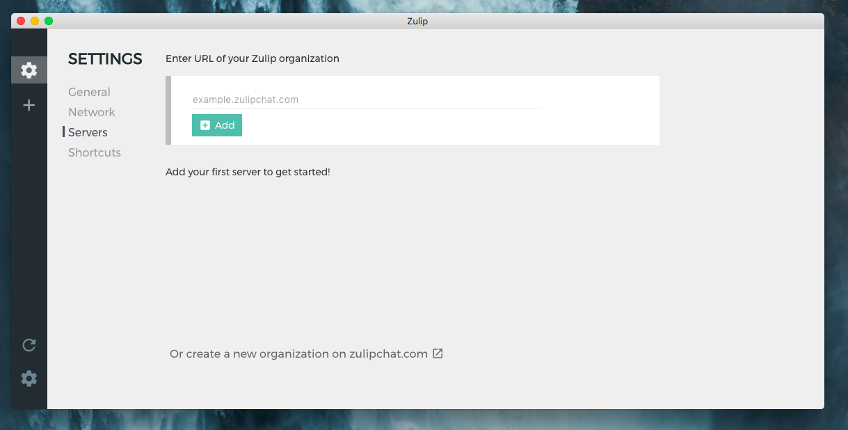
I think the title Enter URL of your Zulip organization is good enough.
For placeholder - example.zulipchat.com
 akashnimare
on 22 Nov 2017
akashnimare
on 22 Nov 2017
Thanks!
A few notes:
- Regardless of the final language, I think the "Enter URL .." instructions should be inside the white box, so it's clear it applies to that box, and isn't a title of the page as a whole
- The "Add your first server .." text should go up top, where "Enter URL .." is now
- I don't think most people will know what a server is. How about the following text?
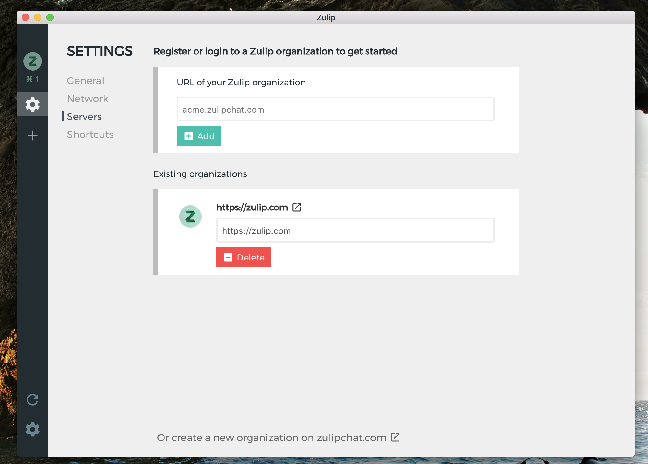
"Register or login to a Zulip organization to get started" as the text up top, and
"URL of Zulip organization" as the instructions in the white box?
rishig
on 22 Nov 2017
We've heard feedback from users who really like Zulip once they get going but find the process of adding an organization in the desktop app very confusing -- so this will be super useful to fix.
 gnprice
on 4 Dec 2017
gnprice
on 4 Dec 2017
Agreed, that page is bit confusing for normal user. I'm working on couple of mockups, will update here!
akashnimare
on 5 Dec 2017
Just to clarify, I think the simple fixes I proposed should be enough.
rishig
on 7 Dec 2017
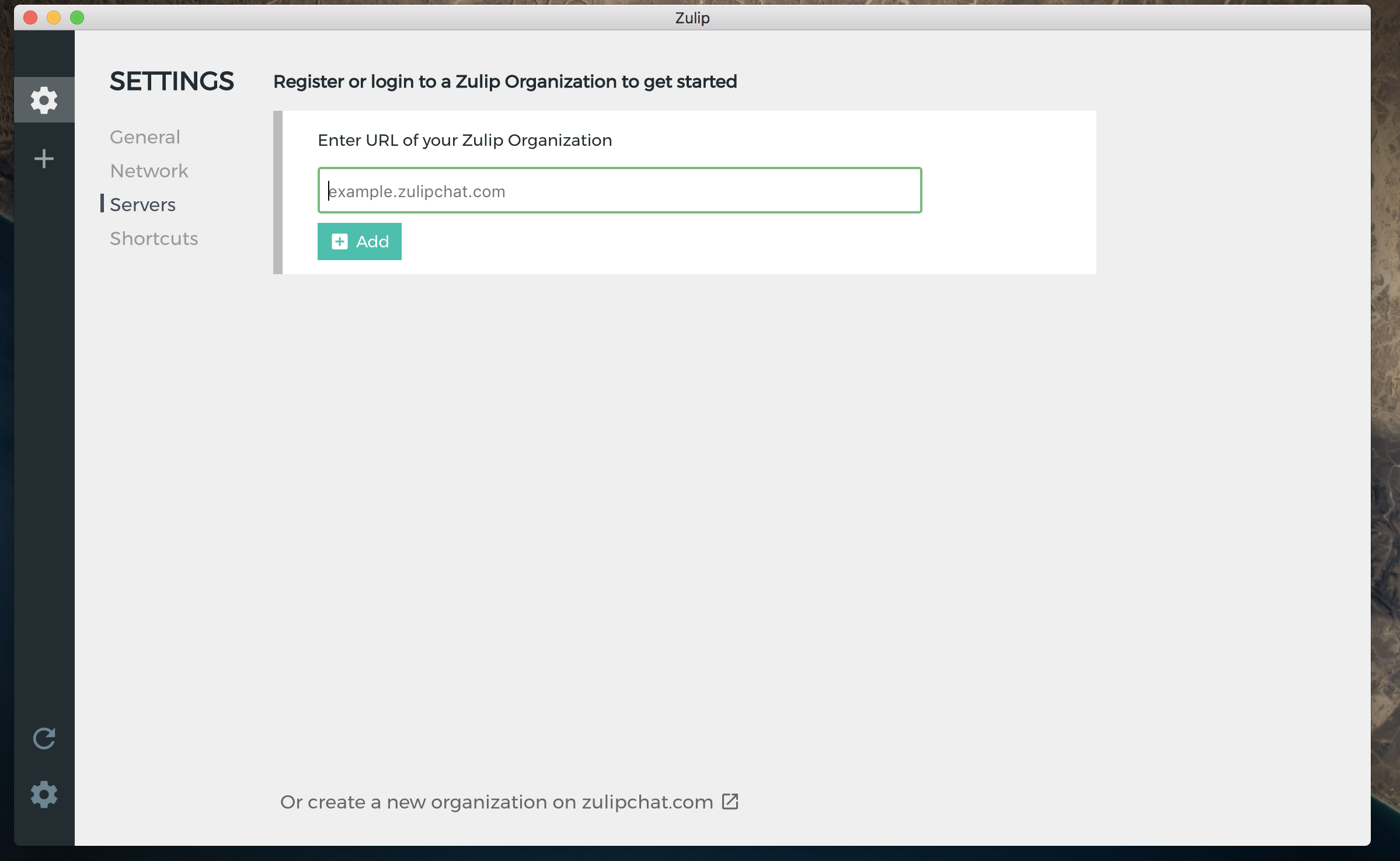
Made few changes -
akashnimare
on 11 Dec 2017
Awesome, thanks! Minor things, to make it consistent with the web product:
- We don't capitalize organization, so "Zulip organization" rather than "Zulip Organization"
- We don't use verb-based descriptions for form fields. So "URL of Zulip organization" rather than "Enter URL .."
- For the placeholder:
acme.zulipchat.com or chat.acme.com, since many (most, actually) users aren't on zulipchat.com.
As followup, if @brockwhittaker thinks this would be consistent with where we want to go with the web design, a nice touch would be to have https:// as fixed text inside the input box, in the same way that this puts the # inside the input box:
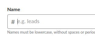
But definitely follow-up, and low priority.
rishig
on 12 Dec 2017
Also just noticed that the "Create an organization text" has fallen below the fold in this screenshot.
rishig
on 6 Jan 2018
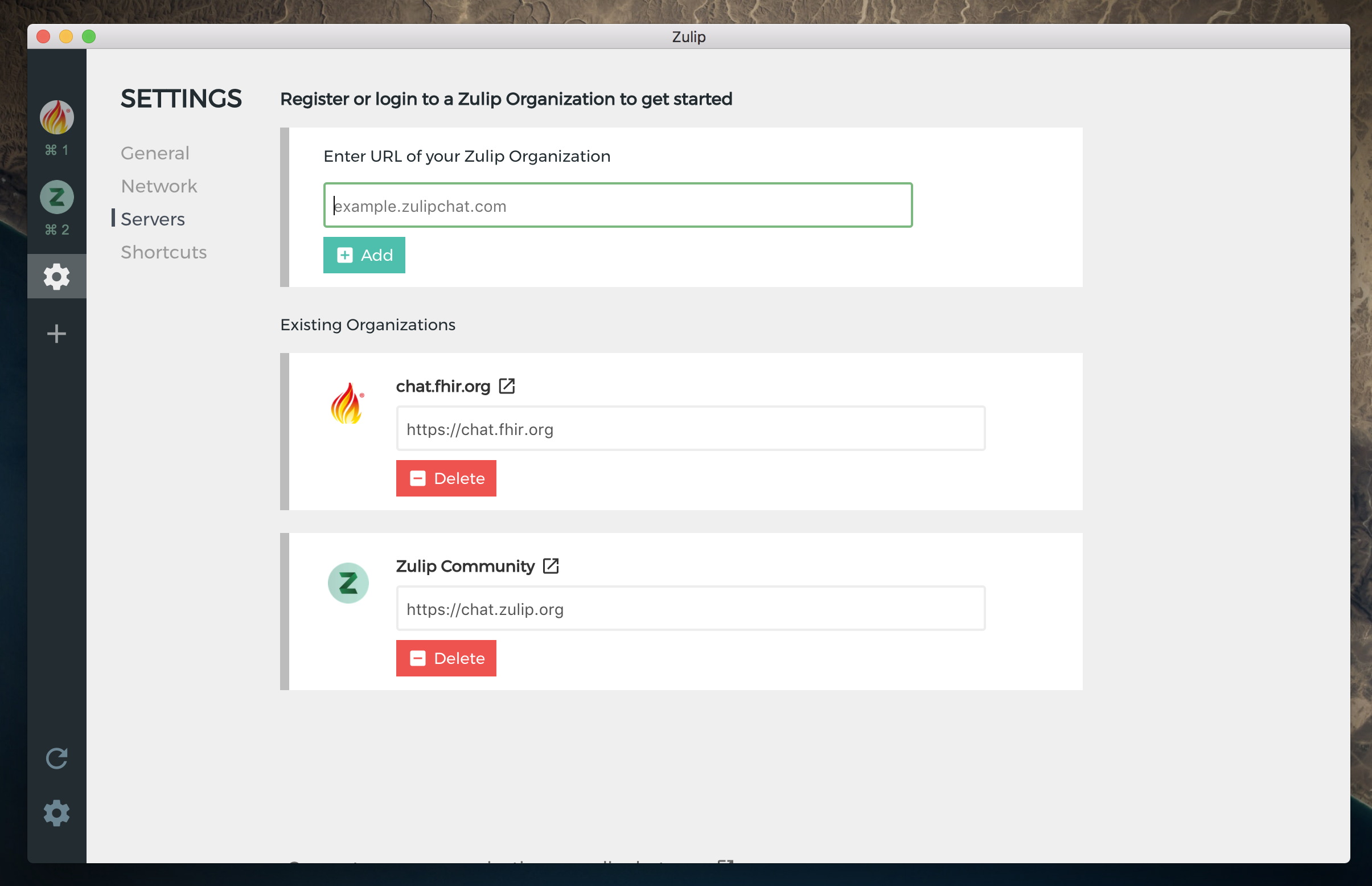
@rishig that's an outdated screenshot 😅 This is how it looks -
akashnimare
on 6 Jan 2018
Looks good! @rishig it'd be great if you could give some quick feedback.
I think for "Existing organizations", do we need the text box with the URL? It's not clear to me that editing is common. If we want to support editing the URL, we could hide it behind clicking a pencil/edit icon, but aside from that. I was thinking we might just need a single row with the logo, name, and a red trash can icon, where clicking on the logo/name takes you to that organization, and clicking the trash can removes it.
(I realize this is basically independent from the changes made here to the "new organization" fork; feel free to consider them a follow-up issue)
 timabbott
on 17 Jan 2018
timabbott
on 17 Jan 2018
Quick style note on this: the buttons should have the same border radius as the input fields in my opinion.
 brockwhittaker
on 17 Jan 2018
brockwhittaker
on 17 Jan 2018
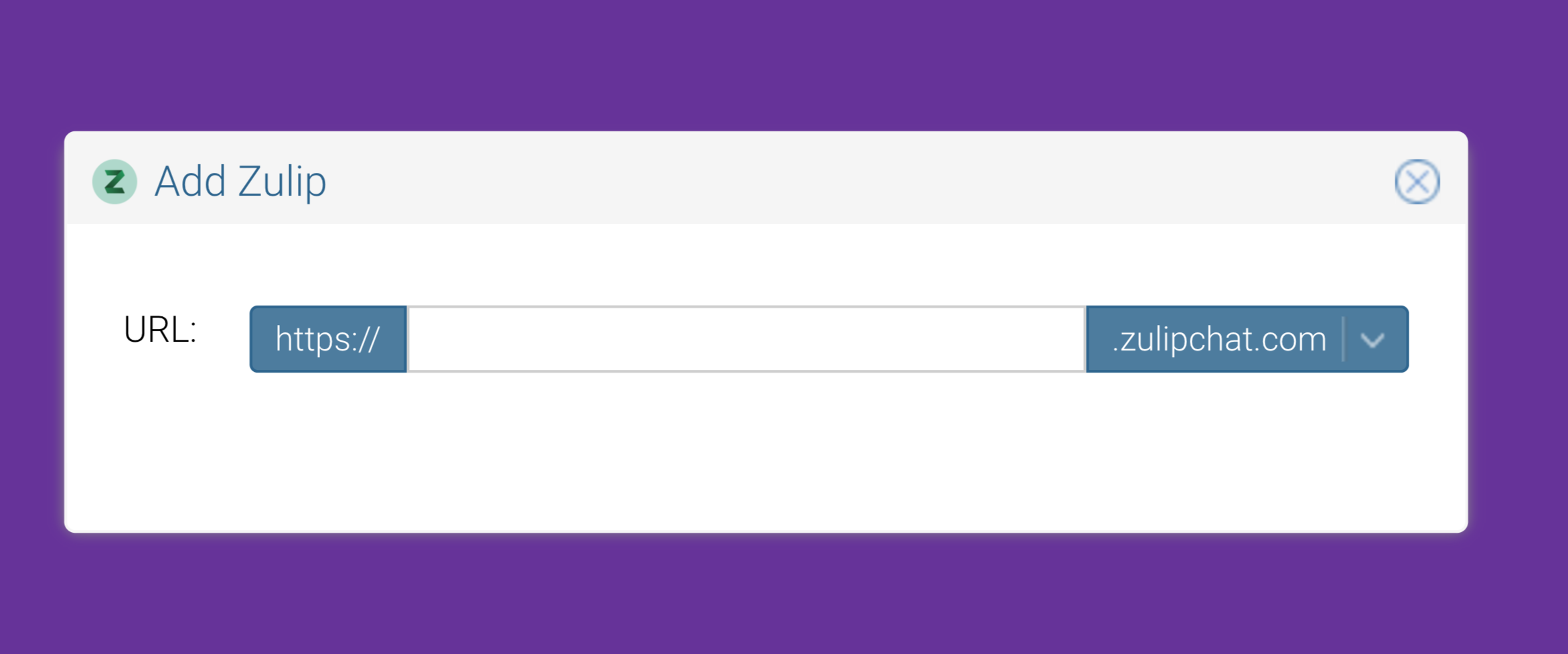
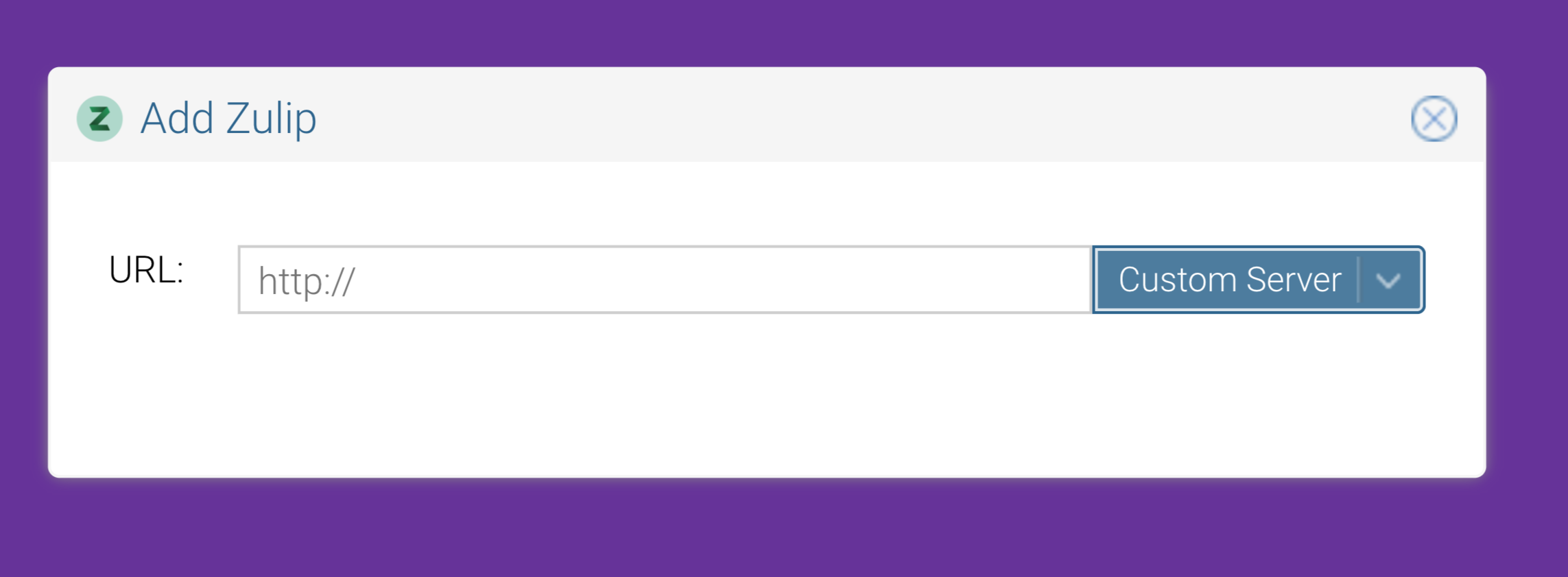
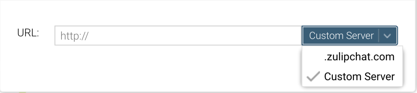
Okay, so I think for input and placeholder this will look good -


akashnimare
on 19 Jan 2018
hm, I'm not sure any of these are improvements. The nice thing about showing by example rather than using words like "Custom Server" is that almost none of our users know what a server is.
rishig
on 19 Jan 2018
Other domain might work instead of custom server
 priyank-p
on 19 Jan 2018
priyank-p
on 19 Jan 2018
Yeah, I agree with Rishi that this is more confusing than the previous draft by removing all the text explaining what things are (though the button does look pretty). If we want to have a "use zulipchat.com" toggle, it might be better to just have that be a checkbox for something much more friendly to less technical users, e.g. "Login URL ends with zulipchat.com"?
timabbott
on 19 Jan 2018
I was thinking to put the "Create new Org.." link in the add server box.
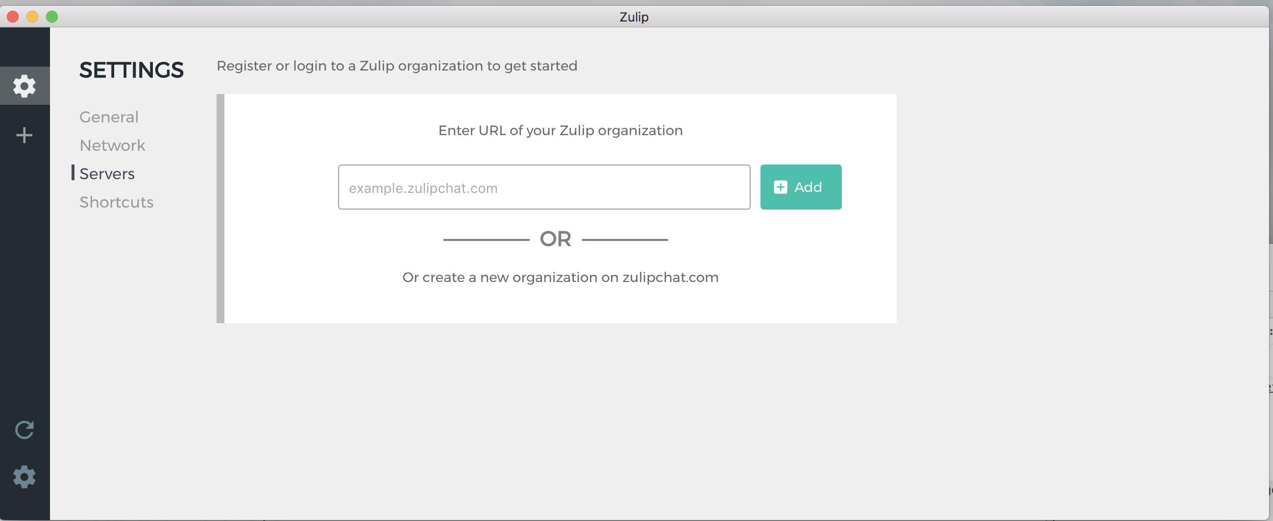
akashnimare
on 26 Feb 2018
I would consider that change separately from the current discussion, since it is a mostly independent change?
rishig
on 26 Feb 2018
I think "Create new Org.." link in the add server box looks good. The new mockup also looks better than the current one. @akashnimare @rishig Should I implement the above mockup?
 abhigyank
on 2 Mar 2018
abhigyank
on 2 Mar 2018
I think we should first resolve this PR, and then make further improvements after that. Otherwise the discussion gets too messy.
rishig
on 2 Mar 2018
@rishig Which PR are you referring to?
I am actually confused as to what work is left on this issue. The main issue description is already resolved. What are we currently trying to implement?
abhigyank
on 3 Mar 2018
I would consider that change separately from the current discussion, since it is a mostly independent change?
@rishig hmm, it's on the same page. This is how it looks currently -
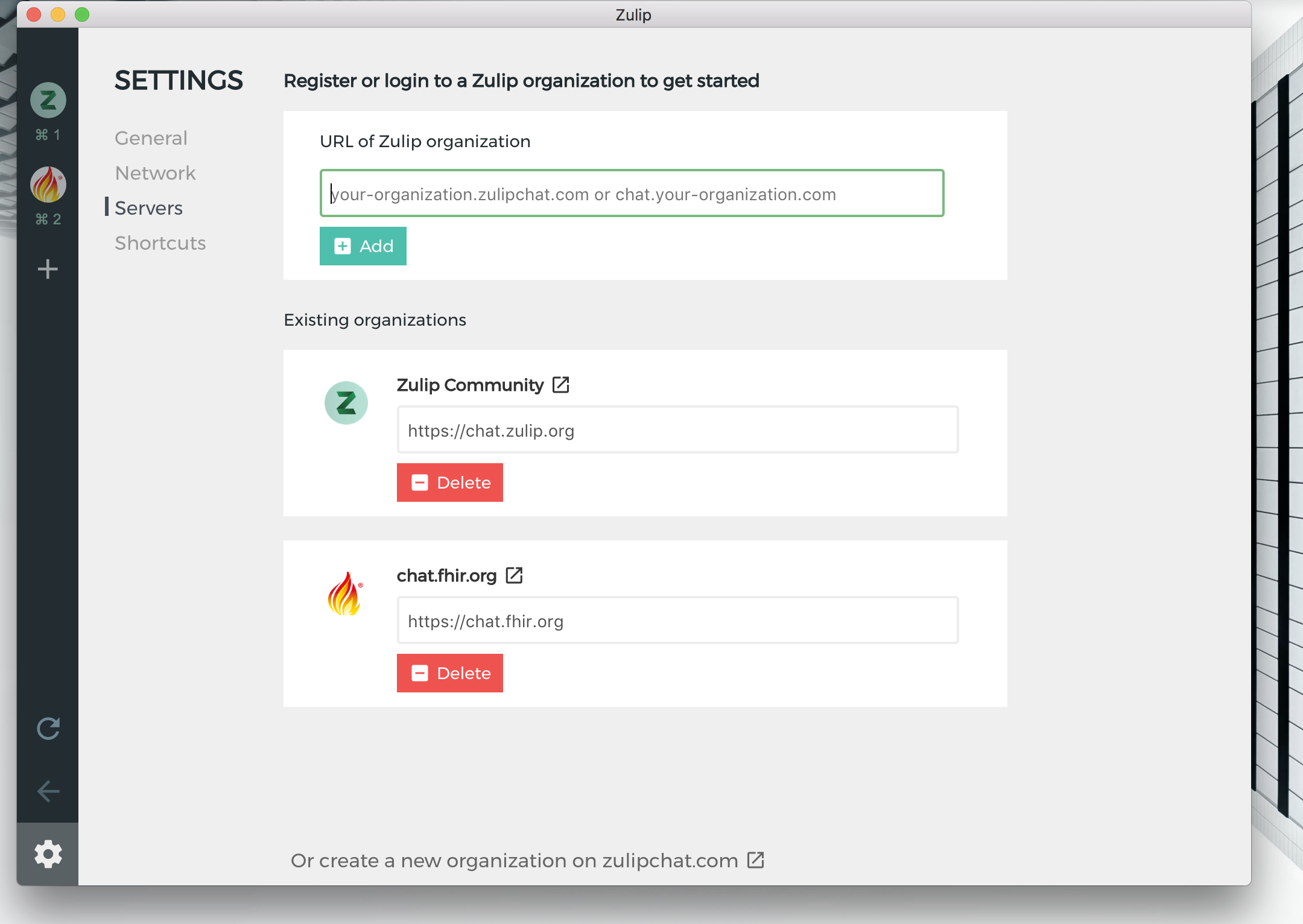
I am actually confused as to what work is left on this issue. The main issue description is already resolved. What are we currently trying to implement?
@abhigyank in short, we still need to improve the design of this page. I think the mockups I have posted earlier, looks better than the current one but it does need some refactoring. Let's work on the mockup first and discuss it in /#design.
I think for "Existing organizations", do we need the text box with the URL? It's not clear to me that editing is common. If we want to support editing the URL, we could hide it behind clicking a pencil/edit icon, but aside from that. I was thinking we might just need a single row with the logo, name, and a red trash can icon, where clicking on the logo/name takes you to that organization, and clicking the trash can removes it.
Let's try to implement this too as it's on the same page.
akashnimare
on 3 Mar 2018
@akashnimare I like the idea of:
https://github.com/zulip/zulip-electron/issues/340#issuecomment-368463051
What do you think about making "Add new organization" it's own tab in the left-side settings navigation, separate from the list of existing ones? I think having that add-organization tab look like what you've designed would look really good, and then we can do a separate project of making the list of existing organizations look nicer (which is also worth doing).
I think what @rishig was trying to express is just that making this screen look significantly nicer should be a top priority for the desktop app, since it has a high value to effort ratio. So @akashnimare I'd love it if you can prioritize getting the new design implemented as your main goal for the next week or two.
timabbott
on 4 Mar 2018
Just to clarify, I was actually saying that we should get the UX for this correct first, and then do the visual design second.
For the mockup Tim linked to: I think Zulip (and most modern apps) use text centering sparingly. It makes it hard to extend the page; e.g. I'm not sure how to add Existing organizations to that design. I tihnk it also doesnt' look good to have some things left-justified (like "Register or login to ..") and some things centered.
rishig
on 4 Mar 2018
There are a couple of things we could try here.
For Adding a new server page -
a) Make a dedicated new page for adding a new server, something like this -
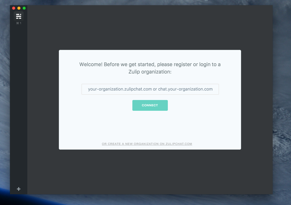
^^ we could also show this page in a popup.
For connected organizations -
I should mention that other chat apps don't have the page for removing the added servers, most of the apps handle this like -
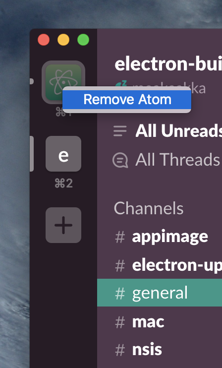
but I think a dedicated tab looks good for this purpose. For now, we could just make it look like -
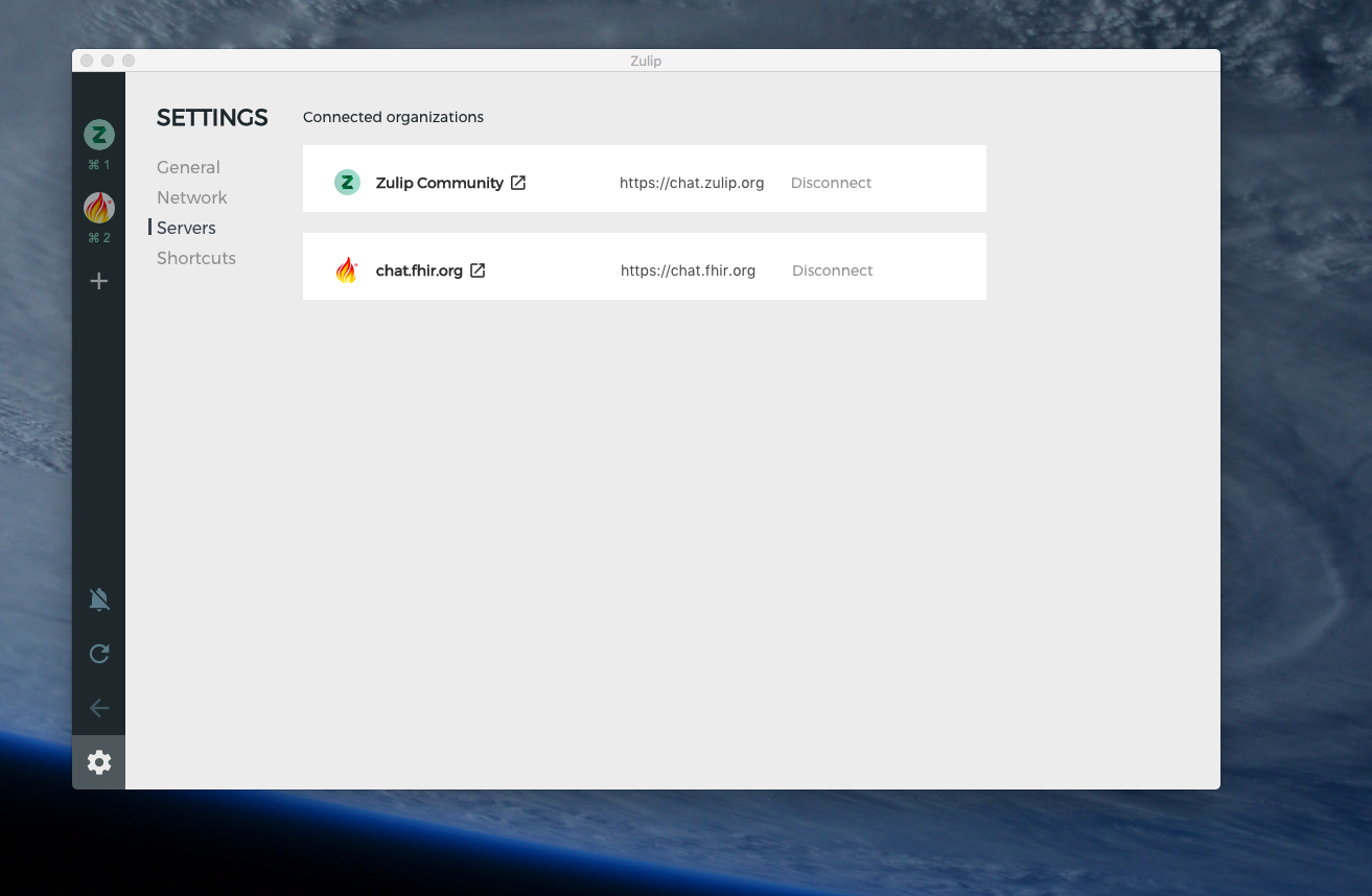
b) I think Add new server page + connected organization could look good on the same page if we combine https://github.com/zulip/zulip-electron/issues/340#issuecomment-368463051 with few re-arrangements and the connected org section I posted before.
akashnimare
on 5 Mar 2018
JFYI, this is how Hipchat deal with the custom server and hosted server -

akashnimare
on 6 Mar 2018
Related issues
abhigyank
·
4Comments
 EpicEric
·
6Comments
EpicEric
·
6Comments
 develar
·
11Comments
develar
·
11Comments
 dylnuge
·
5Comments
dylnuge
·
5Comments
 brainwane
·
5Comments
brainwane
·
5Comments