Ypimagepicker: Design contribution proposal
Hi,
I am a graphic designer. I guess there is not yet a logo of this new and wonderful project. If you need a logo, I can do something. You add me to the list as 3rd Turkish contributor. :)
 ihtiht
All 18 comments
Hi @ihtiht Thanks for asking!
Well I'm not against the idea of having a cool-looking logo if you want to suggest one :)
 s4cha
on 25 May 2018
s4cha
on 25 May 2018
I will do it with pleasure. I only need a few ideas for design. "YP Image Picker" I think so. What does YP mean? What exactly is YPImagepicker doing? If you have an idea for design, I can evaluate it.
ihtiht
on 25 May 2018
One of the ideas is to play with instagramm name/icon, cos it's an instagramm clone. But, of course, don't forget about copyrights)
 NikKovIos
on 25 May 2018
NikKovIos
on 25 May 2018
Hello again,
I made some designs.
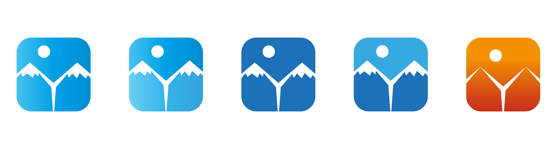
The main idea of designs is as follows;
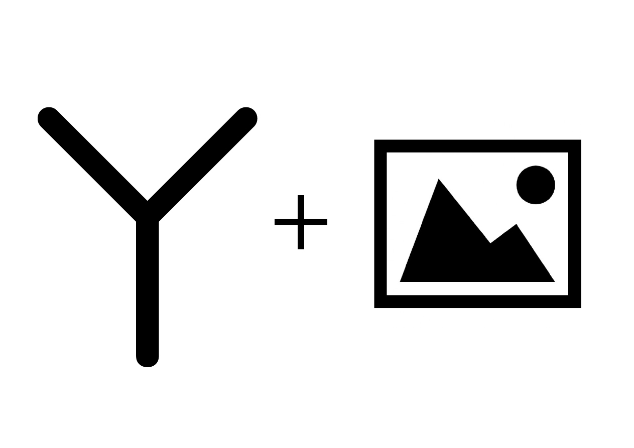
I wanted to use an item and letter Y that generally represent the photos. Thus, both the name of the project and its function were emphasized. I think it's important that the logos are simple and logical. So I made such designs for.
I also made a logotype version like this;
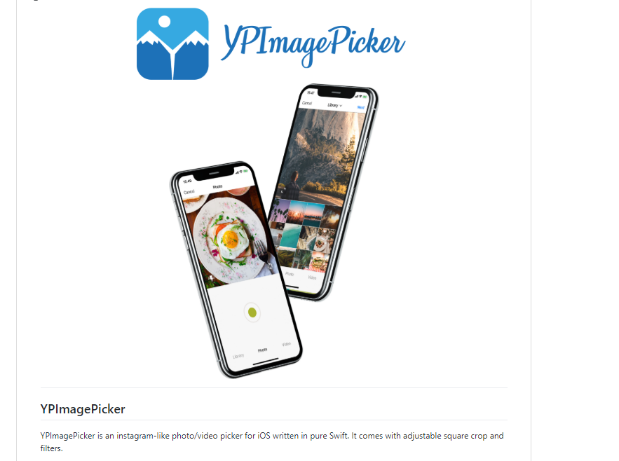
This design will look like this in the readme file. Click here for a detailed review.
ihtiht
on 25 May 2018
@ihtiht Sweet !
YP stands for Yummypets which is our App for pet lovers from which the picker comes from.
@NikKovIos
Thinking about it, I don't really like the YP prefix, I mean since it's meant to be used by others I don't think the YP prefix in the name adds any value.
I would actually suggest renaming from YPImagerPicker to YmagePicker
I think it would be a pretty memorable name :)
The renaming would not be such a big deal since GitHub redirects for quite a long time whenever we change a project's name.
The prefixes inside the code would stay YP standing for YmagePicker so no code changes !
Concerning the logo I really like the Y and the mountains I think it works pretty well.
Not a big fan of the font used for the name to be honest. Concerning the colours, maybe playing around the instagram gradient (diagonal from orange to purple) as @NikKovIos suggested or The Yummypets theme (neon green) . I honestly don't know if there are copyrighted gradients 🙃 .
Also the fact that you did a preview of how it would look like is fantastic!
Looking forward to hear your thoughts,
s4cha
on 27 May 2018
I think the YmagePicker idea is not bad. It sounds good. :)
Regarding design. In terms of color, I tried to apply the Instagram gradient, but I did not do the same. I do not think there will be a problem with copyright because it is not the same as the original. Here are some color experiments;
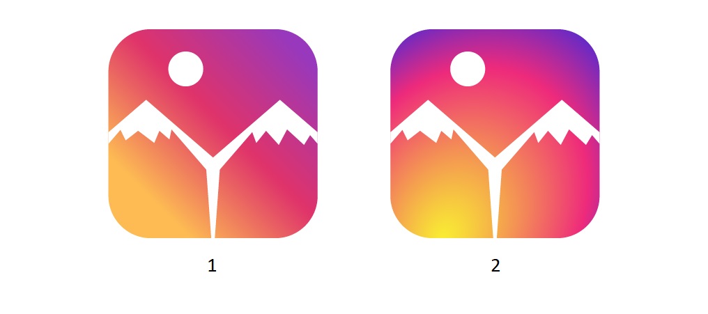
I guess you do not like the font. How about choosing a font via this site? (it can be any site) So I can apply a font you like.
ihtiht
on 27 May 2018
@ihtiht Great job, look professional 👍
1) YmagePicker is a good idea but there is a little problem with searching. For example: imagine that you didn't ever heart about this lib. You need an image picker. So u'll google image picker ios. Got it? So i think it's better to use image and Picker words with any prefix. The prefix could be anything, that you prefer. Also it's not good to have YP as a prefix of files in lib and not have it in the name of lib. Of course YmagePicker is YP also, i see your idea =)
2) I like insta-like logo (maybe play with color place, for example the yellow color would be at the top, like a sun light. There is no need to use exactly instagram colors and the way they placed them at their icon, but it really better to rely peoples attention that this picker is very similar to instagram's and do this with colors. So i vote for the last icons, but think that u should play with saturation and color locations little bit more 🙃
3) The font. Agree with @s4cha . The font is very subjective thing. I gonna list the font's are close to me:
https://www.dafont.com/lactosa.font?text=YmagePicker
https://www.dafont.com/slow-life.font?text=YmagePicker
https://www.dafont.com/waltograph.font?text=YmagePicker
https://www.dafont.com/im-wunderland.font?text=YmagePicker
https://www.dafont.com/edo-sz.font?text=YmagePicker
https://www.dafont.com/moon-flower.font?text=YmagePicker
However got to say, that they are not insta-like, but i just don't like instagram font =)
NikKovIos
on 28 May 2018
Hello again,
I am sorry for being late. @NikKovIos I developed the design as you like.
- I made the design a bit more saturated.
- I changed the color scheme.
- I applied the fonts you selected one by one.
I just got undecided about the font color. As a result, the final state of design;
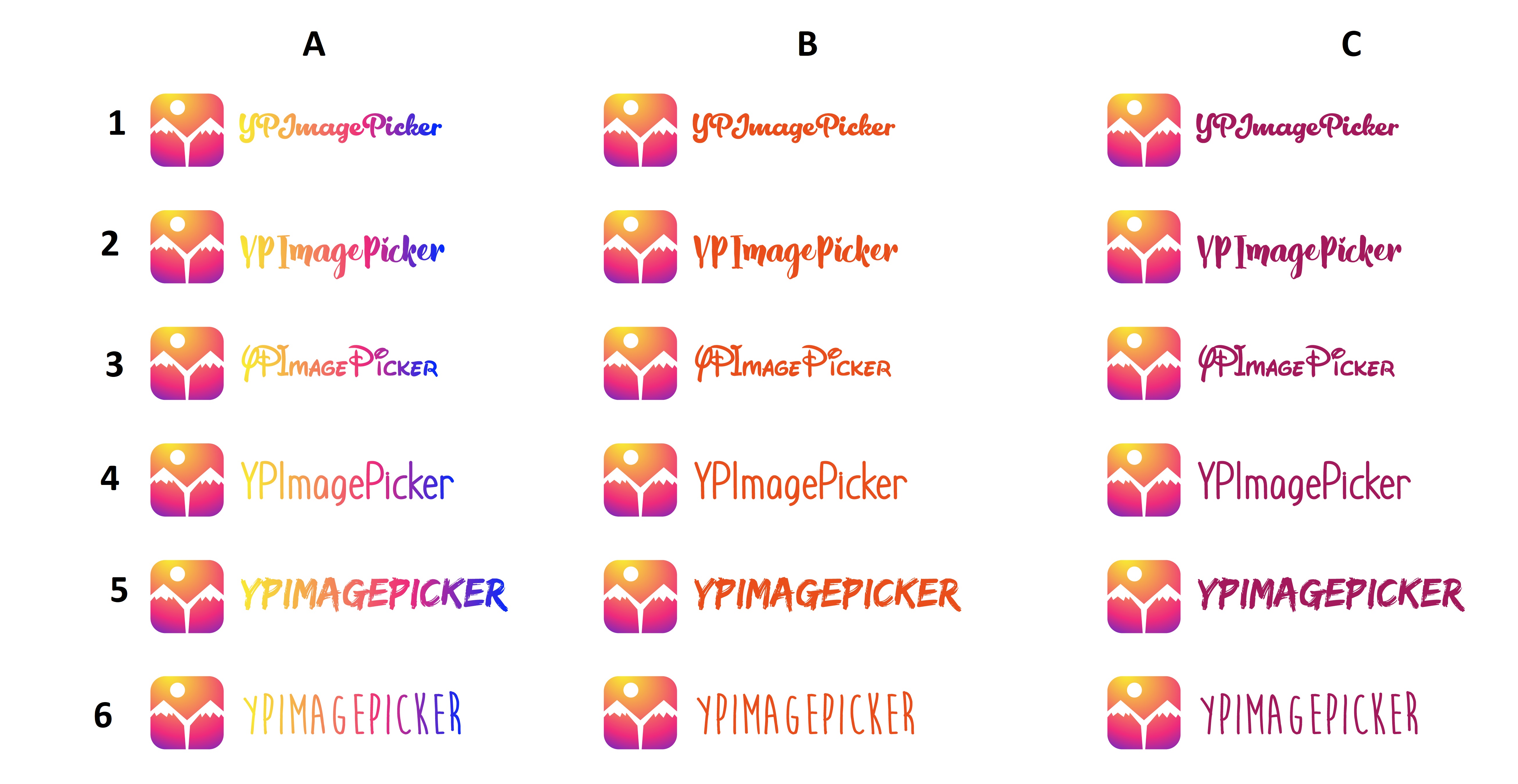
Which of these do you like? (you can also say a different color) If you ask me about my idea, I choose A-3.
Click to see how A-3 looks.
ihtiht
on 29 May 2018
I like B, C 1,2,3
What @s4cha say? Maybe there is a font, you prefer not from these?
NikKovIos
on 29 May 2018
Hey @s4cha what do you think? I can not wait to apply this design.
ihtiht
on 1 Jun 2018
@ihtiht away on ad road trip at the moment, I will take time to answer tomorrow pinky promise : )
s4cha
on 1 Jun 2018
@ihtiht @NikKovIos I just broke a pinky promise 🙊 🔫
The icon looks gorgeous :)
Colors
I love the gradient in the A category.
In order A > C > B
Fonts
My personal favourite is 4.
3 Really looks like the Disney font to me 🙃
5 & 6 are Caps only which feels a bit weird to me.
In order
4 > 1 > 2 > 6 > 5 > 3
From what you previously selected @NikKovIos my favourite font would be :
https://www.dafont.com/im-wunderland.font?text=YmagePicker
s4cha
on 4 Jun 2018
Hey @s4cha @NikKovIos, what are we doing then?
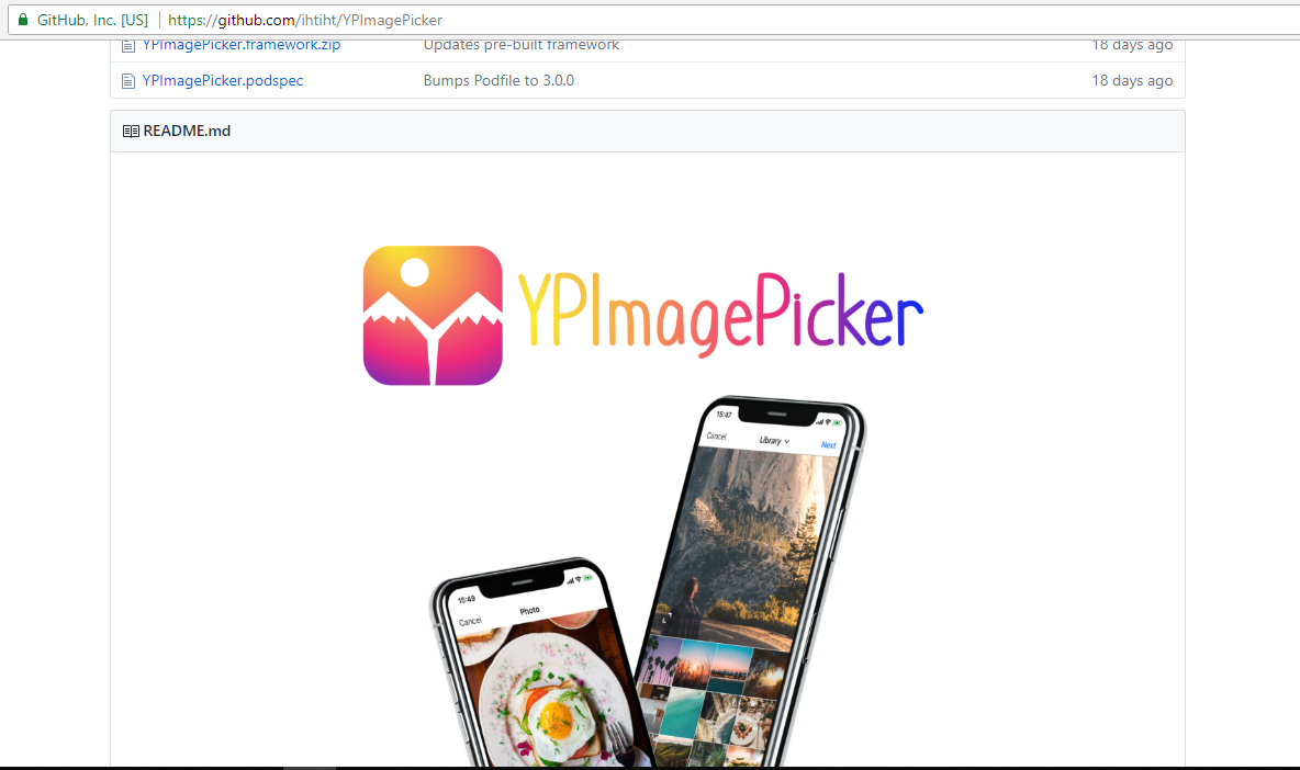
In the A-4 readme file it will look like this:
ihtiht
on 4 Jun 2018
I would agree about font. The colors i think is too funky or there are too many colors in one title. I prefer to use less colors or not so attention diffuus colors. At least less yellow)
Also, maybe overlap the phones under the logo text and add a shadow from the text on the phones to make it look volume? It's just an ideas, don't bit me)
NikKovIos
on 4 Jun 2018
Awesome, let's decrease the yellow part in the beginning of the title to make it more legible then.
And we're good?
Concerning the last point I like the way it is now but feel free to try :)
s4cha
on 5 Jun 2018
I think I'm too late this time. I am sorry about that.
I brought the yellow color as readable as you want. It was better this way. And I sent a PR without delay. https://github.com/Yummypets/YPImagePicker/pull/146 I also added editable versions of files. This way, a possible change can be made in the future. If there is no problem, merge the PR. If you still want to make any changes, specify this. I am here. And I am happy to contribute to your other open source projects. Do not forget me.. :call_me_hand:
ihtiht
on 10 Jun 2018
@ihtiht @NikKovIos Can we close this? @ihtiht Thanks again for your great work and your patience 👍
s4cha
on 12 Jun 2018
You can turn it off.
ihtiht
on 12 Jun 2018
Related issues
 VitaliiDeveloper
·
5Comments
VitaliiDeveloper
·
5Comments
 kerimsener
·
6Comments
kerimsener
·
6Comments
 Sieniek
·
5Comments
Sieniek
·
5Comments
 AndreiBoariu
·
5Comments
AndreiBoariu
·
5Comments
 fukemy
·
6Comments
fukemy
·
6Comments
Most helpful comment
Hello again,
I made some designs.
The main idea of designs is as follows;
I wanted to use an item and letter Y that generally represent the photos. Thus, both the name of the project and its function were emphasized. I think it's important that the logos are simple and logical. So I made such designs for.
I also made a logotype version like this;
This design will look like this in the readme file. Click here for a detailed review.