Yetiforcecrm: New design - suggestions most welcome
Hi everyone!
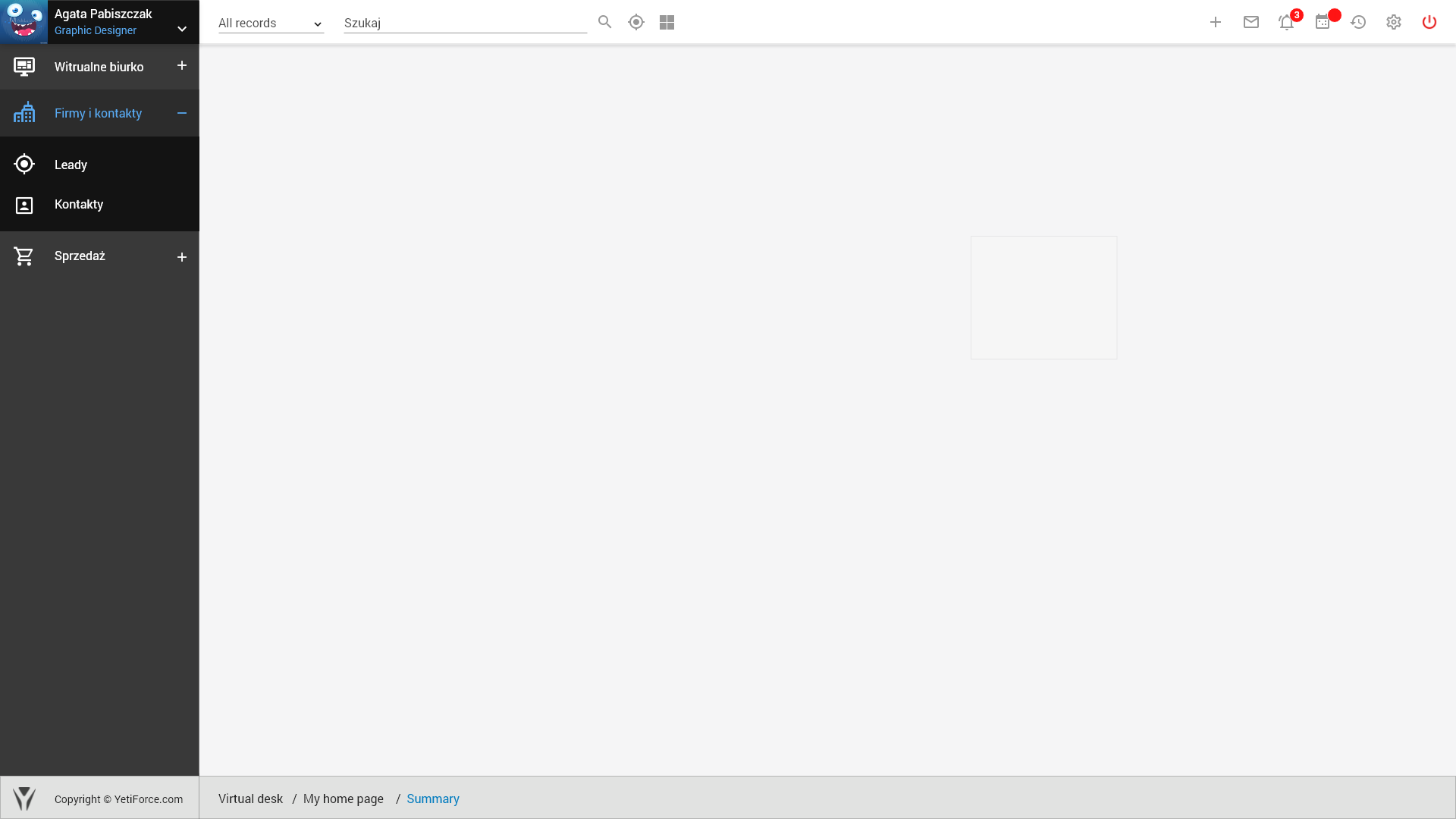
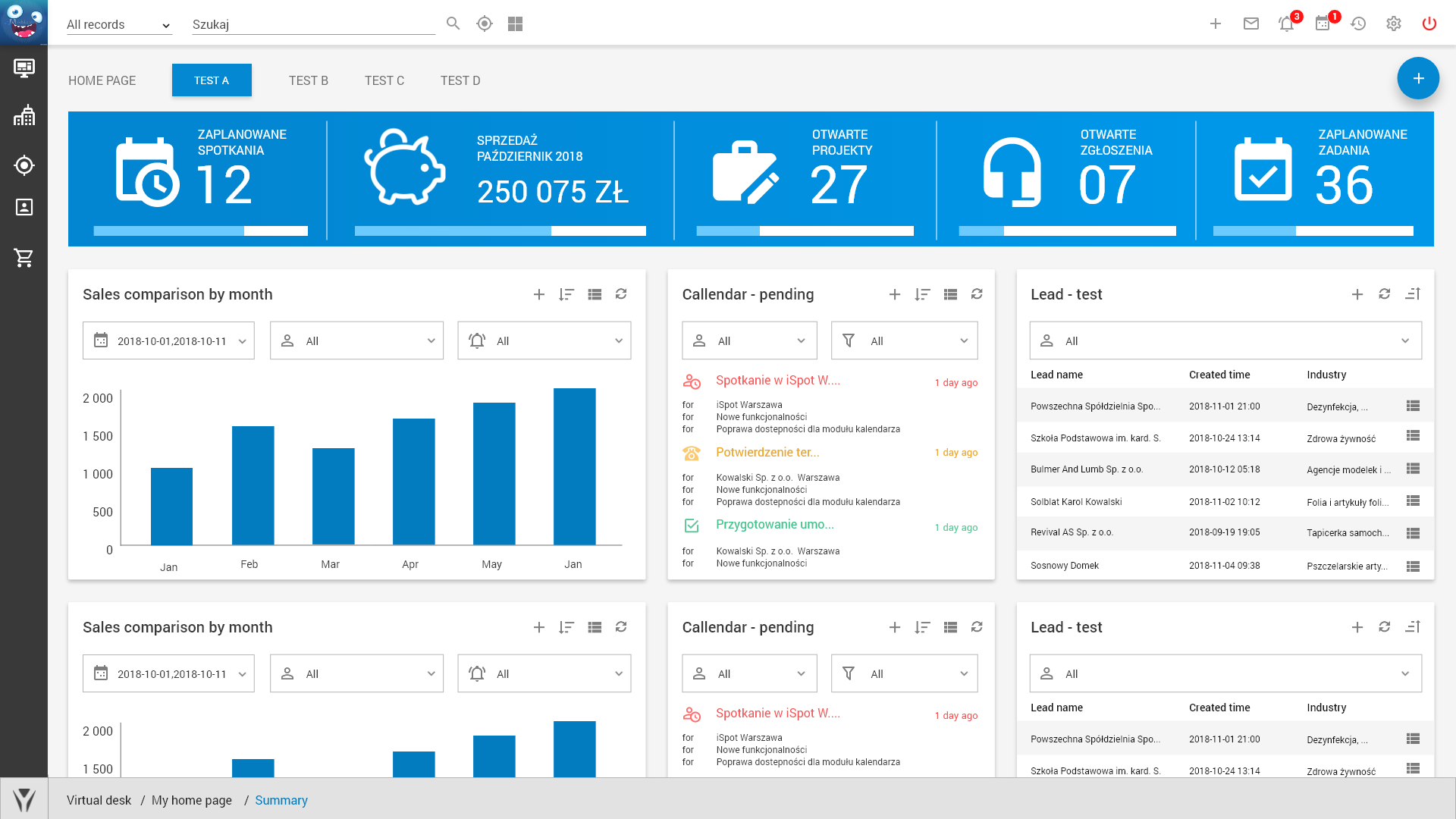
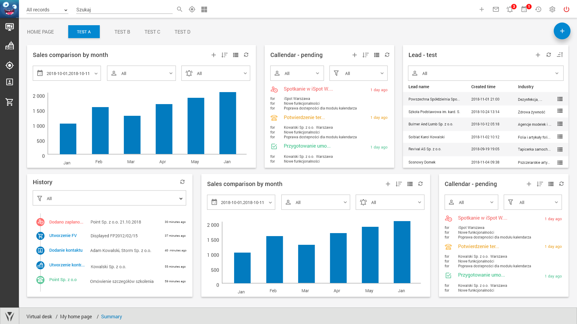
We’re currently working on a new design for YetiForce. It’s going to take at least several months, we have to design over 500 screens. We’re open to your suggestions because we want to create something amazing together with you. For starters, please take a look at the login and home screens:
1) 
2) 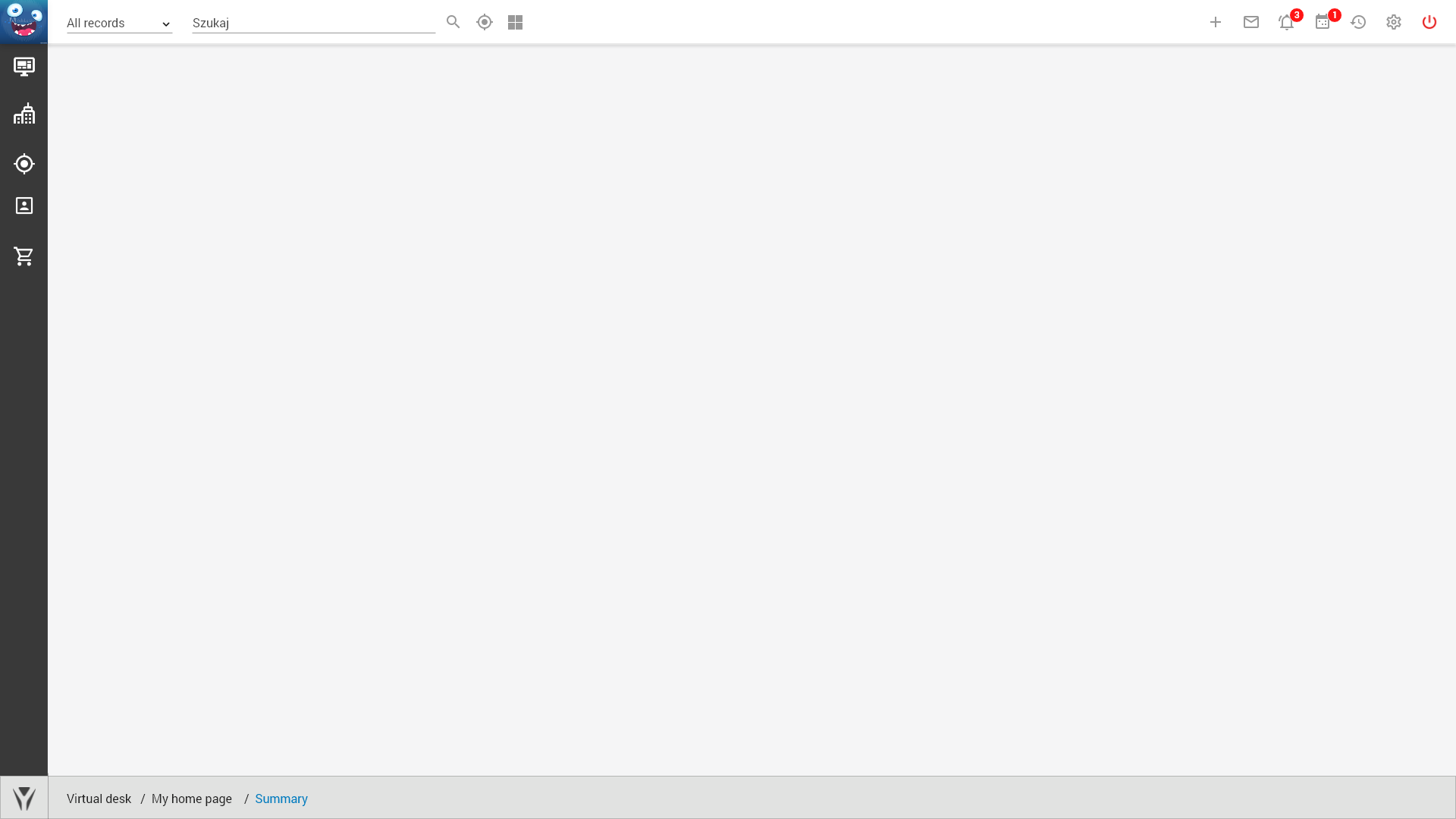
3) 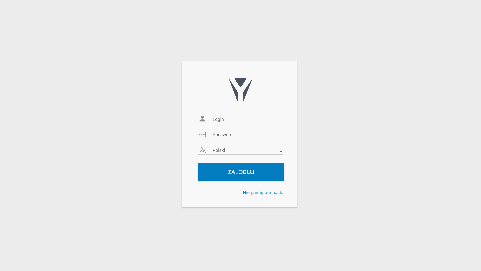
4) 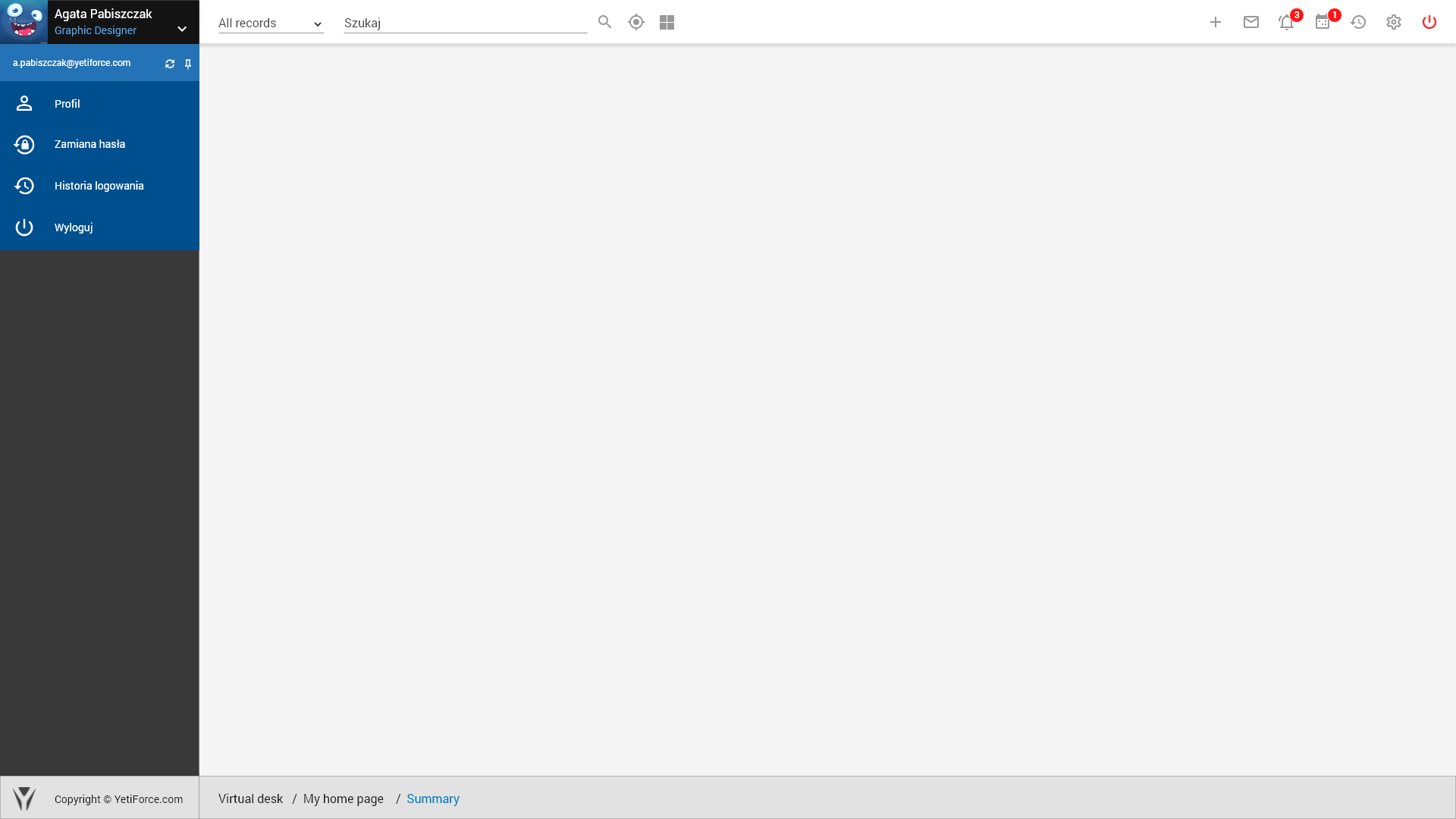
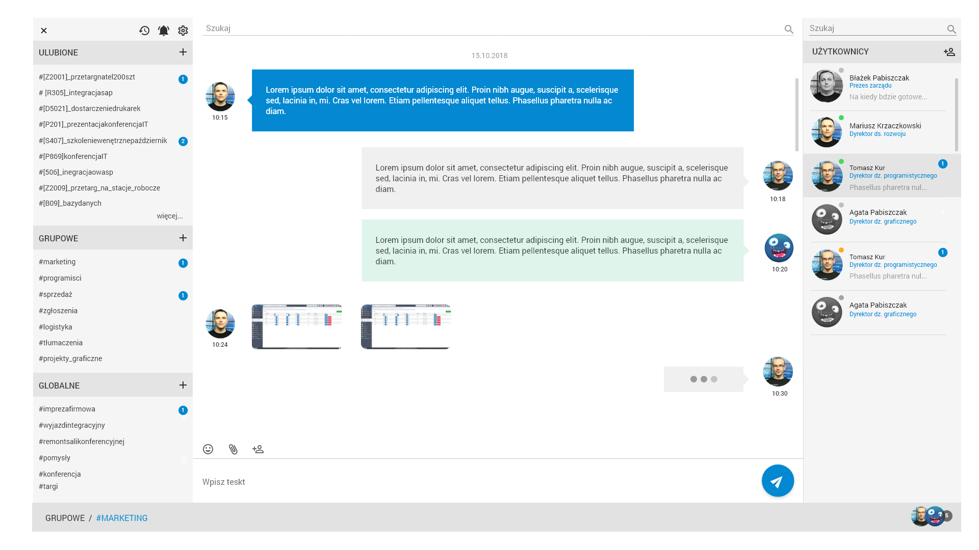
5) 
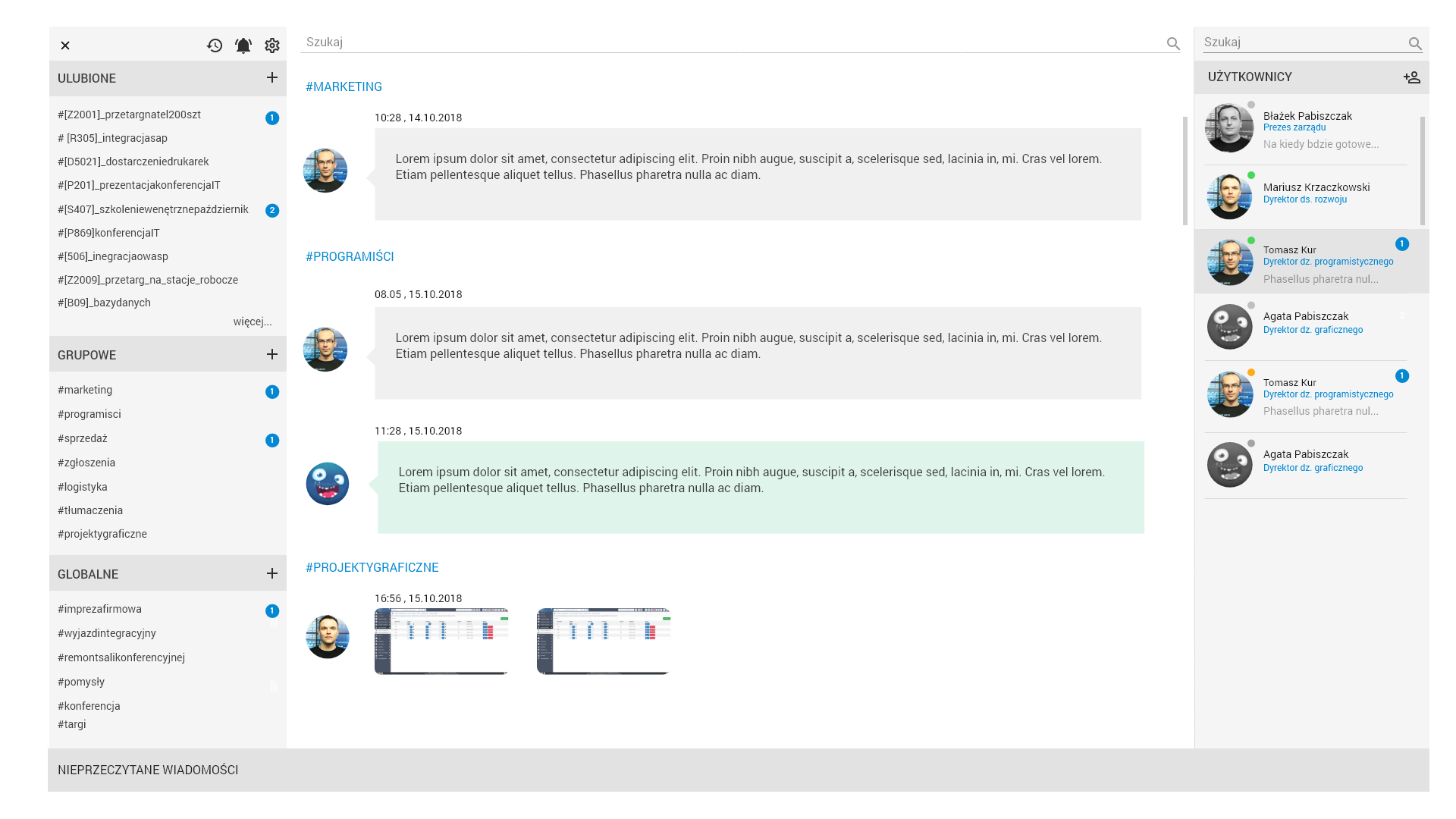
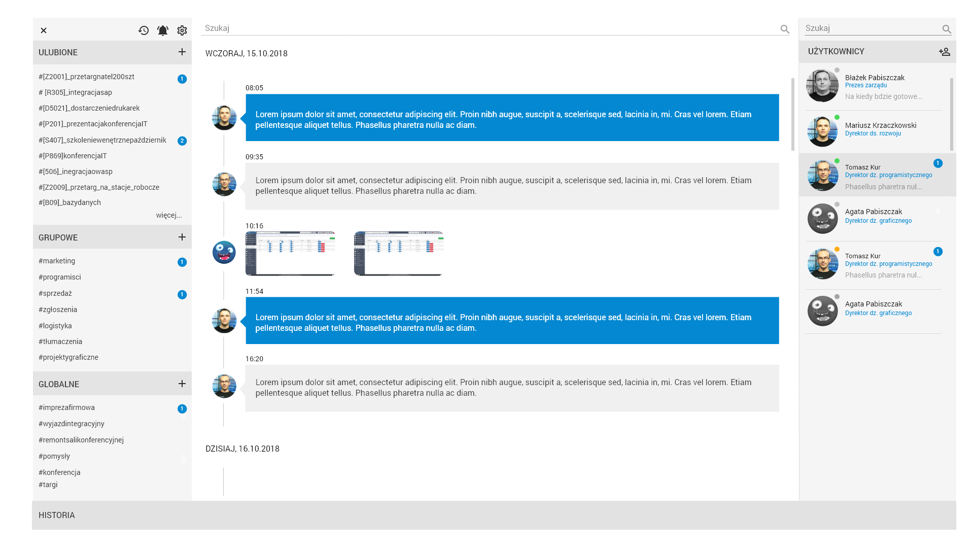
Chat

Let us know what you think and what you'd like to see in the new design.
Thanks!
Want to back this issue? Post a bounty on it! We accept bounties via Bountysource.
 paula-w
All 13 comments
I really dont use the submenu option with +.
I mean, when you have 3 leves or even 4 levels submenu, its very difficult to always click the +. Also, there are people who a really stupid and its hard to explain that they need to click and click and click to get to a menu.
I would recommend something like megamenu, horizontally opening of the menu.
The ideea of the design its quite nice, all flat colours. I like it. Maybe i would have use more joyful color. YetiForce its the best opensource crm/erp on the market, but it has a dark feeling, because of the dark/sad colours. Ok, not childish colours, or candy like, but, a little more open, that gives the sensation off warm place to work on.
Sorry if i upset someone with this review. Its just my 2 cents.
Keep up the good work.
 liviubbo
on 11 Oct 2018
liviubbo
on 11 Oct 2018
Very similar to the VTiger. Bad idea.
A horizontal menu is a good idea.
All business application design comes down to beautiful graphics. They give that wow effect. This is a good design. Lacking the ability to edit color schemes and change icons. And then, perhaps the community would offer interesting options. I am for sure.
 alexandr256
on 11 Oct 2018
alexandr256
on 11 Oct 2018
 bpabiszczak
on 11 Oct 2018
bpabiszczak
on 11 Oct 2018

bpabiszczak
on 11 Oct 2018
Wow. Great design.
Would be nice to have a feature to change number of entries on that widgets.
I will think about some sugestions.
 cltvchannel
on 11 Oct 2018
cltvchannel
on 11 Oct 2018
I like that
 mskoczek
on 14 Oct 2018
mskoczek
on 14 Oct 2018
You did great work, as you always do!
I feel similar with @liviubbo regarding the colours. I would change the color of left main menü (if it closed and if it opens) to some brighter color. Maybe grey, orange, blue or green. But not the same colors of the widgets, they look good! I think the colour red, yellow and dark green ar very intuitive colors for get a feeling of meening of the values und figures which are shown in this colours.
 manwenick
on 16 Oct 2018
manwenick
on 16 Oct 2018
Chat [sorry for the Polish version]


bpabiszczak
on 16 Oct 2018
@bpabiszczak Wow, chat looks also amazing! I don't recognize if the group chat also possible? I see different icons of users in the chat window, on the right side I don't see if it's a group, or something like a main chat group for the company?
manwenick
on 16 Oct 2018
This is bomb
 vovpff
on 17 Oct 2018
vovpff
on 17 Oct 2018
@paula-w @bpabiszczak
Do you have the appx. date of new release, which will contain all this amazing look?
I also would like to share my UX: I am using dashboards/widgets, with several filtered data. Most of the time I use 4K resolution laptop. If I change the size of widgets, and then change to HD screen or tablet, the size of the widgets is not realy responsible. Maybe there is a solution an nowadays, but it could be great, if you also take this in account.
Thank you!
manwenick
on 17 Oct 2018
I've made couple of modifications for first and third screen. I think it looks a litttle bit better and have kind of lighter feeling.
Here I have all files https://drive.google.com/drive/folders/16n8IgU48E8tFpiT9mYlLhv9gj5Z2F8d8?usp=sharing
color scheme was initially from here http://www.flatcolorsui.com/
Also I think that icons could be thinner - some kind of LINE ICONS / outline icons probably will look better and give that light flat feeling too.
This is just my opinion if you like it let me know, maybe I could help in other views if you want.
Of course this modification isn't perfect and it takes time to improve them, but for the purspose of showing concept it should be ok.
Thanks.
 neuronetio
on 28 Oct 2018
neuronetio
on 28 Oct 2018
We will post new screenshots and updates from time time but for now I'm closing this issue.
Thanks for all your suggestions and feedback!
paula-w
on 27 Nov 2018
Related issues
 rubysown
·
3Comments
rubysown
·
3Comments
 ldgbc
·
3Comments
ldgbc
·
3Comments
 serbiaserbia
·
3Comments
serbiaserbia
·
3Comments
ldgbc
·
3Comments
serbiaserbia
·
3Comments
serbiaserbia
·
3Comments
ldgbc
·
3Comments
Most helpful comment
Chat [sorry for the Polish version]


