With the flat buttons the relatively strong shadow looks a bit too much in my opinion.
Also I've found that swapping selection fg and bg color reduces the jarring of the orange a lot and gives all three themes a "fresh" vibe?
What do you think @clobrano @madsrh @ubuntujaggers @Jupiter007-43 ?
:wastebasket: or :+1: ?
 Feichtmeier
All 27 comments
For ease of reference can we please have before/after in the top post? Some differences are instantly obvious (e.g. the X) but maybe not all.
 ubuntujaggers
on 29 Sep 2020
ubuntujaggers
on 29 Sep 2020
Yeah the orange close button might be too iconic... let's keep this out of discussion for the moment.
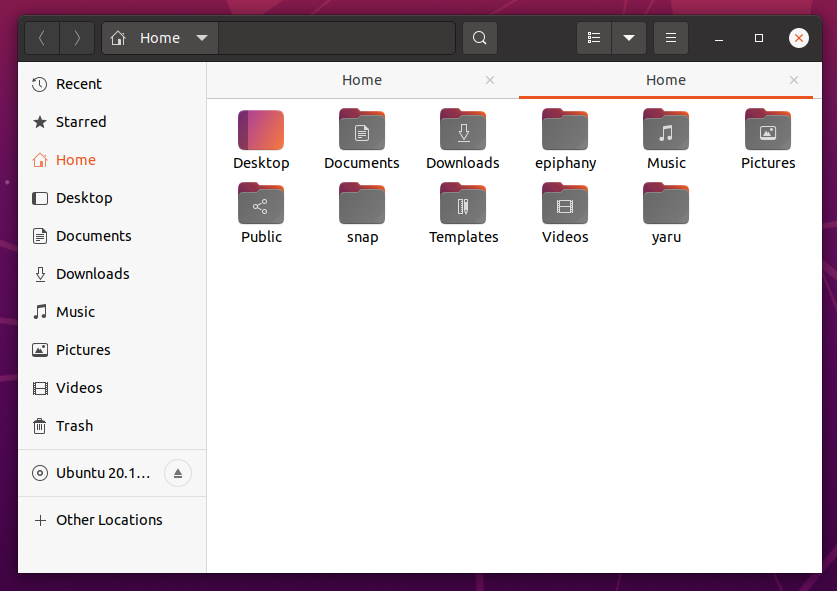
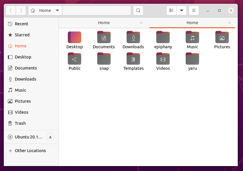
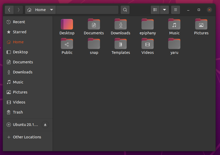
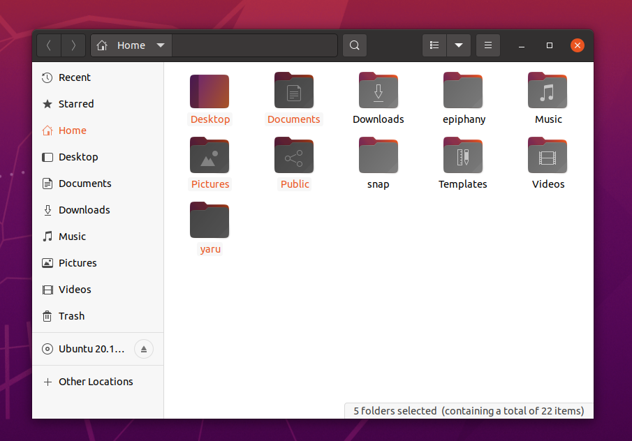
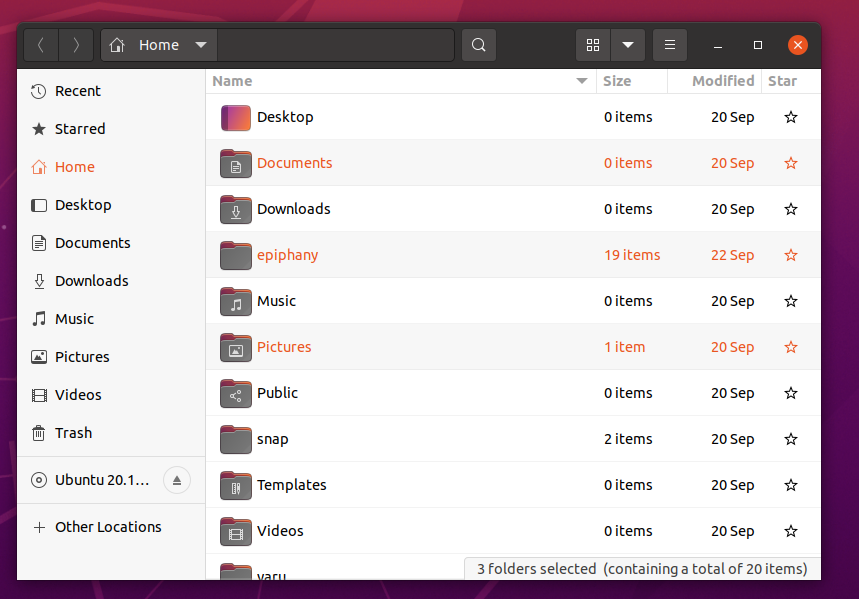
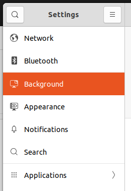
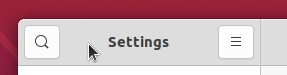
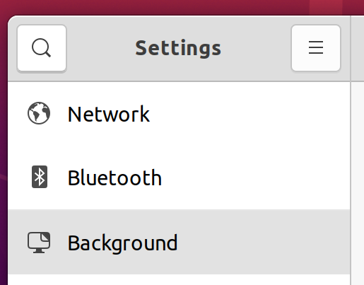
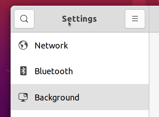
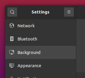
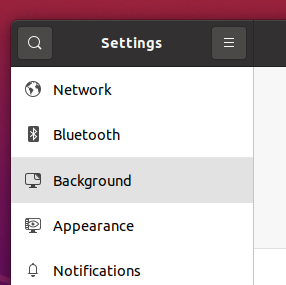
Selection in nautilus
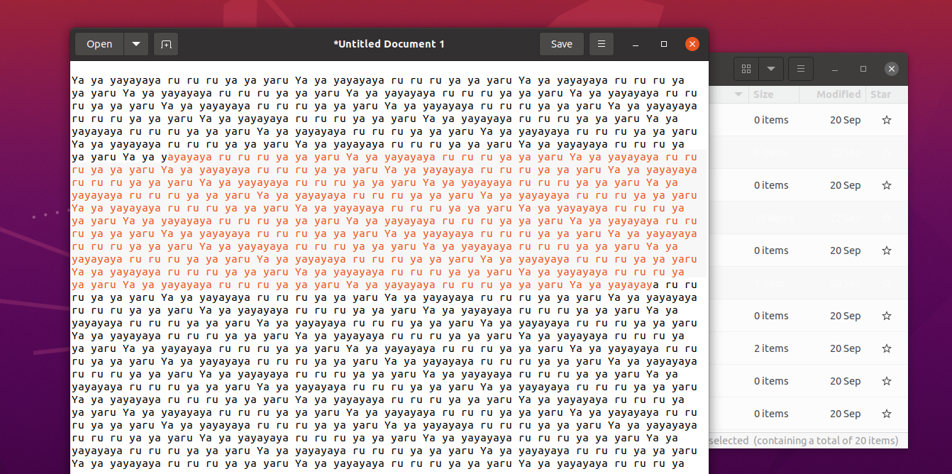
Selection in text areas like in Gedit
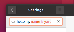
Selection in entries
Edit: oh damn you said top post :( I'll update that later, sorry
Feichtmeier
on 29 Sep 2020
I'm not instantly a fan, but this could change over time 😊
IMO the current colors are much better for usability. I think by design, colored text is a bad idea. Looking at 🍏 there's a lot of blue, but the text is always black/white 🤷♂️
 madsrh
on 29 Sep 2020
madsrh
on 29 Sep 2020
Yeah I think making this global is prbly a very bad idea. Maybe it's still the sidebar blobs I dislike. MacOS looks really good. Really good. Maybe we could include some of those ideas
Feichtmeier
on 29 Sep 2020
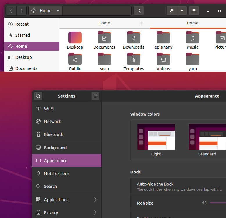
@madsrh what comes a little closer to mac os sidebars is maybe this:
Feichtmeier
on 29 Sep 2020
The actual style is very good for visibility. We clearly see which items are selected and it's not the case IMO in your first proposal.
But the orange in nautilus sidebar is also a bit aggressive (it looks good for me, but I think it could be aggressive for some people) and I think your last screenshot is very smarter.
Selection in text areas like in G edit
😄 It is a Yaru song (Ya Yaru Ya Ya Yaru 🎶💃)?
 Jupiter007-43
on 29 Sep 2020
Jupiter007-43
on 29 Sep 2020
I'm not sure it's ok for visibility actually. Using background color for highlight guarantees that the text is always visible no matter what background the selection has.
 clobrano
on 29 Sep 2020
clobrano
on 29 Sep 2020
Yeah. Looks sometimes cool but it's prbly not realistic.
What about the last picture with the upstream style row selection plus orange icon?
Feichtmeier
on 30 Sep 2020
What about the last picture with the upstream style row selection plus orange icon?
It's nice, but probably unnecessary.
clobrano
on 30 Sep 2020
A less orange solution 😄
madsrh
on 30 Sep 2020
Okay, shall I propose a PR with that rows then?
It's basically this code from upstream nautilus but folded on all sidebars:
Edit: oh looks like @madsrh replied in the moment I wrote this. Purple looks def. better than orange here in my opinion, but I'd prefer still the upstream solution
Feichtmeier
on 30 Sep 2020
Okay, shall I propose a PR with that rows then?
At this point, I think we should change things to solve problems, and I don't understand what the orange symbol is solving.
clobrano
on 30 Sep 2020
If you mean bug = problem, there is no bug. This is why this issue is named "Design idea" and not "Bug idea" :roll_eyes:
I showed the orange icons, because I think this looks good on the gray bars, similar to what macos does, and it adds the icons as little orange "gems"/runes on top of the subtle gray selection. I think it's elegant but I can understand if you don't like it or whatever.
The proposal contained more though. Even if I can't convince @clobrano that the orange blob must die, I still think that with the bigger buttons our current shadow does not work anymore.
Adding pictures of zoomed buttons later before/after and you can share you opinion.
Feichtmeier
on 30 Sep 2020
This is why this issue is named "Design idea" and not "Bug idea" :roll_eyes:
No need to roll eyes, I understood. I meant problem, like a design problem. After a couple of years of development I think we should keep things a bit stable, not changing design without a specific need. It is not specific to "this" change, but as approach in general.
The proposal contained more though.
It would be easy to show 1 thing at a time, I think and discuss that only.
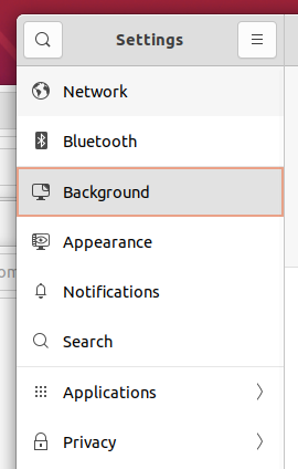
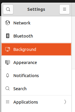
If by orange blob you mean the orange selection in nautilus, we can use grey as upstream does.
For the strong shadow, this is true for the light headerbar, while dark ones look fine for me.
clobrano
on 30 Sep 2020
That emoji should address my bad joke, not your reply. :|
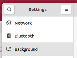
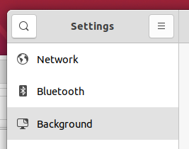
Anyways, without the orange icon, which also didn't look very good on the dark theme, the row looks like this if it is selected and has focus:
has focus master:
Without focus:
Master:
Buttons
Master:
normal button:
hovered button:

Proposal:
normal button:
hovered button:
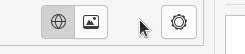
Zoomed
Master:
Proposal:
normal button:

hovered button:
Feichtmeier
on 30 Sep 2020
For me, the grey selection proposed, even with the orange borders, looks good.
Also the button in bright headerbar is good. I think this applies to Yaru-dark and defult, right? Since it's already quite dark, does it lose visibility with dark headerbar? If not, I am ok with this changes.
clobrano
on 30 Sep 2020
Okay, i'll post images and GIFs of the other themes later, would be nice if you could write what you think of those, too. The branch is already pushed if you have time to test it yourself before
Feichtmeier
on 30 Sep 2020
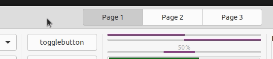
dark theme
zoomed
sidebar
mixed theme
zoomed
sidebar
Feichtmeier
on 30 Sep 2020
This looks good @Feichtmeier 👍 My only concern is that the gray is too similar to the hover gray - ofc this is easy to fix
madsrh
on 30 Sep 2020
Important point, I think there is still enough difference, what do you think?
Feichtmeier
on 30 Sep 2020
The grey for sidebar/selection looks quite nice. For text selection I really think it has to have a properly visible background so you can see whether your selection is picking up white space and stuff at the sides.
ubuntujaggers
on 30 Sep 2020
Yeah text selection was a bad idea :| looked so cool for a moment :brain:
Feichtmeier
on 30 Sep 2020
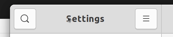
hi,
For me the grey for sidebar/selection works fine with Yaru-light and Yaru but on Yaru-dark, the selection is too similar to hover
maybe darken the selection a little bit?
 Muqtxdir
on 1 Oct 2020
Muqtxdir
on 1 Oct 2020
@Muqtxdir thanks for notice. Like this?
Feichtmeier
on 1 Oct 2020
yes, this looks better
Muqtxdir
on 1 Oct 2020
Thanks, pushed @Muqtxdir
Would you be interested in further contributing? What's your name on discourse.ubuntu.com ?
Feichtmeier
on 1 Oct 2020
Would you be interested in further contributing? What's your name on discourse.ubuntu.com ?
yes, name on discourse.ubuntu.com : Muqtxdir
Muqtxdir
on 1 Oct 2020
Related issues
 matthewpaulthomas
·
3Comments
matthewpaulthomas
·
3Comments
 eaglersdeveloper
·
3Comments
eaglersdeveloper
·
3Comments
 chrisjbillington
·
3Comments
madsrh
·
3Comments
Feichtmeier
·
3Comments
chrisjbillington
·
3Comments
madsrh
·
3Comments
Feichtmeier
·
3Comments
Most helpful comment
The actual style is very good for visibility. We clearly see which items are selected and it's not the case IMO in your first proposal.
But the orange in nautilus sidebar is also a bit aggressive (it looks good for me, but I think it could be aggressive for some people) and I think your last screenshot is very smarter.
😄 It is a Yaru song (Ya Yaru Ya Ya Yaru 🎶💃)?