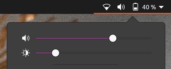
Yaru: Slider-bar not easily visible in dark theme
Hi,
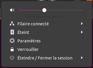
Firstly, Yaru-dark shell theme is awesome and I love it
However the slider-bar color for volume and brightness control is almost not easily distinguishable from Menu (sometimes)
Actual Behavior
Expected Behavior

Thanks!
 Muqtxdir
All 15 comments
Hi @Muqtxdir,
thank you for taking time to report this, and for liking Yaru :smile:
I agree with you that this slider is harder to spot than in Yaru light, we went through some iterations to find a decent compromise, but I am not 100% satisfied as well. Of course we don't want to use blue color here :) and the choosen purple is already a compromise that works fine in other places, so it is not easy, but I think we can try get it just right.
 clobrano
on 16 Jun 2020
clobrano
on 16 Jun 2020
Hi @clobrano,
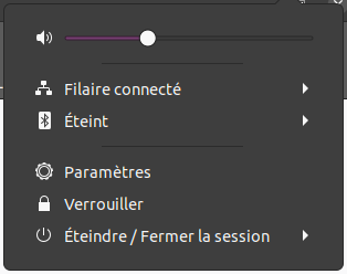
The screenshot is from other Theme,I didn’t mean purple to be changed to blue, I wanted reference screenshot to compare Yaru-dark’s background slider color (Sorry for the misunderstanding)
Anyways, Thanks for looking into this!
Muqtxdir
on 16 Jun 2020
Maybe we need to brighten up the purple slightly for the dark theme(s)?
 Feichtmeier
on 16 Jul 2020
Feichtmeier
on 16 Jul 2020
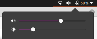
Just a suggestion but set $progress_bg_color to $aubergine instead of if($variant=='light', $aubergine, darken($aubergine, 8%)) should increase the contrast with the background on dark variant:

Default:
 Jupiter007-43
on 18 Jul 2020
Jupiter007-43
on 18 Jul 2020
Good idea @Jupiter007-43
If you want to test this yourself, you need to log out after building from src and log into the "yaru session"
Feichtmeier
on 18 Jul 2020
In fact it is already a screenshot. I installed Yaru as Yaru-dev by modifying meson.build file, then I change the Gtk and shell theme variant into Gnome-tweaks.
But anyway, thanks for the advice 😉
Jupiter007-43
on 18 Jul 2020
Hi @Jupiter007-43,
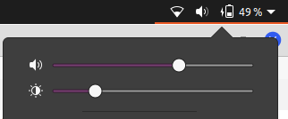
The contrast helps the purple slider-bar
but is it possible to make the remaining unfilled bar (barlevel-background-color) little more visible like this:
I changed barlevel-background-color value from #3d3d3d to #9d9d9d to show what I mean
barlevel-background-color: #3d3d3d (default):
barlevel-background-color: #9d9d9d (changed):
Thanks!
Muqtxdir
on 18 Jul 2020
Thanks @Muqtxdir,
the contrast is indeed better with a lighter gray. 👍 Personally I prefer use the Ubuntu color $graphite: #666666 for the barlevel-background-color. What do you think of?
@Feichtmeier should be a good idea to add more variables to _colors like a $barlevel-background-color, instead of hard coded them? 🤔
Jupiter007-43
on 18 Jul 2020
We try to avoid differences from upstream if not direly needed. To make it easier to merge their code
Feichtmeier
on 18 Jul 2020
Okay.
Jupiter007-43
on 18 Jul 2020
Should I create a PR?
Jupiter007-43
on 21 Jul 2020
Nono, I'll do it :) Time until 20.04.2 now and/or groovy UI freeze
Feichtmeier
on 21 Jul 2020
Ok 👍 Thank you!
Jupiter007-43
on 21 Jul 2020
I don't know if this will be helpful for you, but I also adjust (on my screenshot upper) the $progress_border_color var to:
if($variant== 'light', darken($progress_bg_color, 5%), darken($progress_bg_color, 25%));
Instead of:
if($variant== 'light', darken($progress_bg_color, 5%), darken($progress_bg_color, 20%));
Just because it looks better with the $aubergine color. 20% darken is too light and looks a bit blurry (in my opinion) 🙂
Jupiter007-43
on 21 Jul 2020
Should I create a PR? Nono, I'll do it :) Time until 20.04.2 now and/or groovy UI freeze
Would be great to get this into master now so we can test this 🙃
 madsrh
on 3 Aug 2020
madsrh
on 3 Aug 2020
Related issues
 mivoligo
·
3Comments
madsrh
·
3Comments
mivoligo
·
3Comments
madsrh
·
3Comments
 sicklylife-jp
·
3Comments
sicklylife-jp
·
3Comments
 YamiYukiSenpai
·
3Comments
YamiYukiSenpai
·
3Comments
 8none1
·
3Comments
8none1
·
3Comments
Most helpful comment
Just a suggestion but set
$progress_bg_colorto$aubergineinstead ofif($variant=='light', $aubergine, darken($aubergine, 8%))should increase the contrast with the background on dark variant:Default: