Disclaimer: please don't mind the broken elements, don't have the new shell on my host yet
Just look to the colors
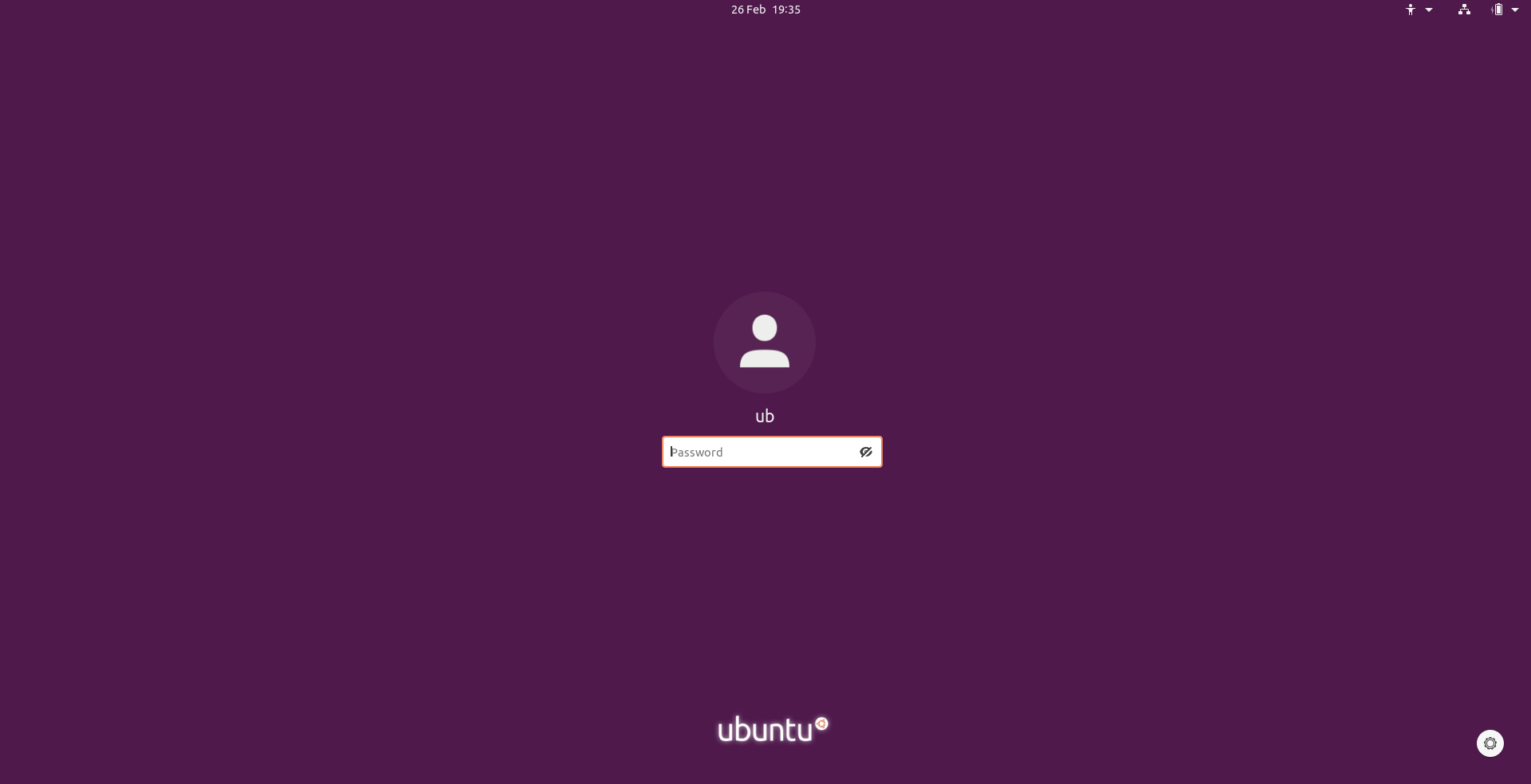
@3v1n0 mentioned that he is not too happy with the white search and lock screen/login screen entries
As an alternative we could make it look like in 19.10 https://github.com/ubuntu/yaru/pull/1350

I personally prefer the white one :crying_cat_face:
@clobrano @madsrh ?
 Feichtmeier
All 14 comments
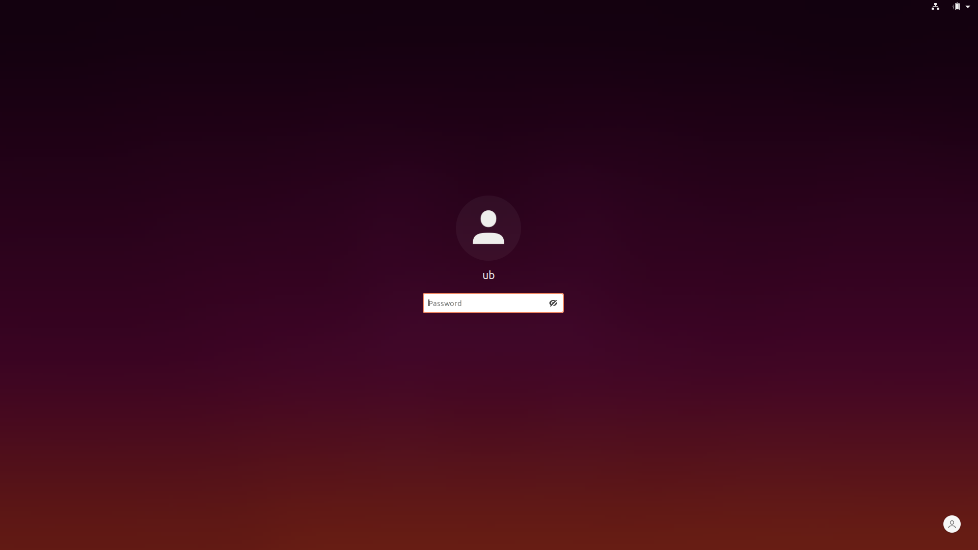
More transparency:
Feichtmeier
on 29 Feb 2020
I like the "More transparency" version but I also prefer just white
 madsrh
on 29 Feb 2020
madsrh
on 29 Feb 2020
White Version to compare
Feichtmeier
on 29 Feb 2020
The last one is very nice
 clobrano
on 29 Feb 2020
clobrano
on 29 Feb 2020
I also prefer the white one.
 Amr-Ibra
on 29 Feb 2020
Amr-Ibra
on 29 Feb 2020
Can we safely do a gradient for the background?
madsrh
on 29 Feb 2020
That's the new blur. It blurs the background but only for the lock screen
Feichtmeier
on 29 Feb 2020
The white version is nice.
 ghost
on 29 Feb 2020
ghost
on 29 Feb 2020
@3v1n0 mentioned that he is not too happy with the white search and lock screen/login screen entries.
I'm feeling the same, especially about the search entry. Looks like a minority opinion right now :smiley:
 Paz-it
on 29 Feb 2020
Paz-it
on 29 Feb 2020
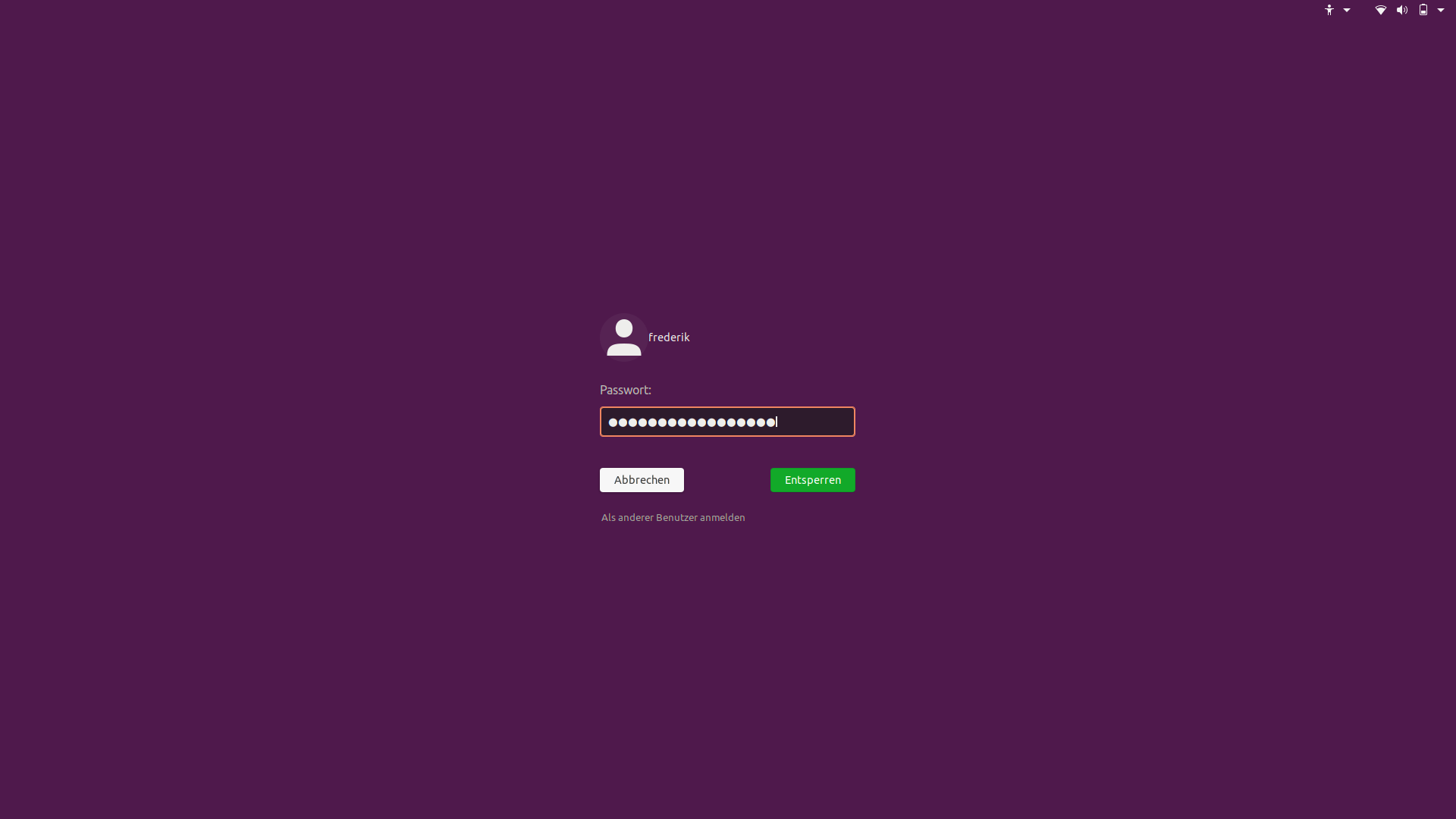
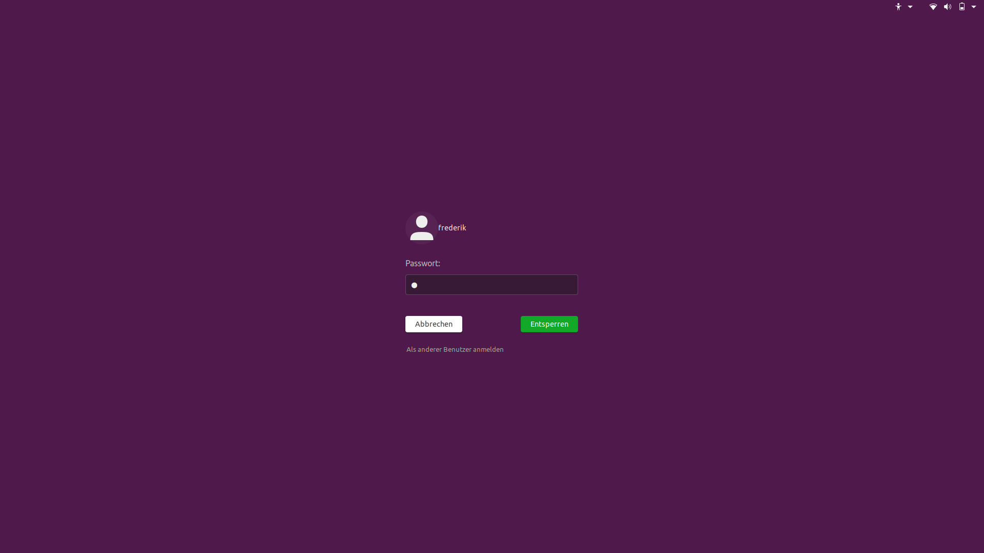
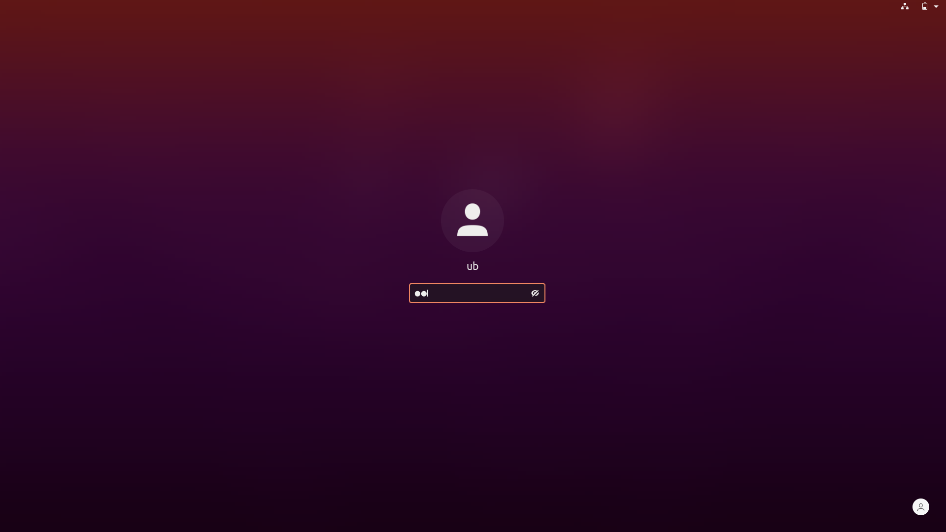
What will happen to the "eye" asset in the login screen entry when the entry goes dark? As I can see, the asset itself is black, so a black asset on dark background...
Amr-Ibra
on 29 Feb 2020
Hi @Paz-it great to see you back :smile_cat:
Okay since most people seem to prefer what's in master. Let's just keep it?
Feichtmeier
on 29 Feb 2020
What will happen to the "eye" asset in the login screen entry when the entry goes dark? As I can see, the asset itself is black, so a black asset on dark background...
We need to slim it. Will tackle this is @3v1n0 successfully put the spinner as a gresource into Ubuntu
Feichtmeier
on 29 Feb 2020
Closing it since most people like the current white entries :+1:
(search entry switches to dark when one uses the dark shell theme with https://extensions.gnome.org/extension/19/user-themes/)
Feichtmeier
on 1 Mar 2020
Just for a fair comparison, this is what the 19.10 entry would look like in the new lock screen
Feichtmeier
on 6 Mar 2020
Related issues
Feichtmeier
·
3Comments
 mivoligo
·
3Comments
mivoligo
·
3Comments
 pojntfx
·
3Comments
pojntfx
·
3Comments
 8none1
·
3Comments
8none1
·
3Comments
 eaglersdeveloper
·
3Comments
eaglersdeveloper
·
3Comments
Most helpful comment
Hi @Paz-it great to see you back :smile_cat:
Okay since most people seem to prefer what's in master. Let's just keep it?