Yaru: Entryfields in dark theme are hard to spot
Entryfields are really hard to spot:
 madsrh
All 18 comments
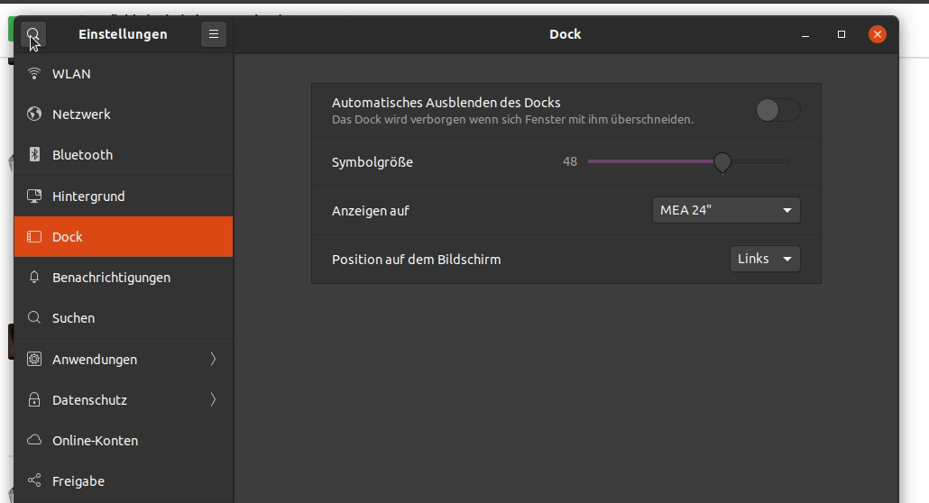
Yes because the background is using base colour there.
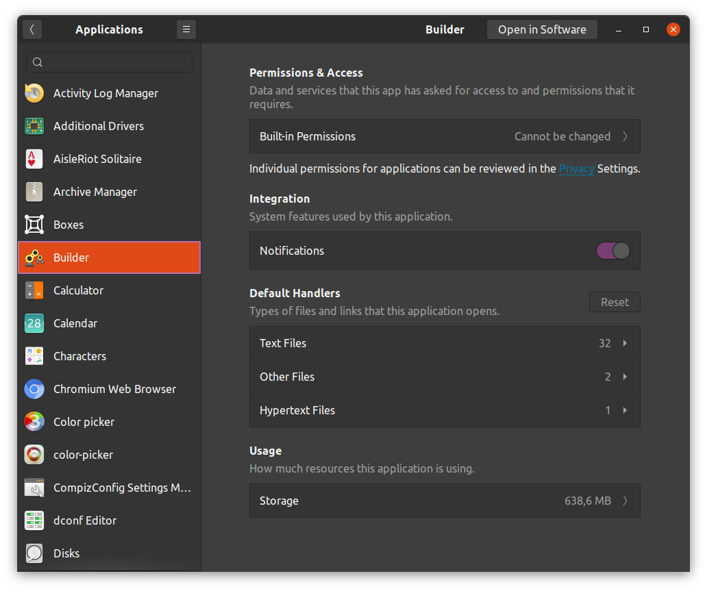
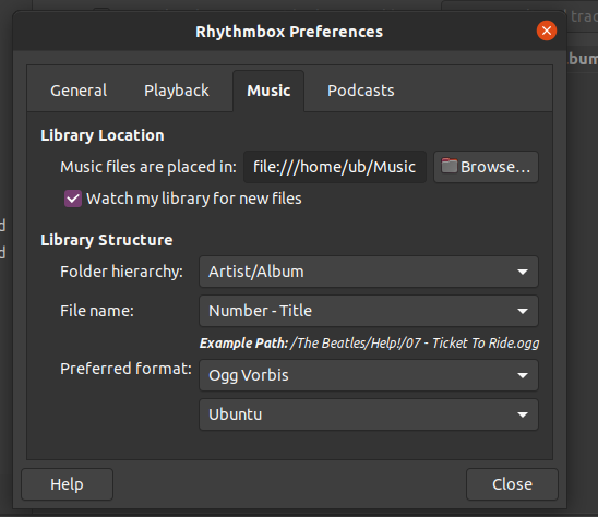
Could you show a different app please?:)
I'm sure they look fine elsewhere
 Feichtmeier
on 23 Jan 2020
Feichtmeier
on 23 Jan 2020
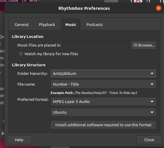
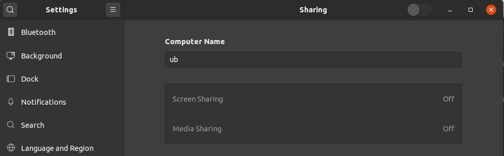
Please check Nautilus and control center
Feichtmeier
on 23 Jan 2020
(sorry, I kept the checkbox/radio from the other discussion)
 clobrano
on 23 Jan 2020
clobrano
on 23 Jan 2020
Could you show a different app please?:)
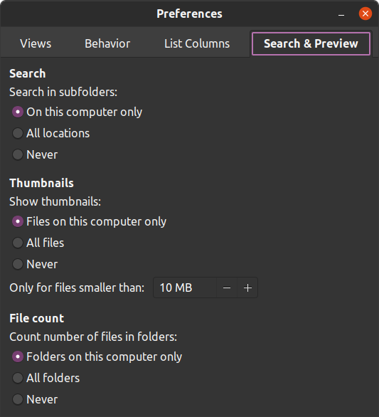
This one is fine.
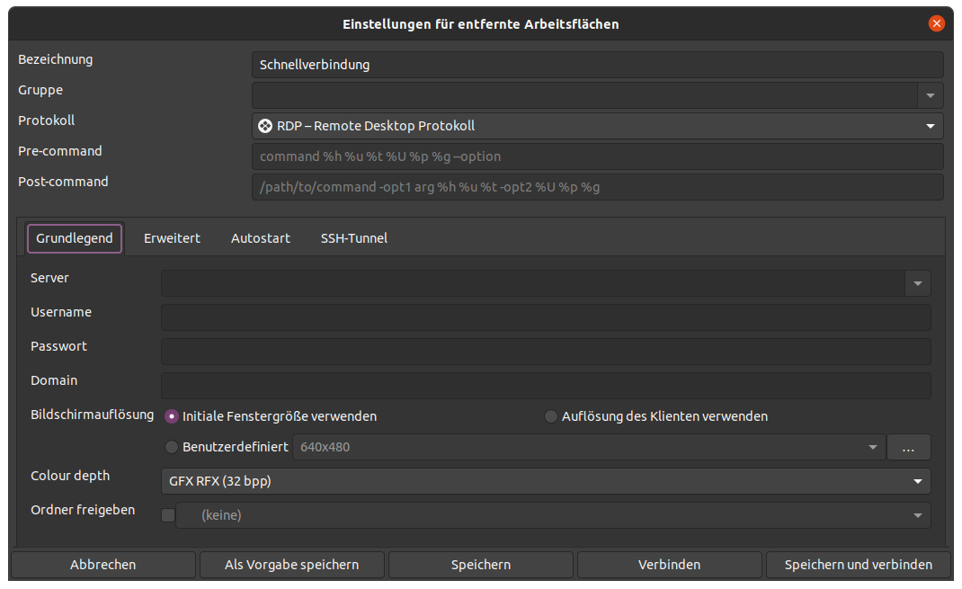
but this one is odd (Terminal settings):
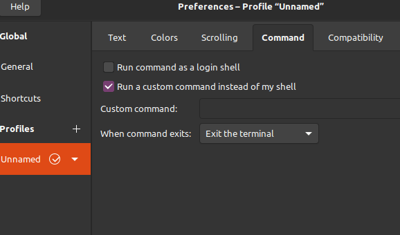
madsrh
on 23 Jan 2020
Yes but that's the problem.
There are some elements that use bgcolor and some use base colour
So we would need to brighten them up like with the buttons (1%)
I understand that certain parts are not always perfect but at least they are consistent. I would rather stop to do it this way:
- find elements that are not perfect
- add a fix for that element in tweaks
- move on
I think we are past this phase for now where we've chosen the current build and model
I have an idea for the entries though. But I'm really getting worried
Feichtmeier
on 23 Jan 2020
I agree we should not abuse tweaks.
Let's try not to prevent any change only for the fear to break something. I would suggest marking this and similar "works-everywhere-but-here" bugs as "papercuts", hopefully having a clearer big picture about this kind of issues will make also clearer how to proceed
clobrano
on 23 Jan 2020
Let's not change something only for certain parts of certain apps ;)
If it's really a big issue, there is _apps.scss
If we continue like this the whole thing will fall apart just like it did in the first version.
Not to break something should really be the first priority for a professional theme suite, in my opinion.
Feichtmeier
on 23 Jan 2020
Not to break anything for sure, not to fear also ;)
clobrano
on 23 Jan 2020
I think we're all on the same page here.
You'll have to excuse my ignorance but I'm not skilled enough to tell if it's using bgcolor or base colour. I simply noticed something that could be improved and opened an issue for it 😄
Not just for this one but for all issues, both of you are perfectly entitled to close them or mark as won't fix - no hard feelings AT ALL 👍
madsrh
on 23 Jan 2020
I would be lying to say that those entries on top of elements with $base_color, like rows and notebook tabs, are easy to spot.
It would be just awesome if we could get all the double styling out of _tweaks, like the switches (which was my mistake not to include $switch_bg/border_color in my upstream contribution) and Carlos tab styling that haven't been merged yet upstream.
And it would be awesome if we could have a smart theme which works for all widgets in gtk in all apps.
Reality is, that we disagree often with upstream and gtk apps are not designed consistent.
I'll see what we can do about the entries
Feichtmeier
on 23 Jan 2020
So, do we agree on adding a papercut tag?
clobrano
on 23 Jan 2020
Added papercut label, to suggest that a fix here is surely desirable, but since the nature of the fix is complex, it's also annoying :smile:
clobrano
on 23 Jan 2020
@madsrh
This is how dark theme entries look, when they are drawn on $bg_color:

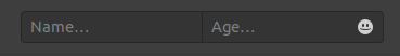
I think the good thing about this darker-than-buttons-look is, that they look different from buttons - AND I am very sure to remember an issue from Yaru1.0 where someone complained that entries can't be differentiated from buttons ;)
this is with the same color the buttons use (lighten(bg_color, 1%):

Now they drown, too - as they are drawn on $bg_color
So the only solution I see is to darken them explicitly
@if $variant=='dark' {
row entry, tab entry, notebook entry, notbook tab entry { background-color: darken($base_color, 4%); }
}
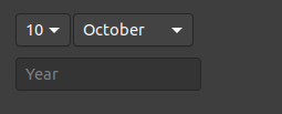
So everywhere else they still look like this:

Feichtmeier
on 23 Jan 2020
Looks like a good solution @Feichtmeier
madsrh
on 23 Jan 2020
@madsrh @clobrano
Tab's should now always be $base_color, so i think this is a safe special case for entries
however rows in listboxes are not. I would rather not special case all entries in rows and only in notebooks. Is this okay for you?
Feichtmeier
on 12 Feb 2020
I would rather not special case all entries in rows and only in notebooks
Sorry, but I'm not sure what that means 🙈😄
madsrh
on 12 Feb 2020
Np. What I mean is
Entries on a notebook page, is a very common pattern.
Entries have $base_color
Notebook pages have $base_color
Rows have sometimes $bg_color and sometimes $base_color
But I've rarely seen entries in rows, except the search entries which receive a focus border immediately for example in gnome control center
So If you agree @madsrh , I would reduce the change only to entries in notebooks:
Feichtmeier
on 12 Feb 2020
Thanks 👍😀 Yes! +1
madsrh
on 12 Feb 2020
Related issues
 eaglersdeveloper
·
3Comments
eaglersdeveloper
·
3Comments
 pojntfx
·
3Comments
pojntfx
·
3Comments
 8none1
·
3Comments
8none1
·
3Comments
 Muqtxdir
·
3Comments
Muqtxdir
·
3Comments
 sicklylife-jp
·
3Comments
sicklylife-jp
·
3Comments
Most helpful comment
I think we're all on the same page here.
You'll have to excuse my ignorance but I'm not skilled enough to tell if it's using bgcolor or base colour. I simply noticed something that could be improved and opened an issue for it 😄
Not just for this one but for all issues, both of you are perfectly entitled to close them or mark as won't fix - no hard feelings AT ALL 👍