Yaru: Colour selection for window snapping
Expected Behavior
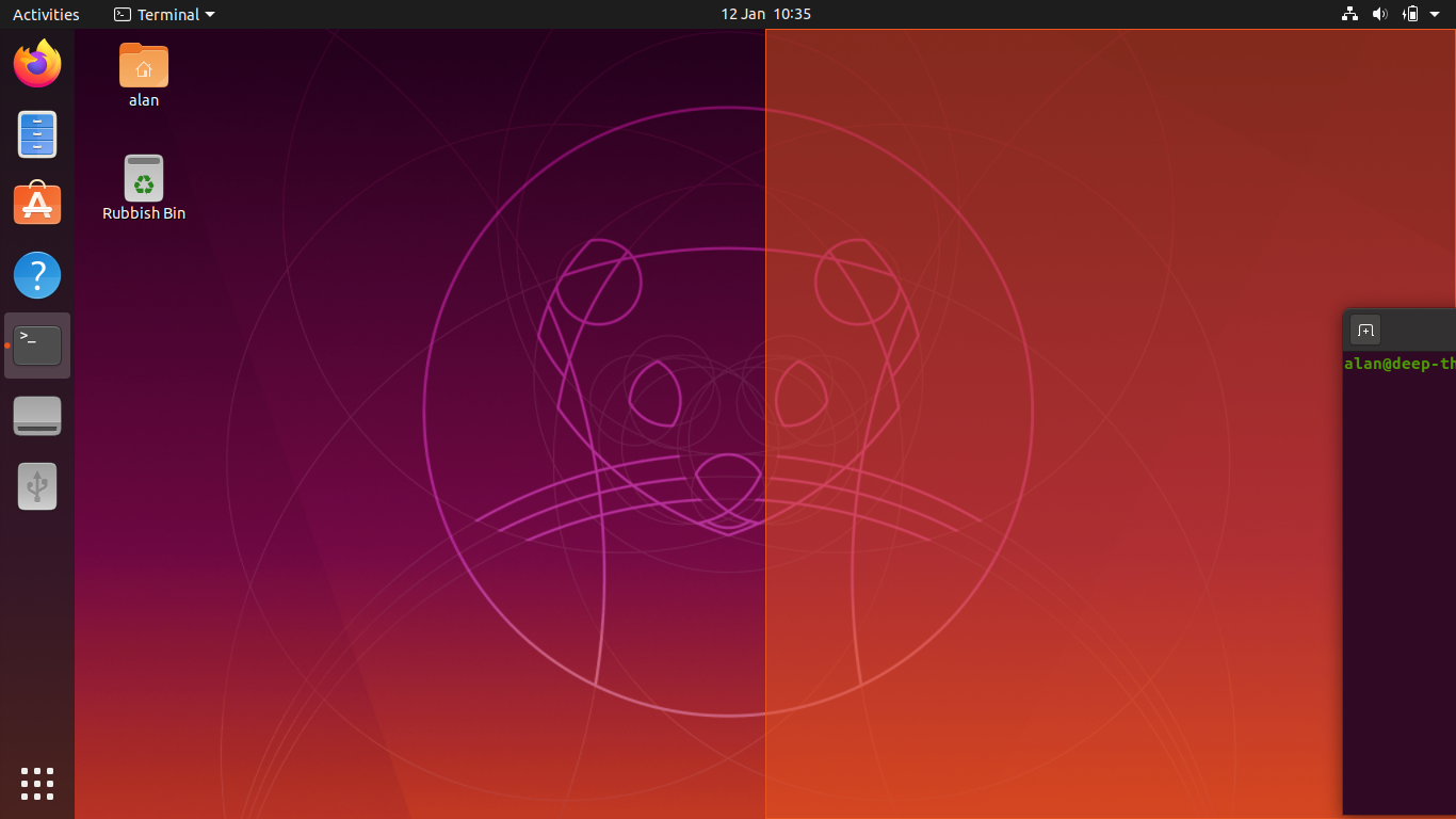
With the latest build of Yaru on 20.04 (built from source as per the excellent Contributing document), I noticed the window snapping guide is bright orange.
Given during the recent desktop yaru design sprint we committed to reducing the overall amount pf orange on the desktop. I wanted to start a discussion whether we think the orange snap is still appropriate, and if not, what would it look like when changed?
 popey
popey
All 14 comments
I had a look at the code and, luckily, it's entirely in our power
 clobrano
on 12 Jan 2020
clobrano
on 12 Jan 2020
If we can change border and background independently, how about white solid border and background only 20-25% transparent white? I was thinking that this would be sort of related to the highlight on hover 🤷♂
 madsrh
on 12 Jan 2020
madsrh
on 12 Jan 2020
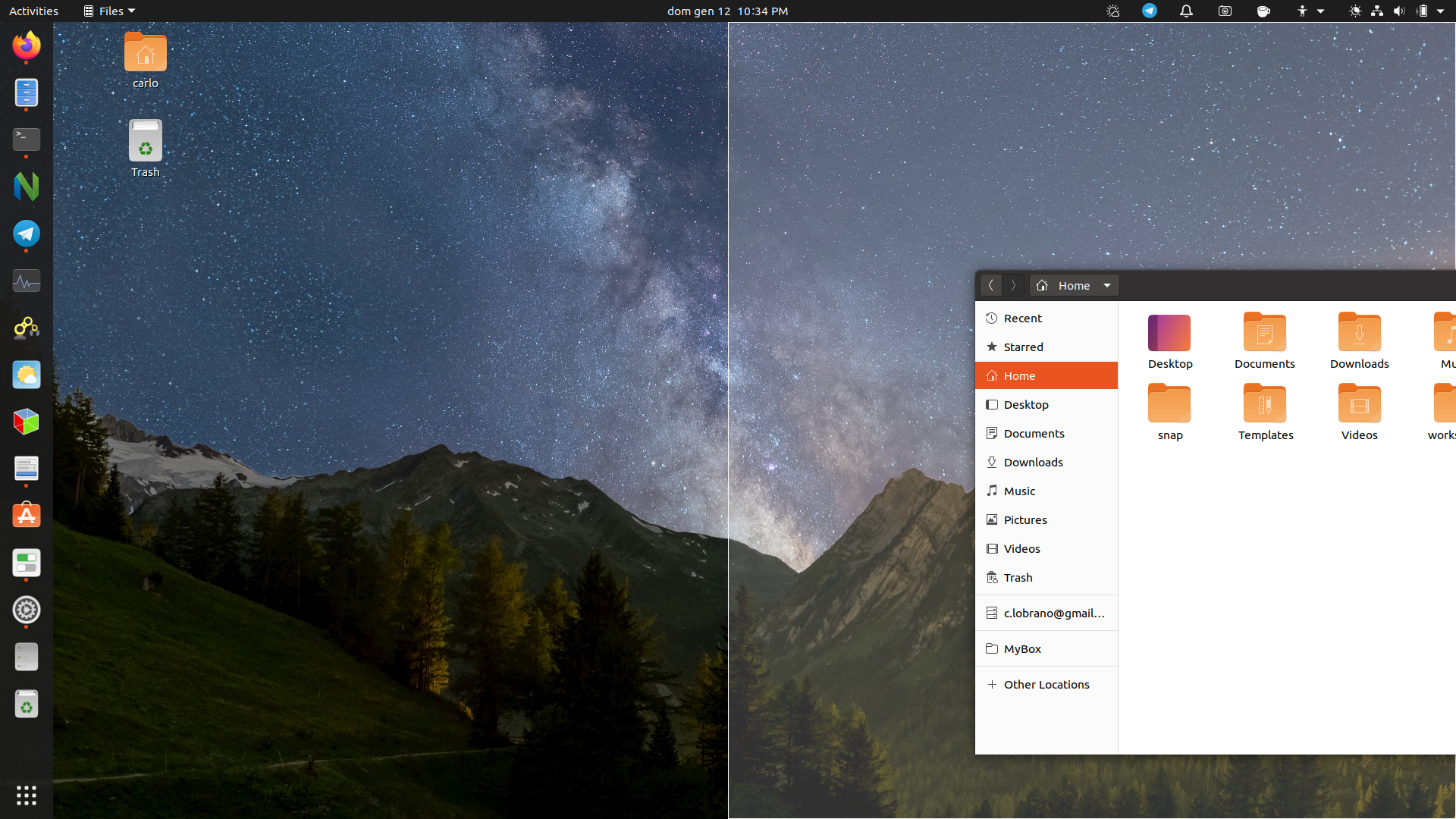
I still don't know how you can be so precise with a mock-up :D
This is on the real thing
clobrano
on 12 Jan 2020
So, @popey, @madsrh, any preference? White is probably more neutral as orange alternative, but I don't have a strong opinion here
clobrano
on 9 Feb 2020
I prefer the white one (if it fits with the theme). Can you make a test PR?
I tried to make a PR for this myself for testing, but I didn't succeed. So I'm keen to see how you did it 😃
madsrh
on 9 Feb 2020
I really like the white/porcelain, that's much better than 🍊 or 🍆.
How does it look with each of the three theme options?
popey
on 9 Feb 2020
Being a gnome-shell thing, it's the same on all three options
On Sun, 9 Feb 2020, 8:52 pm Alan Pope, notifications@github.com wrote:
I really like the white/porcelain, that's much better than 🍊 or 🍆.
How does it look with each of the three theme options?—
You are receiving this because you were assigned.
Reply to this email directly, view it on GitHub
https://github.com/ubuntu/yaru/issues/1727?email_source=notifications&email_token=AAWAAHV3XLY6XOIYZD6FPY3RCBNJVA5CNFSM4KFXKXD2YY3PNVWWK3TUL52HS4DFVREXG43VMVBW63LNMVXHJKTDN5WW2ZLOORPWSZGOELGWHTQ#issuecomment-583885774,
or unsubscribe
https://github.com/notifications/unsubscribe-auth/AAWAAHTCSV6UAYVW2GGK2I3RCBNJVANCNFSM4KFXKXDQ
.
clobrano
on 9 Feb 2020
I meant can you show a mockup of it in all three?
popey
on 9 Feb 2020
Oh sorry, sure I can do that
On Sun, 9 Feb 2020, 9:04 pm Alan Pope, notifications@github.com wrote:
I meant can you show a mockup of it in all three?
—
You are receiving this because you were assigned.
Reply to this email directly, view it on GitHub
https://github.com/ubuntu/yaru/issues/1727?email_source=notifications&email_token=AAWAAHRGU7TGVGVZT7XJACTRCBOT3A5CNFSM4KFXKXD2YY3PNVWWK3TUL52HS4DFVREXG43VMVBW63LNMVXHJKTDN5WW2ZLOORPWSZGOELGWQQA#issuecomment-583886912,
or unsubscribe
https://github.com/notifications/unsubscribe-auth/AAWAAHSEOWZ5HSF4QUO5WZDRCBOT3ANCNFSM4KFXKXDQ
.
clobrano
on 9 Feb 2020
Uhm, I am afraid this white is actually a problem with white backgrounds
clobrano
on 9 Feb 2020
Over at the PR #1883 I am posting some mockups, let's discuss there
clobrano
on 9 Feb 2020
I'll reopen this since this isn't in 20.04 after the shell refresh :/
madsrh
on 26 Feb 2020
Let me check again
clobrano
on 26 Feb 2020
Expected Behavior
This definitely feels like the most natural color option, in my very subjective and totally biased opinion. :-)
 geckolinux
on 22 Jun 2020
geckolinux
on 22 Jun 2020
Related issues
 Feichtmeier
·
3Comments
Feichtmeier
·
3Comments
madsrh
·
3Comments
Feichtmeier
·
3Comments
Feichtmeier
·
3Comments
madsrh
·
3Comments
 matthewpaulthomas
·
3Comments
matthewpaulthomas
·
3Comments
 Muqtxdir
·
3Comments
Muqtxdir
·
3Comments
Most helpful comment
I still don't know how you can be so precise with a mock-up :D
This is on the real thing