I've never really been happy with the printer icon (although it's not as bad as it was) and I've had to revisit it, because whatever I do for legacy/document-print has to be consistent with the device icon.
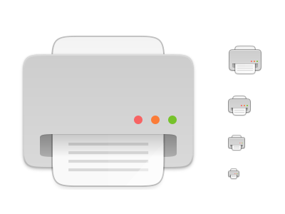
I wondered what everyone thought of this... it's a simpler graphic and (IMO) resembles the other Suru icons a bit more:
 ubuntujaggers
All 14 comments
Looks nice. If I may, would be nice to change those 3 button colours. More like the Mac theme :)
 meetdilip
on 27 Oct 2019
meetdilip
on 27 Oct 2019
I am adding an alternative version. Just for another viewpoint


meetdilip
on 27 Oct 2019
Hm.... @ubuntujaggers I think I would prefer the current printer icon. I think you really hit the spot with it (is this correct english? :D )
 Feichtmeier
on 27 Oct 2019
Feichtmeier
on 27 Oct 2019
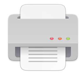
The current printer icon is something like this, right ?

meetdilip
on 28 Oct 2019
Current is this one
https://raw.githubusercontent.com/ubuntu/yaru/master/icons/Suru/256x256/devices/printer.png
it's a simpler graphic and (IMO) resembles the other Suru icons a bit more
I totally agree with this, the current one is probably the most 3D-ish we have now. Both are fantastic though, so if it is a matter of consistency with new work, I am ok with changing it.
 clobrano
on 28 Oct 2019
clobrano
on 28 Oct 2019
The current icon makes sense in terms of perspective it's in front of the printer
The icon @meetdilip posted is a different perspective, the top perspective and makes also sense.
My problem with your new proposal @ubuntujaggers is that I don't get what perspective it is. It's somehow two perspectives in one :D
Feichtmeier
on 28 Oct 2019
Hmm, looking again I hate them both. Let me take another pass when I'm home...
ubuntujaggers
on 28 Oct 2019
Tell you what though: because it's not a quick job to do, I'll finish the legacy action buttons first, and I might end up redoing the document-print button if I can come up with something better for printers in general.
ubuntujaggers
on 28 Oct 2019
Okay, is this moving in the right direction:
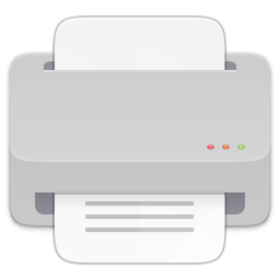
Current one for context:
ubuntujaggers
on 31 Oct 2019
Wow, indeed a good step forward 👍
clobrano
on 31 Oct 2019
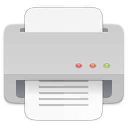
Okay, I'm fairly happy with this:
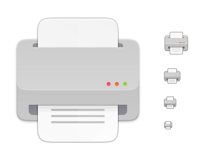
More or less the same design as current but not quite as crap :)
ubuntujaggers
on 2 Nov 2019
Definitely an improvement! I still find the traffic light buttons very distracting and have never seen anything like that on a printer. (They're also totally out of proportion considering the point of view.) If you have to keep them I tend to prefer the smaller ones from above and would remove them in all but the largest size. Maybe try a more simple on/off button as seen in the icons posted by meetdilip?
Adding the corner radius to the highlight line is probably too much detail for the smaller sizes?
 ya-d
on 4 Nov 2019
ya-d
on 4 Nov 2019
@ubuntujaggers
Thanks for the rework!
Do you consider this issue fixed now?
Feichtmeier
on 5 Nov 2019
Yep, we can always add more improvements to any icon at any time - I created the issue because the printer was really bugging me before :)
For instance: @ya-d, when I get chance I'll try your ideas.
ubuntujaggers
on 5 Nov 2019
Related issues
 mivoligo
·
3Comments
mivoligo
·
3Comments
 chrisjbillington
·
3Comments
chrisjbillington
·
3Comments
 eaglersdeveloper
·
3Comments
Feichtmeier
·
3Comments
eaglersdeveloper
·
3Comments
Feichtmeier
·
3Comments
 madsrh
·
3Comments
madsrh
·
3Comments
Most helpful comment
Okay, I'm fairly happy with this:
More or less the same design as current but not quite as crap :)