Hi all,
Before I do a PR, how about something like:

?
 ubuntujaggers
All 12 comments
...or maybe lighter blue to minimise clash with LibreOffice Writer:


?
ubuntujaggers
on 11 Dec 2018
First probably looks better tbh.
ubuntujaggers
on 11 Dec 2018
That's a very good BG!
Is this already the new icon from Thunderbird?
 Feichtmeier
on 11 Dec 2018
Feichtmeier
on 11 Dec 2018
It's the 2018 version on Wikipedia: https://en.wikipedia.org/wiki/Mozilla_Thunderbird#/media/File:Thunderbird_Logo,_2018.svg
I note it's Creative Commons by Attribution - as it's the normal icon, I presume it's attributed somewhere in the installation of the app itself?
ubuntujaggers
on 11 Dec 2018
I would prefer the second lighter BG as the contrast to the logo is higher
And yes you are using the correct icon

Feichtmeier
on 11 Dec 2018
Any more comments on Thunderbird or should I PR today?
ubuntujaggers
on 12 Dec 2018
To me, the last one was very good :+1:
 clobrano
on 12 Dec 2018
clobrano
on 12 Dec 2018
Can you make the background of the same color as the background of the Firefox icon?
 eaglersdeveloper
on 12 Dec 2018
eaglersdeveloper
on 12 Dec 2018
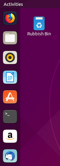
@eaglersdeveloper consider that firefox and thunderbird are placed directly beside each other on a fresh ubuntu install
Feichtmeier
on 12 Dec 2018
And not only because of this. Thunderbird is a product by Mozilla. It recently received a new icon, Proton UI and Quantum engine like Firefox. Need a single style.
eaglersdeveloper
on 12 Dec 2018
xD
I actually meant this as an argument against 2x purple bg :D
Don't fear that mozilla will have a problem with thunderbird having a light blue bg since we place their logo 100% on it. @didrocks already said, that if owners of trademarks have a problem with that, they will reach out to canonical
Feichtmeier
on 12 Dec 2018
Both are excellent. The second one works well with dark environment themes. The first one does too but really fits best with the light themes. The Yaru/Saru icons are a welcome addition. I love the uniformity of them and they look great with every desktop environment I have tried. In fact, your work inspired me to attempt creating some of my own to fill in the gaps.
 techmedixx
on 24 Feb 2019
techmedixx
on 24 Feb 2019
Related issues
eaglersdeveloper
·
3Comments
 pojntfx
·
3Comments
Feichtmeier
·
3Comments
Feichtmeier
·
3Comments
Feichtmeier
·
3Comments
pojntfx
·
3Comments
Feichtmeier
·
3Comments
Feichtmeier
·
3Comments
Feichtmeier
·
3Comments
Most helpful comment
...or maybe lighter blue to minimise clash with LibreOffice Writer:
?