Yaru: Missing styling for Nautilus filter labels
I'm not even sure this is an issue at all, but IMO there's too many lines and perhaps adding a bit of color would be nice 🎨
Adwaita:
Yaru:
Mockup:
 madsrh
All 16 comments
Definitely needs work!
I wonder if the .close style class can be styled without a border globally? Because tabs should have none, app notifications should have none. I wonder if we have a single . close that needs the border? @clobrano
 Feichtmeier
on 23 Nov 2018
Feichtmeier
on 23 Nov 2018
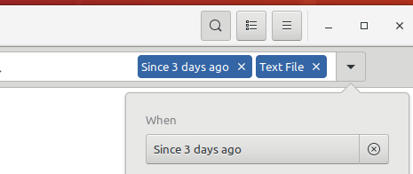
Hmhmhm, just looked on my VM into 3.30 with the "fix_pathbar_branch" installed and looked how the label looks there:

Pretty shitty!
How about to fix this in the pathbar branch, to avoid double work? If this is possible, if not... I fear then this could be the first time we need to have a big branch swap (bionic branch, cosmic/disco branch=master)
Feichtmeier
on 23 Nov 2018
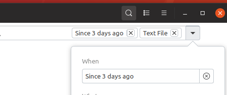
Hm Maybe this way @madsrh - works on the new pathbar at least :man_shrugging:

Feichtmeier
on 23 Nov 2018
Definitely needs work!
I wonder if the .close style class can be styled without a border globally? Because tabs should have none, app notifications should have none. I wonder if we have a single . close that needs the border? @clobrano
Probably only the Terminal tabs, but you're right, better set it only when needed if there is only one place.
Orange doesn't look the best choice for these labels
 clobrano
on 23 Nov 2018
clobrano
on 23 Nov 2018
It looks hardcoded ...
Edit: no it doesnt, sec (imstupidagain)
Feichtmeier
on 23 Nov 2018
WHat about this

?
Feichtmeier
on 23 Nov 2018
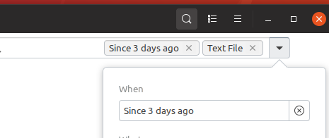
Or what about this?

@madsrh @clobrano
Feichtmeier
on 23 Nov 2018
This looks really good @Feichtmeier
I wonder if the plain white text is a bit too much 🤷♂️ It's a bit hard to tell from this image.

madsrh
on 23 Nov 2018
What do you mean with too much? :D
Feichtmeier
on 23 Nov 2018
Do mind the noise, maybe it's just me. I was thinking the text color maybe should be slightly more gray. IDK


madsrh
on 23 Nov 2018
Like this

? @madsrh
Feichtmeier
on 23 Nov 2018
Or like this

Feichtmeier
on 23 Nov 2018
Do they look deactivated? Perhaps it's a bad idea
madsrh
on 23 Nov 2018
No idea! I am bad with colors! (not that I am color blind or anything... but maybe a bit too fast "ok works") You tell me! :D
Feichtmeier
on 23 Nov 2018
Yeah I think it could be better to use the normal color

Feichtmeier
on 23 Nov 2018
it's only "fixed" for 3.30+
I (doesnt mean there isnt any) did not find a way to theme it for 3.26 :man_shrugging:
@madsrh hope that is okay for you :)
Feichtmeier
on 23 Nov 2018
Related issues
 pojntfx
·
3Comments
Feichtmeier
·
3Comments
Feichtmeier
·
3Comments
Feichtmeier
·
3Comments
pojntfx
·
3Comments
Feichtmeier
·
3Comments
Feichtmeier
·
3Comments
Feichtmeier
·
3Comments
 matthewpaulthomas
·
3Comments
matthewpaulthomas
·
3Comments
Most helpful comment
Or what about this?

@madsrh @clobrano