Yaru: Tweaks icon doesn't respect switch proportions
_I'll add one more to the icon theme issues. Although Tweaks is not among the default apps, Yaru still provides an icon for it._
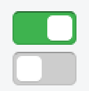
The Suru icon for Tweaks uses switches as a visual metaphor. Those switches are styled like in the Yaru GTK theme but use different proportions which makes them seem distorted. The icon should follow the actual proportions in Yaru.

 ya-d
ya-d
All 7 comments
Honestly, it's the first time I actually recognize that Tweaks has switches similar to Yaru's :smile:
 clobrano
on 25 Sep 2018
clobrano
on 25 Sep 2018
What I am seeing above are icons for 2 different apps ?
 meetdilip
on 26 Sep 2018
meetdilip
on 26 Sep 2018
@meetdilip nope, first one is Tweak icon, while the latter is a screenshoot of UI
clobrano
on 26 Sep 2018
What change do you want to see ?
meetdilip
on 26 Sep 2018
I think being on par with the Suru icon guidlines is much more important here.
It is an icon, it does not need to look 100% like what it is representing.
Currently the spaces between the edges and the pictogram are perfect, when the form factor would be changed the icon wouldn't look even anymore. Don't know how @madsrh @clobrano feel about this, but for me this would make things worse than it is now. :man_shrugging:
Thus, I'm for closing this.
 Feichtmeier
on 9 Nov 2018
Feichtmeier
on 9 Nov 2018
I agree with you, we can close this, unless Mads has a different opinion
clobrano
on 9 Nov 2018
Closing this issue because the icon is just that - an icon, not a screenshot.
 madsrh
on 9 Nov 2018
madsrh
on 9 Nov 2018
Related issues
Feichtmeier
·
3Comments
 Muqtxdir
·
3Comments
Muqtxdir
·
3Comments
 8none1
·
3Comments
madsrh
·
3Comments
Feichtmeier
·
3Comments
8none1
·
3Comments
madsrh
·
3Comments
Feichtmeier
·
3Comments
Most helpful comment
I think being on par with the Suru icon guidlines is much more important here.
It is an icon, it does not need to look 100% like what it is representing.
Currently the spaces between the edges and the pictogram are perfect, when the form factor would be changed the icon wouldn't look even anymore. Don't know how @madsrh @clobrano feel about this, but for me this would make things worse than it is now. :man_shrugging:
Thus, I'm for closing this.