Yaru: Desktop icons inconsistent with the Desktop and with each other
yaru-theme-* 18.10.4, Ubuntu Cosmic
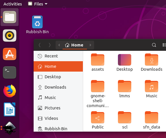
The Ubuntu Desktop is only ever a rectangle on a computer screen. It’s not a physical object (though it uses one as a metaphor), or song that can be played, or a database that can be queried, or anything else with a variety of visual interpretations. It exists, at any moment, as a precise block of pixels, and Ubuntu knows exactly what those pixels are.
Despite this, neither of the icons for the Desktop (2, 3) look anything like the Desktop (1).
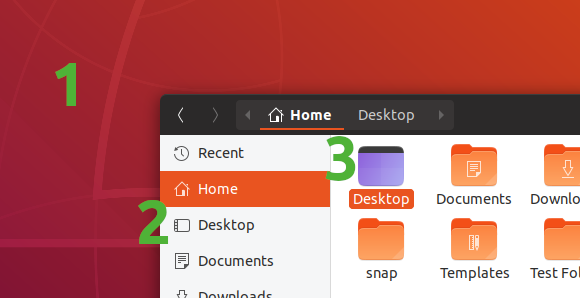
One icon (2) has a transparent background, with a launcher but no top bar. The other icon (3) is blue, with a top bar but no launcher. And both have rounded corners, when the actual desktop doesn’t (and neither do the other sidebar icons).
Ideally, both icons would be a miniature of your current actual desktop, with the sidebar version desaturated, which is something an icon theme can’t do by itself.
What the icon theme _could_ do by itself is to show a miniature of the default desktop background (again with the sidebar version desaturated). Perhaps this could be auto-generated whenever a new default background is committed. And they should agree on whether the desktop has a launcher and a top bar.
[[Originally reported in the Yaru forum](https://discourse.ubuntu.com/t/call-for-participation-an-ubuntu-default-theme-lead-by-the-community/1545/1750).]
 matthewpaulthomas
All 33 comments
Perhaps this could be auto-generated whenever a new default background is committed
This looks like a nice idea, however I see two problems:
there is more than one Ubuntu version supported at the same time (at least the xx.04 and xx.10). So only one of them can have the right default desktop at each time. What about the others? Should we keep different theme release for only one icon?
Suru is still a distro-agnostic icon theme
 clobrano
on 24 Sep 2018
clobrano
on 24 Sep 2018
We can use a simple icon with Ubuntu colours which is more descriptive than what we have now


 meetdilip
on 26 Sep 2018
meetdilip
on 26 Sep 2018
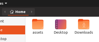
A more refined version

meetdilip
on 26 Sep 2018
I like the concept, but that gradient def. isn't Suru compliant. Maybe just the purple?
 polyjitter
on 27 Sep 2018
polyjitter
on 27 Sep 2018
I thought it will go well with Ubuntu as a whole. I can do a purple theme if you wish

meetdilip
on 27 Sep 2018
there is more than one Ubuntu version supported at the same time (at least the xx.04 and xx.10). So only one of them can have the right default desktop at each time. What about the others? Should we keep different theme release for only one icon?
I’m sure it’s not the only thing that would change from release to release of the deb. As for the snap, 97.6% of its users are on Ubuntu 18.04 (and if anything, that percentage will get even higher as people gradually stop using 17.10 and earlier).
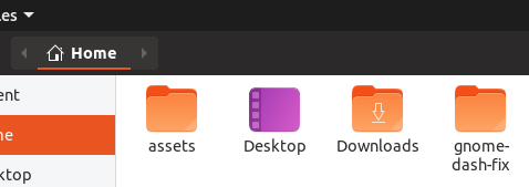
Even if you weren’t able to make the icon match each release, when shrunk to a typical icon size, the default backgrounds for 17.10, 18.04, and 18.10 are very similar to each other — basically @meetdilip’s first version above, but reflected horizontally. Add the launcher and top bar and you’re done.
I like the concept, but that gradient def. isn't Suru compliant.
What does “Suru compliant” mean in this context? (I don’t see anything relevant in CONTRIBUTING.md or in the palette.) And if it’s true that ideally, the icon would be a thumbnail of the user’s current actual desktop, how often would people’s actual desktops be Suru-compliant?
matthewpaulthomas
on 28 Sep 2018
basically @meetdilip’s first version above, but reflected horizontally
I agree, @meetdilip approach is probably the best
What does “Suru compliant” mean in this context?
Interaction with Suru upstream is still to be completely defined (and also it changes from time to time according to it's maintainer time, I believe), however, as you know Suru has guidelines. In this context, we aren't going through Suru upstream path for a time limitation, but we still hope that our new icons will be accepted upstream sooner or later, so to adhere to the guidelines is important.
clobrano
on 28 Sep 2018
@clobrano @matthewpaulthomas
Like this ?

The top bar is there, but hard to spot on a white background.
meetdilip
on 28 Sep 2018
A darker top bar might fix the background compatibility

I feel that we can ignore the top bar for now. Mainly because it makes the icon less refined. Launcher alone is descriptive enough.

meetdilip
on 28 Sep 2018
https://snwh.org/suru/guidelines for suru guidelines. the icon isn't meant to be directly the desktop itself, but merely to represent it.
polyjitter
on 28 Sep 2018
Personally, I too think that Yaru team should not depend on Suru guidelines. Let us choose what fits best for Ubuntu and Yaru.
meetdilip
on 29 Sep 2018
1) I agree that this icon needs work. It's unfinished but thanks for the idea
2) I agree with @matthewpaulthomas and @meetdilip that no user cares what Suru compilant is. What the user needs and what fits his use cases best is often forgotten when you think too much without the user in mind
 Feichtmeier
on 30 Sep 2018
Feichtmeier
on 30 Sep 2018
Personally, I too think that Yaru team should not depend on Suru guidelines. Let us choose what fits best for Ubuntu and Yaru.
Do not forget that we have tons of icons that follow those guidelines, so diverging from them could compromise consistency
clobrano
on 15 Nov 2018
@ubuntujaggers could you see if you could adapt the fullcolor places icon to the symbolic icon? Or if you could find a new icon for both
The THIRD request by @matthewpaulthomas is currently out of scope IMHO, no way to make that live thumbnail possible
Feichtmeier
on 15 Nov 2018
Yep, happy to have a go :) Will report back.
 ubuntujaggers
on 15 Nov 2018
ubuntujaggers
on 15 Nov 2018
Hi guys,
Had a busy couple of days but am working on this now.
ubuntujaggers
on 17 Nov 2018
My first attempt at a full colour version of the symbolic icon is a bit naff:
...but I'll keep trying :)
ubuntujaggers
on 17 Nov 2018
How about something like this one:
I know there was a concern around using a gradient that more closely matches the real desktop... I've used a purple and an orange from the Suru palette, but is the problem more that there aren't any two-tone gradients in the existing Suru icons?
ubuntujaggers
on 18 Nov 2018
I think this goes into the right direction. Could you post this a little bit bigger? @ubuntujaggers
Feichtmeier
on 18 Nov 2018
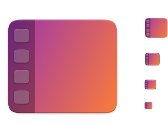
Smaller sizes (icons 3-5) need pixel work!
ubuntujaggers
on 18 Nov 2018
Wow, that's nice!
Feichtmeier
on 18 Nov 2018
Smaller sizes (icons 3-5) need pixel work!
Looks great. Will look better without those icons. The sidebar will be there to represent the dock.
meetdilip
on 19 Nov 2018
Smaller sizes (icons 3-5) need pixel work!
Looks great. Will look better without those icons. The sidebar will be there to represent the dock.
Na, I think we could end up too abstract again. Like the current one is too abstract. Otherwise there would not be so much discussion about it.
Feichtmeier
on 19 Nov 2018
Smaller sizes (icons 3-5) need pixel work!
Looks great. Will look better without those icons. The sidebar will be there to represent the dock.
Na, I think we could end up too abstract again. Like the current one is too abstract. Otherwise there would not be so much discussion about it.
I agree, moreover the symbolic version has the icons as well
clobrano
on 19 Nov 2018
I did these before I saw the comments, but worth actually having them to look at IMO - both without buttons:


ubuntujaggers
on 19 Nov 2018
Here's the buttons version with all sizes optimised for pixels:

@meetdilip I used your mockups as a starting point, cheers :)
ubuntujaggers
on 19 Nov 2018
Well, do whatever you like, it's awesome anyway ;D
clobrano
on 19 Nov 2018
Hmm maybe meettidip is right :thinking:
This looks great
Feichtmeier
on 19 Nov 2018
No preference, personally!
ubuntujaggers
on 19 Nov 2018
Personally, while I like both, once the symbolic is changed I like the one
without the icon skeletons. It looks a lot better at smaller sizes and when
side by side with other icons feels like it has just the right amount of
detail. I'd accept either one, though, and think they're both some
fantastic work!
On Mon, Nov 19, 2018, 4:46 PM ubuntujaggers notifications@github.com
wrote:
No preference, personally!
—
You are receiving this because you commented.
Reply to this email directly, view it on GitHub
https://github.com/ubuntu/yaru/issues/867#issuecomment-440052907, or mute
the thread
https://github.com/notifications/unsubscribe-auth/ARScQCfimjCIa4B2nOpGczLzUgV763wcks5uwyamgaJpZM4W2Y02
.
polyjitter
on 19 Nov 2018
If there's a general preference for the version without buttons, should I commit it using the fork of Yaru I already have @Feichtmeier ?
One small note: I changed the glyph version and exported it as-is - it seems to be a very slightly lighter shade of grey than the other glyphs on the sidebar (music, pictures, videos, etc.). Is Yaru doing something to recolour the glyphs, or should I change the grey in the svg to be the same as the others on my desktop?
ubuntujaggers
on 20 Nov 2018
@ubuntujaggers though the one with the abstracted apps looks very nice when the icon is big, the other option with only the abstracted dock looks better on small sizes. So I would go with the dock only icon. Seems the other participants of this thread prefer it too so I'd say make a PR! :)
I hope that your fork is not too outdated, otherwise you would need to
git remote add upstream https://github.com/ubuntu/yaru
git fetch upstream
git checkout master
git merge upstream/master
But better do this before you commit your new icon or after, not in between otherwise you have to use "git stash", I can do the export after if you want and make a 2. PR after yours.
Feichtmeier
on 20 Nov 2018
PR submitted: https://github.com/ubuntu/yaru/pull/978
@Feichtmeier , I ran your git commands above, the third one said I was up-to-date.
ubuntujaggers
on 21 Nov 2018
Related issues
 snydox
·
3Comments
Feichtmeier
·
3Comments
snydox
·
3Comments
Feichtmeier
·
3Comments
 YamiYukiSenpai
·
3Comments
Feichtmeier
·
3Comments
YamiYukiSenpai
·
3Comments
Feichtmeier
·
3Comments
 chrisjbillington
·
3Comments
chrisjbillington
·
3Comments
Most helpful comment
I did these before I saw the comments, but worth actually having them to look at IMO - both without buttons: