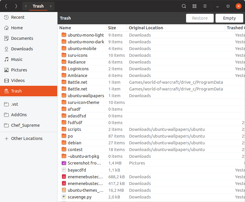
Yaru: Trash / Rubbish Bin infobar purple is odd
yaru-theme-* 18.10.4, Ubuntu Cosmic
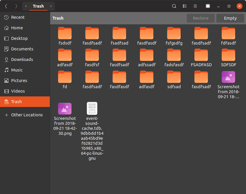
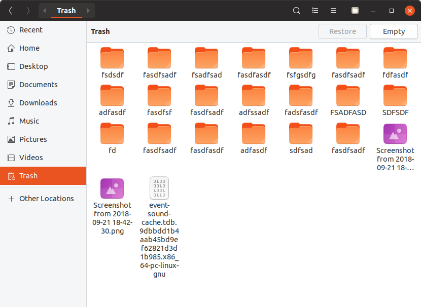
The “Restore” / “Empty” banner for the Trash / Rubbish Bin is purple.

Purple doesn’t seem to be used anywhere else in the app, so it looks out of place here. (And I may be biased because I work for Canonical, but I don’t think it’s so great for the Canonical brand color to be associated with garbage. :wink:)
I think it would be more appropriate to use a neutral color for this, perhaps some shade of grey.
(In the wiki this element is referred to as an “infobar”. I’m not familiar with GTK development, but the purpose of this particular bar is quite different from the description of GtkInfoBar to “Report important messages to the user”. Unlike most infobars, this one is present immediately almost every time you open this location. So even if it’s approprate to color _other_ infobars purple, that doesn’t mean this one should be.)
[[Originally reported in the Yaru forum](https://discourse.ubuntu.com/t/call-for-participation-an-ubuntu-default-theme-lead-by-the-community/1545/1750).]
 matthewpaulthomas
All 26 comments
Purple doesn’t seem to be used anywhere else in the app
It is used in the login screen and lock screen and boot screen
I don’t think it’s so great for the Canonical brand color to be associated with garbage.
It is not only used in trash...
Those are generic GtkInfoBars and they exist in two three colors/variants
yellow for rather something risky like insecure pictures in emails
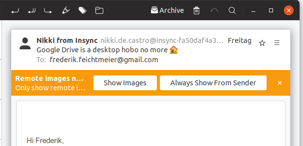
or more generous information like this trash or other info bars in for example pitivi

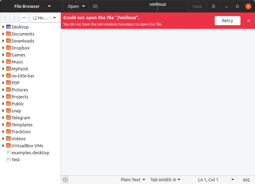
red for seomthing very risky / or no file permission

 Feichtmeier
on 23 Sep 2018
Feichtmeier
on 23 Sep 2018
It is used in the login screen and lock screen and boot screen
and the terminal 😉

 madsrh
on 23 Sep 2018
madsrh
on 23 Sep 2018
.... and...Odd is GOOD!
I'm odd too :smiley_cat: (not the best argument, I know... :) )
 Paz-it
on 23 Sep 2018
Paz-it
on 23 Sep 2018
Purple doesn’t seem to be used anywhere else in the app
It is used in the login screen and lock screen and boot screen
and the terminal
When I wrote “in the app”, I was referring to the app that displays the Trash window, that is, Files.
Those are generic GtkInfoBars
As I said, “even if it’s approprate to color other infobars purple, that doesn’t mean this one should be.” One way of resolving this would be to change the background of all generic infobars. (And those Pitivi screenshots suggest that it might be a good idea!) But it’s not the only way.
matthewpaulthomas
on 23 Sep 2018
Here's the PR where this was discussed.
@matthewpaulthomas Do you have replacement color suggestion we can try?
madsrh
on 24 Sep 2018
@madsrh Pretty much any shade of grey darker than #eee would be fine by me. Probably it should be different for light vs. dark apps, though.
matthewpaulthomas
on 2 Oct 2018
@matthewpaulthomas
The problem is, that there are different infobars
I don't have a picture at the moment but there are also red info bars when you do something really dangerous for example in gedit when you open a file that is opened elsewhere or you have no permission and you are not allowed
So Gtk has three infobars
Purple - okay your trash is full, want to empty it?
Yellow - okay if you do this be sure you are awake and really want this
Red - you are doing something dangerous / no permission
It must be three colours. One is not enough.
With gray for all we would basically overwrite the meaning of the element
Edit: here we go those are red:
Edit2: for the purple infobars here are some ideas from my side (I am really against changing the yellow and the red ones, since they have a meaning)
$inkstone: #3D3D3D;
$slate: #5D5D5D;

headerbar bg color
Feichtmeier
on 2 Oct 2018
Purple - okay your trash is full, want to empty it?
There’s no such thing as “your trash is full” — you can leave in the trash as much as you like as long as you like (given enough disk space). And this isn’t just a technicality, because if the bar looks like something you need to get rid of urgently, it undermines the undoability that the trash exists to provide in the first place.
Edit2: for the purple infobars here are some ideas from my side (I am really against changing the yellow and the red ones, since they have a meaning)
I don’t think anyone suggested changing the yellow and red ones.
$slate: #5D5D5D;
I like that one. Using the headerbarbg color would make the “Trash” “Trash” text duplication look worse, and $inkstone is very similar to headerbarbg.
matthewpaulthomas
on 4 Oct 2018
Fine then let's go with slate for the neural ones iif @madsrh and @clobrano don't have a veto for this?
Feichtmeier
on 4 Oct 2018
Need to see how it looks with the dark theme, though
Feichtmeier
on 4 Oct 2018
LGTM, let's give it a try if you can create a PR @Feichtmeier. I guess we'll need a freeze exception here too?
Is this particular purple variant of the infobar used anywhere else that we need to test?
madsrh
on 4 Oct 2018
Slate is ok to me as well. Probably it's already well understood, however, just for clarity, even if Nautilus can not show all the possible info bars, other application can. There's a gtk3-demo example with all the info bars together you can use as mockup.
 clobrano
on 4 Oct 2018
clobrano
on 4 Oct 2018
Found another usage: in rhythmbox when you insert an audio CD:
I must say, that I really like the purple :|
Feichtmeier
on 6 Oct 2018
This is a 5% lighter slate
Light version with 1 disabled button
Light version without disabled button
Light backdrop:
Dark version with 1 disabled button
Dark version without disabled button

Dark Backdrop
Feichtmeier
on 6 Oct 2018
What about sidebar color?
clobrano
on 6 Oct 2018
$sidebar_bg_color is not used in nautilus, in nautilus the colors of the window and the sidebar is flipped so sidebar_bg_color is just white
Feichtmeier
on 6 Oct 2018
I see, but can we use the same color instead of the variable?
clobrano
on 6 Oct 2018
If this would be the desired color, the whole thing needs re-theming.
In general I would say, that we need to move the discussion away from nautilus, since those infobars are used basically everywhere.
So a new theming needs to look good everywhere and not only in that trash view.
But an alternative would be, that if this purple should not be connected to a trash can, then how about styling the infobar ONLY for the trash in gray and use the current colors for everything else?
We themed nautilus anyways quiet excessively so this bit more won't hurt, or is this too much individual styling? :thinking:
Edit: so with a bit of a tweak

But again we would need to check for all the other apps using those infobars :see_no_evil:
Feichtmeier
on 6 Oct 2018
I agree with you about not using Nautilus as example for all info bars.
However, to me, the new work on Nautilus looks very good and I would keep it
clobrano
on 6 Oct 2018
+1 This tweaked one looks really good @Feichtmeier
https://github.com/ubuntu/yaru/issues/856#issuecomment-427576904
Ofc only if it looks good in other applications too.
madsrh
on 6 Oct 2018
Haha I knew it! xD
God damn 3D lovers ;)
I try if I can find a good solution. But I prbly will end up with the solution before I made them flat, because ... 1) this way we have less upstream diff ( /ok-face ) but 2) with the "normal" buttons again, I can't make red and yellow flat and these here 3D, this makes no sense (to me)
Feichtmeier
on 6 Oct 2018
I don't mind the 3D effect too much, but the bg color fits pretty well in both light and dark variants
clobrano
on 6 Oct 2018
Yeah, not so much the 3d thing, but without a border even the active button blends too much into the background.
Also I like the bottom border of the gray background as a separator to the canvas.
madsrh
on 6 Oct 2018
Is this a bug fix? :thinking:
Feichtmeier
on 6 Oct 2018
I see it as a restyle. Probably the border color should be the same used for tabs?
clobrano
on 6 Oct 2018
Okay, I'll do it at the end of October then. I think it would be a waste to have PR's opened that can't be merged :dancing_men:
As discussed on telegram, PRs are opened to merge AFTER cosmic release, since I am AFK for some weeks now
Feichtmeier
on 6 Oct 2018
Related issues
 8none1
·
3Comments
8none1
·
3Comments
 pojntfx
·
3Comments
matthewpaulthomas
·
3Comments
pojntfx
·
3Comments
matthewpaulthomas
·
3Comments
 chrisjbillington
·
3Comments
chrisjbillington
·
3Comments
 YamiYukiSenpai
·
3Comments
YamiYukiSenpai
·
3Comments
Most helpful comment
and the terminal 😉