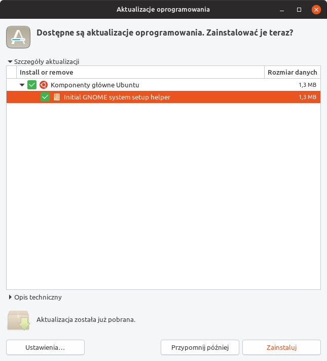
Yaru: Looks like clicking on this button will make something dangerous
Ubuntu 18.04, Yaru from stable snap.
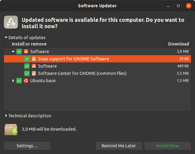
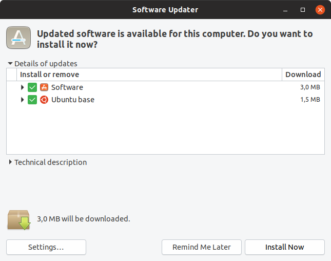
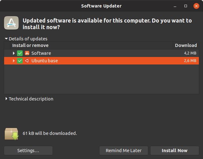
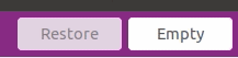
I've opened the update manager app. It showed some apps could be updated. But I see the colour of the text on "Zainstaluj" (Install) button is kinda red. Hmmm... could that mean it is a not recommended operation?
Obviously as an old user of Ubuntu I know it is save and the colour is probably orange but I believe it could be confusing for some people.
Screenshot:
 mivoligo
All 39 comments
It's not the same like suggested action. It's orange because we decided that it looks better than the dark border which we had before for the default button.
It changes btw: tab a little around and you see it
 Feichtmeier
on 3 Sep 2018
Feichtmeier
on 3 Sep 2018
I understand it will change after tabbing around but my wife asked me why this is red, is there a problem this time with updates? She's not a "power user" and she doesn't know about using keyboard to move focus. For her it looked like the colour of the text on the button suggests the action is not recommended.
mivoligo
on 3 Sep 2018
Well, we could also use green but please, for the love of God, let's not go back to the ugly black border
Feichtmeier
on 3 Sep 2018
That orange text just isn't growing on me, like I hoped it would. I'm still trying to get used to it and I know that @Feichtmeier will cancel my christmas gift 🎁 🎄 for saying this, but I'm +1 for reverting to the old design 🙊
It was a joint decision, so I'm not pushing anything here (I'll leave that to @clobrano 😉 ) I just wanted to share my point of view.
but my wife asked me why this is red
I guess it depends on the screen, but here it doesn't look red at all.
For her it looked like the colour of the text on the button suggests the action is not recommended.
I can see why and find the old design much less confusing _(searching for a better word)_
 madsrh
on 3 Sep 2018
madsrh
on 3 Sep 2018
Oh no...
The black border destroys all the beauty of the buttons.
Could we have a look at green text please?
How do other themes make this?
Also we changed it because when the focus ring is also in the game the awkwardness even strengthens, do you remember ? It was a double border with one border dashed. Seriously please no
Feichtmeier
on 3 Sep 2018
We use green for everything positive like installed icon in gnome software (the number badge)
Feichtmeier
on 3 Sep 2018
This is the old issue: https://github.com/ubuntu/yaru/issues/306
Oh no...
SORRY! 😞
The black border destroys all the beauty of the buttons.
The colored text isn't pretty eighter 🤷♂️
How do other themes make this?
Most themes ignore this (Adwaita, Arc,...) except Ambiance/Radiance:
I'm not sure I want to argue against you here. You seem very determined on only changing the text color. Perhaps it's only mivoligo's wife and me 😆
Could we have a look at green text please?
But couldn't the default selection also be for destructive action?
madsrh
on 3 Sep 2018
I am sure this is nothing personal or any subjective crusade from both of us and we only want the best for the theme :dancer:
That's
$_default_color: if($variant=='light',darken($success_color,10%),$success_color);
Feichtmeier
on 3 Sep 2018
I am sure this is nothing personal or any subjective crusade from both of us and we only want the best for the theme 💃
+1 😁
That green is really NOT good. I would rather keep the orange (or revert to the strong border).
madsrh
on 3 Sep 2018
What about white and black then
Feichtmeier
on 3 Sep 2018
What about white and black
Much better. Is the difference too subtle in the dark theme? I can't tell on my phone here.
You only changed the color, not the weight, right?
madsrh
on 3 Sep 2018
It's very subtle in the dark theme yes. No I didn't change the font weight
Feichtmeier
on 3 Sep 2018
I really like the light theme, but I seriously cannot tell that the text is white in the dark theme.
What about this or must the light and dark theme be 100% alike? Maybe this will mess up the hover color 🤔
madsrh
on 3 Sep 2018
Just and idea, but since Adwaita ignores it, why don't we as well?
 clobrano
on 3 Sep 2018
clobrano
on 3 Sep 2018
The reason why they don't style it is because modern gnome apps don't use it. They have the suggested action button for things like that :)
Feichtmeier
on 3 Sep 2018
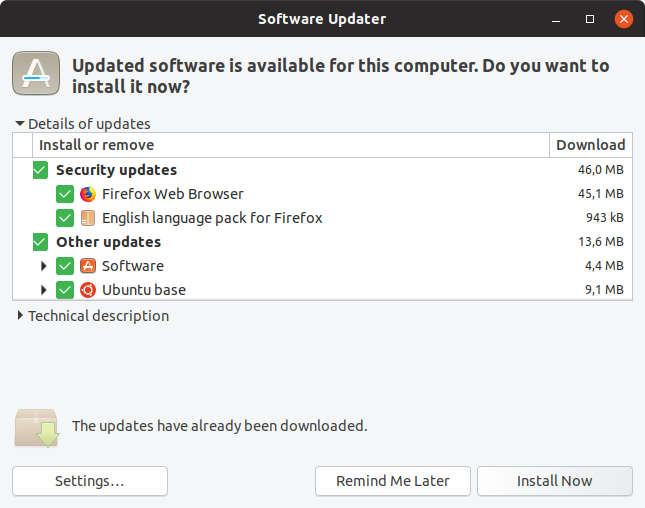
Also just stumbled over the orange font in the Software Updater and are kind of irritated because of it.
Like the OK is maybe not OK?
Black and white will make it for me I guess^^
 Luxamman
on 5 Sep 2018
Luxamman
on 5 Sep 2018
I just realized (again) that this default button jumps around and is defined after the last button you clicked.
I am +1 for unstyling it to be a normal button. It just makes no sense:
Feichtmeier
on 6 Sep 2018
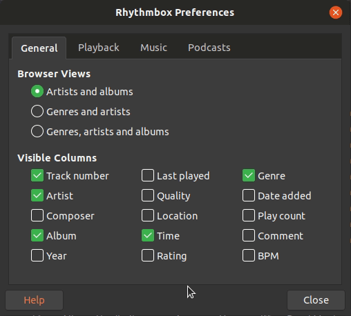
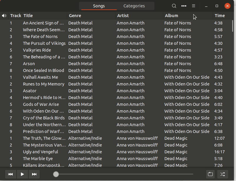
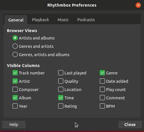
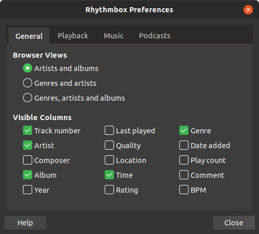
@Feichtmeier but it shows you which button will be activated if you press return. If it is not styled, you have no idea which button will be activated. See my comment about Rhythmbox's preferences dialog https://github.com/ubuntu/yaru/issues/306#issuecomment-378231953
Darkening the font colour seems like the best idea to me. At least there would be _some_ indication, even if it is only slight.
I know this is mainly an issue for 'legacy' apps - but there are a lot of these, and not all Gtk apps are designed to be GNOME apps. If a subtle method can be found, what harm is there in using it? If most GNOME apps do not use a 'default' button, then there is no change to them. But it will help with apps that _do_ use a default button. Simply not styling it is just ignoring the issue - as its still there.
 CDrummond
on 6 Sep 2018
CDrummond
on 6 Sep 2018
but it shows you which button will be activated if you press return. If it is not styled, you have no idea which button will be activated.
This is often not true, actually. Default button is most of the times selected as well, the only missing case is when selection goes to a different widget (not button), but that's a consequence of user action and he/she should be able to figure out what happened
Darkening the font colour seems like the best idea to me.
This won't work in dark variant
clobrano
on 6 Sep 2018
Mostly the default button is just one button beneath others, for example in the software installer of Ubuntu.
So indicating anything ends in confusion as you can see because this topic exists. It's NOT the same as a suggested action because suggested actions don't jump around. ( In my opinion the install button in the software installer should be the suggested action but unless we don't step up and change this in launchpad I guess this won't change. )
So why do we need it? Does the user really need to know which button he recently pressed? In my opinion: no
Feichtmeier
on 6 Sep 2018
Its not what was recently pressed - its which button will be pressed if return is pressed.
You could argue the same with focus rectangles - why show those? (They 'jump' around too) Because they indicate which widget will be activated with the spacebar. How is that different from indicating which widget will be activated with the return/enter key?
I fail to see how there is any confusion. If there exists a button/widget that would be activated by the return/enter key, then it should be indicated in some manner. This topic exists because (some users find) the current indication is sub-optimal (its colour leads to confusion).
Windows (probably not the best example), shows the default button (at least windows 7) with a blue border. Some Gtk2 styles used a small rectangle top/left or bottom/right. Perhaps an underline could be used?
CDrummond
on 6 Sep 2018
Adwaita does not show anything, however
clobrano
on 6 Sep 2018
@clobrano Adwaita also does not show mouse-over events for inactive windows.
CDrummond
on 6 Sep 2018
Which we decided to have because it does not bring any problem
Il gio 6 set 2018, 11:12 CraigD notifications@github.com ha scritto:
@clobrano https://github.com/clobrano Adwaita also does not show
mouse-over events for inactive windows.—
You are receiving this because you were mentioned.
Reply to this email directly, view it on GitHub
https://github.com/ubuntu/yaru/issues/769#issuecomment-419022980, or mute
the thread
https://github.com/notifications/unsubscribe-auth/ACwAHve0Gy-nlx74pK_Mto-0Ykcn9ZGwks5uYObsgaJpZM4WXKsj
.
clobrano
on 6 Sep 2018
Just adding my point of view to the discussion. I can live with both, but I'm kind of with @CDrummond on this one. I know we don't have a solution for the dark theme, but the black font is a good solution IMO. Not sure if it's bad practise to only style the light theme 🤷♂️
...its which button will be pressed if return is pressed.
Exactly!

If we decide to do like Adwaita, it's fine - we just follow upstream, but it's a conscious choice that IMO takes away some of the usability - an extra service.
madsrh
on 6 Sep 2018
Its not what was recently pressed - its which button will be pressed if return is pressed.
Okay, maybe I misunderstood. But it is also active in some apps "by default" and in other dialogues/windows it is only active if I have pressed it before, like in the rhythmbox setting gif I posted, where you can clearly see that it is orange after I pressed it.
It is orange WITHOUT pressing anything and thus the user (the reason this issue is opened) thinks there is anything special (negative or positive) about this button. If it would not be colored, you could just decide which button you want to press. If you use a keyboard, there is still the focus ring and you can tab around like you wish. So why should we confuse the user with this button? No matter how you color it, it seems that there is something suggested in there when there is clearly no suggestion and it is only caused by some previous behaviour.
When you open the ryhthmbox preferences THE FIRST TIME, the default button is colored:
It is just confusing, no matter what the technical behavior or intend behind this is, the result is that it looks like either a positive or negative recommendation to press or to not press the button. No matter if you color it black, white, orange, or have an orange box shadow.
Edit: yes, when you are a heavy keyboard user, this might be useful since it is pressed if you press enter or whatever
But you can't tell me that in rhythmbox you tab to the 10th button (the hamburger menu) then navigate with the keyboard down to preferences and then open the dialogue to close it with enter. SOrry I don't buy this
Feichtmeier
on 6 Sep 2018
What about setting the font-weight to 500 instead of changing the text colour? I did a quick hack on my system, and it seems to work OK (for me). I know on the original report there was some concern about this changing the size of the button, but that does not seem to happen for me (in my very limited testing)
Or, perhaps have a semi-transparent version of the focus ring? This might be confusing though...
_IMVHO_ there should be some indication, but it does not have to be in your face (as per the Ambiance example, which is a bit heavy handed)
CDrummond
on 6 Sep 2018
Let's have some testing with font weight. I am sure I tried something similar, but not sure exactly what
clobrano
on 6 Sep 2018

Feichtmeier
on 6 Sep 2018
Feichtmeier
on 6 Sep 2018
Bolt font is merged in --edge.... IF the build finishs successfully you can all test it from the edge channel
Feichtmeier
on 7 Sep 2018
I don't think this transition looks very sexy, what do you guys think?
If it is even worse when you see it with higher fps ("live").
Feichtmeier
on 7 Sep 2018
Have you tried to add a transition effect to font-size change only? Maybe it would be better if smoother
clobrano
on 7 Sep 2018
Okay guys I tried a transition and it didn't work (maybe I did it wrong).
Now... what about this :see_no_evil: just an idea... (if you can't see it... it's a super soft gradient... like... I USED these "trousers"/button before)
Feichtmeier
on 7 Sep 2018
I prefer the bold text - even without any transition. This seems too subtle.
madsrh
on 7 Sep 2018
Ok then no gradient xD!
HOWEVER... the bold does not work, even the buttons increase in size, this is really a show-stopper:

I'd say let's go with black and white:
https://github.com/ubuntu/yaru/issues/769#issuecomment-418080454
Feichtmeier
on 8 Sep 2018
I'd say let's go with black and white
+1
But I'm a bit confused. Why didn't we see that in the earlier peeks: https://user-images.githubusercontent.com/15329494/45234074-edf70580-b2d4-11e8-9f86-2212dee552cf.gif
madsrh
on 8 Sep 2018
It depends on how much space left is for the label.
clobrano
on 8 Sep 2018
Yes, I fear we might find other places
Feichtmeier
on 8 Sep 2018
Related issues
 sicklylife-jp
·
3Comments
sicklylife-jp
·
3Comments
 eaglersdeveloper
·
3Comments
eaglersdeveloper
·
3Comments
 snydox
·
3Comments
snydox
·
3Comments
 pojntfx
·
3Comments
Feichtmeier
·
3Comments
pojntfx
·
3Comments
Feichtmeier
·
3Comments
Most helpful comment
Bolt font is merged in --edge.... IF the build finishs successfully you can all test it from the edge channel