Yaru: New light-blue selection colour: darker blue when on dark background (proposal)
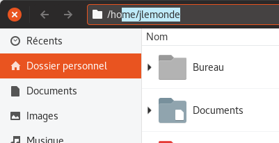
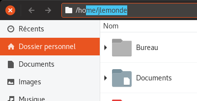
I really enjoy the new light-blue selection colour, although I'd preferred a light orange. But in some places such as in Nautilus' path bar, the blue just doesn't match the other colours:
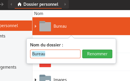
I think that the new light-blue matches pretty well with the orange, but only when it is on a light background, such as in the file-renaming field (white background). Here it is beautiful:
But when it is on a dark background, a light-orange should be a better idea.
Or: put the old orange colour again:
It could also be better if it were like the colour in GNOME's overview:
 jlemonde
All 9 comments
Hi @jlemonde
Well, this was a very "hot" topic on the community hub. And this is somehow the solution most people prefer, thus we have gone for this blue.
Concerning the adaption of the shell entries: we haven't talked about that, so thanks for bringing this up! If we would reduce this issue to the shell entries then this would be the wrong repo, though :D
Edit: wait, after re-reading the issue... that's pretty valid, since we've gone for a bit darker blue in the dark variant of this theme and thus we could use this darker blue for the headerbar entries, too. @madsrh would you be okay with this?
 Feichtmeier
on 25 Jun 2018
Feichtmeier
on 25 Jun 2018
@Feichtmeier Are you asking me, what I think about using blue for white backgrounds and orange on dark backgrounds?
 madsrh
on 25 Jun 2018
madsrh
on 25 Jun 2018
No: the headerbar entries have a dark background but use the light blue for text selection. In the dark theme we use a darker blue for text selection bcause it looks a bit "sharper" on dark backgrounds. For the same reason I would propose to change the text selection for header bar entries to the same dark blue as we use in the dark variant normal entries text selection
Feichtmeier
on 25 Jun 2018
@Feichtmeier Aaahhh, sorry I didn't see the gif.
Sure, let's give it a try 👍
BTW, while you're tweaking the text colors (again), what do you think about a lighter black for selected text? Is the current Jet?
Below is the same color as the background, but maybe it's a bit too subtle. Perhaps something in between??? 🤷♂️
madsrh
on 25 Jun 2018
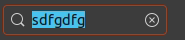
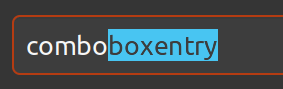
Your comboboxentry looks really good :+1:
I enjoy that stronger blue: it seems less weak than the previous one on dark backgrounds. For the text, a black in between should be amazing: the light one in your gif is too light and the strong one seems too bold, in my point of view...
jlemonde
on 25 Jun 2018
The text is 5% lighter now and the bg color is the same as in the dark theme now. Ok this way?
Feichtmeier
on 25 Jun 2018
Yeah! It looks fine. I can't wait to see the change for real.
jlemonde
on 25 Jun 2018
+1
madsrh
on 25 Jun 2018
@jlemonde might suggest you to change the title of the bug? It would be helpful to see that it actually proposes a change to the dark variant text selection, more that saying that it looks ugly :)
 clobrano
on 26 Jun 2018
clobrano
on 26 Jun 2018
Related issues
Feichtmeier
·
3Comments
 matthewpaulthomas
·
3Comments
matthewpaulthomas
·
3Comments
matthewpaulthomas
·
3Comments
matthewpaulthomas
·
3Comments
 eaglersdeveloper
·
3Comments
eaglersdeveloper
·
3Comments
 8none1
·
3Comments
8none1
·
3Comments
Most helpful comment
@jlemonde might suggest you to change the title of the bug? It would be helpful to see that it actually proposes a change to the dark variant text selection, more that saying that it looks ugly :)