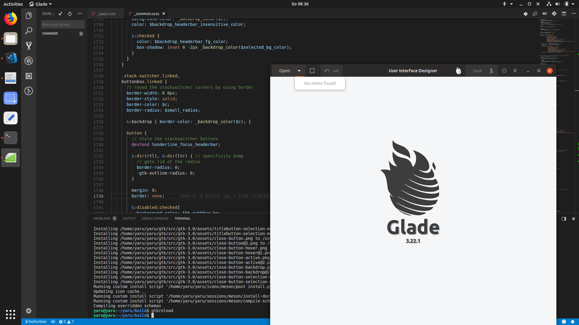
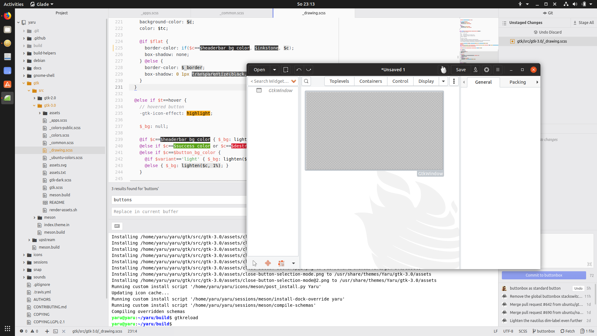
Glade uses a strange box for buttons which seems to be styled wrong - compared to other buttons.
Adwaita styles them exactly like normal buttons:
 Feichtmeier
All 25 comments
I don't have glade installed but It seems this kind of style is the same in logs :

and in Adwaita :

 Paz-it
on 26 May 2018
Paz-it
on 26 May 2018
@Paz-it sorry I don't understand your comment. Logs seems fine in both communitheme and adwaita, which are the similarities with glade?
 clobrano
on 26 May 2018
clobrano
on 26 May 2018
@clobrano sorry for not explaining it better. I meant that the type of the tool bar is the same style so it will be (maybe) easier spot on.
Paz-it
on 26 May 2018
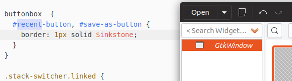
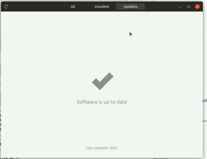
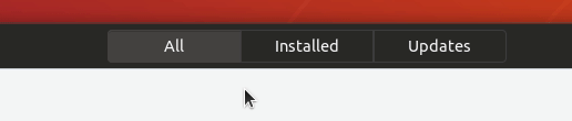
The problem is that we styled buttonbox.linked like the stackswicthers.
We did this because some apps use a buttonbox as a "fake" stackswitcher, for example gnome-software. (tbh I didn't find any other O.o)
So this is rather problematic, because buttonboxes will be probably used more often in apps other than glade.
We should unstyle the buttonbox.linked to look like normal buttons, but then we need a solution for gnome-software again.
They have a styleclass .toolbar-primary-buttons-software
So it's probably possible.
Feichtmeier
on 5 Aug 2018
@madsrh
Concerning glade:
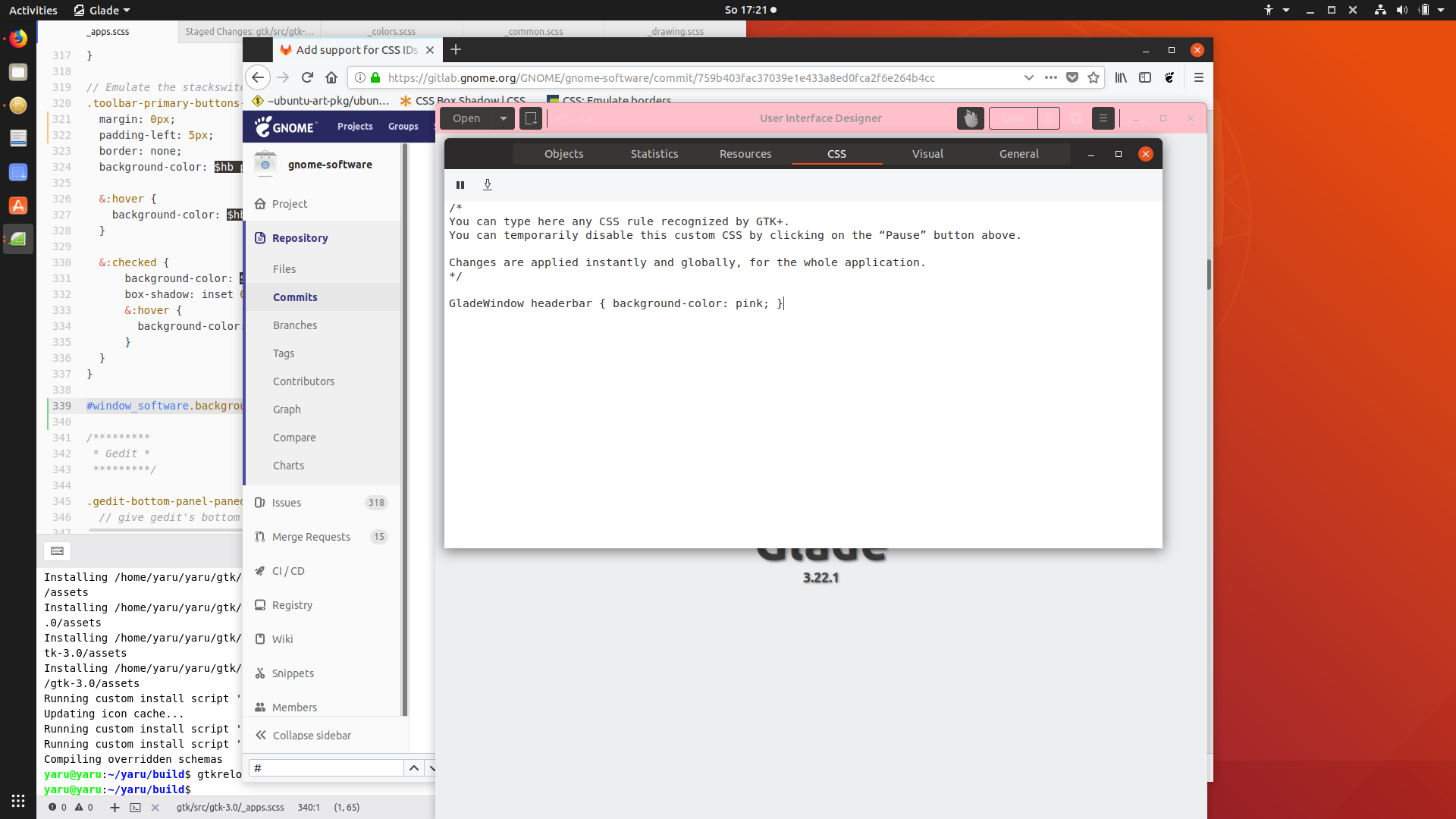
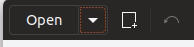
That buttonbox with its open and save buttons... There is an arrow close to it.
Should I remove the border of this specific save/open buttons ( they have an ID yay) or should I add the border to the arrow buttons?
Edit:

Feichtmeier
on 5 Aug 2018
So basically, are we going to have squared buttons in gnome-software headerbar?
clobrano
on 5 Aug 2018
Well I am working on emulating the stackswitcher. (no idea if I succeed) But we styled the buttonbox like a stackswitcher at the moment and that could become really problematic if more apps use that buttonbox :|
Feichtmeier
on 5 Aug 2018
:see_no_evil:
Well :man_shrugging: I can't say this would look bad, but somehow it doesn't look right.
I think one of the reasons for this complex hierarchy instead of a stackswitcher could be that there are also the counter-labels for the update/install counts
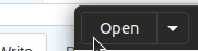
Edit: okay, partly succeeding. Only the marging is left:
Pushed the branch already maybe you have some ideas
Feichtmeier
on 5 Aug 2018
I remember that all the quest about stackswitcher started from those curly underlines :D
clobrano
on 5 Aug 2018
Okay to sum it up:
- we have a very good style for stackswitchers! They are very often used and are in almost every "modern" / newer GNOME app - we should stick to this style for stackswitchers
- we found that gnome-software uses a similiar tooling in its headerbar named "buttonbox" (But it is made with different UI elements) so we styled it GLOBALLY the same way as stackswitchers. This is a problem, since NORMALLY buttonboxes can pop up everywhere since they are just that: a box for buttons
- gnome-software has not many individual style classes nor IDs, thus we are dependent on the global styling of buttonboxes
Options (@madsrh @luxamman please decide):
- Quick-and-dirty-solution: glade has a style class for its window
where we can follow its hierarchy and style the buttonbox individually and fix this issue for glade ONLY. If a buttonbox pops up anywhere else, we have the same problem again
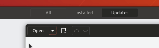
- long term solution: remove the global buttonbox styling and end up with this:
https://user-images.githubusercontent.com/15329494/43684719-84db72f0-98a5-11e8-971a-e907c3ac513d.gif and live with the fact that it is a different UI element for a similiar solution (switching between UI layers/ stacks)
Feichtmeier
on 5 Aug 2018
About long term solution, we slightly improved the style (still buggy, but just to give an idea)
clobrano
on 5 Aug 2018
I think it's a bit problematic now that we would then end up with 3 different button styles (not talking about true stackswitchers or the window controls) in the headerbar then
- regular headerbar buttons (no border, gray hover, black box shadow at the top)
- headerbar text.buttons (super subtle border (inkstone), black box shadow at the top)
- headerbar buttonbox buttons (super subtle border (inkstone), mixed box shadow at top)
The difference between headerbar buttons and textbuttons is also discussed in aarons issue but we could maybe find a solution for everything here. (prbly dreaming :D but who knows?)
My brain hurts... too many options... halp pl0x
Edit: maybe we should "give up" on this extra ordinary buttons alltogether and go with this solution for ALL buttons (exept window controls ofc [stackswitchers are not buttons so those ofc neither])
Adwaita has 1 solution for all buttons, too :man_shrugging:
And @godlyranchdressing would be pleased, too :D
Feichtmeier
on 5 Aug 2018
What about this (no internal separation inside a buttonbox)?
conceptually is similar to stackswitcher, which is a whole object, but styled as a headerbar button
clobrano
on 5 Aug 2018
@clobrano concerning the buttonbox in software I would prefer this indeed. But not for that "comboboxes" :thinking:
On topic of the "great button problem" (the other issue would be prbly more fitting but maybe we can do it all in this one)
It's funny that I am trying to like the subtle inkstone border for all headerbar buttons (well, why not change my mind?):
Feichtmeier
on 5 Aug 2018
I believe that having a border for any icon would make the headerbar quite messy :(
clobrano
on 5 Aug 2018
Yes I am torn, too...
The current one looks very elegant and modern.
Yet, I remember my father didn't realize that those icons in the headerbar are something you can click :/
Edit: sorry for this offtopic, I created a seperate branch to test the border. I keep on topic now with the buttonbox =)
Feichtmeier
on 5 Aug 2018
@clobrano even if we prbly keep the current headerbar buttons, we would still need (imho) a solution for the different press effects. We now have a press effect for the buttons inside buttonboxes in the headerbar and one for "normal" buttons in the headerbar
Feichtmeier
on 6 Aug 2018
We now have a press effect for the buttons inside buttonboxes in the headerbar and one for "normal" buttons in the headerbar
No we don't. The press effect is the same, just the border is always visible
clobrano
on 6 Aug 2018
Hmmmm but there are situations where it is quiet visible, for example this one:

Feichtmeier
on 6 Aug 2018
Because the bright border masks the dark press effect
clobrano
on 6 Aug 2018
Okay - I understood, sorry for the slowness.
Yet it is a visual mismatch, don't you think? The normal button looks "harder" or "deeper" pressed
Feichtmeier
on 6 Aug 2018
Yet it is a visual mismatch, don't you think? The normal button looks "harder" or "deeper" pressed
I agree on that. I'll try to come up with a generic solution
clobrano
on 6 Aug 2018
Nice! I think the idea to leave out the border between elements of the buttonbox is actually quiet good - changed my mind about that after using it a bit
Feichtmeier
on 6 Aug 2018
clobrano
on 6 Aug 2018
Imho this looks good =D don't know what others say
Feichtmeier
on 6 Aug 2018
Related issues
 sicklylife-jp
·
3Comments
Feichtmeier
·
3Comments
sicklylife-jp
·
3Comments
Feichtmeier
·
3Comments
 8none1
·
3Comments
Feichtmeier
·
3Comments
8none1
·
3Comments
Feichtmeier
·
3Comments
 mivoligo
·
3Comments
mivoligo
·
3Comments
Most helpful comment
I agree on that. I'll try to come up with a generic solution