Yaru: Color enhanchment : suggestions in Nautilus
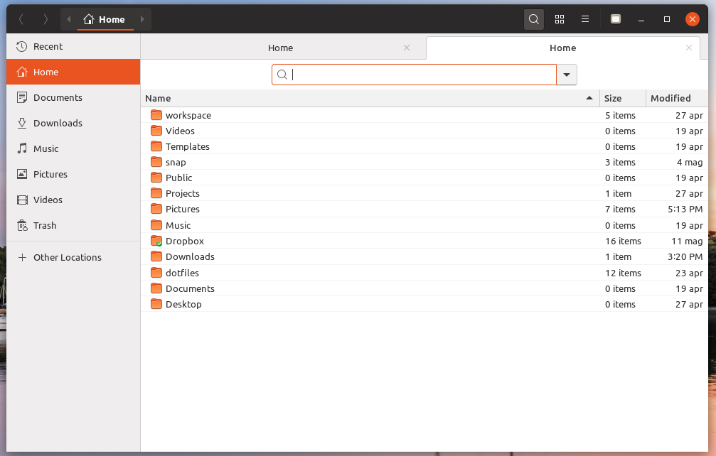
as you can see in my screenie :

Too many colors, right?
So...
What if the search area bg will be #efeded (the same as sidebar)?
What if(2) the underline of the column headerbar will be no more?
What if(3) The canvas/view area will be #f2f2f2 (the same as column header bar)
End if
Then it will look much more harmonious and flowing and less bright to the eyes .
If I remember well, it means to have base.color : #f2f2f2 instead of #ffffff.
What do you think?
 Paz-it
All 4 comments
Hi @Paz-it, thanks for contributing ;)
I can tell you that there are two threads of work on this exact view, so we'll probably change something in the coming weeks.
That said:
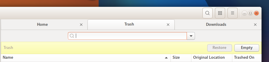
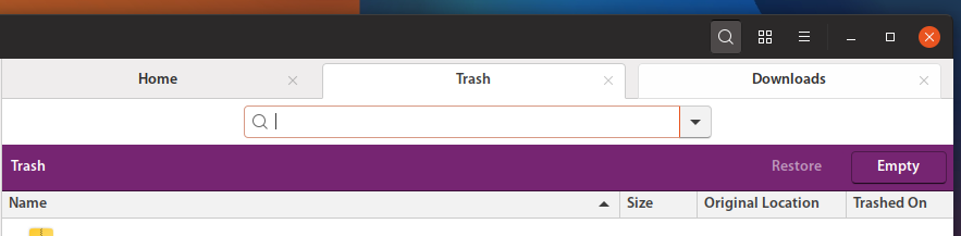
What if the search area bg will be #efeded (the same as sidebar)?
With current colors, it will clash with tab view: unfocused tabs have sidebar color already
However, treeview's color is different than folder view's one (it's brighter) so yes, it's something to work on
 clobrano
on 23 May 2018
clobrano
on 23 May 2018
Hi @clobrano , ;)
I see what you mean, the tabs make it even more complicated.
The all area looks like a big mess :))...
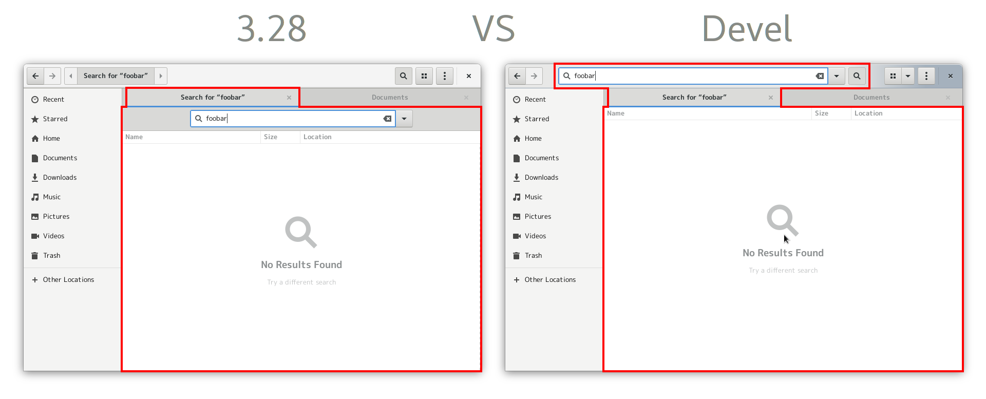
Radiance :
Communitheme current :
Something to work on for sure ..
Paz-it
on 23 May 2018
In newer Nautilus versions search field would probably be in the header bar, so it should looks less messy in the future
Source
 zappedfish
on 27 May 2018
zappedfish
on 27 May 2018
closed by #532 and #389
clobrano
on 11 Jun 2018
Related issues
 matthewpaulthomas
·
3Comments
matthewpaulthomas
·
3Comments
 Feichtmeier
·
3Comments
Feichtmeier
·
3Comments
Feichtmeier
·
3Comments
Feichtmeier
·
3Comments
 YamiYukiSenpai
·
3Comments
matthewpaulthomas
·
3Comments
YamiYukiSenpai
·
3Comments
matthewpaulthomas
·
3Comments
Most helpful comment
In newer Nautilus versions search field would probably be in the header bar, so it should looks less messy in the future

Source