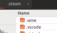
Yaru: Treeview header button has no hover effect, sidebar separator is too light
The treeview header button has no hover and active effect. The sidebar separator is too light and the treeview button blends into the sidebar too much.
 godlyranchdressing
All 5 comments
I disagree about the separator. I think it's clean and elegant.
 Paz-it
on 16 May 2018
Paz-it
on 16 May 2018
It'd be fine if you couldn't interact with the treeview header buttons.
godlyranchdressing
on 17 May 2018
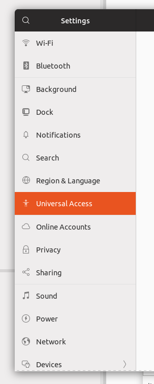
Just a note: sidebar separator on Nautilus now it's the same as in gnome control center (settings), but these separators are defined in different places
 clobrano
on 17 May 2018
clobrano
on 17 May 2018
The separator between elements within the sidebar shouldn't be darker than the separator between the sidebar and a whole other view (which is now how it is in both control center and nautilus). I never noticed the difference between the sidebars in nautilus and control center, but I'd label control center the odd one out instead of Nautilus. What if we try to standardize things like this?
Nautilus
placessidebar separator { background: #e1e1e1; } // separators within the sidebar
separator { background: #ccc } // separators outside
.view { border-bottom: 1px solid #f5f5f5 } // lightening the separator between treeview rows
Control Center
list separator { background: #E1E1E1 } // separators within the sidebar
separator { background: #ccc } // separators outside
I can make a PR.
godlyranchdressing
on 18 May 2018
Previously separator in Nautilus was way too dark to me, so I changed it, but this one looks good
clobrano
on 18 May 2018
Related issues
 madsrh
·
3Comments
madsrh
·
3Comments
 Feichtmeier
·
3Comments
Feichtmeier
·
3Comments
 sicklylife-jp
·
3Comments
sicklylife-jp
·
3Comments
 8none1
·
3Comments
8none1
·
3Comments
 snydox
·
3Comments
snydox
·
3Comments
Most helpful comment
The separator between elements within the sidebar shouldn't be darker than the separator between the sidebar and a whole other view (which is now how it is in both control center and nautilus). I never noticed the difference between the sidebars in nautilus and control center, but I'd label control center the odd one out instead of Nautilus. What if we try to standardize things like this?
Nautilus
Control Center
I can make a PR.