Yaru: Terminal tabs and scrollbar colors with custom color scheme
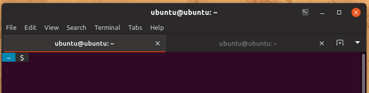
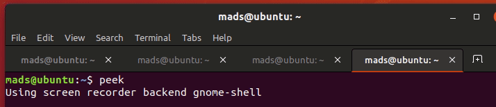
I've set my terminal color scheme to "Tango dark", but the tabs and the scrollbar still stay the default Ubuntu purple, which clashes with this scheme and others.
I noticed that the default Ubuntu 18.04 color scheme actually uses white and gray tabs with an orange scrollbar, which seems to be a good match for most color schemes.
Is there a way that I could customize these colors as an end-user or that they could be changed to something that matches better with the default color schemes available in the terminal?
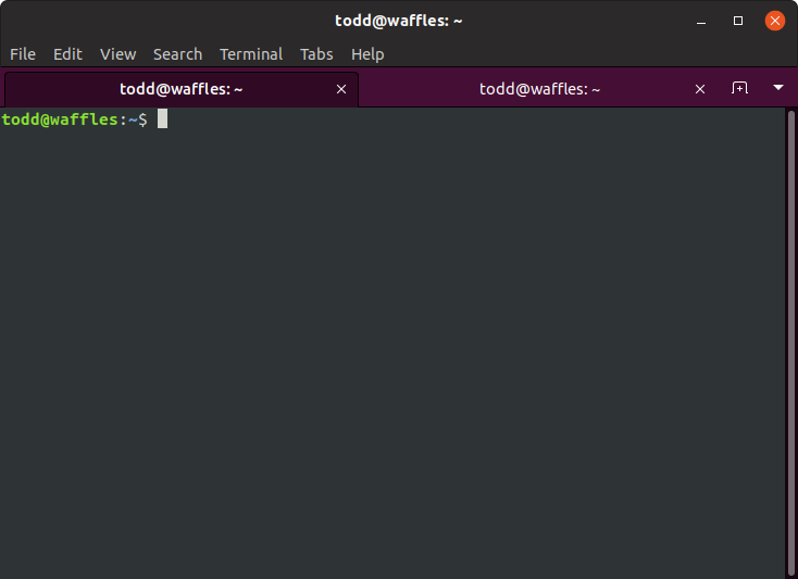
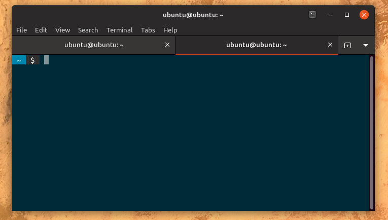
This screenshot illustrates my problem with Communitheme and the "Tango dark" scheme:
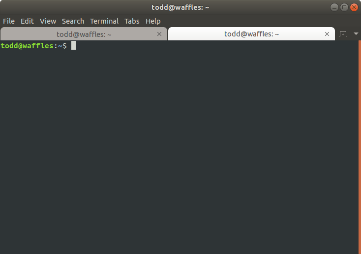
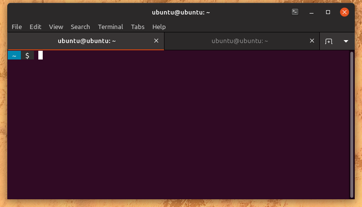
Here is the default theme's terminal:
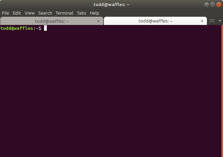
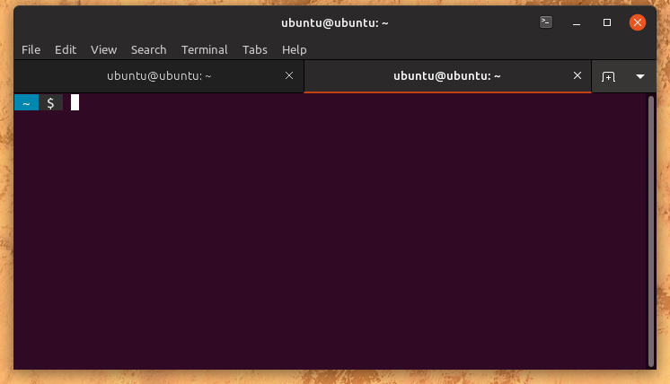
Here is the default theme's terminal with the "Tango dark" color scheme:
 toddjames
All 14 comments
I will look into it, but I am afraid this could not be possible for the theme, it might be up to gnome-terminal to extend the color to the full selected tab at least.
I noticed that the default Ubuntu 18.04 color scheme actually uses white and gray tabs with an orange scrollbar, which seems to be a good match for most color schemes.
I don't agree. To me, white and gray matches with no scheme, except white and grey, so it doesn't seem an improvement
 clobrano
on 8 May 2018
clobrano
on 8 May 2018
I gave a look at what Adwaita does with the terminal. Their solution is to color the tabs like the headerbar + menubar, so that tabs look styled with any terminal color scheme.
This is a possible mockup for communitheme using this way
here with terminal using solarized dark theme
For sure unchecked tab still takes too much attention, but this is just a first mockup.
@madsrh, @Luxamman and all the others what do you think?
clobrano
on 10 May 2018
Again, excellent work @clobrano 👍
By using the headerbar colors, I experience that the bright tab steals my attention - although the dark one is in focus (I persume). I think we can switch the colors (light=active and dark=backdrop) without anyone mentioning “He-who-must-not-be-named” 😉
Also slightly darker text for the unfocused tab:
I wondered if I would experience the same with the headerbar colors and tried a few mockups with a window in focus and one in backdrop, but somehow that works differently 🤔
 madsrh
on 10 May 2018
madsrh
on 10 May 2018
By using the headerbar colors, I experience that the bright tab steals my attention - although the dark one is in focus
I agree with you, the bright one stands out. However in this case I would use a slighly darker headerbar color for the unfocus one, since headerbar is on focus, so using the same color for something which is not would look wrong to me.
I'll prepare some mockups
clobrano
on 10 May 2018
Ahhh okay, that might also work.
madsrh
on 10 May 2018
I simplified the change keeping current tab shape, which should be make easier to see which tab is on, and changed the colors
clobrano
on 11 May 2018
This looks really good @clobrano 👍
madsrh
on 11 May 2018
@clobrano @madsrh The tabs look great, thanks for the quick turnaround!
The scrollbar background is still purple. Any chance to see that blended better, too, or should I open a separate issue now?
toddjames
on 11 May 2018
Oops, I didn't notice, but yes I'd prefer a new ticket. Thank you!
clobrano
on 11 May 2018
@clobrano I sorry to comment after you've closed this issue, but I've been AFK 💻
I think the black lines are a bit heavy 🏋️ What would you think about brightening them a bit and perhaps using a light gray for that active tab?
Here's a quick and dirty mockup:
madsrh
on 11 May 2018
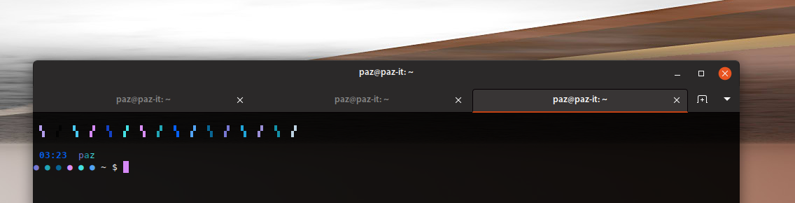
@clobrano two more tiny details (sorry):
I see that the _new tab_ and arrow down buttons have a black border. Shouldn't they look like the image-buttons in the headerbar with no border?
On hover, shouldn't the tab behave like the light ones instead of only showing the border? I think the black border for the close X should be removed too.
Here's the light tab:
Here's a mockup for background hover:
madsrh
on 12 May 2018
@madsrh @clobrano
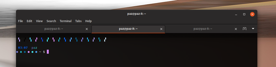
I'll remove the line under the menu-bar as well... See how clean it looks without it:
Look at the line under the menu-bar when it shows :
 Paz-it
on 12 May 2018
Paz-it
on 12 May 2018
@madsrh you're right, buttons should behave the same.
@Paz-it I prefer a lighter separation line
clobrano
on 12 May 2018
I prefer a lighter separation line
I prefer no line at all :))
Paz-it
on 12 May 2018
Related issues
 eaglersdeveloper
·
3Comments
eaglersdeveloper
·
3Comments
 Feichtmeier
·
3Comments
Feichtmeier
·
3Comments
 snydox
·
3Comments
Feichtmeier
·
3Comments
snydox
·
3Comments
Feichtmeier
·
3Comments
 8none1
·
3Comments
8none1
·
3Comments
Most helpful comment
@clobrano I sorry to comment after you've closed this issue, but I've been AFK 💻
I think the black lines are a bit heavy 🏋️ What would you think about brightening them a bit and perhaps using a light gray for that active tab?
Here's a quick and dirty mockup:
