Yaru: Style GtkFileChooserDialog preview area
The preview column in the file chooser dialog looks unstyled. Very small tweaks, I know and yes, the typo is just for fun 😆
- Center text and add padding
- Center image (if possible)
- Add border
Here is Adwaita, Current and mockup:
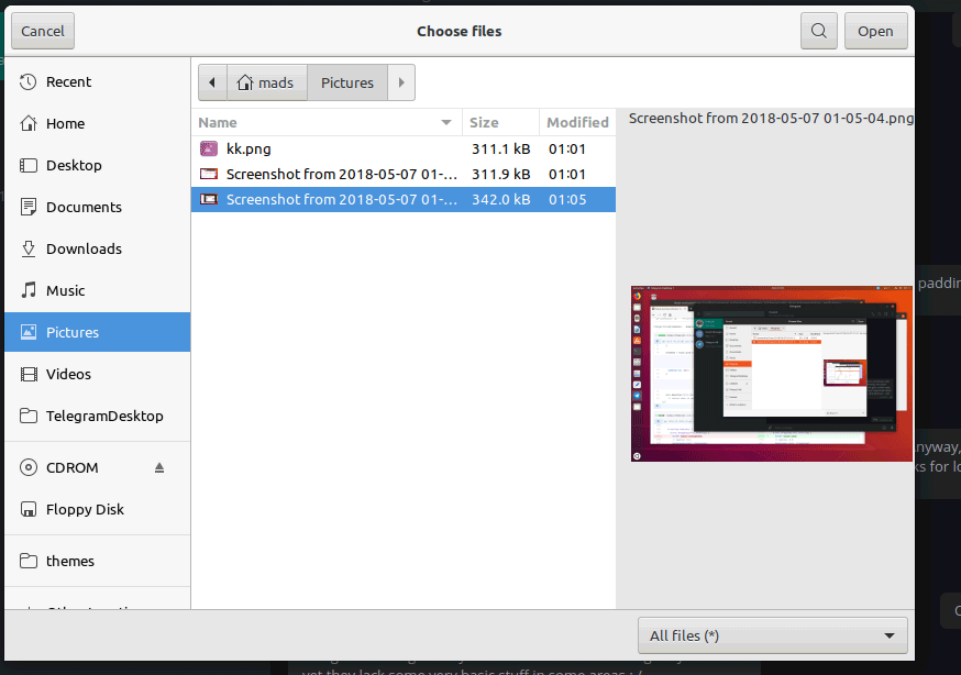
Align text (I can't believe Adwaita doesn't do this):
EDIT: Are the white borders around _Cancel_ and _Open_ missing here? I think _Open_ only has a border because it's the default action if I press Enter ???
 madsrh
All 4 comments
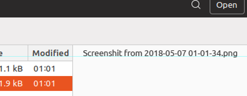
(((sorry for the offtopic but why does your ubuntu name the screenshots screenshit? xD)))
Good idea - yet I hope we find a global solution rather than in _apps
 Feichtmeier
on 7 May 2018
Feichtmeier
on 7 May 2018
sorry for the offtopic but why does your ubuntu name the screenshots screenshit?
It's just a mockups, so only for shits and giggles 😆
yet I hope we find a global solution rather than in _apps
Yes! Are you suggesting a upstream bug? That would be great, although it might not be fixed in time for the next LTS 🙊
madsrh
on 7 May 2018
It's in adwaita, too. Could be worth a try to report it. It isn't so bad after they moved to gitlab away from bugzilla.
Feichtmeier
on 7 May 2018
Oops, I didn't mean to push on master, sorry
 clobrano
on 21 May 2018
clobrano
on 21 May 2018
Related issues
 pojntfx
·
3Comments
pojntfx
·
3Comments
 mivoligo
·
3Comments
mivoligo
·
3Comments
 chrisjbillington
·
3Comments
Feichtmeier
·
3Comments
chrisjbillington
·
3Comments
Feichtmeier
·
3Comments
 matthewpaulthomas
·
3Comments
matthewpaulthomas
·
3Comments
Most helpful comment
It's in adwaita, too. Could be worth a try to report it. It isn't so bad after they moved to gitlab away from bugzilla.