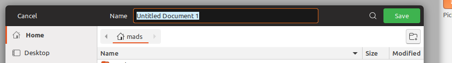
I don't have the answer for this one, but whenever I see the save dialog, I always think it looks a bit off 🤔
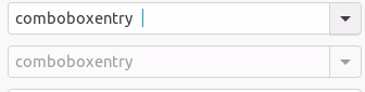
- The textfield where you have to type the filename is almost impossible to spot if it isn't selected. Maybe the background is just inherited from the darkmode. Perhaps this should be white as it is in Ambiance?
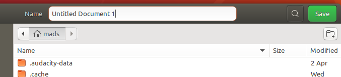
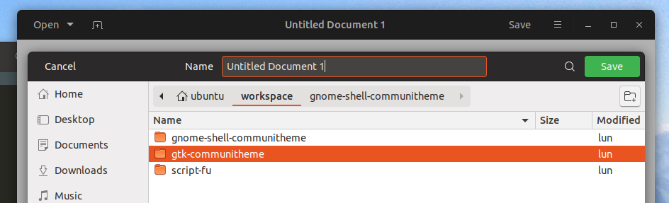
- The "browser-header-stack" panel looks weird being white when there's a table header with a lightgray background below - looks like something went wrong. Here I tried to make it darker. Is it too many shades of gray? Perhaps just use the sidebar color?
 madsrh
All 22 comments
What about headerbar button hover background?
 clobrano
on 25 Apr 2018
clobrano
on 25 Apr 2018
Would be enough to make it look like we had a plan! =D
 Feichtmeier
on 25 Apr 2018
Feichtmeier
on 25 Apr 2018
@clobrano You don't like the white background? IMO the hover background is still too dark
madsrh
on 25 Apr 2018
Unfortunately white background is so strong that selection ring is no more visible. This way the entry looks visible to me, fixing the original problem, without distracting because if it's not selected, my attention is actually elsewhere in the window.
Not to forget that the entry is the first thing selected when window opens, so the user should be able to understand what it is and how to use it. What do you think?
clobrano
on 25 Apr 2018
Unfortunately white background is so strong that selection ring is no more visible. This way the entry looks visible to me, fixing the original problem, without distracting because if it's not selected
I agree @clobrano! Although it's a small improvement, the hover background is an improvement for sure.
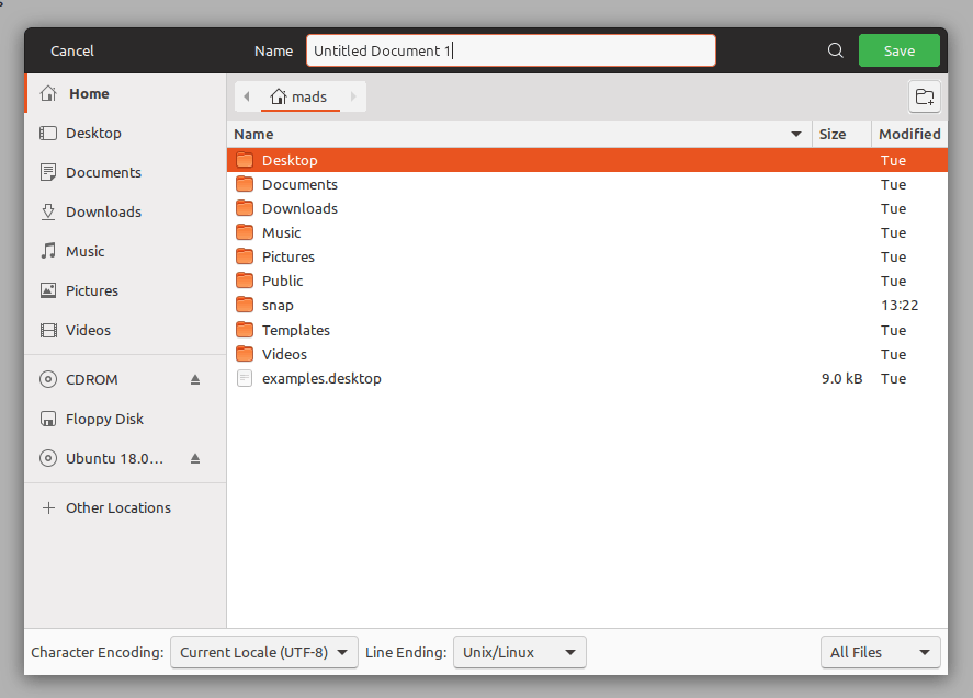
What do you think about the "browser-header-stack" panel?
madsrh
on 25 Apr 2018
What do you think about the "browser-header-stack" panel?
Uhm, darker because the pathbar is already the same color of "name" row below, right?
clobrano
on 25 Apr 2018
@clobrano I can't tell on my phone 😆 but yes +1 for something darker
madsrh
on 25 Apr 2018
Alright, this actually requires some time, since all the path-bar inside a filechooser is to be restyled :smile:
I'll work on it
EDIT: but, I can start pushing the change on the entry (I added a 5% brightness to hover bg color), and open a new ticket for the filechooser's path bar
clobrano
on 25 Apr 2018
Consistency-police here:
Shouldn't the entryfield look like this?
 ghost
on 25 Apr 2018
ghost
on 25 Apr 2018
Worth a try
clobrano
on 25 Apr 2018
Nope - the hover background color is better.
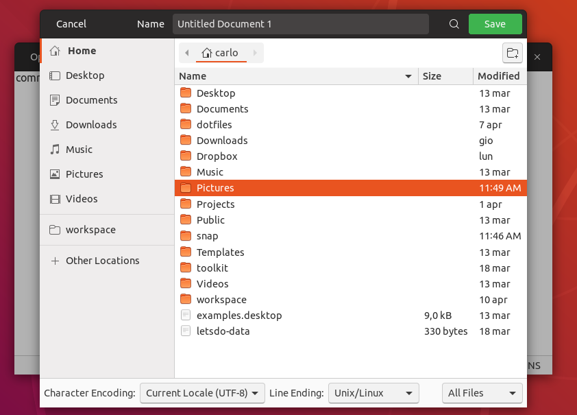
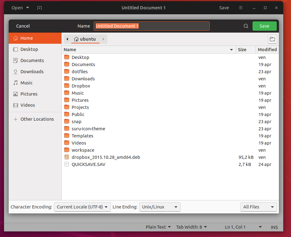
Totally unrelated: did you notice the blurry edge of the Gedit over Nautilus? I was wondering if a border would fix this or what do you think?
...But here's a fix @NusiNusi 🤣
madsrh
on 25 Apr 2018
as long as all entryfields look the same i am happy. buuuuuut the white entryfield somehow "eats" the orange. The orange is this way for me not so strong visible anymore. dark entryfield looks IMHO better.
ghost
on 25 Apr 2018
Okay, it was a bad joke @NusiNusi - sorry. Carlo already killed the white fields 💀
I'm not sure if we can use the same color - it just doesn't look good. I would love to see them unified, but I would rather they look great but differently styled. Also, they are not exactly the same thing: one is a shell dialog and the other is part of the GTK theme.
madsrh
on 25 Apr 2018
@clobrano I've found one additional issue which you could resolve with this:
The color of the text should be black in the dark version (peek uses the dark one)
Feichtmeier
on 26 Apr 2018
The white entry field looks better than I thought it would! The only problem is it overpowering the orange. Though the following is still an option. I mentioned this to fix the strange "orange border with blue text selection" inconsistency. Just rely on caret-color instead of border-color. Maybe this is too muted though.
 godlyranchdressing
on 26 Apr 2018
godlyranchdressing
on 26 Apr 2018
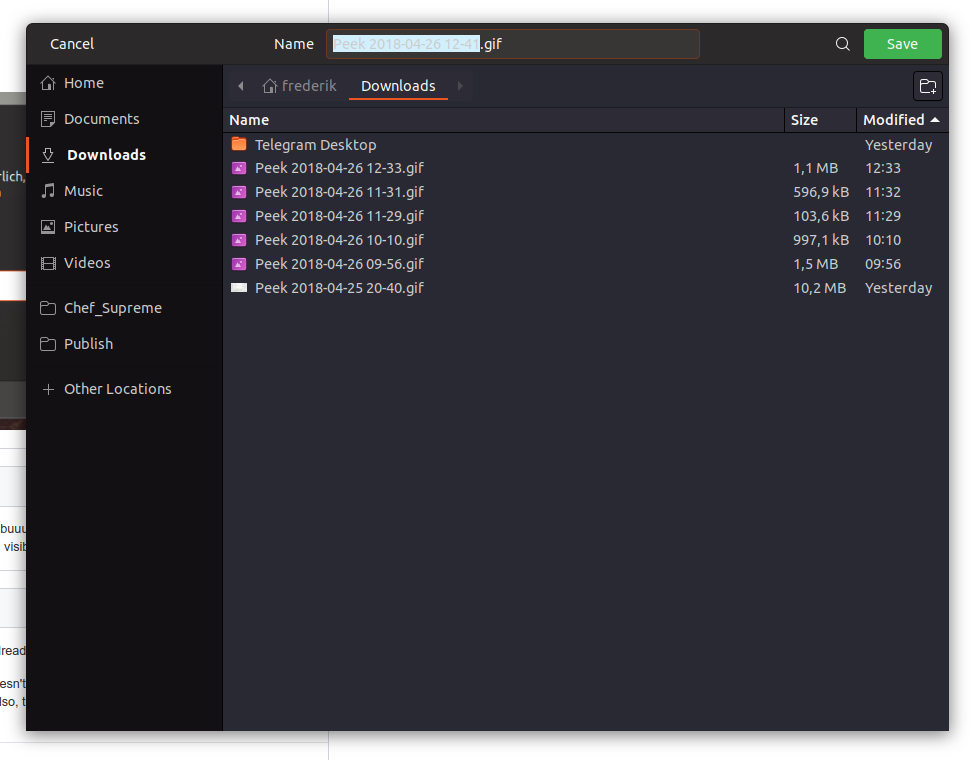
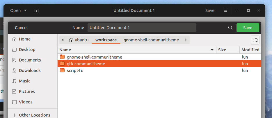
I feel white entry in headerbar is a bit too much. I came up with this now
clobrano
on 26 Apr 2018
@clobrano Isn't the first pic how it already is? I think the entryfield should have an orange border to show that it is selected and needs my attention. But yes, we could test the second version you showed. Bit it might be confusing: _Is this a button or an entryfield? Is "Untitled Document 1" the name of the window or a possible name for a file i can change?_
ghost
on 26 Apr 2018
@NusiNusi :open_mouth:
Both pictures come from the change, but those are just static pictures, the interaction with the filechooser is clear, the only problem was that originally, unselected entry in headerbar was not really visible.
When you open the file chooser, the entry is selected and text is highlighted, so you cannot misunderstand it for a window title.
clobrano
on 26 Apr 2018
...I came up with this now
@clobrano the "browser-header-stack" panel also looks much better.
madsrh
on 27 Apr 2018
Totally unrelated: did you notice the blurry edge of the Gedit over Nautilus? I was wondering if a border would fix this or what do you think?
Gedit is blurred there because the filechooser is opened. I don't feel like is necessary to sharpen it
The white entry field looks better than I thought it would! The only problem is it overpowering the orange. Though the following is still an option. I mentioned this to fix the strange "orange border with blue text selection" inconsistency. Just rely on caret-color instead of border-color. Maybe this is too muted though.
@godlyranchdressing
I am not very happy with the first image opening filechooser (black from the headerbar, orange ring, light blue text selection, a very clash of colors :disappointed: ), so I am trying what you proposed, only I cannot get rid of orange selection. Is it the outline-color property, right?
clobrano
on 27 Apr 2018
Linking the same issue into this: https://github.com/ubuntu/gtk-communitheme/issues/295
Feichtmeier
on 28 Apr 2018
With the recent changes in text selection, this looks a bit better even with selection ring
clobrano
on 2 May 2018
Related issues
Feichtmeier
·
3Comments
Feichtmeier
·
3Comments
 pojntfx
·
3Comments
Feichtmeier
·
3Comments
pojntfx
·
3Comments
Feichtmeier
·
3Comments
 chrisjbillington
·
3Comments
chrisjbillington
·
3Comments
Most helpful comment
@clobrano I've found one additional issue which you could resolve with this:

The color of the text should be black in the dark version (peek uses the dark one)