Remove the semitransparent orange color and use gray (maybe a light gray) and a solid orange border.
 madsrh
All 12 comments
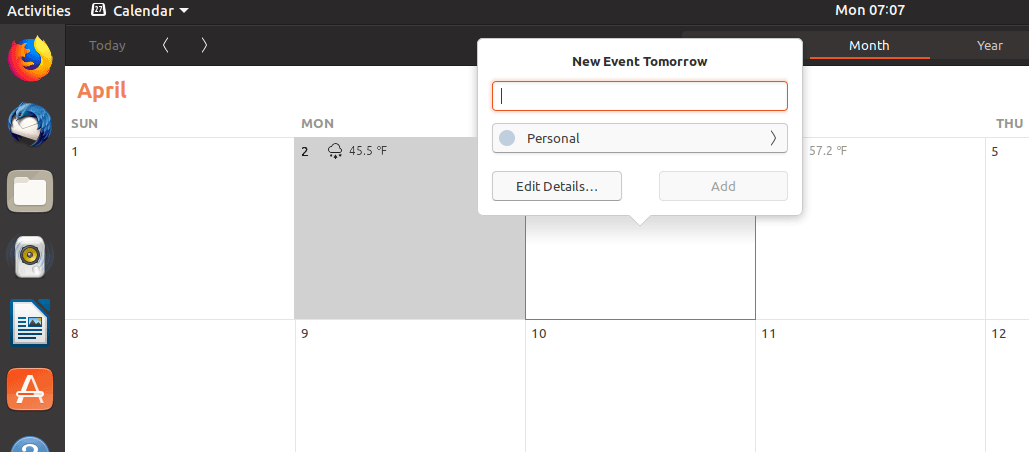
@madsrh What do you think about the calendar in gnome-shell:
The orange background used for the current day makes it difficult to see the number. I am sure this depends on the screen someone is using. But thin white text on bright orange is only recognizable on second sight. I recommend using orange solid frame current day or orange underline (since mostly lines are used for selected stuff).
On the other side the gray used for calendar week is not bright enough. The numbers are only recognizable on second sight too. More contrast needed?
Should i open an issue for this on the gnome-shell-site? Is this an issue? I posted it here since you talk about the calendar.
 ghost
on 2 Apr 2018
ghost
on 2 Apr 2018
@NusiNusi I disagree. It is quiet easy to see on my computer.
 Feichtmeier
on 2 Apr 2018
Feichtmeier
on 2 Apr 2018
On a full-hd-screen with small numbers they are already difficult to see on first sight. With this low contrast it makes it even more difficult. What kind of screen do you have? I use 1920x1080 on a mat dell-display. I am only asking for changing the orange highlight for the current day. I am not asking for completly removing it.
ghost
on 2 Apr 2018
@NusiNusi The Gnome-shell calendar is fine IMO.
madsrh
on 2 Apr 2018
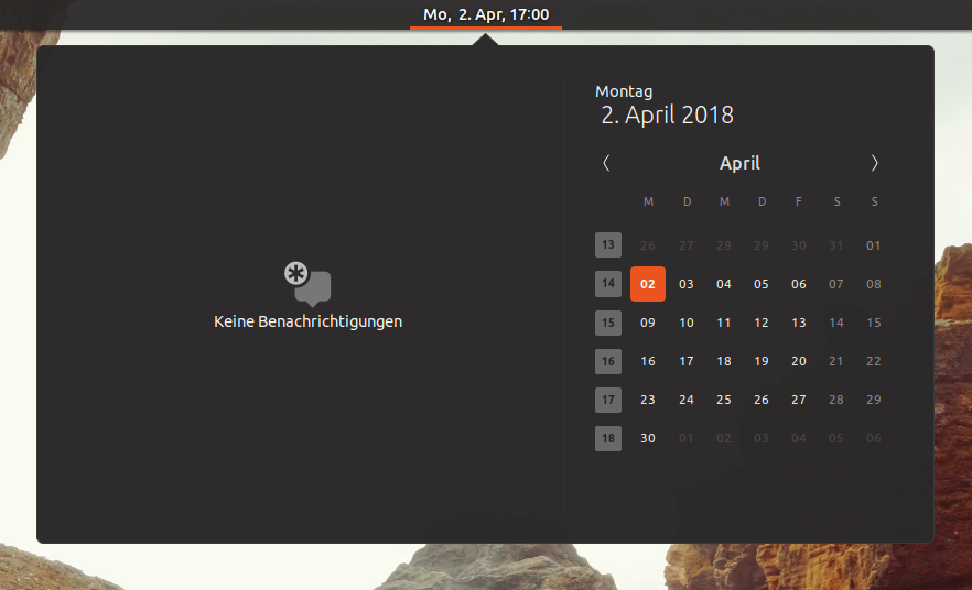
@madsrh okay, you are in the communitheme-team, so you decide. But it is not my opinion. This is how i really experience it on my display:
- The little white number on orange background is difficult to see on first sight (current day)
- The little dark gray number on a little brighter background is difficult to see on first sight (calendar week)
I am not asking for agreement. Only for recognizing some might have problems seeing the numbers easily and i am one of them who took the time to tell this.
ghost
on 2 Apr 2018
@NusiNusi I have a 13'' display 1920x1080 and it's perfectly clear. Could you post a picture of your desktop with calendar opened?
 clobrano
on 2 Apr 2018
clobrano
on 2 Apr 2018
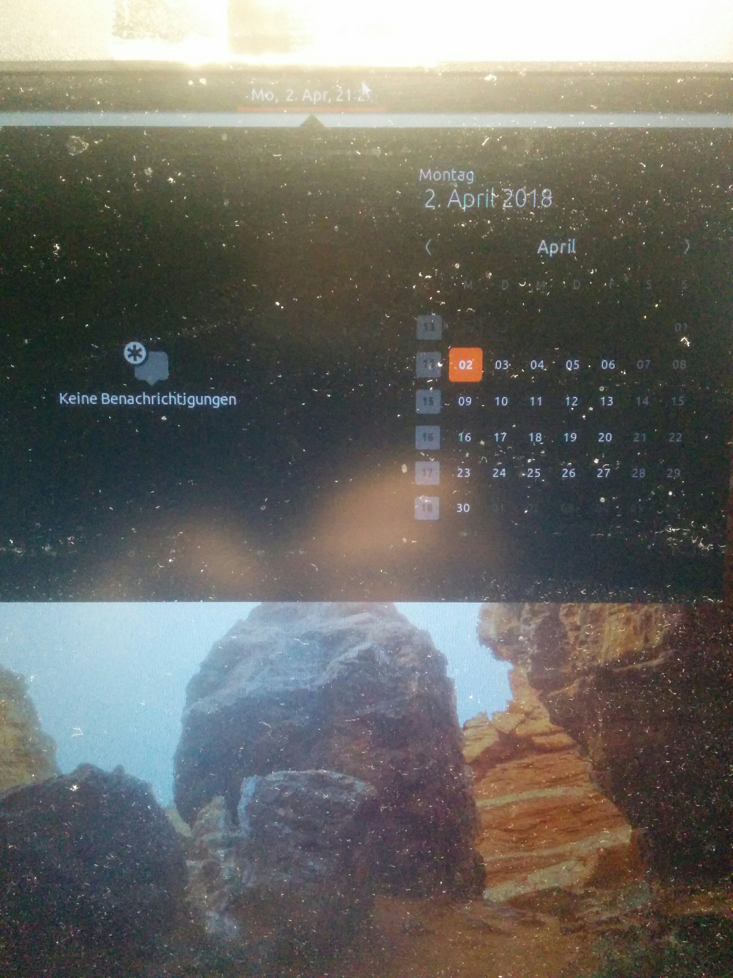
a bit dusty :) On the picture you can see that especially the calendar weeks are very difficult to see.
I think i need to repeat that i do not ask for removing the orange. Only to use a different kind of highlight: An orange border or underline.
The combination of white and bright orange is really not good for readability. And gray with darker gray too. Here is another explanation:
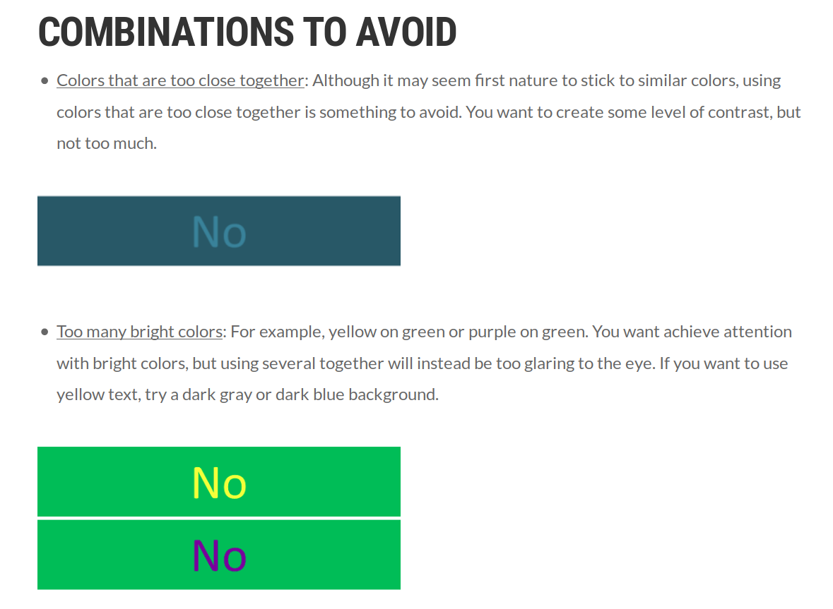
Which I found here: http://www.majesticsignstudio.com/blog/best-color-combinations-for-readability/
Other sources for explaining why the background should not be orange or a brighter gray:
https://designshack.net/articles/ux-design/designing-for-the-web-are-there-colors-you-should-avoid/
https://www.viget.com/articles/color-contrast/
I am only asking for better readability. Using an orange underline etc. is only a suggestion. I have no reason to write about this when it would not be a readability-problem for me.
On the other issue i explained the moving x and it seems i am the only one (noone reacted to this) but here is another explanation for it:
https://designshack.net/articles/ux-design/designing-for-the-web-are-there-colors-you-should-avoid/
When highly saturated colors are paired, they create a “vibrating effect” where colors seem to almost move in a blurring or glowing motion. You don’t want to do this.
This vibration can be unsettling for users as outlined by color theorist Josef Albers in his classic guide “Interaction of Color:” “This initially exciting effect also feels aggressive and often even uncomfortable to our eyes. One finds it rarely used except for a screaming effect in advertising, and as a result it is unpleasant, disliked, and avoided.”
You can almost predict what will make colors vibrate before putting them side by side.
ghost
on 2 Apr 2018
I've did a quick look for the gnome-calendar - I think we are crossing a border now where we theme for specific apps. Gnome-Calendar uses regular GTKclasses and IMHO we should be careful and really rethink if we want to start "if X app then theme Y" theming.
Feichtmeier
on 3 Apr 2018
I absolutely agree @Feichtmeier! We don't want to do that.
I think orange might the "fallback selection color" (if such a thing exists). @clobrano do you agree that there's no way to "fix" this?
I'll close this issue!
madsrh
on 3 Apr 2018
I think there is no need to fix this too. From the picture, numbers are clearly visible
clobrano
on 3 Apr 2018
Have you at least read what i posted about the color-contrast?
ghost
on 3 Apr 2018
@NusiNusi open an issue on the 🐚 repo for this and I will post some variations and we could decide wether we change it or not
Feichtmeier
on 3 Apr 2018
Related issues
 sicklylife-jp
·
3Comments
sicklylife-jp
·
3Comments
 mivoligo
·
3Comments
Feichtmeier
·
3Comments
madsrh
·
3Comments
Feichtmeier
·
3Comments
mivoligo
·
3Comments
Feichtmeier
·
3Comments
madsrh
·
3Comments
Feichtmeier
·
3Comments
Most helpful comment
@NusiNusi I disagree. It is quiet easy to see on my computer.