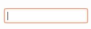
What does everyone think of incorporating shadows into the entry fields as well? The colors are a little off in the gif, but this is what I'm proposing.
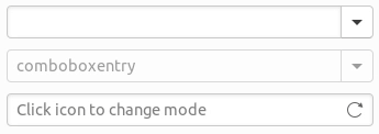
The sunken effect uses inset 0 1px 2px 0 rgba(0, 0, 0, 0.1)
The blured orange on focus uses 0 0 2px 2px transparentize($fc, .8);
 godlyranchdressing
All 19 comments
I like it. How does it look like when hover on the linked button?
 clobrano
on 22 Mar 2018
clobrano
on 22 Mar 2018
godlyranchdressing
on 22 Mar 2018
@godlyranchdressing did you see the Hangout message on the hub or is this just a coincidence?
I like the orange glow too.
 madsrh
on 22 Mar 2018
madsrh
on 22 Mar 2018
@madsrh Nope. Totally a coincidence.
I guess I'll just make a PR and it can be merged once we get more feedback.
godlyranchdressing
on 22 Mar 2018
Could you try making the border-top slightly darker?
madsrh
on 22 Mar 2018
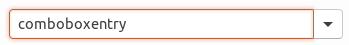
@madsrh this is how it actually looks, should I still darken the top border? 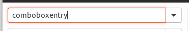
godlyranchdressing
on 22 Mar 2018
@godlyranchdressing If so, I can't see it :confused:
I actually also applied the inner shadow to the button in my mockup, but perhaps it makes sense to seperate them since we're also doing this with the V button hover shadow.
Here both top and bottom border appears as #c9c9c9
madsrh
on 22 Mar 2018
It really looks good and crisps like this :)
 didrocks
on 23 Mar 2018
didrocks
on 23 Mar 2018
@godlyranchdressing I'm really conflicted regarding the orange glow :speak_no_evil: While it looks good here, I felt a bit different when I tried it with the latest update today. IMO it feels like it doesn't fit with the rest of the theme. I'm associating this with something "old school".
@luxamman ?
madsrh
on 23 Mar 2018
The glows and shadows now make the theme look like an old version of Twitter Bootstrap :/
 fitojb
on 25 Mar 2018
fitojb
on 25 Mar 2018
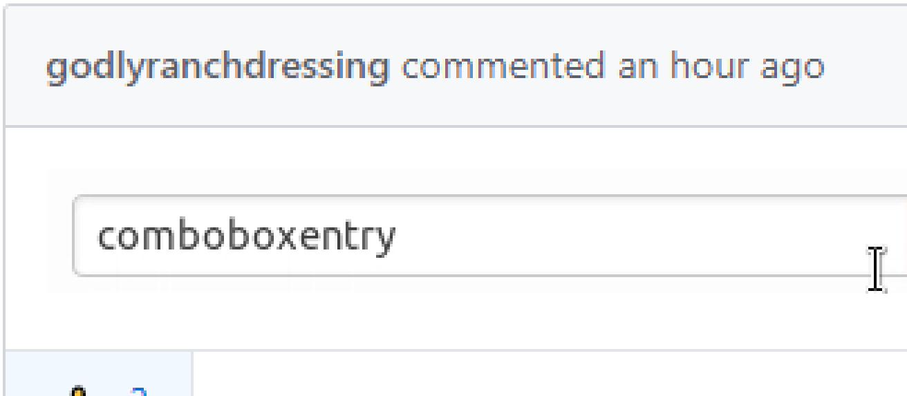
I really like the look of these entry fields and the look of buttons before 7579503
IMVHO, that change should be reverted (the dark bottom is weird) and the current entry look kept. The internal shadow of entries is consistent with the external shadow of buttons - and helps to differentiate between the two.
 CDrummond
on 25 Mar 2018
CDrummond
on 25 Mar 2018
I didn't notice this at first, but I'll have to agree with @CDrummond's post here, that the before contrast was better.
I love the shadow inside the fields, but I'll have to say -1 for the orange "glow" - it really looks out of place to me.
madsrh
on 25 Mar 2018
I love the glow, as its sort of an inverse to the shadow. When not active, the entry field has a sunken look. When active the glow kicks in and raises the field.
CDrummond
on 25 Mar 2018
Isn't this allready live? :D
Is there any reason to not close it as solved? :) Sorry if I am wrong here.
@godlyranchdressing
 Feichtmeier
on 1 Apr 2018
Feichtmeier
on 1 Apr 2018
What about drawing the lighter shade inside? This is from KvCommunitheme
CDrummond
on 2 Apr 2018
When did suddenly the communitheme become all the rage about glows which aren't part of neither Adwaita nor Suru visual languages?
fitojb
on 3 Apr 2018
no orange glow. only inner shadow (gray) and orange border. the theme uses only thin sharp orange lines.
 ghost
on 15 Apr 2018
ghost
on 15 Apr 2018
I am a fan of this glow on a flat UI :+1:
Feichtmeier
on 15 Apr 2018
I pretty sure this was fixed/reverted/ =)
Feichtmeier
on 20 Apr 2018
Related issues
Feichtmeier
·
3Comments
Feichtmeier
·
3Comments
madsrh
·
3Comments
 eaglersdeveloper
·
3Comments
Feichtmeier
·
3Comments
eaglersdeveloper
·
3Comments
Feichtmeier
·
3Comments
Most helpful comment