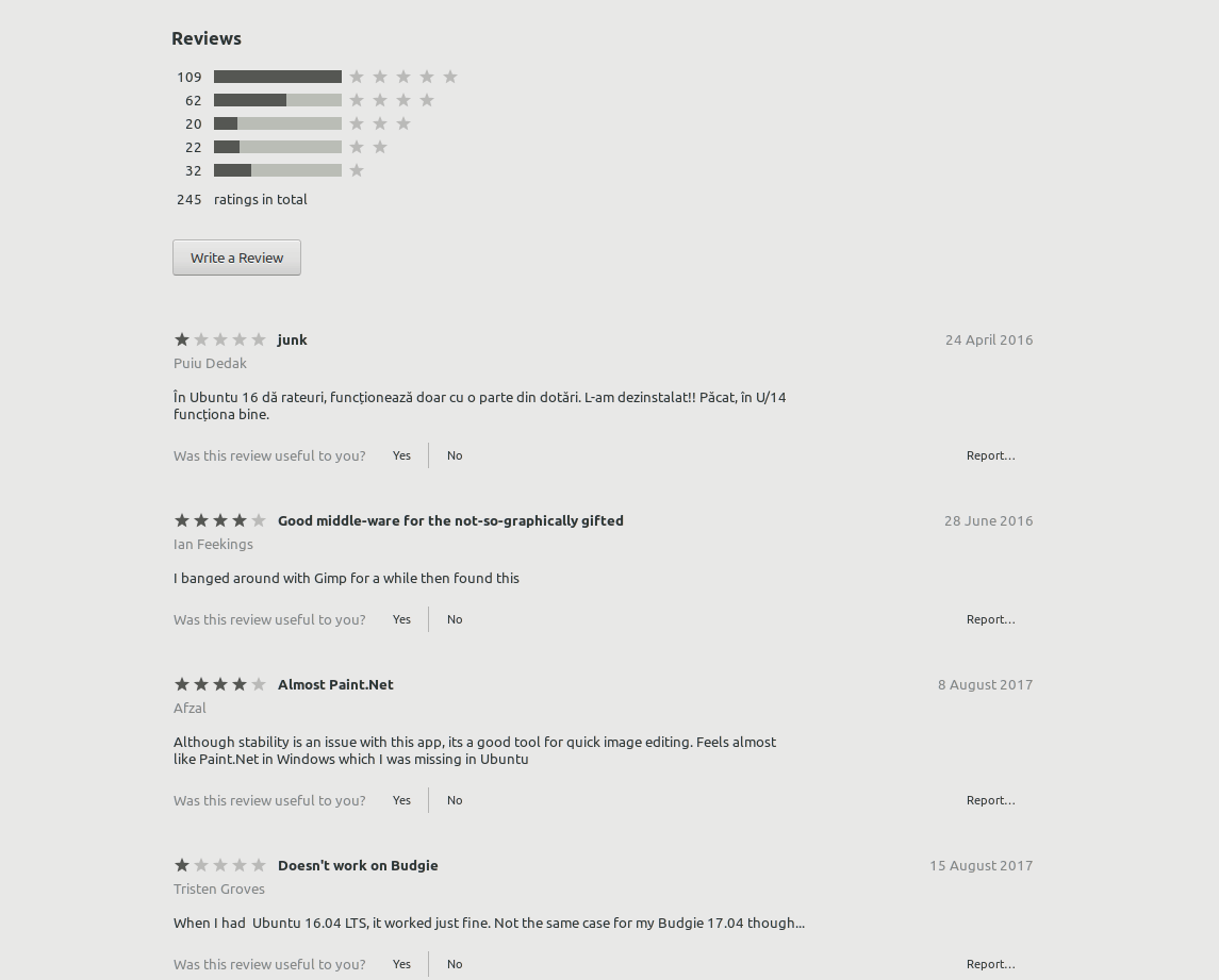
Looking at the reviews in Software Center is very messy - even in Adwaita.
I would like to see each review separated (_into a white box?_) to achieve a more organized look. In the mockup below I've also add some color, but perhaps I got a little too carried away :laughing:
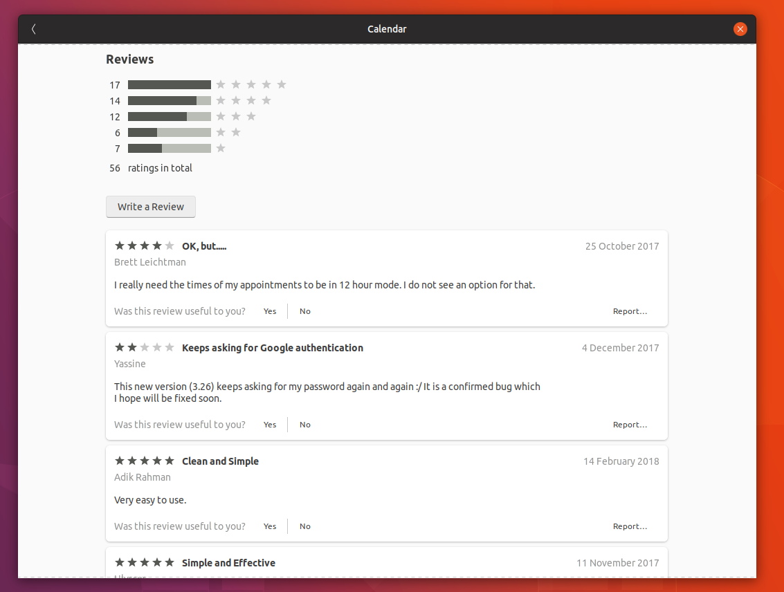
Comparing: Adwaita vs. Community theme mockup
(_click for fullsize_)
 madsrh
All 6 comments
Maybe with more rounded corners?
 ghost
on 5 Mar 2018
ghost
on 5 Mar 2018
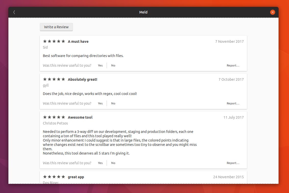
How about this? I adapted the Unity8 card style to each review.
Oh, it seems we can't change the "star icon" and "review bar" colors because those styles are hard-coded in the app. 😥
 nana-4
on 5 Mar 2018
nana-4
on 5 Mar 2018
@nana-4 Already a much improved look. Can you push a PR for this?
I really think the difference between Adwaita and the colored mockup is night and day, so it's truly bad news that they are hard-coded :disappointed:
We should file a bug upstream ( or is it this one? ). It looks like they got a ton of more important bugs that needs attention, but we can always hope a fix will land in time for 18.10.
I know that the white boxes are a different style then everything else in the UI, but I was trying to mimic paper more than an actual window element. I don't know why, but when thinking of a list of reviews, this was the first thing I thought of. So I deliberately left out the rounded corners @NusiNusi :wink:
madsrh
on 5 Mar 2018
Can you push a PR for this?
Sure :smile:
( or is it this one? )
I don't think it's actually related. I guess this issue is rather close to this:
https://gitlab.gnome.org/GNOME/gnome-software/issues/80
So I deliberately left out the rounded corners
So do you think that I should left out the rounded corners in the PR?
(Indeed) I might prefer the squared corners rather than the rounded corners for review boxes. 😜
nana-4
on 6 Mar 2018
(Indeed) I might prefer the squared corners rather than the rounded corners for review boxes. 😜
+1 for squared corners. Perhaps remove the gray border (if there is one) and add a bit more shadow - just a thought.
I don't think it's actually related. I guess this issue is rather close to this:
https://gitlab.gnome.org/GNOME/gnome-software/issues/80
Okay, we can just add our +1 in this issue.
madsrh
on 6 Mar 2018
@madsrh There's no border, there's only a shadow (in the screenshot). :smiley:
Hmm, I tested but even with just a bit more shadow, the boxes look unfocused and distract attention IMHO. I'd say let's go with the current one (at least so far).
nana-4
on 6 Mar 2018
Related issues
 eaglersdeveloper
·
3Comments
eaglersdeveloper
·
3Comments
 YamiYukiSenpai
·
3Comments
YamiYukiSenpai
·
3Comments
 pojntfx
·
3Comments
pojntfx
·
3Comments
 CDrummond
·
3Comments
CDrummond
·
3Comments
 Feichtmeier
·
3Comments
Feichtmeier
·
3Comments
Most helpful comment
@madsrh There's no border, there's only a shadow (in the screenshot). :smiley:
Hmm, I tested but even with just a bit more shadow, the boxes look unfocused and distract attention IMHO. I'd say let's go with the current one (at least so far).