Yaru: Separation between active and passive (backdrop) windows is very harsh
As posted by @Luxamman (https://github.com/Ubuntu/gtk-communitheme/issues/194#issuecomment-368857266):
The passive windows are tricky, I had to rethink them a little because the separation between active and passive windows is very harsh.
This is especially irritation when working with two windows side by side (something very common I think) - because passive windows look almost like deactivated or like they hung up.
Like in other systems, it is good to give a hint which window is passive (like windows control orange getting grey and headerbar little lighter, and content colors getting brighter or grey), but maybe we should not separate the whole content and buttons too hard.
When windows are stacked, they have separation lines and a shadow to be visually separated - so I'm with you to reduce the overall passive look - including buttons and content.
 ya-d
ya-d
All 39 comments
(Quickly wrote down, so probably incomplete…)
Main issue for me:
- active entry fields and inactive buttons/fields swap colors: from white to grey/transparent or vice versa
Minor issues:
- Terminal changing background colors is rather intrusive
- sliders are not recognizable as active or inactive (proposal coming)
- …?
Proposal:
- white stays white (like new check/radiobuttons)
- inactive doesn't need to change at all
- active elements should be recognizable by higher contrast
- "pushed" buttons should be recognizable (darker)
- does the background really need to change? (same goes for Terminal background)
- maybe all colors should become the same grey value (see new check/radiobuttons) [currently their different even for the same color – maybe resulting from making them more transparent which makes the final color dependent of the background]
- reconsider/check all colored buttons/elements in their various states

ya-d
on 27 Feb 2018
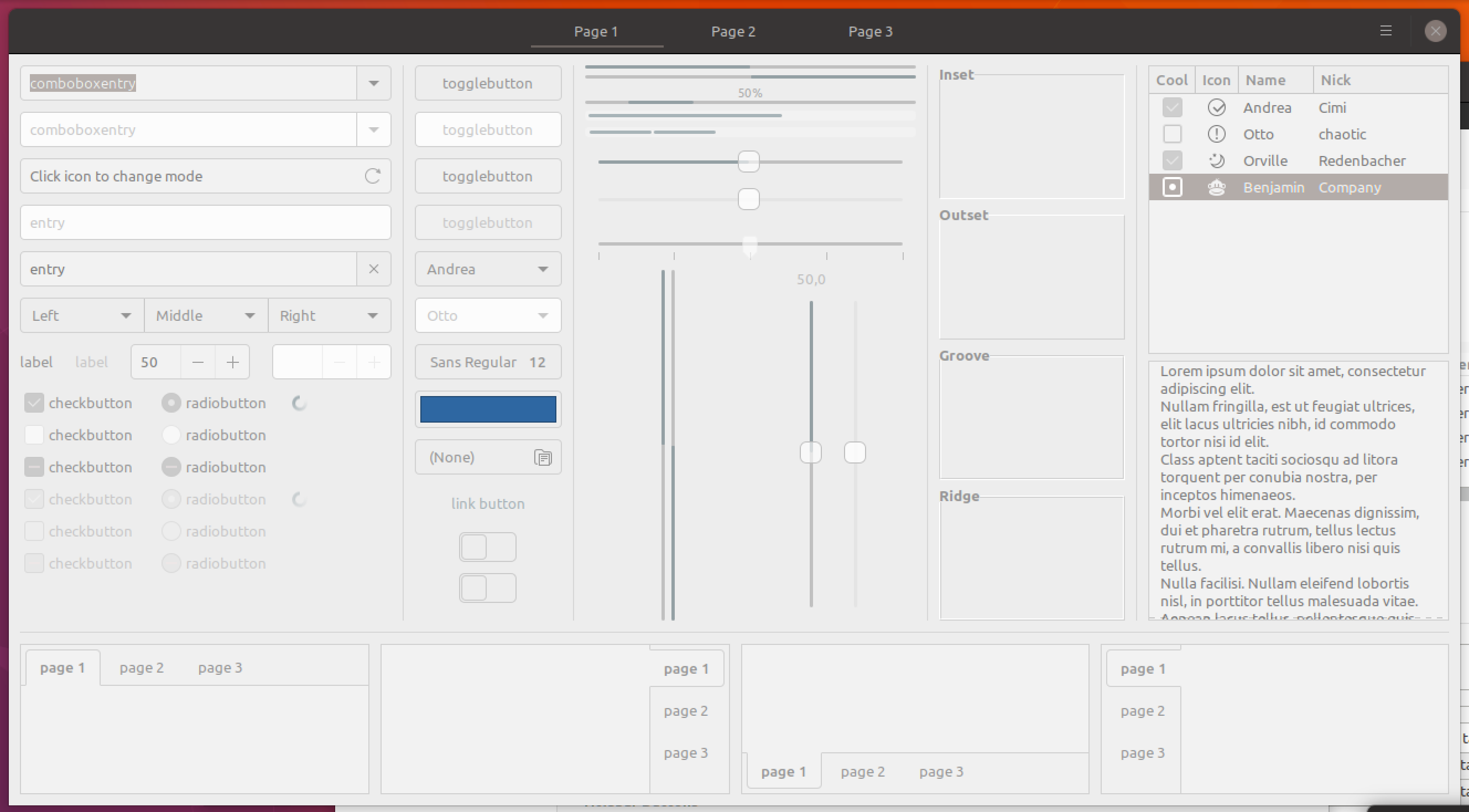
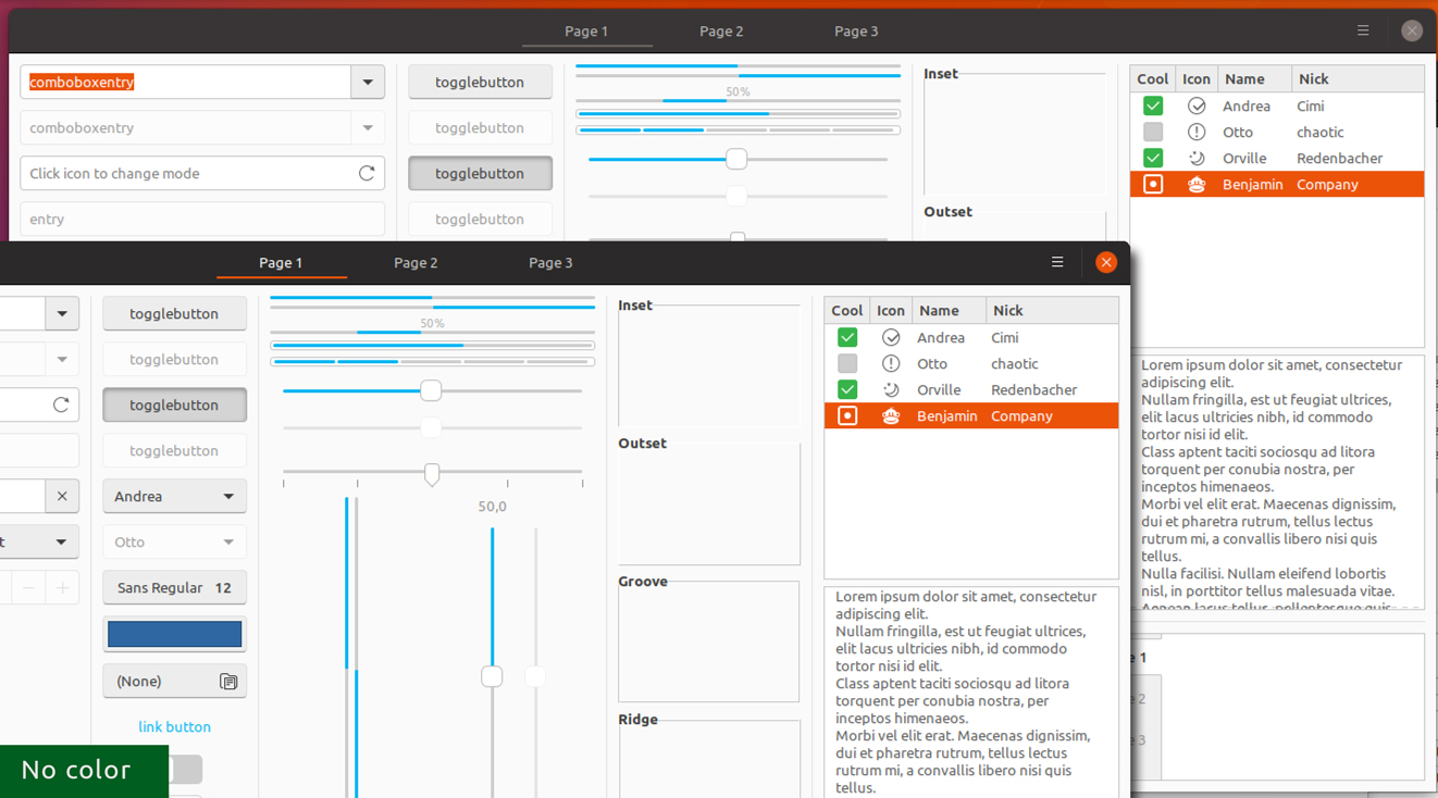
Quick and very dirty mockup:

ya-d
on 27 Feb 2018
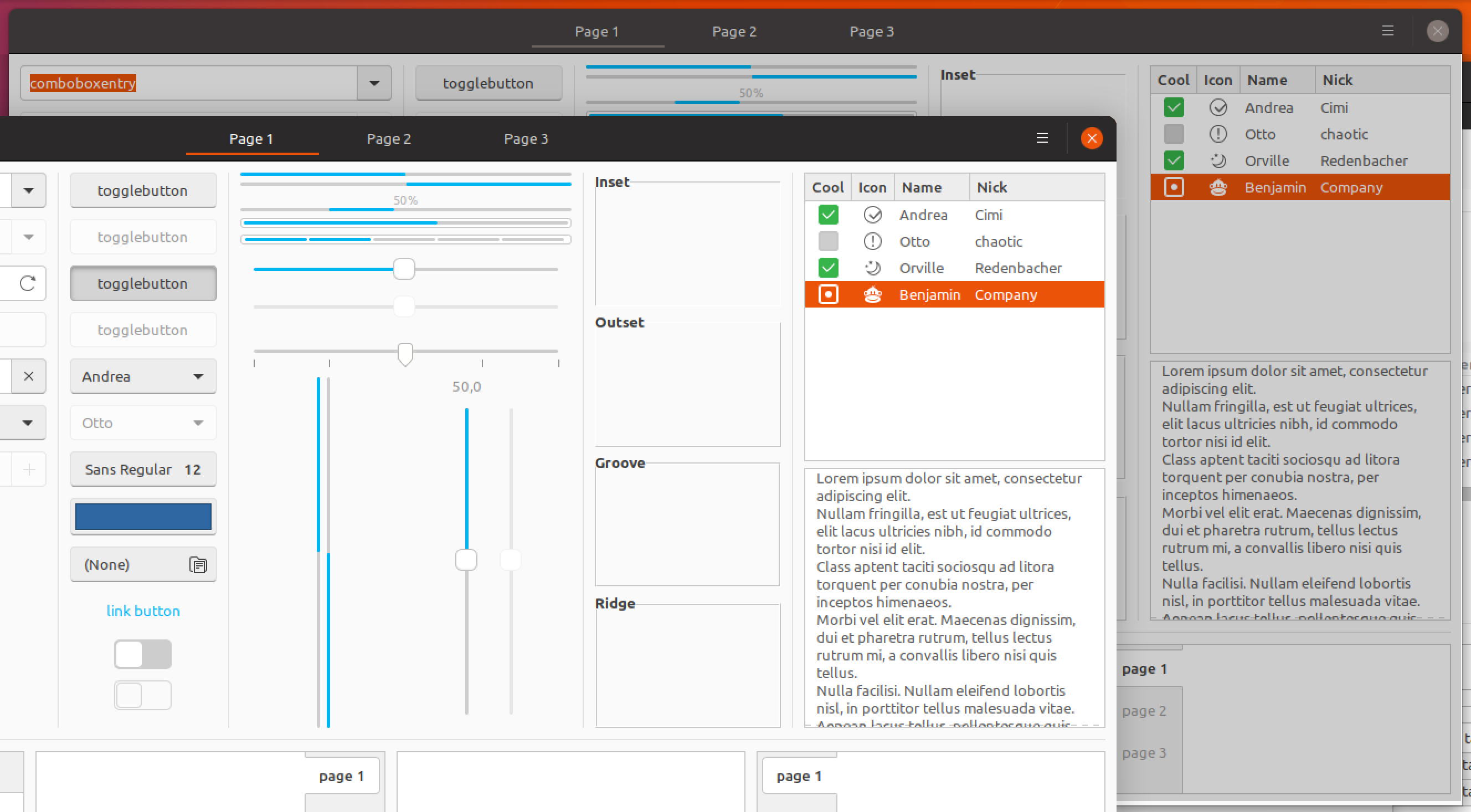
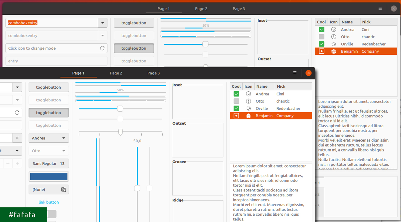
...Or we could keep the colors and behavior, but add a gray overlay. Here it's Silk #cdcdcd
 madsrh
on 28 Feb 2018
madsrh
on 28 Feb 2018
That looks much nicer. But does the difference need to be so drastic? Perhaps a more subtle difference? Also, how would this affect apps such as GIMP? Would the image being edited also be affected by the overlay? If so, that would be (IMHO) bad...
By keeping behavior - do you mean the mouse-over of items in inactive windows? That would be great too :-)
 CDrummond
on 28 Feb 2018
CDrummond
on 28 Feb 2018
That looks much nicer.
I think so too :)
But does the difference need to be so drastic? Perhaps a more subtle difference?
Perhaps you're right. I like this particular difference though. The idea is that you, at a glance, can tell which window is in focus.
Also, how would this affect apps such as GIMP? Would the image being edited also be affected by the overlay?
Not sure, but I don't think so. This isn't actually an overlay, I'm just describing the effect. I guess we would have to style each item to look this way. How does GIMP look in Adwaita, I never noticed?
By keeping behavior - do you mean the mouse-over of items in inactive windows?
Exactly! At the moment, the style items differently in backdrop (like the switches/toggels)
madsrh
on 28 Feb 2018
As to the 'drasticiness' of the effect - I'll leave that up to you, I'm no designer!
GIMP was perhaps a bad example - as its Gtk2. Just wanted to check that the 'view' within windows would not change - as the term 'overlay' had me thinking it would affect all windows. Anyway, I've just checked GIMP and GNOME Photos - and in neither of these, when styled with Adwaita, is the image affected when switching between active and inactive window states.
So for me, this would be an excellent change to have. I'm 100% in favour of widgets in inactive windows reacting to mouse-over (as they still receive any clicks over them, so should act as if they do)
CDrummond
on 28 Feb 2018
There still need to be a visual difference, even via side-by-side windows: only one window will receive keyboard inputs. However, I agree it can be way more subtle.
 didrocks
on 1 Mar 2018
didrocks
on 1 Mar 2018
I agree it can be way more subtle.
Way more, or just more?
The headerbar looses color (window controls, suggested-action / destructive-action - well like now) but everything inside the window keeps their colors with, this time, a Silk overlay at 50% (white becomes #e6e6e6).
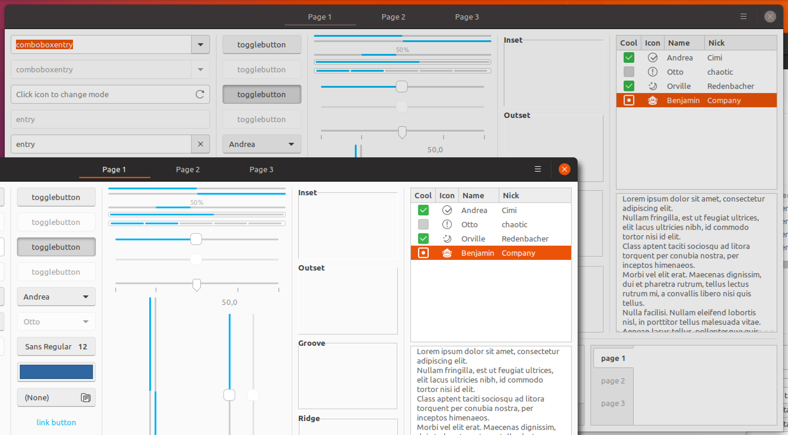
madsrh
on 1 Mar 2018
I find it quite obvious that way that the window isn't focused. However I think it's a little too visible when you work on side-by-side windows, as the original report stated, do you agree?
didrocks
on 2 Mar 2018
I noticed that the color in the mockup above is actually darker that the current backdrop (#f2f2f2 vs. #e6e6e6), but this was done intentionally since the window elements keep their color and therefore steal more focus.
I don't disagree with you, but at the same time I would like to keep that "_quite obvious_" difference. I'm +1 for a bit brighter.
@didrocks So would you like to see:
- a brighter overlay color (like #f2f2f2)
- only the headerbar to be colored
- or using the original concept that strips the all colors from the window but lighter
madsrh
on 2 Mar 2018
@madsrh: I think a brighter overlay color might work. At worse, we reverse the decision and go for only the headerbar to be color.
The concept of stripping all the colors out was really cool, but I'm afraid it's a little bit too distracting for the side-by-side workflow.
I think we'll see soon a new "state" for those windows being side-by-side (but not in the current release), which may help differentiate like "being immediately workarable, even if not focused" and backdrop, which thus can use that stripping color concept.
didrocks
on 2 Mar 2018
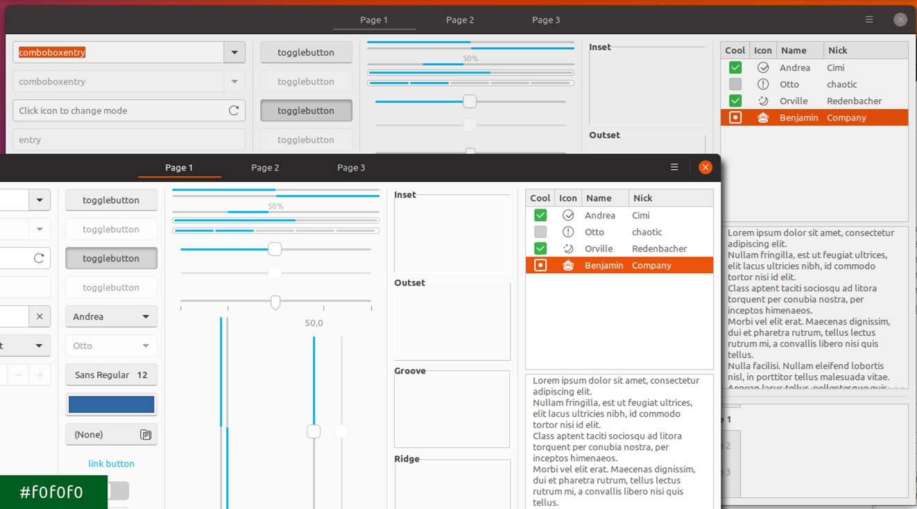
Okay, let's see if one of these might work:

madsrh
on 6 Mar 2018
FWIW, I'd go with f5f5f5 or f0f0f0
CDrummond
on 6 Mar 2018
Consider also #211, which will make active window's background a little less bright and almost the color of the buttons' background in above mockups
 clobrano
on 6 Mar 2018
clobrano
on 6 Mar 2018
We didn't actually consider making the backdrop lighter. As @luxamann pointed out, if the backdrop is too dark, it looks like it's deactivated or like they hung up.
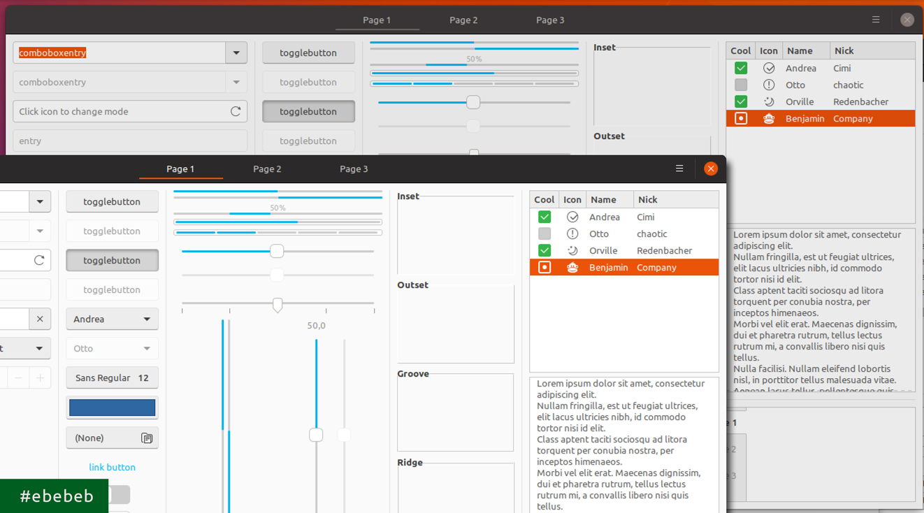
Some light versions:


madsrh
on 6 Mar 2018
Consider also #211, which will make active window's background a little less bright and almost the color of the buttons' background in above mockups
@clobrano Let's do another round of mockups when the button style, background and text color lands
madsrh
on 6 Mar 2018
To me, the lighter versions look like something has gone wrong with the app.
I'm no designer - but usually things in the background are darker, hence why (IMHO) the darker tinting looks nicer. The f5f5f5 and f0f0f0 shades are quite subtle, do don't make the app look disabled - just further away.
CDrummond
on 6 Mar 2018
We didn't actually consider making the backdrop lighter.
Right, but if the active window is darker, the difference from the backdrop would be less visibile. About button restyle, I'd like to see if I can push some other changes for consistency, but it's almost done.
clobrano
on 6 Mar 2018
Right, but if the active window is darker, the difference from the backdrop would be less visible.
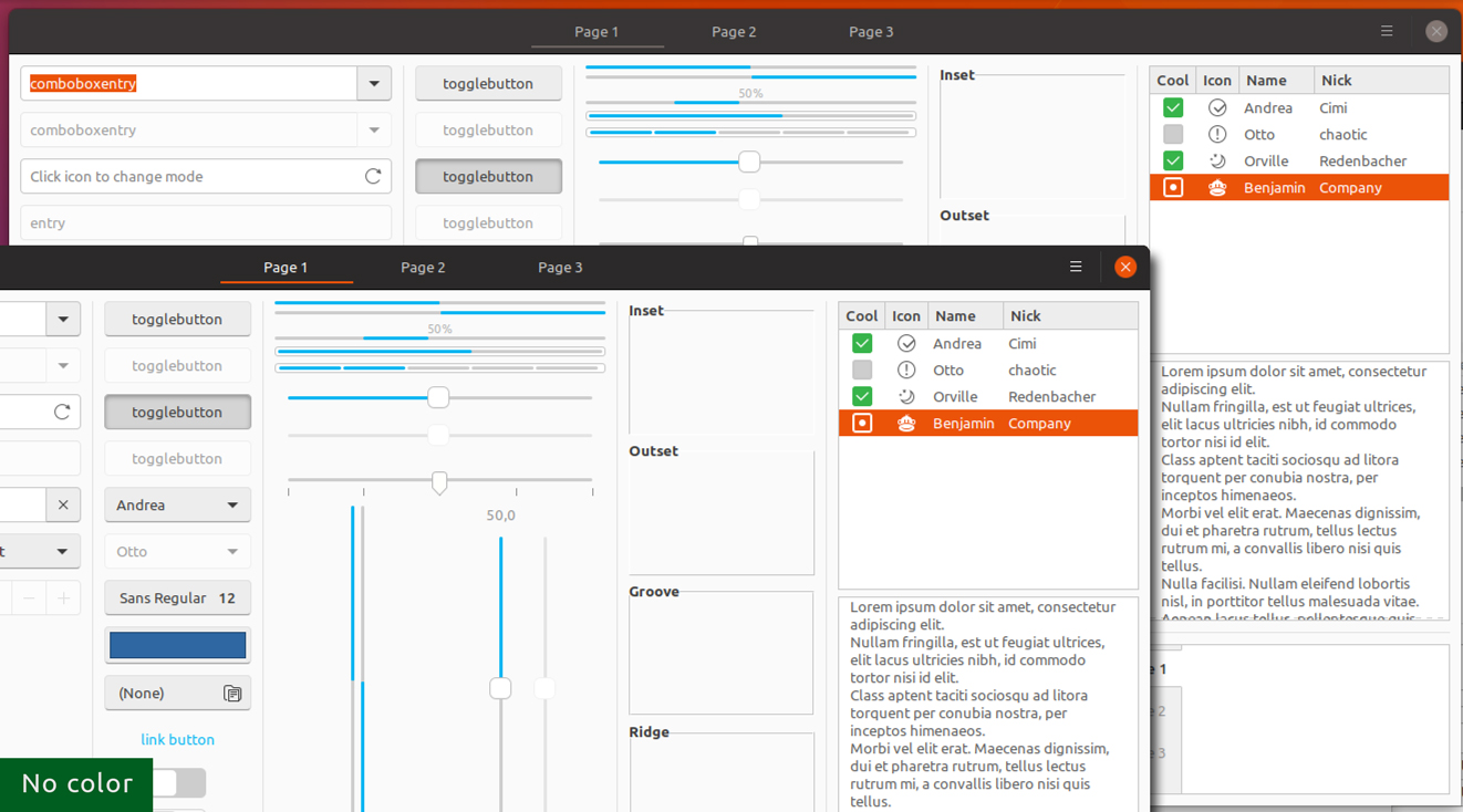
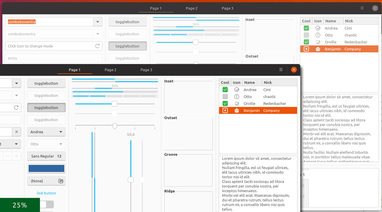
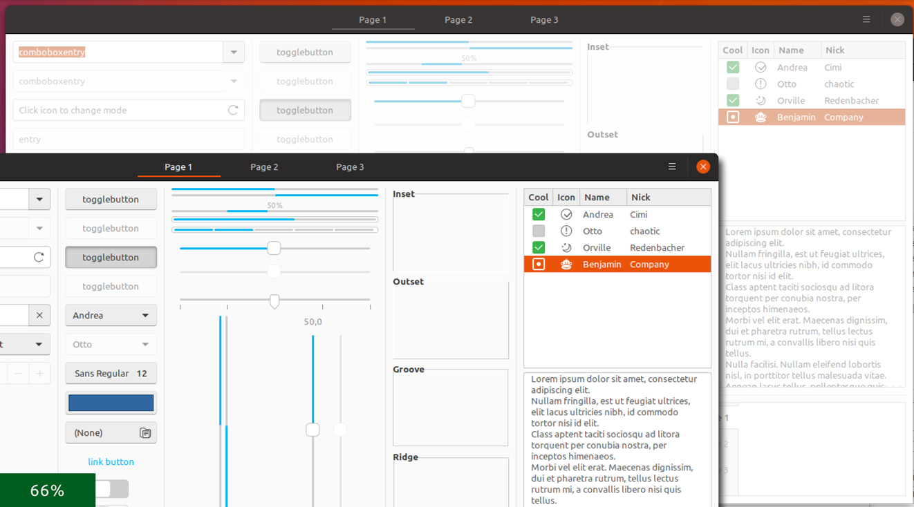
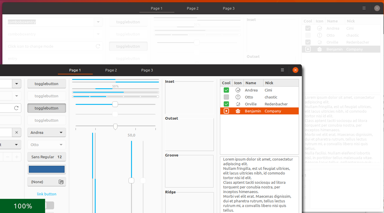
Well, the light backdrop is actually stripping away the colors again. So it's no so much that the active window is darker as it is that the backdrop looks pale. You can see what I mean below at the 100%. Anyway, I do agree that the slightly darkened versions CDrummond mentioned works best, but at least we explored this option. Let's hear what the bdfl @didrocks says :stuck_out_tongue_closed_eyes:
madsrh
on 6 Mar 2018
bdfl? Honored and scared :p
That's true that we shouldn't too much on the light or dark shadowing/overlay as it has the connotation the application has done something bad or stuck.
I personnally like fefefe (f0f0f0 is a little bit too much to my taste), fafafa or 25% opacity works as well for me.
didrocks
on 6 Mar 2018
The changes are great for the light variant. The variant, however, is still very harsh when changing between active an inactive. The terminal also changes from a purple background to a black background when going from active -> inactive.
So, this issue is only partialy resolved.
CDrummond
on 23 Mar 2018
The variant, however, is still very harsh when changing between active an inactive
do you mean the "dark" variant, or are you talking about the transition?
clobrano
on 23 Mar 2018
I meant when a dark window is focused, then unfocused, etc - the change to the dark window's widgets is quite harsh. Likewise the change in console background colour seems unnecessary - if a change is required, then a slight change in the shade but not a whole colour change.
CDrummond
on 23 Mar 2018
The terminal also changes from a purple background to a black background when going from active -> inactive.
double checked now and this shouldn't look right, it should be this way now

clobrano
on 23 Mar 2018
Ah, I was using the dark variant for GNOME terminal - this sets inactive window to black. Just tried with the light variant, and it is indeed a darker purple. Still think the difference is too strong - but that's just my opinion...
CDrummond
on 23 Mar 2018
The original problem is fixed now, closing this.
clobrano
on 11 May 2018
Necromancing this old conversation. Even we had a solution for this, I think we could still de-colorize the orange in backdrop a bit:
This is too intense imho. Same for the orange underline in the stackswitcher:
If you mostly disagree I will leave this in issue in peace ;D Otherwise I'll reopen and upload some pics (I can't say mockups, since I try stuff in CSS since I am bad with gimp)
 Feichtmeier
on 22 May 2018
Feichtmeier
on 22 May 2018
Right, @madsrh requested the same some days ago proposing a color similar to #dd501e
clobrano
on 22 May 2018
Well, the idea here was to give everything a #f2f2f2 overlay. This will make everything slightly darker (obviously). In Gimp I simply create a solid color layer above a screenshot and set mode to multiply.
@clobrano I was merely pointing out the the backdrop orange isn't #dd501e as it should be if we follow the above reference 😃
@Feichtmeier are you suggestion making everything darker like #f5f5f5 or are you only talking about the orange sidebar?
madsrh
on 22 May 2018
@madsrh currently every color is lightened up or "de-colorized". So for me that's why it would make sense to lighten/de-colorize the orange, too. If this could be again achieved by opacity, sure why not
Feichtmeier
on 22 May 2018
Sorry to be that annoying, but the window backdrop looks still unfinished to me.
I'd like to have a smart and logic solution which most of you agree on before opening the next PR ;D
This is what happens at the moment:
- the header bar lightens (bg color)
- the icons in nautilus lighten (opacity)
- the icons in the sidebar lighten (opacity)
- the close button lightens/gets its background completely removed
- the orange does not change (and if it does, I can not see that :) ) and stays orange
This is how ambiance does it:
- everything becomes lighter and less colorful
- the orange gets exchanged by gray everywhere
This is how adwaita does it:
- the 3d header bar becomes 2d
- blues stay blue (blue is a bit less attention grabbing than orange, I guess that's why ambiance decided to shift it to grey and adwaita didn't)
- the text color lightens
- every dark border become light gray
I like @madsrh idea to let the backdrop window fade into darkness.
I like the solution of adwaita and ambiance.
But the current solution is mixed up and misleading.
Either become lighter and less colorful or become darker but mixing both seems looks like a mixed communication to the user.
After reading this issue again, I understand where @luxamman 's idea was coming from (side by side work) but I would classify our users into two groups regarding this workflow (two personas ;) ):
- power users (like didi), know what they do, do a lot of work in tiled windows (yes! gnome can handle real tiling ;) try it!)
- "my father"-kind of users, who open a window, do stuff and mostly close it; yet sometimes it happens that another window opens (filechooser as an example) and a clear active/foreground separation is useful and greatly improves the usability for this stereotype of users/personas
Feichtmeier
on 28 May 2018
I would certainly update the backdrop orange color, however where do you see a mixed approach?
the header bar lightens (bg color)
the icons in nautilus lighten (opacity)
the icons in the sidebar lighten (opacity)
the close button lightens/gets its background completely removed
the orange does not change (and if it does, I can not see that :) ) and stays orange
EDIT: other than orange, I'd work on labels too, but just slightly
clobrano
on 28 May 2018
@clobrano
The "mix" is that the orange does not lighten, it actually darkens a tiny bit somehow (could be an optical illusion, then sorry)
Feichtmeier
on 28 May 2018
What about this? :angel: :innocent: @madsrh @luxamman
It's also quiet nice in the overview. You really know which window was the active one =)
Feichtmeier
on 1 Jun 2018
@Feichtmeier I like, but I'm not sure if too much difference when working in side-by-side windows 🤷♂️
We also need to to make some kind of logic for the backdrop as we've talked about before.
IMO if you have a PR we could give this a try, but let's hear what the others have to say 😃
madsrh
on 3 Jun 2018
To me the window still does not look disabled. Yes I have a branch for this. I also provided a backdrop_selected_bg_color for both dark and light versions. PR incoming
Feichtmeier
on 3 Jun 2018
Hi @fabd,
I am not aware of any setting that turn off the management of active and backdrop windows, this is entirely up to the window manager. Moreover, I don't think this would be possible (all the windows on focus? Or all the windows out of focus?).
I used both Vbox and gnome-boxes (libvirtd) and I've found no issues in this regards, probably is just that the VM doesn't have enough resources.
clobrano
on 11 Mar 2019
Disable 3D acceleration in your VM
clobrano
on 11 Mar 2019
Or disable animations in Gnome tweaks or via Terminal:
gsettings set org.gnome.desktop.interface enable-animations false
Feichtmeier
on 12 Mar 2019
Related issues
madsrh
·
3Comments
 matthewpaulthomas
·
3Comments
matthewpaulthomas
·
3Comments
 eaglersdeveloper
·
3Comments
eaglersdeveloper
·
3Comments
 mivoligo
·
3Comments
mivoligo
·
3Comments
 pojntfx
·
3Comments
pojntfx
·
3Comments
Most helpful comment
bdfl? Honored and scared :p
That's true that we shouldn't too much on the light or dark shadowing/overlay as it has the connotation the application has done something bad or stuck.
I personnally like
fefefe(f0f0f0is a little bit too much to my taste),fafafaor 25% opacity works as well for me.