Yaru: Menus should have rounded corners to fit suru-style
Please add "design"-label.
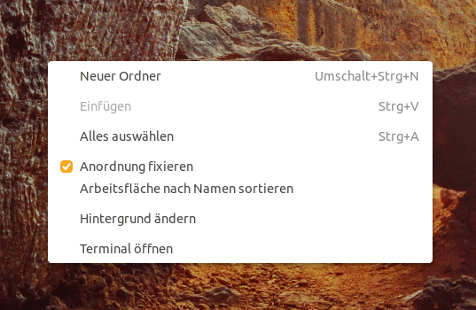
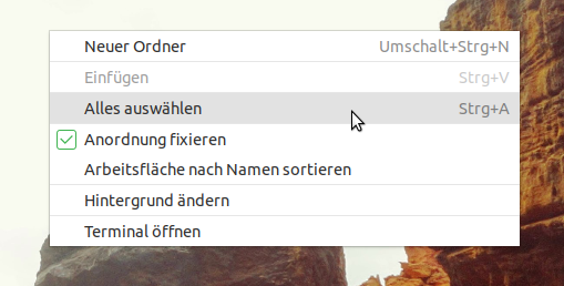
Menus should have rounded corners to fit the suru-style. An example can be found in the pop-theme.
 ghost
ghost
All 28 comments
Well spotted @NusiNusi +1 from me!
 madsrh
on 21 Feb 2018
madsrh
on 21 Feb 2018
is it possible to make the highlight with round corners too? i think i remember a mockup from you with round highlights @madsrh
ghost
on 5 Mar 2018
No matter what I try the border always bleeds out of of the background. Tried several google solutions like
-moz-background-clip: padding;
-webkit-background-clip: padding-box;
background-clip: padding-box;
Nothing removes the border bleed :(
Thats' what I did
menu,
.menu,
.context-menu {
margin: 4px;
box-shadow: 0 2px 5px transparentize(black, 0.75);
background-color: $menu_color;
color: $text_color;
border: 1px solid $borders_color;
border-radius: 10px; // <----------------------------------- That
Edit: sorry for the crappy screenshot, must be the VM
 Feichtmeier
on 24 Mar 2018
Feichtmeier
on 24 Mar 2018
The United theme has rounded corners as well, so @godlyranchdressing will know
madsrh
on 24 Mar 2018
Ah cool I'll look into that and see how he does it :dagger: I guess he is faster anyways but let's see :)
Feichtmeier
on 24 Mar 2018
@Feichtmeier The Canta-theme has round menus too: https://www.omgubuntu.co.uk/2018/03/canta-gtk-theme-rounded-corners?utm_source=slideshow
ghost
on 25 Mar 2018
Another thing is: the color of checkboxes should be inverted, like in the rest of the theme (box should be green and checkmark should be white). not sure if i should open a new issue for this or we can talk about this here.
EDIT:
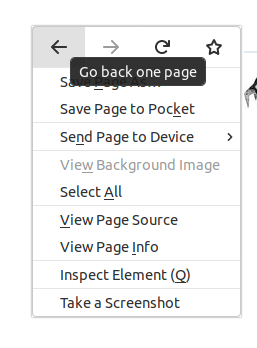
By the way, this is how menus look in firefox (maybe this could be a role model? I like the roundness and the very soft gradient):

ghost
on 26 Mar 2018
@NusiNusi I don't want to derail the conversation to checkboxes 😄 but perhaps we should rather remove the inverted checkboxes? This looks better IMO:
@Feichtmeier Did you look into the United code (or Pop OS) for?
madsrh
on 27 Mar 2018
@madsrh yeah, tried many things - the background still bleeds out of the radius. I look into that later today again. Unitedgnome is a little bit different organized but I stay optimistic :)
Feichtmeier
on 27 Mar 2018
@madsrh that it is what i meant. remove the inverted version OR invert the inverted. green box and white checkmark everywhere but in different sizes. or some different design. it should just be everywhere the same, on menus too.
ghost
on 27 Mar 2018
@Feichtmeier i still have some work to do but maybe i can later look for other themes with rounded menus. Maybe their code is easier to "implement" in communitheme.
ghost
on 27 Mar 2018
About radio and check buttons, didn't we already agreed on this design?
https://github.com/CanonicalLtd/desktop-design/tree/master/Check%20boxes%20and%20radio%20buttons
 clobrano
on 27 Mar 2018
clobrano
on 27 Mar 2018
About radio and check buttons, didn't we already agreed on this design?
😃 Yes, we did @clobrano, but there isn't a design in these specs for a selected checkbox in list view (on orange background). None of these are inverted.
You don't like this one? If you think it blends too much into the orange we can add a very light green border outside the checkbox, but I think this one is fine (my mockup uses a darker green for the selected checkboxes)
madsrh
on 27 Mar 2018
smiley Yes, we did @clobrano, but there isn't a design in these specs for a selected checkbox in list view (on orange background).
I agree on a change for orange background :+1:
What about keeping the same green? Not enough noticeable?
clobrano
on 27 Mar 2018
IMO no but almost - give it a try. I think the color in the mockup looks slightly more distinct. As@NussiNussi said should we create a separate issue or are you on it @clobrano ?
madsrh
on 27 Mar 2018
IMO no but almost - give it a try. I think the color in the mockup looks slightly more distinct.
ok, I'll try
As@NussiNussi said should we create a separate issue
yes please :)
At the moment I'm at too many things, better to keep track of all of them, so that anyone can see and help
clobrano
on 27 Mar 2018
@Feichtmeier I could find the lines in the code of the canta-theme for the rounded menus. Should i post it here? Would that help you? Its a bit long...
ghost
on 27 Mar 2018
@NusiNusi sure why not :)
Feichtmeier
on 27 Mar 2018
This is from the canta-theme:
``/***
- Menus *
***/
menubar,
.menubar {
-GtkWidget-window-dragging: true;
padding: 0;
// box-shadow: inset 0 -1px $border_color;
background-color: $titlebar_bg_color;
menuitem {
transition: $shorter_transition;
min-height: 20px;
padding: 4px 8px;
color: $titlebar_secondary_fg_color;
&:hover { // Seems like it :hover even with keyboard focus
// transition: none;
// background-color: $titlebar_divider_color;
color: $titlebar_fg_color;
box-shadow: inset 0 -3px $primary_color;
}
&:disabled { color: $titlebar_disabled_secondary_fg_color; }

label:disabled { color: inherit; } // to inherit the above color
}
}
.csd.popup { background-color: transparent; }
menu,
.menu,
.context-menu {
margin: 4px 0; // See https://bugzilla.gnome.org/show_bug.cgi?id=591258
padding: 4px 0;
box-shadow: inset 0 1px $highlight_color;
background-color: rgba($menu_bg_color, 0.96);
border: 1px solid $border_color; // adds borders in a non composited env
.csd & {
border: none; // axes borders in a composited env
border-radius: $buttons_radius;
}
menuitem {
transition: background-color $shorter_duration $deceleration_curve;
min-height: 20px;
min-width: 40px;
padding: 4px 8px;
font: initial;
text-shadow: none;
&:hover {
  transition: none;
  background-color: $primary_color;
  color: $inverse_fg_color;

  accelerator { color: $inverse_secondary_fg_color; }
}

&:disabled { color: $disabled_fg_color; }

// submenu indicators
arrow {
  min-height: 16px;
  min-width: 16px;

  &:dir(ltr) {
    -gtk-icon-source: -gtk-icontheme('pan-end-symbolic');
    margin-left: 8px;
  }

  &:dir(rtl) {
    -gtk-icon-source:-gtk-icontheme('pan-end-symbolic-rtl');
    margin-right: 8px;
  }
}

// avoids labels color being overridden, see
// https://bugzilla.gnome.org/show_bug.cgi?id=767058
label { &:dir(rtl), &:dir(ltr) { color: inherit; }}
}
// overflow arrows
arrow {
min-height: 16px;
min-width: 16px;
padding: 4px;
background-color: $base_color;
color: $secondary_fg_color;
&.top {
  margin-top: -4px;
  border-bottom: 1px solid $border_color;
  border-radius: $buttons_radius $buttons_radius 0 0;
  -gtk-icon-source: -gtk-icontheme('pan-up-symbolic');
}

&.bottom {
  margin-bottom: -4px * 3;
  border-top: 1px solid $border_color;
  border-radius: 0 0 $buttons_radius $buttons_radius;
  -gtk-icon-source: -gtk-icontheme('pan-down-symbolic');
}

&:hover {
  background-image: image($divider_color);
  color: $fg_color;
}

&:disabled {
  border-color: transparent;
  background-color: transparent;
  color: transparent;
  // color: $disabled_secondary_fg_color;
}
}
separator { margin: 4px 0; }
}
menuitem {
accelerator { color: $secondary_fg_color; }
}
// FIXME: THIS IS A REALLY UGLY WORKAROUND!
// Electron/Atom render all translucent colors in opaque colors.
// It's a very critical issue for this theme and should be fixed by upstream...
.popup:not(.csd) menu {
menuitem {
color: $opaque_fg_color;
&:hover { background-color: $opaque_divider_color; }

&:disabled { color: $opaque_disabled_fg_color; } // separator/border also use this color.
}
// FIXME: not working this
accelerator { color: $opaque_secondary_fg_color; }
}
ghost
on 27 Mar 2018
Rounded borders in contextual menu fixed by #301
Keep this open for checkboxes and radio
clobrano
on 31 Mar 2018
@nana-4
I just noticed that the border bleed is still present in firefox
Feichtmeier
on 2 Apr 2018
@godlyranchdressing since you did some stuff on the round menues: could you try to fix this for firefox, too? :)
Feichtmeier
on 20 Apr 2018
@Feichtmeier I tried, but I don't know if it's possible.
 godlyranchdressing
on 26 Apr 2018
godlyranchdressing
on 26 Apr 2018
@godlyranchdressing what about these old properties?
-moz-border-radius-topright:
-webkit-border-top-right-radius:
-moz-border-radius-bottomright:
-webkit-border-bottom-right-radius:
-moz-border-radius-bottomleft:
-webkit-border-bottom-left-radius:
Feichtmeier
on 26 Apr 2018
Those are only for web browsers
clobrano
on 26 Apr 2018
@Feichtmeier it didn't work. I didn't expect it to either since not all CSS properties are supported. There's also weird stuff like !important working in Shell CSS but not GTK3 CSS.
godlyranchdressing
on 26 Apr 2018
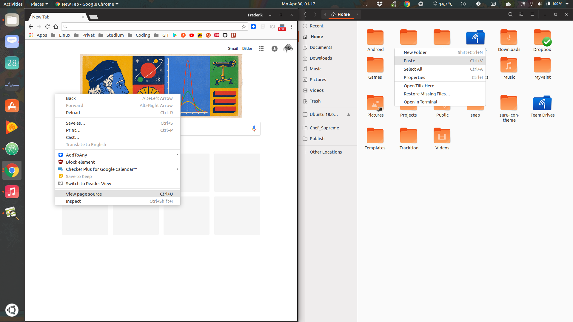
@godlyranchdressing @madsrh is it possible to give the context menu a box shadow like in chrome? Could bring some readability improvements and it's again a layer above a layer like notifications and popovers:
On the firefox topic: could we just scrap the rounded corners for firefox only? It's the default browser in ubuntu (though I don't use it myself =P)
Feichtmeier
on 30 Apr 2018
Fixed by many changes :) closing this and opening a new ticket specifically for Firefox (just to track any decision about it)
clobrano
on 11 May 2018
Related issues
madsrh
·
3Comments
Feichtmeier
·
3Comments
Feichtmeier
·
3Comments
Feichtmeier
·
3Comments
 snydox
·
3Comments
snydox
·
3Comments
Most helpful comment
@godlyranchdressing @madsrh is it possible to give the context menu a box shadow like in chrome? Could bring some readability improvements and it's again a layer above a layer like notifications and popovers:

On the firefox topic: could we just scrap the rounded corners for firefox only? It's the default browser in ubuntu (though I don't use it myself =P)