Yaru: Decrease the default interface font size
The default font size is HUGE and makes the UI look very cluttered. Although I'm using 9 on my desktop, I think Ubuntu regular 10 as default would be a good choice for most people.

 madsrh
All 35 comments
I tried 10' for a while, and I find it hard to parse for me on my laptop screen, which is a standard 14'' (thinkpad x220) 1366x768.
No issue on an external monitor which is bigger (23'') on 1920x1080 though.
 didrocks
on 11 Jan 2018
didrocks
on 11 Jan 2018
I’ve mentioned this several years ago at Launchpad. The first thing I’ve been doing every time I install Ubuntu, since the introduction of the Ubuntu typeface back in 2010, is to reduce the font size to 10 points. It is an adequate size for netbooks and basic laptops. BTW, Xubuntu also has a nice default of 9 pt.
 fitojb
on 29 Jan 2018
fitojb
on 29 Jan 2018
@didrocks Of course you get the final word on what we can do and can't do, but I would argue that if the theme isn't going to be the default in 18.04 we could try a smaller font. Especially now in this pre-release state. What do you think?
madsrh
on 1 Feb 2018
Oh sure, as long as it's not final, things can get tested. I'm just telling my personal opinion :)
didrocks
on 1 Feb 2018
I've been trying 10 since you opened this issue, and I already forgot I did it, so +1 for me. Let's try it out!
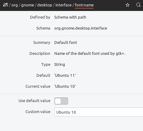
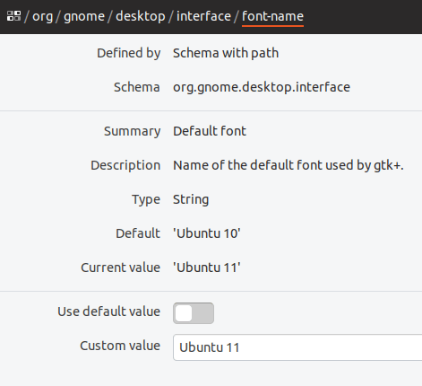
Can you do this in css or is this a dconf thing?
 galgalesh
on 1 Feb 2018
galgalesh
on 1 Feb 2018
It's a dconf value for the gtk interface apps. You can use the override file I've put in the -session package.
For the shell itself, it's in its css.
didrocks
on 1 Feb 2018
@galgalesh is there a PR for this?
madsrh
on 21 Feb 2018
I've been trying 10 since you opened this issue, and I already forgot I did it, so +1 for me. Let's try it out!
I used 10pt on an Hi-Res 12'' 16:10 Display for a while and it absolutely works for me. Albeit I can see "smaller" text (8pt?!) being an issue for some people or on bad displays. Should be tested thoroughly for different screen sizes and resolutions.
 ya-d
on 21 Feb 2018
ya-d
on 21 Feb 2018
@madsrh is this fixed with the latest snap now? Don't have the snap installed atm
 Feichtmeier
on 20 Apr 2018
Feichtmeier
on 20 Apr 2018
@Feichtmeier it should be, but I can't confirm, because I had manually changed the font size. Changeing it back and doing a snap refresh communitheme --edge does nothing.
I don't have time to spin up a wm atm, but perhaps someone else can confirm?
madsrh
on 20 Apr 2018
I believe @nusinusi installed it with the snap, too
Feichtmeier
on 20 Apr 2018
Using snap here:
 ghost
on 21 Apr 2018
ghost
on 21 Apr 2018
👍
madsrh
on 21 Apr 2018
This got reverted because of another bug 😭 😭 😭
I'm reopening this for 19.04!
madsrh
on 6 Oct 2018
For what it's worth, I tested for a little while and I feel my eyes are straining a bit when using interfaces with size 10 on a 15 inch 1920×1080 screen. My previous laptop (dell XPS 13) had a 13 inch 1920×1080 screen, I imagine that one would require a lot of squinting to use with size 10 font!
I suppose most laptop users have 1366×768 screens, and most desktops have larger screens so I'm sure it is fine for them.
The tradeoff seems to be that erring on the side of a larger font means nobody strains their eyes, though it's excessively large for some people, whereas erring on the size of a smaller font means means an ideal size for some but others are straining their eyes. It seems like erring on the side of a larger font is the lesser crime if you think there are a significant number of 1920×1080 laptops.
Another point might be that higher resolutions are becoming more common, so even if 1366×768 is the most common laptop resolution now, 1920×1080 or higher will likely be in the future.
It would be nice if the default size could be DPI-dependent, or if the scaling factor settable in gnome-tweaks were automatically set based on the DPI, but that's outside the scope of a theme!
I think I will continue to use size 11 if 10 is the default, but I understand 10 makes sense for many.
 chrisjbillington
on 13 Nov 2018
chrisjbillington
on 13 Nov 2018
It would be nice if the default size could be DPI-dependent, or if the scaling factor settable in gnome-tweaks were automatically set based on the DPI
This is exactly what I was thinking about reading your comment :smile:
Luckily we have real statistics about screen sizes https://www.ubuntu.com/desktop/statistics. 1366x768 is the second most used resolution, being 1920x1080 the first.
My opinion is that 10px font is very clean and nice at first (I experienced that once that I installed the theme and have forgotten this setting), but working every day with this size might be actually annoying.
 clobrano
on 13 Nov 2018
clobrano
on 13 Nov 2018
My opinion is that 10px font is very clean and nice at first (I experienced that once that I installed the theme and have forgotten this setting), but working every day with this size might be actually annoying.
I agree with this exactly - 10 looks really pretty and makes interfaces look more organised and efficient. I want to use it, but I nonetheless found myself not wanting to read things after a while because my eyes were tired.
chrisjbillington
on 13 Nov 2018
Sorry for the extremely late reply here. In the end, I think we're all on the same page here.
When I opened this issue (one year ago now! 🎉 ), my day was spend evenly across OSX (Retina), Win10 and Ubuntu. When you only use Ubuntu with the default size 11, you don't notice anything. But switching between (especially) OSX and Ubuntu makes it really obvious that the huge font size makes it look unprofessional.
10 looks really pretty and makes interfaces look more organised and efficient. I want to use it, but I nonetheless found myself not wanting to read things after a while because my eyes were tired.
Yeah, you nailed it. Size 10 is pretty and makes the UI look slick and elegant, but all that is worth nothing if users can't read the text. Could this be the font? Comparing it to something like Roboto, I find that Roboto is much clearer in small sizes 🤷♂️
So, what can we do here? Is the DPI-dependent solution getting worked on or were you just "hope casting"? :wink:
Would it be possible to go for something like 10.5 or aren't decimals allowed?
madsrh
on 6 Jan 2019
Okay, so after some testing on 19.04 I have a suggestion 😃
With some size changes only the spacing is changed and not the actual size of the letters (size mostly referring to the height). And so would you please test theses sizes in the real world:
10.3 - same height letters as 10.0 but might be easier to read because of the spacing
10.5 - same height letters as 11.0 but looks better because it has less spacing between the letters
madsrh
on 14 Jan 2019
Hey! I just came across this option which I think might be perfect: Ubuntu Medium 10
Please give this a try in dconf-editor and post some feedback here 😃
madsrh
on 17 Jan 2019
lol @madsrh I was failing to copy what you're doing in your .gif, it turns out you're misspelling "Medium" such that GTK is falling back on something else, I assume Cantarell.
chrisjbillington
on 17 Jan 2019
@chrisjbillington 🤣 That's both funny and sad, because that means that it isn't an option! Okay, I was a bit too fast there 🤦♂️ No wonder the other guys didn't reply #embarrassing! BUT at least you did 🎉
Did you try the 10.3 or 10.5 mentioned above?
EDIT: I really shouldn't post anything after midnight 😁
madsrh
on 17 Jan 2019
No sorry I just forgot to reply :( sorry about that
Feichtmeier
on 18 Jan 2019
Ubuntu Medium 10 is actually not bad. I need to use it a bit more, though
clobrano
on 18 Jan 2019
Ubuntu Medium 10 is actually not bad. I need to use it a bit more, though
See the comment above @clobrano
madsrh
on 18 Jan 2019
Ubuntu Medium 10 is actually not bad. I need to use it a bit more, though
See the comment above @clobrano
I read it :D, I am talking about the real Medium 10
clobrano
on 18 Jan 2019
Do not forget the "scaling" feature. I'm testing Ubuntu Medium 10 on a 13'' screen. It's too small with no scaling, but using 1.25 of scale ratio is pretty nice
clobrano
on 29 Jan 2019
Okay, we got a bit off track above I think 😁
As mentioned above, changing the font size by decimals doesn't always change the font size BUT only the spacing between the letters (which IMHO looks better as long as the text is still readable).
So, can we try something like 10.8? 🤷♂
madsrh
on 7 Aug 2019
I think @chrisjbillington said everything there is to say here, so maybe we should just close this one @clobrano? Size 10.8 may be slightly prettier but it is far from perfect 😞
madsrh
on 7 Aug 2019
necromancing the issues
What is everyone's current opinion on this nowadays? @clobrano @madsrh @ubuntujaggers
I'm personally
.... Edit: I should try both sizes again to have an up to date opinion
.... Edit2: I am pretty neutral on this :man_shrugging: Slight preference for 11, thinking of older people
Feichtmeier
on 13 Sep 2019
Hmm, I might like 10 as a default as long as its easy to change if you have e.g. a smaller monitor. I think 11 is a little too big. No strong feelings though :)
 ubuntujaggers
on 14 Sep 2019
ubuntujaggers
on 14 Sep 2019
10 is nice at first, but might be too small, however it's just an idea, I
always change fonts for coding and can't be sure
On Sat, 14 Sep 2019, 6:23 pm ubuntujaggers, notifications@github.com
wrote:
Hmm, I might like 10 as a default as long as its easy to change if you
have e.g. a smaller monitor. I think 11 is a little too big. No strong
feelings though :)—
You are receiving this because you were mentioned.
Reply to this email directly, view it on GitHub
https://github.com/ubuntu/yaru/issues/30?email_source=notifications&email_token=AAWAAHXAYJHAVIZFQKSB55LQJUFXTA5CNFSM4ELIKYHKYY3PNVWWK3TUL52HS4DFVREXG43VMVBW63LNMVXHJKTDN5WW2ZLOORPWSZGOD6W7A7A#issuecomment-531492988,
or mute the thread
https://github.com/notifications/unsubscribe-auth/AAWAAHTSGTOBUE23QAQDIL3QJUFXTANCNFSM4ELIKYHA
.
clobrano
on 14 Sep 2019
Closing this since @madsrh told us to do so on telegram :smile:
I think 11 might be the better choice for usability and accessibility. though there are certain circumstances where it is too big.
Feichtmeier
on 31 Oct 2019
Is the decision final of staying with size 11? I got a new screen and using 200% scaling (192 dpi monitor) and honestly you can tell the font size is too big! Been using size 10 for few days and it's just perfect. @madsrh @Feichtmeier
 barmadrid
on 27 Feb 2020
barmadrid
on 27 Feb 2020
I think that hardcoding a font size is not the right solution for this problem
clobrano
on 27 Feb 2020
Related issues
Feichtmeier
·
3Comments
chrisjbillington
·
3Comments
 snydox
·
3Comments
Feichtmeier
·
3Comments
Feichtmeier
·
3Comments
snydox
·
3Comments
Feichtmeier
·
3Comments
Feichtmeier
·
3Comments
Most helpful comment
For what it's worth, I tested for a little while and I feel my eyes are straining a bit when using interfaces with size 10 on a 15 inch 1920×1080 screen. My previous laptop (dell XPS 13) had a 13 inch 1920×1080 screen, I imagine that one would require a lot of squinting to use with size 10 font!
I suppose most laptop users have 1366×768 screens, and most desktops have larger screens so I'm sure it is fine for them.
The tradeoff seems to be that erring on the side of a larger font means nobody strains their eyes, though it's excessively large for some people, whereas erring on the size of a smaller font means means an ideal size for some but others are straining their eyes. It seems like erring on the side of a larger font is the lesser crime if you think there are a significant number of 1920×1080 laptops.
Another point might be that higher resolutions are becoming more common, so even if 1366×768 is the most common laptop resolution now, 1920×1080 or higher will likely be in the future.
It would be nice if the default size could be DPI-dependent, or if the scaling factor settable in gnome-tweaks were automatically set based on the DPI, but that's outside the scope of a theme!
I think I will continue to use size 11 if 10 is the default, but I understand 10 makes sense for many.