Www.rust-lang.org: reduce intensity of background colors and sections on getting started page
I am not visually impaired, but I have a lot of trouble to read or parse the Getting Started page, because of its "reversed" color scheme (light text on colored background).
It may be linked to how the fonts are rendered, or my habits of reading on the web, but I think that this color inversion makes it more difficult for me to parse it, know where I am on the page, understand that some part are code, and, to be honest, I feel it is quite… stressful, in a way.
Why not keeping those colors – that seems to integrate in a new brand color scheme that I'm sure I will enjoy ! – but as "heavy left borders", for example?
I hacked something quickly using the Firefox Dev Tools, but it is just one solution if we think that problem is really one.
 Signez
All 7 comments
I second having issues with reading the Getting Started page (despite having no visual impairments). I think some kind of dark-on-light (if not dark-on-white) colour scheme is probably a good idea for this and other content heavy pages.
 nicoburns
on 30 Nov 2018
nicoburns
on 30 Nov 2018
Agreed, but I also think the dark-backgrounded section might be too busy, which is a contributing factor. The red background might be worse, but the content in it is simpler.
Also, I'm not a fan of the colour scheme in general.
 jacobpledger
on 30 Nov 2018
jacobpledger
on 30 Nov 2018
I made a mashup of screenshots with some styling changes. I feel like removing the header highlights/background colors makes it easier to scan/read the page.
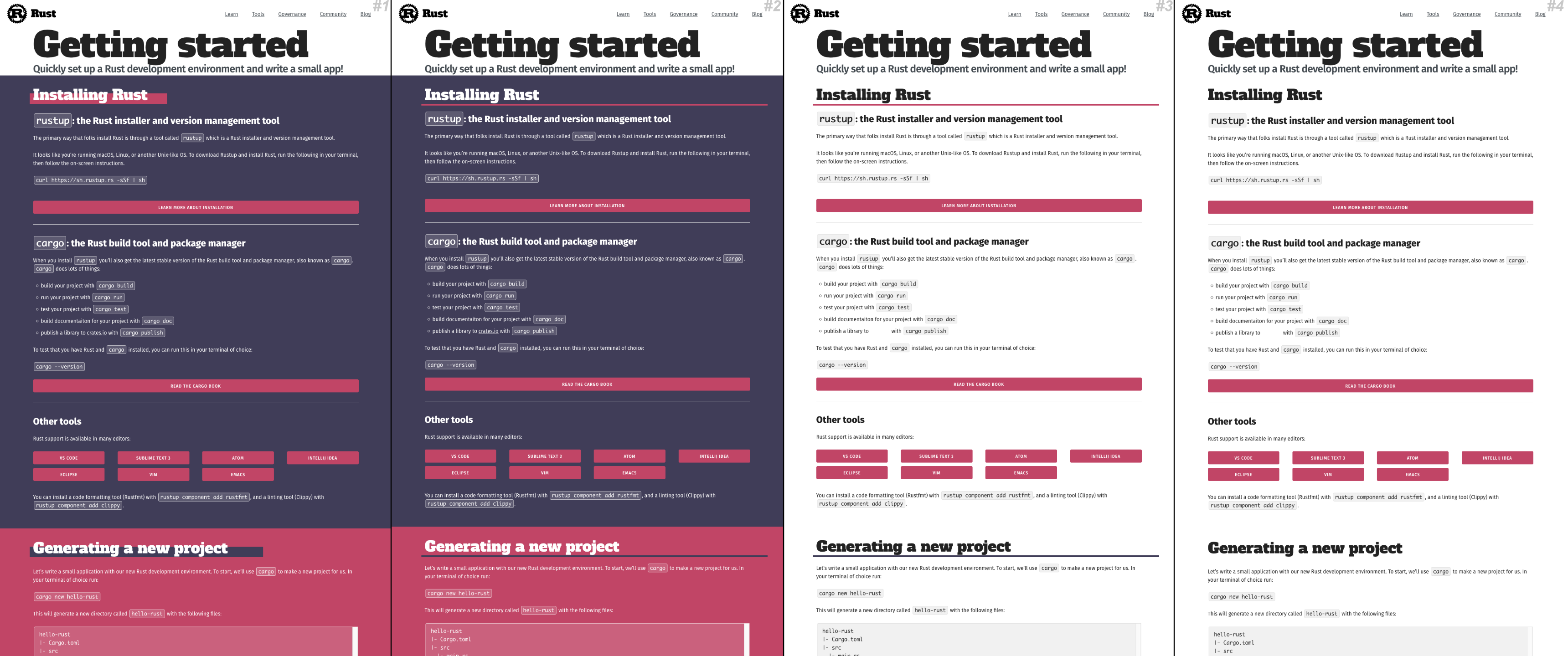
 rudedogg
on 30 Nov 2018
rudedogg
on 30 Nov 2018
I can agree on this reading the sections with the read/green background is quite tiring for me,
the other sections are better.
(Not just on the getting started site, but one the main site to. I noticed that a subconsciously skipped
reading the contents of the three "why rust" sub sections as it feels "to tiring" to be worth it).
Also the yellow highlight bar in "Who’s this crab, Ferris?" also always steals my focus from reading the title,
which I didn't notice before as the other places it appears in are "more compact".
 rustonaut
on 30 Nov 2018
rustonaut
on 30 Nov 2018
hi! we are not looking to overhaul the design at the moment but we are aware of the intensity of hte getting started page and i intend to make a pr to mitigate at least some of it. if there are smaller actionable suggestions i would be useful to surface them (e.g. dont put these two background colors next to each other, make the font bigger, make the sections smaller) - please comment with those here or open another issue!
sometimes when large issues contain multiple changes it can be hard to keep track of them, so i've been encouraging folks to open smaller issues. it's not because i disagree with the feedback! it's because i want to make sure i dont lose/forget them <3
 ashleygwilliams
on 30 Nov 2018
ashleygwilliams
on 30 Nov 2018
Makes sense. Could be worth migrating rudedogg's comment into a separate ticket then, as a smaller, actionable suggestion (Reduce use of background colours/ Use only as highlighting, Something like that), with "difficulty reading" being the motivation?
Is that more in keeping with what you're looking for?
jacobpledger
on 30 Nov 2018
I'll close this issue as being a little to broad and sprawling. I appreciate the issue though.
Thanks for raising it and we will definitely consider that when having the page in place for a complete design review. Still, feel free suggesting and PRing punctual suggestions (e.g. replacing one of the panels by a different colour scheme.
 skade
on 29 May 2019
skade
on 29 May 2019
Related issues
 Manishearth
·
6Comments
Manishearth
·
6Comments
 stevensonmt
·
4Comments
stevensonmt
·
4Comments
 yoshuawuyts
·
4Comments
yoshuawuyts
·
4Comments
 Veedrac
·
5Comments
Veedrac
·
5Comments
 Zaechus
·
5Comments
Zaechus
·
5Comments
Most helpful comment
I made a mashup of screenshots with some styling changes. I feel like removing the header highlights/background colors makes it easier to scan/read the page.