Www.julialang.org: Simplify the download page so it's less intimidating
- The download page is too intimidating for newcomers. Going to the download page you are hit with a complex wall of text and confusing matrices of downloads configurations.
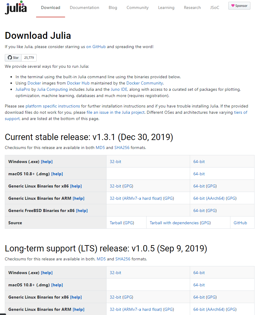
Let's simplify things for the first half of the page. We can keep the granular matrix of downloads further down the page, but users should be greeted with a simple download page that is not complicated.
We should aspire to the following example

@logankilpatrick
 musm
musm
All 12 comments
I just made this using a grid:
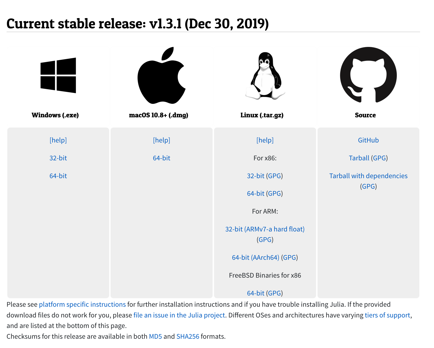
Sort of thing? The [help] could be a question mark I suppose...
 cormullion
on 19 Mar 2020
cormullion
on 19 Mar 2020
Nice!! maybe a one click button for the standard option would be good? (if we're going with something similar to VS Code). I guess that button could wrap the symbol so that if you click on it you get the most recent stable release that is most likely to correspond to your platform.
Personal preference would also be for the icons to be smaller, maybe 70% of the size you show 😄
 tlienart
on 19 Mar 2020
tlienart
on 19 Mar 2020
Yeah Looks good, but the icons are kinda massive and their not all the same size. Is there a better linux photo? It's weird seeing a B&W penguin :)
For the windows one can we use a B&W or color version like this:

musm
on 19 Mar 2020
Can we just detect the running system and present just a single button? I know that is done for other projects.
 fredrikekre
on 19 Mar 2020
fredrikekre
on 19 Mar 2020
I don't think we should present a single button because there have been several times when I've wanted to download e.g. linux binaries for WSL. Having them all present makes it very user friendly to quickly grab and test the binaries you want.
musm
on 19 Mar 2020
I mean obviously the other ones shouldn't be hidden, but we can present a main one. The regular user probably wants that one.
Here is an example: https://ngrok.com/download
fredrikekre
on 19 Mar 2020
I avoided color just because it would be a bit inconsistent- with some in color and others not. (I didn't bother to size everything accurately at this stage... :))
cormullion
on 19 Mar 2020
Here's a mono linux logo that looks much better

musm
on 19 Mar 2020
I would also move the (.exe) and (.dmg) down to the links, since we are also planning to provide (.zip) for Windows.
I would then move (help) next to the OS.
musm
on 19 Mar 2020
The help should probably called Installation notes or something. They are probably not needed by most users - so I would personally move them to the end of the table in their own row.
 ViralBShah
on 19 Mar 2020
ViralBShah
on 19 Mar 2020
The installation notes could also just be moved to the Julia manual.
ViralBShah
on 19 Mar 2020
I also like detecting the default platform and offering that ngrok like install and run instructions. Can be a separate PR if we ever get there.
ViralBShah
on 19 Mar 2020
Related issues
tlienart
·
9Comments
 jekbradbury
·
7Comments
jekbradbury
·
7Comments
 aaowens
·
5Comments
aaowens
·
5Comments
 tianon
·
4Comments
tlienart
·
7Comments
tianon
·
4Comments
tlienart
·
7Comments
Most helpful comment
I just made this using a grid:
Sort of thing? The [help] could be a question mark I suppose...