Wp-calypso: Editor: make it easier to find your way back to dashboard
Update: as a current action item, let's just rename "My Home" to "Dashboard".
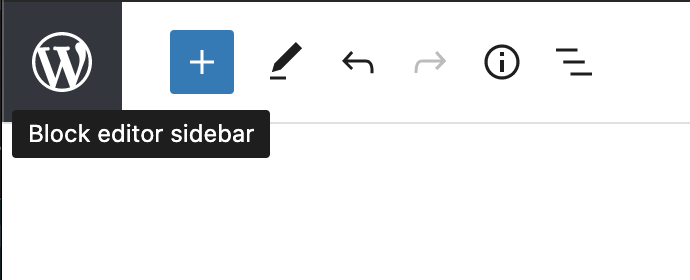
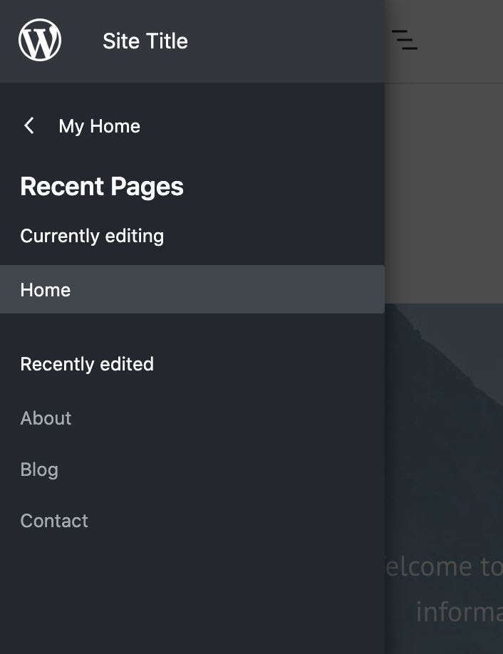
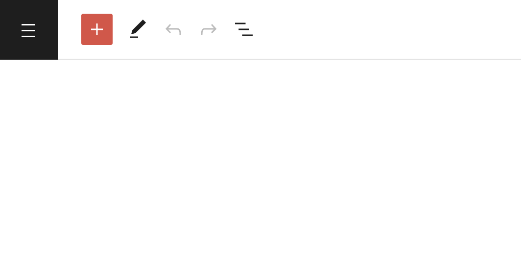
Currently, to get back to the dashboard from the editor, you need to click W icon and then "My home":
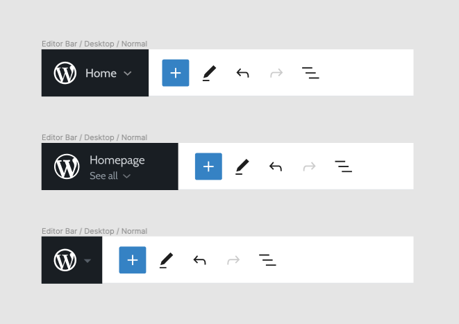
In the site editor in the core, the "back to dashboard" item is called "Dashboard":
Questions
- Would "Dashboard" be more clear than "My home"?
- How could we make it more clear what happens with W icon? Can the tooltip be more clear? Maybe just copy changes?
cc @dubielzyk since this touches editor onboarding. Do customers know how to get back when they first see the editor?
@rickybanister any quick changes we could do to make this clearer?
 simison
All 10 comments
I'd support making the link say 'dashboard' since gutenboarding folks may land in the editor before they ever see Calypso and start to understand the makeup of the pages there. Ideally we start to pull in the entire core editor sidebar as it's ready, but this is a small enough change.
 rickybanister
on 3 Nov 2020
rickybanister
on 3 Nov 2020
Do customers know how to get back when they first see the editor?
I've looked into this and whether we explain it or not. A part of me thinks that this should be obvious in the UI though. I've very very briefly looked at this before:
It's not a great solution, but I still feel like if we have to explain to people how to get back to their dashboard, then something is wrong with the UI.
 dubielzyk
on 5 Nov 2020
dubielzyk
on 5 Nov 2020
if we have to explain to people how to get back to their dashboard, then something is wrong with the UI.
I agree. @mtias @vindl @jameskoster @shaunandrews thoughts? I've also felt this to be weak point of W icon design in site editor.
simison
on 5 Nov 2020
Unpopular opinion incoming – the problem here is that the W logo does nothing to indicate "Navigation".
 jameskoster
on 5 Nov 2020
jameskoster
on 5 Nov 2020
Unpopular opinion incoming – the problem here is that the W logo does nothing to indicate "Navigation".
My thoughts exactly and your solution is actually my personal preference over site or W icon, but you were bolder to say it out loud. :-D
simison
on 5 Nov 2020
I also suspect it's not going to be obvious in its present state.
Another thing to consider is that we are displaying the site icon instead of the W icon if it's set. That's not useful for navigation either, but it will be useful for telling which site you are currently editing at a glance. We had something similar in Calypso classic editor before in a form of site card.
 vindl
on 5 Nov 2020
vindl
on 5 Nov 2020
My thoughts exactly and your solution is actually my personal preference over site or W icon, but you were bolder to say it out loud. :-D
Yolo :D
@vindl that is true. To be honest I believe this issue is one of many examples which indicate that the Top Bar iA probably needs to be re-thought at some point, so that it is able to scale more elegantly and accommodate not only the features we've added to it quite recently, but those we intend to add in the future as well.
</soapbox>
jameskoster
on 5 Nov 2020
Alright so at least we can rename the label to "Dashboard" for clarity. I'll add to create maintenance board and updated the issue description.
Bigger changes could be discussed with core design instead. @jameskoster interested to bring this convo there?
simison
on 10 Nov 2020
Yes, when the time is right :D
jameskoster
on 10 Nov 2020
It seemed quicker to whip up a PR than worry about triaging this one so I've had a go in #47539 of just changing the My Home text to Dashboard.
 andrewserong
on 18 Nov 2020
andrewserong
on 18 Nov 2020
Related issues
 aduth
·
3Comments
aduth
·
3Comments
 apeatling
·
3Comments
apeatling
·
3Comments
 gedex
·
3Comments
gedex
·
3Comments
 spen
·
3Comments
spen
·
3Comments
 jjchrisdiehl
·
3Comments
jjchrisdiehl
·
3Comments
Most helpful comment
Yes, when the time is right :D