Wp-calypso: Typography: smaller font size may be needed
There are two usages of font-size: 10px in Gutenboarding at the moment:
So i'd like to propose an update for the scales/font-size rule and typography variables.
cc: @sixhours
 razvanpapadopol
All 5 comments
I think we should update designs instead to adopt next closest font size if possible. Cc @olaolusoga
 simison
on 26 Aug 2020
simison
on 26 Aug 2020
👋 Thanks for the ping!
Do you have visual examples of the copy in action? 10px is usually very tiny, and I think we should avoid tiny fonts for better accessibility and readability.
If we absolutely can't make the font size larger (I think 12px is the next closest size) then adding exceptions (as you've done) is the way to go, rather than adding a tiny font size to the scale, which would encourage its use.
But I'm open to your thoughts!
 sixhours
on 31 Aug 2020
sixhours
on 31 Aug 2020
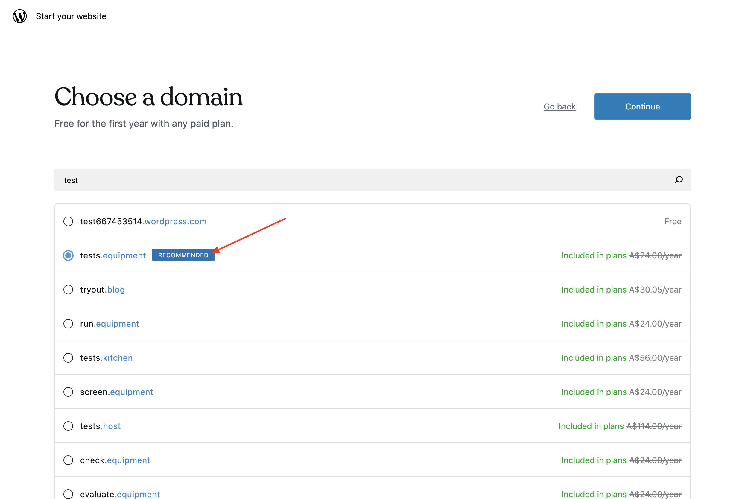
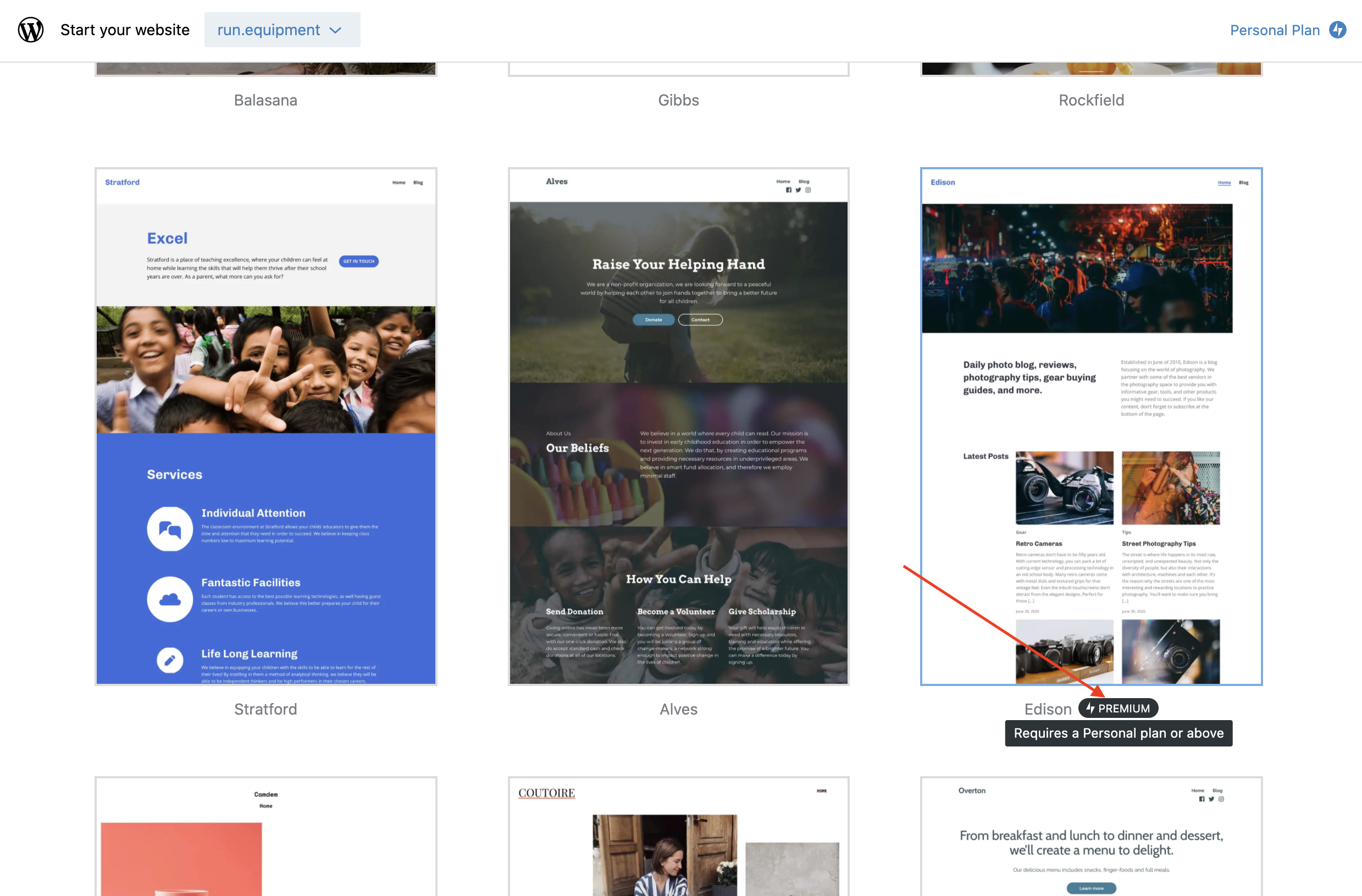
Here are screenshots with the exceptions:
I agree with keeping them as exceptions or even extracting to a Tag component which could become the only exception.
@ollierozdarz what do you think?
razvanpapadopol
on 27 Oct 2020
@razvanpapadopol I'm fine with either solution. I think 10px when in uppercase looks better in these type of tag/label scenarios, but it's quite a fine detail, so not worth the extra work if it's a pain.
 ollierozdarz
on 28 Oct 2020
ollierozdarz
on 28 Oct 2020
Ok, so there is a good reason to keep them as exceptions. Thanks for your input!
Closing this issue for now.
razvanpapadopol
on 3 Nov 2020
Related issues
 aduth
·
3Comments
aduth
·
3Comments
 samouri
·
3Comments
samouri
·
3Comments
 BrookeDot
·
3Comments
samouri
·
3Comments
BrookeDot
·
3Comments
samouri
·
3Comments
 kellychoffman
·
3Comments
kellychoffman
·
3Comments
Most helpful comment
@razvanpapadopol I'm fine with either solution. I think 10px when in uppercase looks better in these type of tag/label scenarios, but it's quite a fine detail, so not worth the extra work if it's a pain.