Wp-calypso: (8P) Premium Blocks: Add Upgrade banner to Placeholder
Instead of the upgrade nudge, let's add a banner to the placeholder that lets users upgrade their plan.
When clicking on the right-hand button, users should be taken to the checkout flow for the required plan: https://wordpress.com/checkout/{SITE}/premium#step2
To do that, we should
- Save the post (see here for example code).
- Land them back at that editor page after checkout.
Screenshot / Video
See 123-gh-dotcom-manage
 obenland
All 11 comments
@davemart-in:
- Are there any premium Jetpack blocks that need a paid upgrade to use, that currently show up in the inserter?
- Where do we need to link to the Jetpack checkout flow?
obenland
on 13 Jul 2020
@obenland the payments block requires a paid upgrade in JP. The "Pay with PayPal" (previously Simple Payments) block used to be in JP as well, but I no longer see it. I pinged in the Earn channel to get the scoop on that one.
 davemart-in
on 14 Jul 2020
davemart-in
on 14 Jul 2020
The "Pay with PayPal" (previously Simple Payments) block used to be in JP as well, but I no longer see it. I pinged in the Earn channel to get the scoop on that one.
I've been testing with my simple site and it shows there.
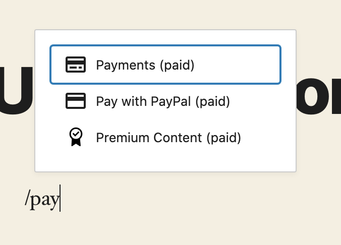
Also, it shows the Upgrade button in the PR https://github.com/Automattic/jetpack/pull/16482
 retrofox
on 14 Jul 2020
retrofox
on 14 Jul 2020
@davemart-in Sorry for the double-ping, but the screenshot above shows the new UI well. Should the upgrade nudge be removed with the addition of the button?
obenland
on 14 Jul 2020
Should the upgrade nudge be removed with the addition of the button?
Yes please. Let's remove the old banners.
davemart-in
on 15 Jul 2020
@retrofox I updated the description of this ticket to reflect the new direction.
obenland
on 15 Jul 2020
two questions about the design:
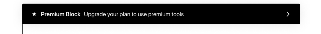
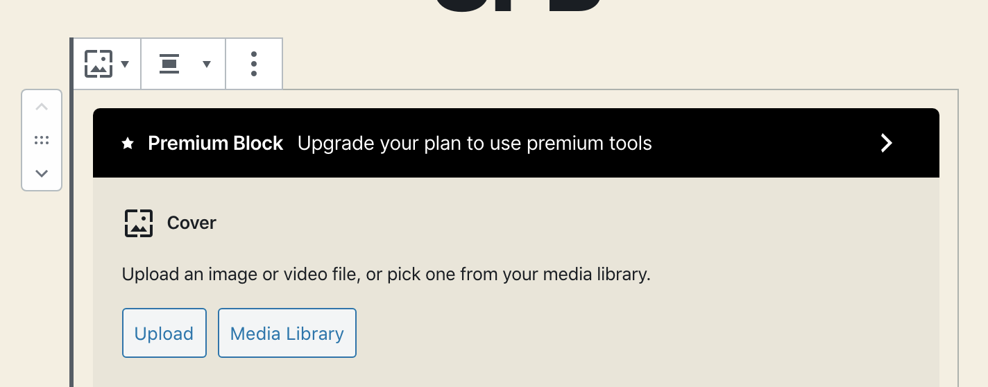
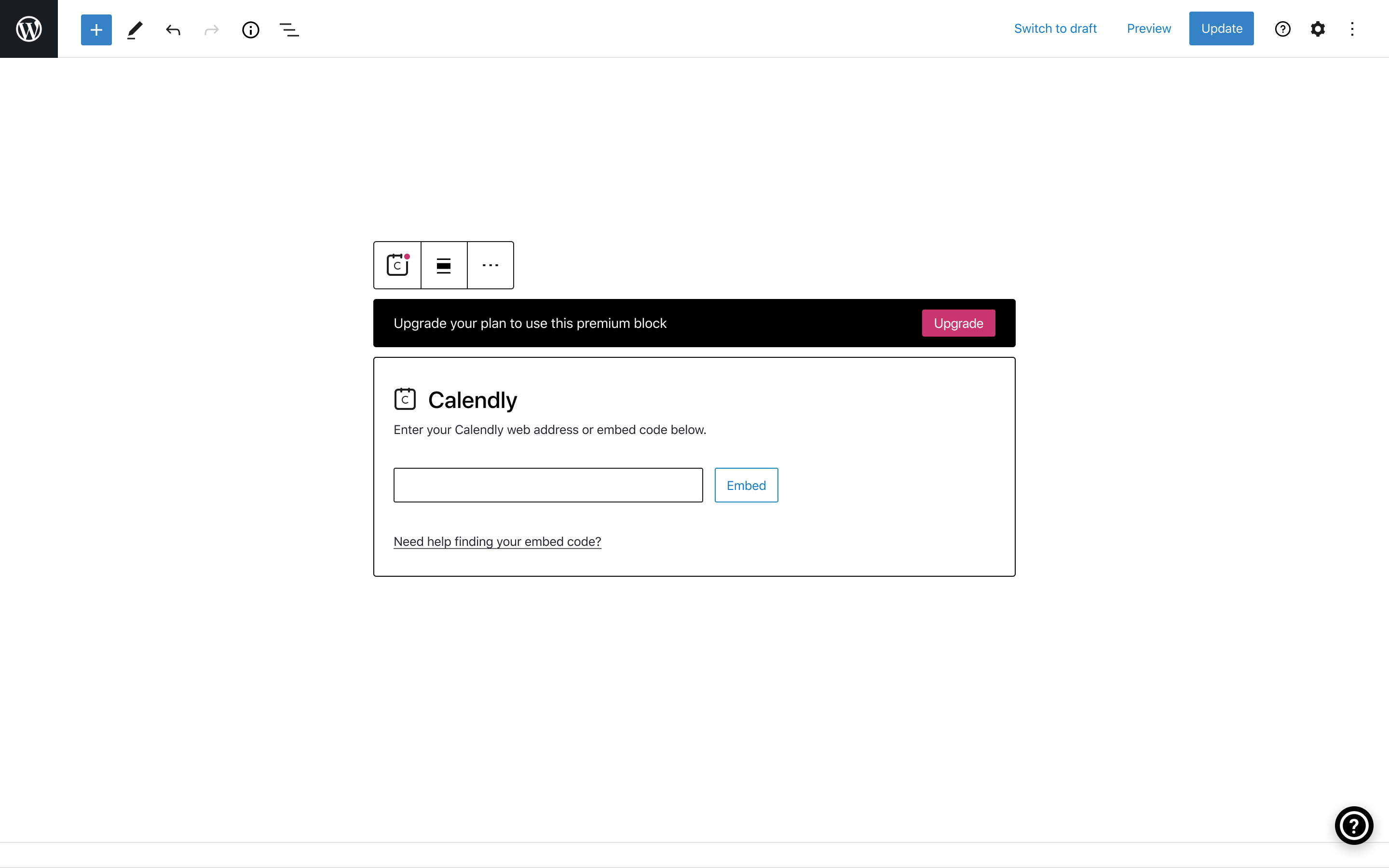
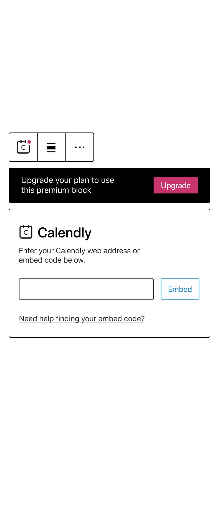
Do you have details such as height, font-size, icon size, etc? The following shows how looks the current implementation.
what's the area used to click on and thus redirects the user to the checkout? I've defined the chevron button, but maybe it's the whole banner?
retrofox
on 16 Jul 2020
two questions about the design:
cc @jancavan @sfougnier in case you miss the comment
retrofox
on 16 Jul 2020
Do you have details such as height, font-size, icon size, etc? The following shows how looks the current implementation.
- Font size is 14px
- Container height is 48px within the block
- The icon will be removed as per new feedback, so disregard that for now.
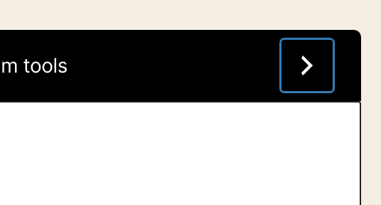
what's the area used to click on and thus redirects the user to the checkout? I've defined the chevron button, but maybe it's the whole banner?
The chevron is being swapped for a button to align with the sidebar.
This screenshot should be a good indicator of where this bar is heading. Color may shift but the rest of the parameters should remain the same.

 sfougnier
on 16 Jul 2020
sfougnier
on 16 Jul 2020
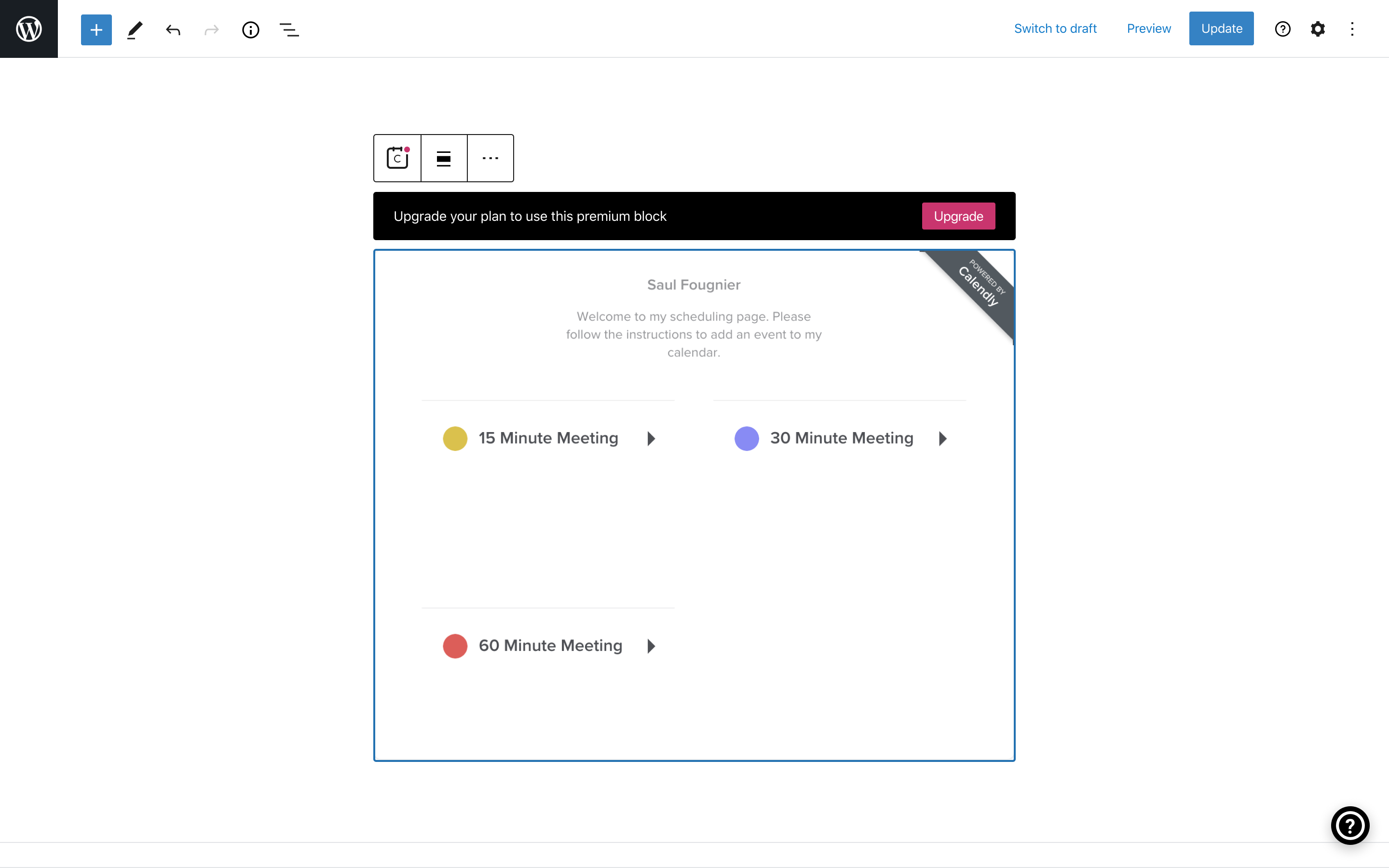
@sfougnier this is the current status.
 cpapazoglou
on 16 Jul 2020
cpapazoglou
on 16 Jul 2020
Latest design
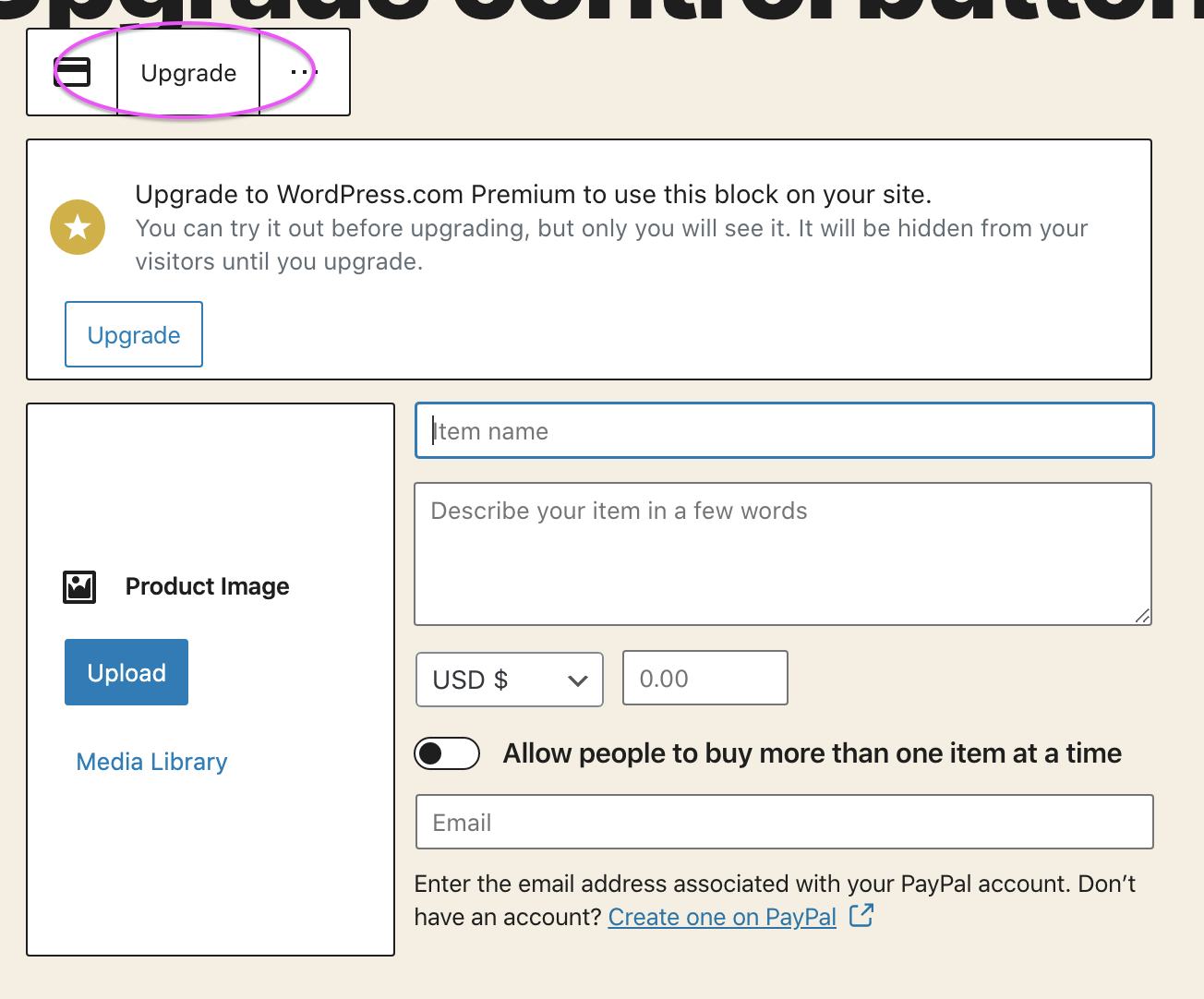
To build on the previous comment, the latest designs maintain the same parameters below:
- Font size is 14px
- Container height is 48px within the block
- The icon has been removed
- The chevron is replaced with a button
In terms of expected functionality:
- Banners now appear across the placeholder and preview states of the blocks (see below)
- Banners appear when the block is selected and disappear along with the toolbar when the block is inactive
- To ensure banners are scalable across different block types, the banner has been detached from the block and is now floating between the toolbar (see below)
- Banners will be removed entirely once a user has upgraded
Desktop
Mobile
Design Links
Flow states
Block states
sfougnier
on 17 Jul 2020
Related issues
 samouri
·
3Comments
samouri
·
3Comments
 kellychoffman
·
3Comments
kellychoffman
·
3Comments
 spen
·
3Comments
spen
·
3Comments
 rickybanister
·
3Comments
rickybanister
·
3Comments
 jjchrisdiehl
·
3Comments
jjchrisdiehl
·
3Comments
Most helpful comment
The chevron is being swapped for a button to align with the sidebar.
This screenshot should be a good indicator of where this bar is heading. Color may shift but the rest of the parameters should remain the same.
