Wp-calypso: Gutenboarding: upgrades to domains page
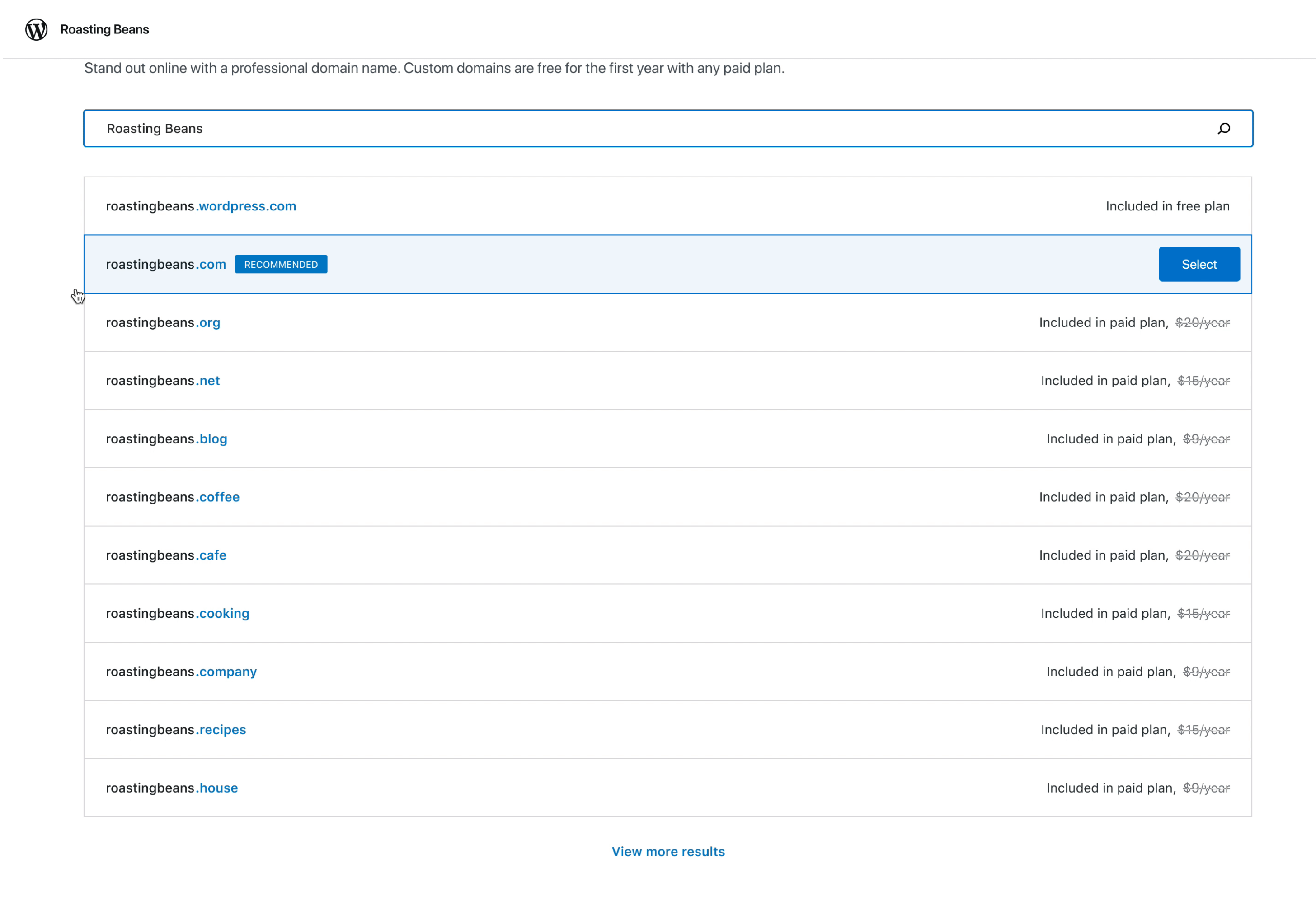
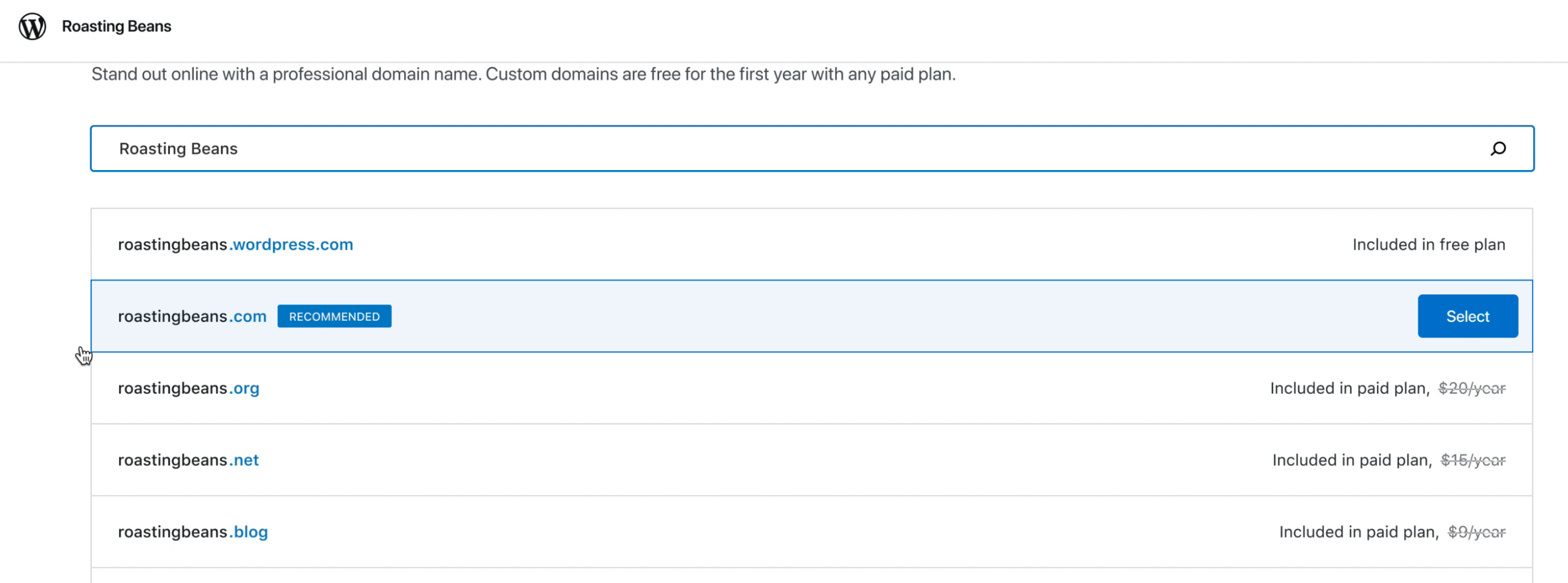
Desktop
See video https://d.pr/i/CdUyXQ
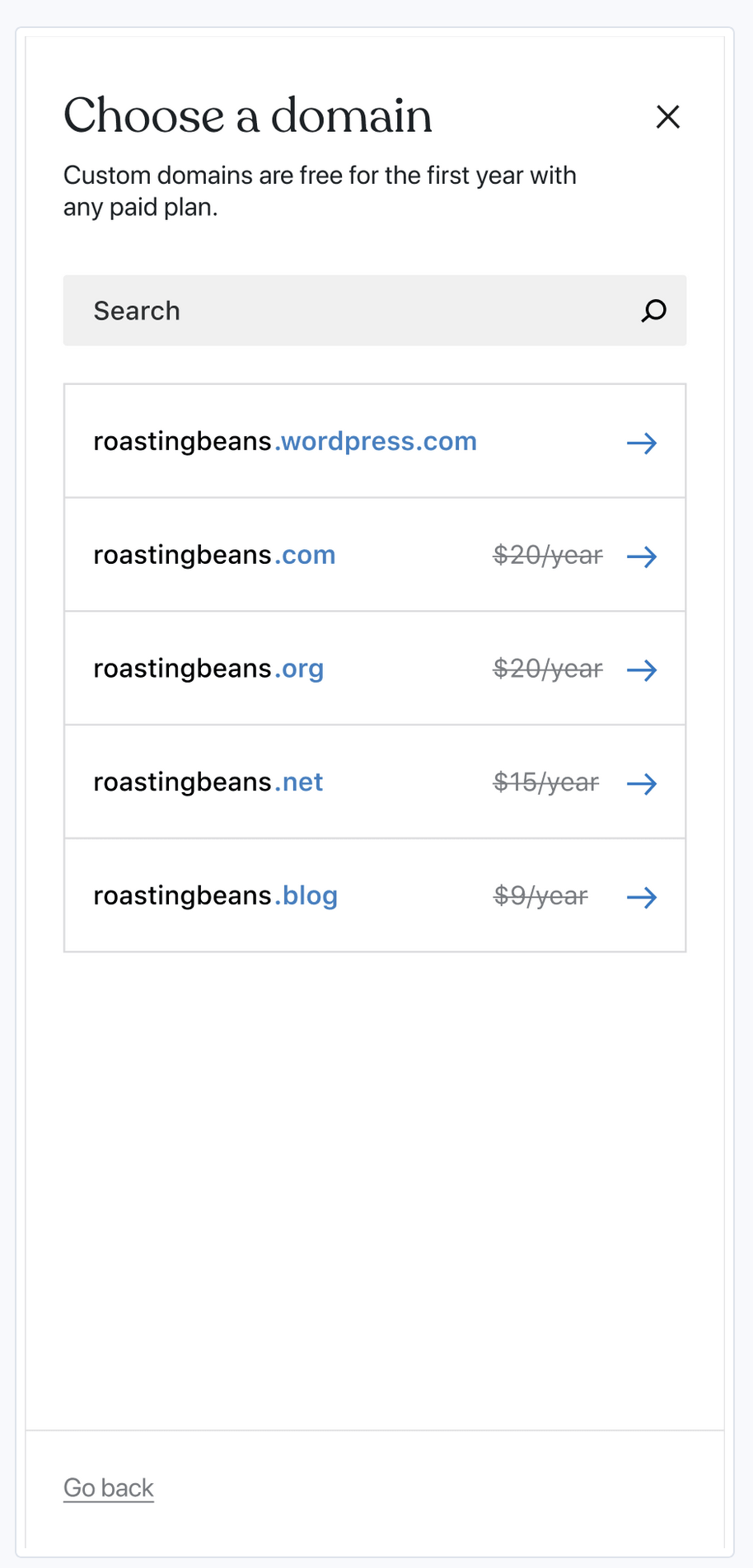
Mobile
Changes summary
- Remove the radio buttons, and skip for now button. The two step process was cumbersome, and felt weird when a person selects a domain, and then needs to find "continue".
- With removing the top right button, a person can just select a domain, and continue.
- The hover state will surface the "select" CTA
- There is no more "skip for now", we need a person to select a domain/sub-domain to continue. Without a domain/sub-domain we'd be assigning folks a random sub-domain/site name, which we want to avoid.
 simison
All 8 comments
The hover state will surface the "select" CTA
Hover functionality can be problematic for screenreader setups.
Please correct me but probably just have to make sure each domain option is focus/clickable in some way.
 lsl
on 16 Jun 2020
lsl
on 16 Jun 2020
Please correct me but probably just have to make sure each domain option is focus/clickable in some way.
I suppose when the list is focused by tabbing, the button appears so it comes clickable.
 yansern
on 16 Jun 2020
yansern
on 16 Jun 2020
Hmm, design doesn't show how it's supposed to look like when an item is selected. Since radio button is now removed.
yansern
on 16 Jun 2020
Hmm, design doesn't show how it's supposed to look like when an item is selected. Since radio button is now removed.
There won't be selected state — we'd move straight to next step or close the modal on domain selection.
simison
on 16 Jun 2020
There won't be selected state — we'd move straight to next step or close the modal on domain selection.
Oh okay! :)
yansern
on 16 Jun 2020
@olaolusoga @dubielzyk in these designs "free" is again on top of the list:
We were about to move to this order as per pbAok1-11X-p2:
recommended
free
the rest
Which way should it be?
simison
on 18 Jun 2020
I've personally wanted Free at the top, but I don't have strong feelings. Perhaps go for Recommended at the top and Free next, then the rest.
 dubielzyk
on 18 Jun 2020
dubielzyk
on 18 Jun 2020
+1 to Recommended, Free, the rest.
 olaolusoga
on 18 Jun 2020
olaolusoga
on 18 Jun 2020
Related issues
 samouri
·
3Comments
samouri
·
3Comments
samouri
·
3Comments
samouri
·
3Comments
 spen
·
3Comments
spen
·
3Comments
 jeherve
·
3Comments
jeherve
·
3Comments
 kellychoffman
·
3Comments
kellychoffman
·
3Comments