Wp-calypso: Jetpack Search: add product specific Thank you modal for WP.com sites.
What I expected
For WP.com sites, switch the post-checkout Thank you modal to My Home task card.
Inspiration:
 AnnaMag
All 17 comments
@rickybanister could you elaborate on the design, please?
Should Thank you step for WP.com sites be a separate modal with the relevant styling or turned into a Card in /home?
AnnaMag
on 19 May 2020
Let me pull in @danhauk and @lcollette here.
Dan can share some mockups of the proposed post-purchase thank you experience (which is similar to what you're showing above).
If we don't want folks to get distracted by other options on customer home and configure search immediately, then a modal might be more appropriate, but I would use the thank you / task card design as inspiration for the modal content.
And 'modal' might not be the best word, a page by itself with the setup search task and perhaps some light weight supporting information about the feature might work better than a modal covering some other screen.
 rickybanister
on 19 May 2020
rickybanister
on 19 May 2020
@danhauk, @lcollette any updates on this?
AnnaMag
on 3 Jun 2020
@AnnaMag Sorry for the delay on this. @olesyabrk has this on her radar and will have an update here by end of the week.
 lcollette
on 4 Jun 2020
lcollette
on 4 Jun 2020
@AnnaMag this is the Thank You page you're referring to, correct?
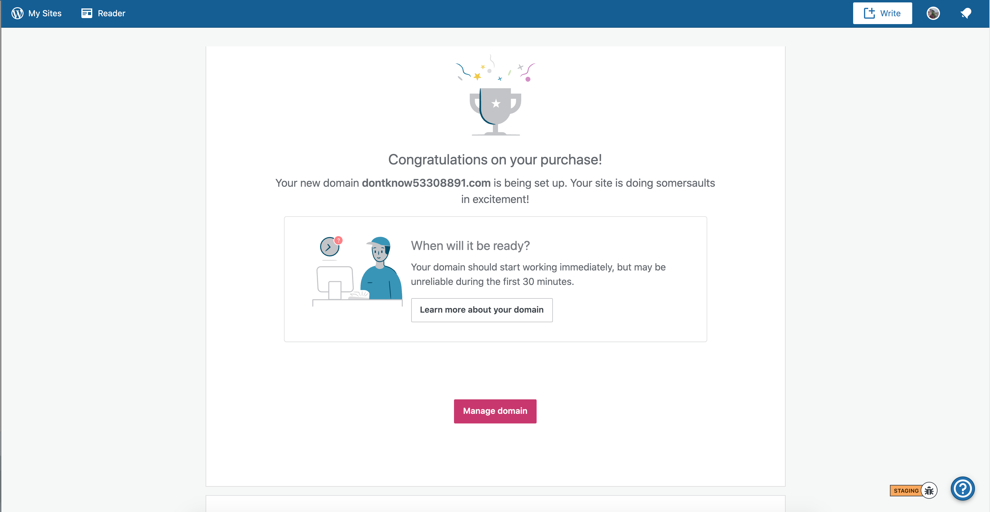
And for new domains:
 olesyabrk
on 4 Jun 2020
olesyabrk
on 4 Jun 2020
@olesyabrk the first one, post product purchase, analogous to Jetpack experience and message.
Thank you.
AnnaMag
on 5 Jun 2020
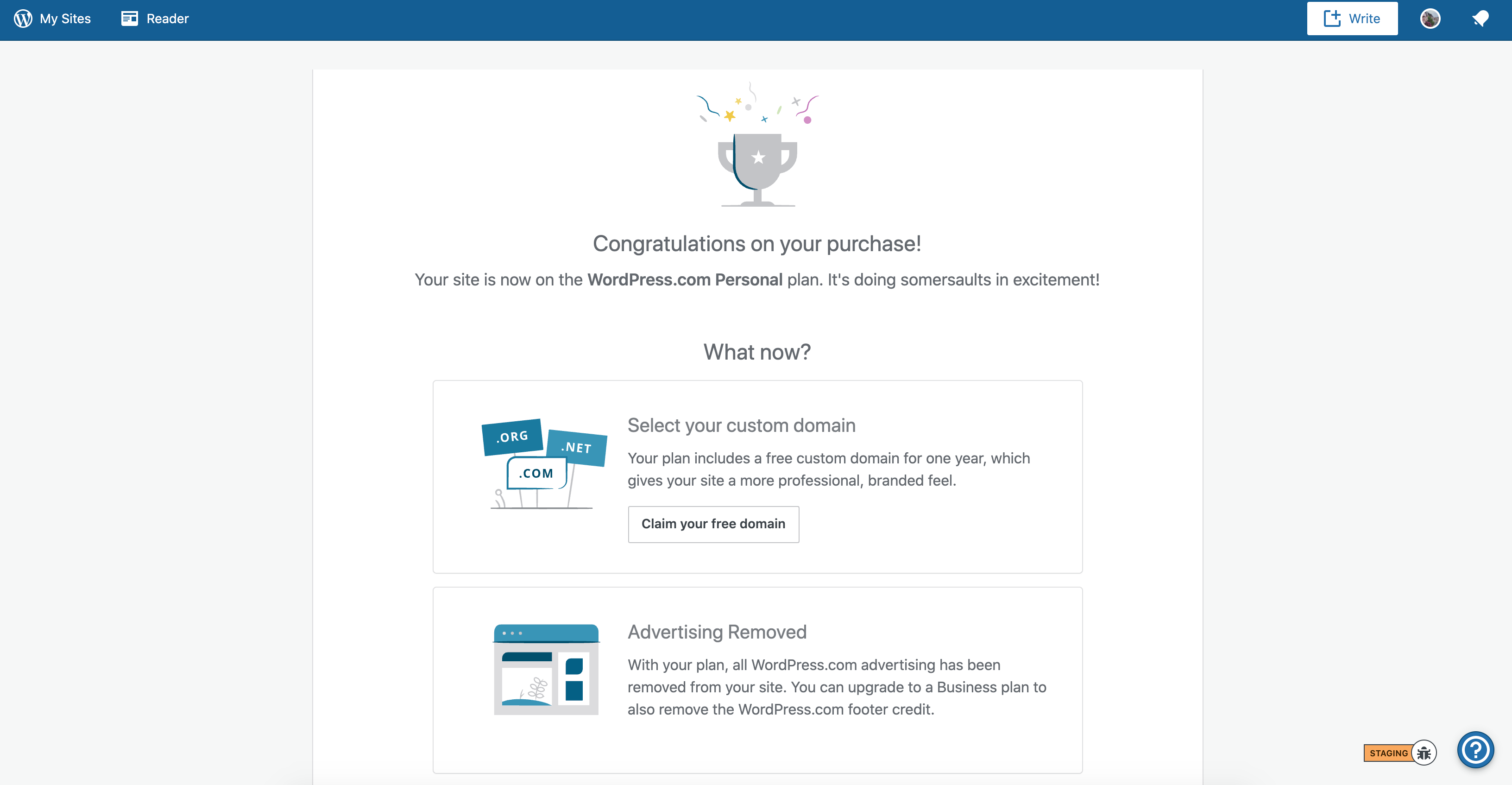
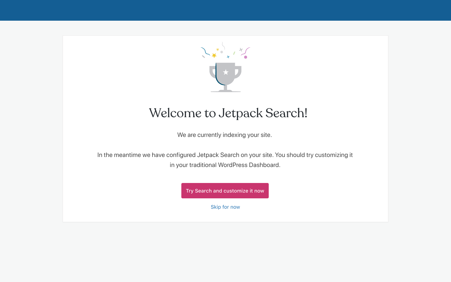
Here is the traditional Calypso thank you screen.
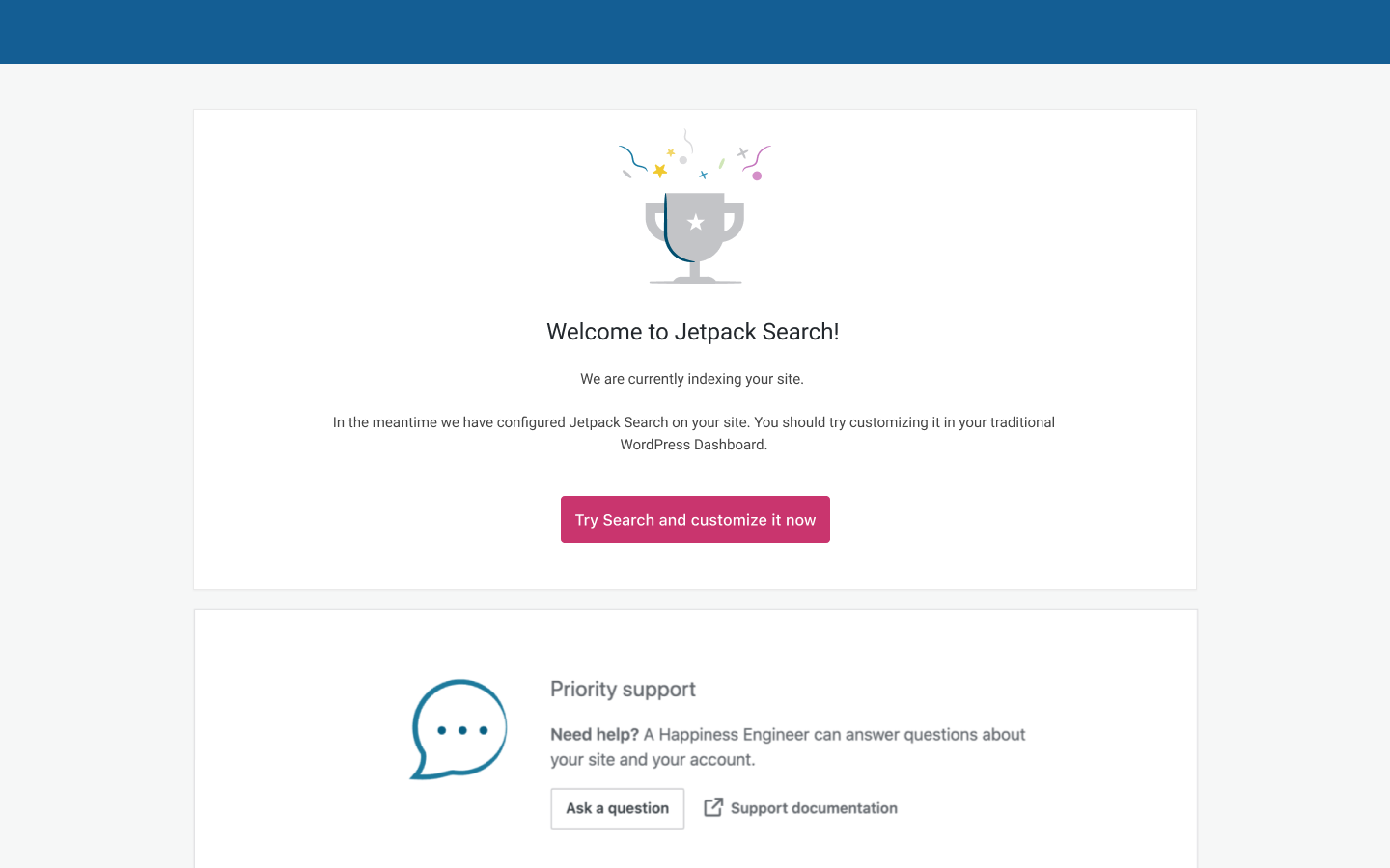
And here is the same in a new styling used for Customer Home.

@rickybanister should we start adapting our new styles?
olesyabrk
on 9 Jun 2020
Thanks @olesyabrk, yes we should definitely start adapting/adopting the new styles.
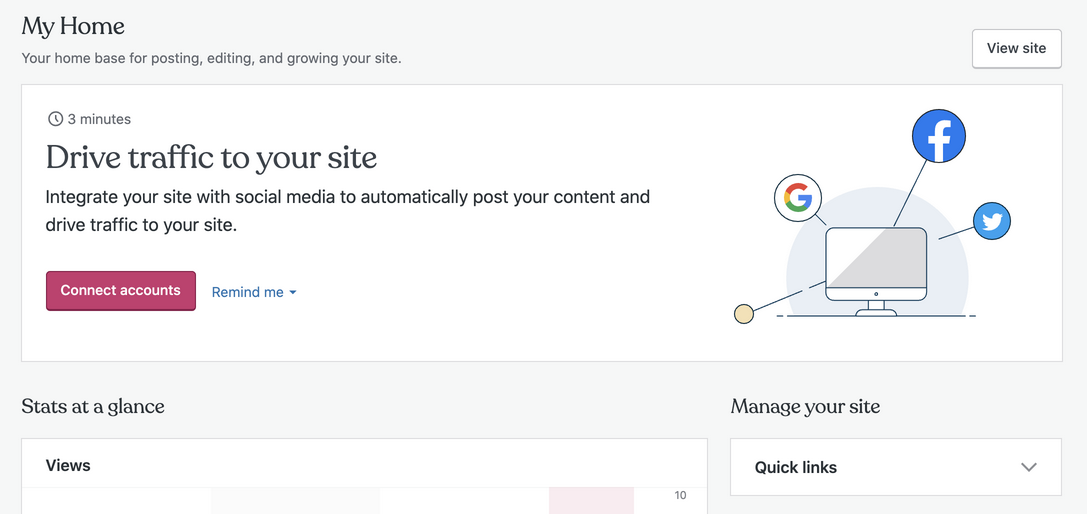
I think I mentioned above that we should be moving the thank you 'page' to be a congratulatory banner on My Home. For standard plan purchases I think that makes the most sense.
For Jetpack Search, since it's a special add-on with its own flow and it needs to be configured in the customizer for now, I think the stand-alone page makes sense for the time being.
That said, when full site editing becomes our reality and search becomes just another block it may make sense to land customers on My Home and add a task or checklist item to configure their purchase.
@AnnaMag maybe we could log that as a future improvement?
rickybanister
on 9 Jun 2020
@rickybanister
I think I mentioned above that we should be moving the thank you 'page' to be a congratulatory banner on My Home. For standard plan purchases I think that makes the most sense.
Agreed, pinging @danhauk to see if a plan Thank You banner is something he's working on.
That said, when full site editing becomes our reality and search becomes just another block it may make sense to land customers on My Home and add a task or checklist item to configure their purchase.
Love this idea not only for Jetpack Search, but for all subsequent premium blocks.
olesyabrk
on 9 Jun 2020
thanks, everyone!
@olesyabrk, could you clarify which mock refers to the final design?
AnnaMag
on 18 Jun 2020
@AnnaMag yes, of course. Here:
olesyabrk
on 18 Jun 2020
We opted for excluding the "Skip" option in the Jetpack version of the modal to gently direct attention to the Customizer (and experience product value). Shall we keep the "Skip for now" for WP.co sites? If so, where should it point to? /cc @rickybanister, @gibrown
AnnaMag
on 18 Jun 2020
Curious to hear back from the cc'ed folks. My two cents are: the "Skip for now" option provides freedom to our users to go back to Customer Home. Coupled with a gentle nudge/reminder at the Customer Home level, we encourage freedom of movement/choice and aren't forcing our customers into a linear path.
olesyabrk
on 18 Jun 2020
@olesyabrk there were two reasons:
- They bought a specific product, so let's just take them to where they can see it. Also, we are explicitly turning it on for their site, so it feels like we should show them it and take them right to the customizer. It feels like adding a "Skip" at this point is just going to lead them down the wrong path. They can always skip on the next screen.
- They were JP users and so leaving them in Calypso rarely makes sense since it is kinda an unknown interface to them, so better to return them to their site anyways
(2) mostly doesn't apply, but since our purchases are really going through jetpack.com, hopping back to their site customization seems like a good thing anyways.
 gibrown
on 20 Jun 2020
gibrown
on 20 Jun 2020
@gibrown:
- They bought a specific product, so let's just take them to where they can see it. Also, we are explicitly turning it on for their site, so it feels like we should show them it and take them right to the customizer. It feels like adding a "Skip" at this point is just going to lead them down the wrong path. They can always skip on the next screen.
I don't think Skip will lead them down the wrong path. It's a secondary button and if they're planning to use the product and customize it, they will go ahead and do that without being forced to. But say, the user doesn't have the time to dive deeper, Skip will lead them to the Customer Home that will have a reminder to get back to customization at a later point.
- They were JP users and so leaving them in Calypso rarely makes sense since it is kinda an unknown interface to them, so better to return them to their site anyways
This mock is for dotcom users who are familiar with Calypso and Customer Home, as a hub for notifications and next steps.
olesyabrk
on 22 Jun 2020
I tend to agree with @gibrown about the skip button. I tend 90% of the time to prefer giving customers a choice, but in this case they may wrongly assume that they have Search active, when in fact they don't. 'Skip for now' won't set up some kind of later reminder for them to visit the customizer (unless we build a mechanism), so it will leave them kind of stuck. We saw the same sort of thing with VaultPress in Jetpack plans. An alarming number of people bought plans and never actually provided credentials so their sites weren't backed up (though they likely assumed it had been done for them).
If we can circle back and add a task card or notification or email reminder or something then skip does make sense.
rickybanister
on 23 Jun 2020
Yes, without a follow up notice on Customer Home, I will also opt in to remove Skip for now.
olesyabrk
on 23 Jun 2020
Related issues
 samouri
·
3Comments
rickybanister
·
3Comments
samouri
·
3Comments
rickybanister
·
3Comments
 aduth
·
3Comments
aduth
·
3Comments
 jeherve
·
3Comments
jeherve
·
3Comments
 kellychoffman
·
3Comments
kellychoffman
·
3Comments
Most helpful comment
Thanks @olesyabrk, yes we should definitely start adapting/adopting the new styles.
I think I mentioned above that we should be moving the thank you 'page' to be a congratulatory banner on My Home. For standard plan purchases I think that makes the most sense.
For Jetpack Search, since it's a special add-on with its own flow and it needs to be configured in the customizer for now, I think the stand-alone page makes sense for the time being.
That said, when full site editing becomes our reality and search becomes just another block it may make sense to land customers on My Home and add a task or checklist item to configure their purchase.
@AnnaMag maybe we could log that as a future improvement?