Wp-calypso: Sidebar: Move site switcher to the bottom
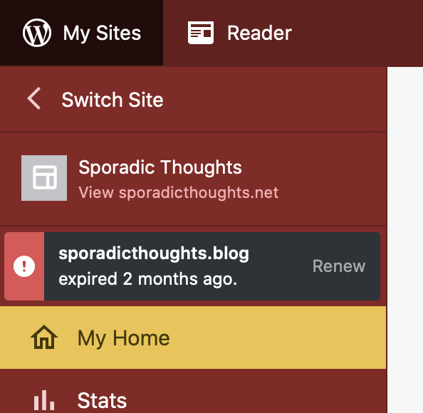
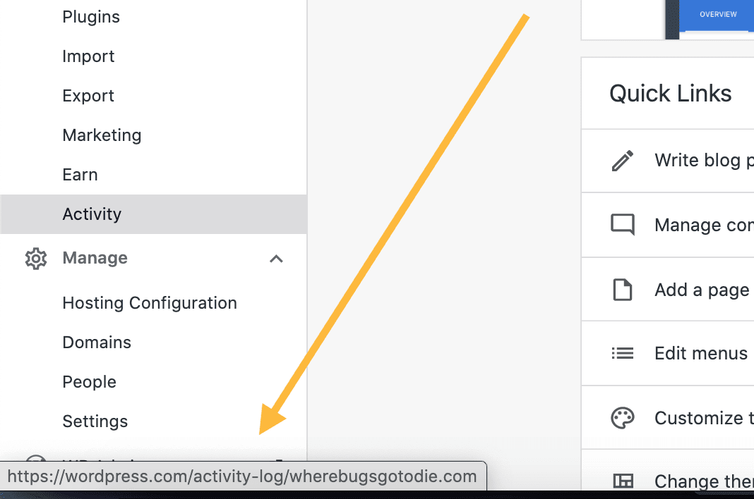
When an account has multiple sites, Calypso shows a button to view a list of sites and select one (or all) to manage. Right now this UI exists at the top of the sidebar:
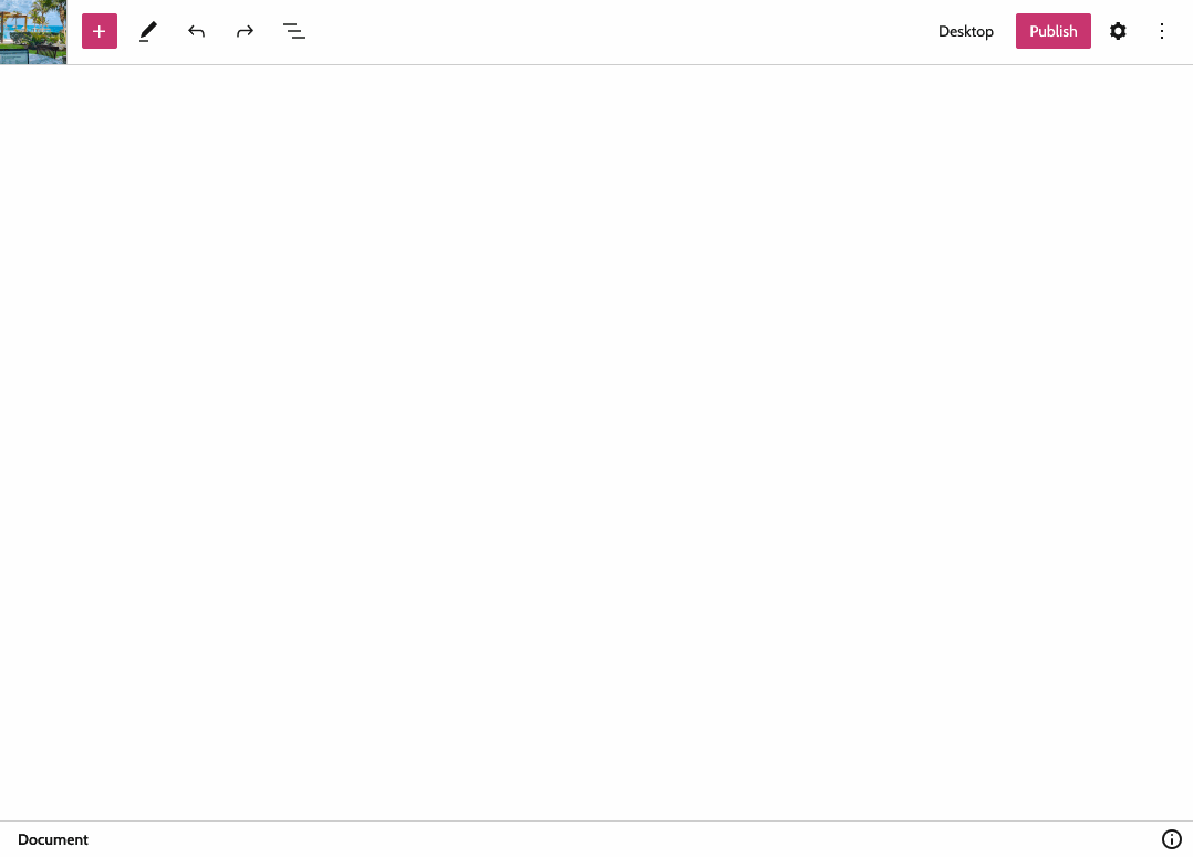
We're looking at ways to expose the Calypso sidebar while in the block editor, similar to Core (https://github.com/WordPress/gutenberg/pull/21121). Here's a rough mockup of what that could look like:

As you can imagine, these two things would conflict; Having the site switcher above the site card when viewing the sidebar within the editor would be strange. One option is to simply remove the site switcher from the sidebar within the editor, but that seems arbitrarily limiting.
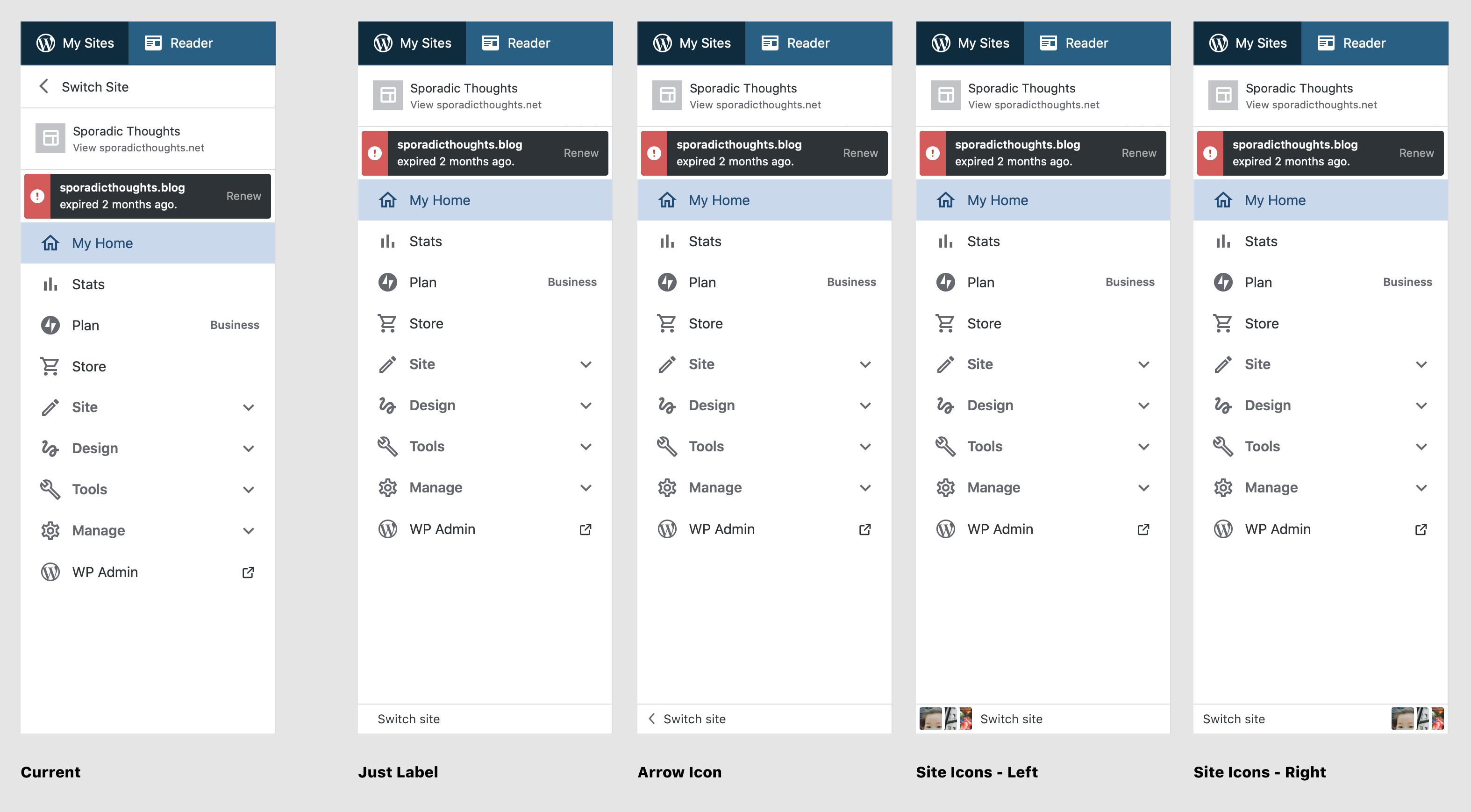
Instead, I suggest we move the site switcher to the bottom of the sidebar everywhere. Here's a few explorations:
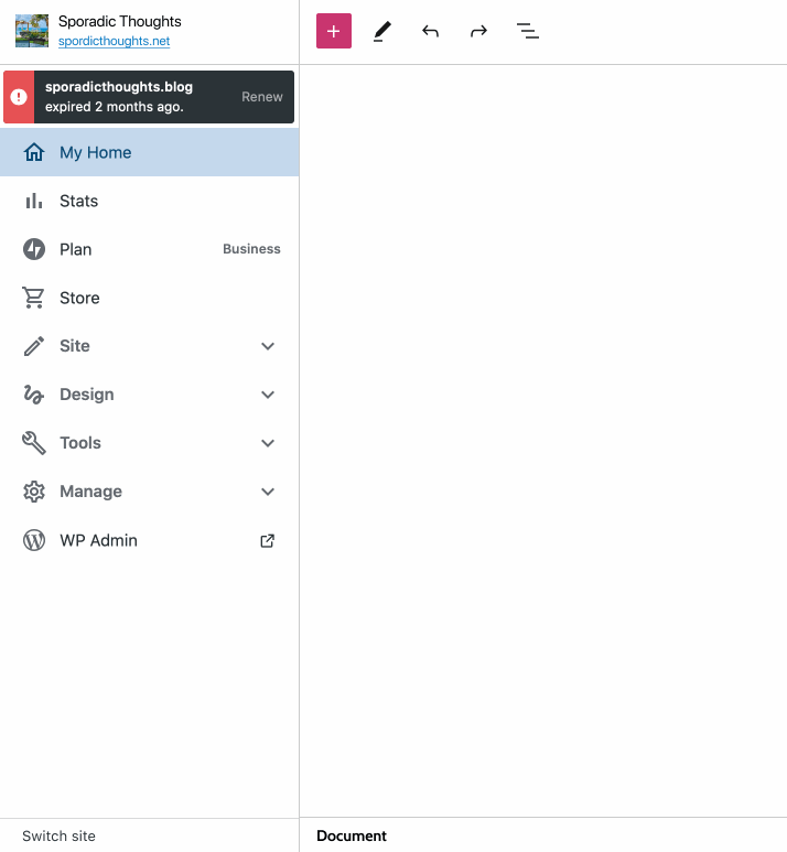
And here's how it could look when toggling the sidebar from within the editor:
 shaunandrews
All 5 comments
One (semi-related) question that I have is how the site switcher should work within the editor. If I click on the switcher, I'd expect the sidebar to slide over and reveal my list of sites. Once I select a site however, things get tricky. Do we...
- ...exit the editor and load the list of posts/pages (or whatever post_type was previously being edited)?
- ...load a blank document (again, based on the previous post_type)?
- ...keep the editor open and load the same document for the newly select site, when possible. (Outside of the homepage this likely makes no sense.)
shaunandrews
on 21 Apr 2020
My preference is the arrow icon. The arrow helps provide that affordance of the behavior if I click it. The arrow does feel a bit cramped in the smaller space though.
Visually, I like the site icons on the right, but it keeps pulling my focus down as I'm trying to scan the menu. I would also expect the site switcher to slide up from the bottom which doesn't match the behavior.
Not related to the site switcher but I want to say I love the site icon animation on the sidebar. It really helps create that consistency between the editor sidebar and Calypso sidebar.
 danhauk
on 21 Apr 2020
danhauk
on 21 Apr 2020
Once I select a site however, things get tricky.
Personally, I would expect it to load a blank document based on the previous post type. But that's as someone who knows how WP works. This could actually be a good candidate for some quick usability testing with Usability Hub. We could spin up a quick test just to find out what people expect to happen if they switch their site within the editor.
Also just to document it, the editor does have a browser alert if you try to exit without saving to help mitigate concerns about people losing work by accidentally switching.
danhauk
on 21 Apr 2020
I would also expect the site switcher to slide up from the bottom which doesn't match the behavior.
I'm not sure its necessary for this issue, but maybe the site switcher _should_ come up from the bottom?
shaunandrews
on 21 Apr 2020
When something important lands in the bottom-right corner of the screen, it gets covered by the browser dialogue
Urgency: I don't thing this will be a huge issue - people will figure it out after clicking around for a bit.
Out of curiosity - why have it segmented from the other sidebar items, and not have it live under the WP-Admin button in the sidebar? The more our actions live in that cascade, the fewer places a customer's brain has to think to check for stuff.
 gracie
on 28 Apr 2020
gracie
on 28 Apr 2020
Related issues
 BrookeDot
·
3Comments
BrookeDot
·
3Comments
 spen
·
3Comments
spen
·
3Comments
 jjchrisdiehl
·
3Comments
jjchrisdiehl
·
3Comments
 hoverduck
·
3Comments
hoverduck
·
3Comments
 rickybanister
·
3Comments
rickybanister
·
3Comments
Most helpful comment
When something important lands in the bottom-right corner of the screen, it gets covered by the browser dialogue
Urgency: I don't thing this will be a huge issue - people will figure it out after clicking around for a bit.
Out of curiosity - why have it segmented from the other sidebar items, and not have it live under the WP-Admin button in the sidebar? The more our actions live in that cascade, the fewer places a customer's brain has to think to check for stuff.