Wp-calypso: Typography: Further standardize font weights across Calypso
We've removed font-weight: 300 from Calypso's vocabulary, and even set up a linter to catch instances that fall outside any given parameters. It looks like we use 500, 600, and 700 frequently:
- 500: https://github.com/Automattic/wp-calypso/search?q=%22font-weight%3A+500%22&unscoped_q=%22font-weight%3A+500%22
- 600: https://github.com/Automattic/wp-calypso/search?q=%22font-weight%3A+600%22&unscoped_q=%22font-weight%3A+600%22
- 700: https://github.com/Automattic/wp-calypso/search?q=%22font-weight%3A+700%22&unscoped_q=%22font-weight%3A+700%22
Should we add these to the "approved" array for linting purposes? Or consider winnowing these down to 1-2 additional font weights besides 400?
 sixhours
All 9 comments
Example where a bold weight of 700 feels too bold: https://github.com/Automattic/wp-calypso/pull/41229#issuecomment-615349411
/cc @dotcom-manage-design what do you think? Should we swap 700 weight for 500? or allow both?
sixhours
on 20 Apr 2020
Thanks for highlighting the inconsistencies, @sixhours! It looks like 600 is the more frequently used weight. What if we update the 500 and 700 weights to be 600 and standardize there?
 lcollette
on 20 Apr 2020
lcollette
on 20 Apr 2020
That sounds good to me! I'll spot-check some instances to see how that changes the visuals and comment here with those screenshots.
sixhours
on 20 Apr 2020
Banners are probably one of the most widespread instances of font-weight: 500 in action. This shows what it would look like to go up to 600.
| 500 | 600 |
| ------- | ------ |
| 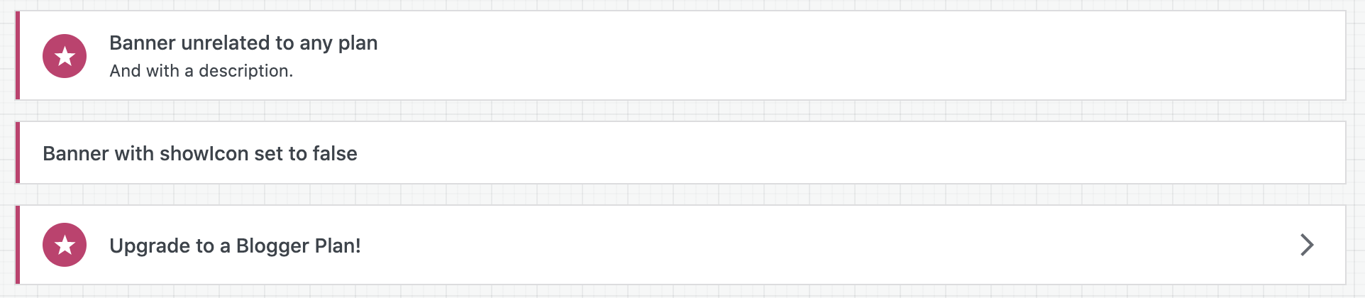 |
| 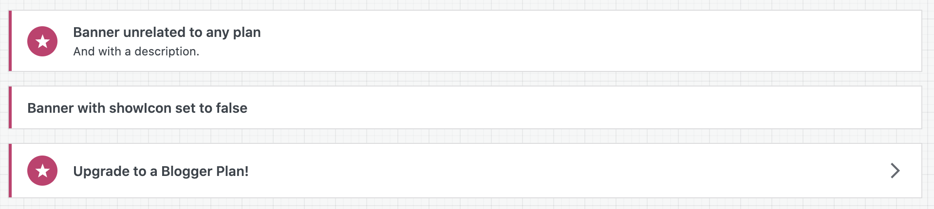 |
|
I'm trying to find other similar examples where making a change to one component would affect a series of UI elements across Calypso. I'll do more of that tomorrow.
sixhours
on 20 Apr 2020
I admit I'm loving the 600 over the 700.
 kwight
on 21 Apr 2020
kwight
on 21 Apr 2020
I opened an issue on the stylelint-scales repo; I think this is something we can fix ourselves, but ideally the plugin itself is updated too: https://github.com/signal-noise/stylelint-scales/issues/37
sixhours
on 23 Apr 2020
@sixhours We just pushed v1.3.0 https://github.com/signal-noise/stylelint-scales/releases/tag/v1.3.0
Let us know if you encounter any further issues. 👍
 digitaljohn
on 28 Apr 2020
digitaljohn
on 28 Apr 2020
@sixhours can this one be closed out or are we still working on it?
 davemart-in
on 15 Jun 2020
davemart-in
on 15 Jun 2020
I think it can be closed out, I've done the majority of the big conversions, and I'm fixing others as I work on typography elsewhere when the linter picks them up.
sixhours
on 15 Jun 2020
Related issues
 BrookeDot
·
3Comments
BrookeDot
·
3Comments
 samouri
·
3Comments
samouri
·
3Comments
 ehg
·
3Comments
ehg
·
3Comments
 kellychoffman
·
3Comments
kellychoffman
·
3Comments
 roccotripaldi
·
3Comments
roccotripaldi
·
3Comments
Most helpful comment
I admit I'm loving the
600over the700.