Wp-calypso: (3P) Media: Library storage space indicator upgrade should explain storage options
I think this would benefit from having a tooltip on hover to perhaps explain how much extra storage you can get.
 rickybanister
All 8 comments
Once this has a design I'll be happy to triage it.
 davemart-in
on 25 May 2020
davemart-in
on 25 May 2020
44037 updates the hit state but does not add a tooltip or any other design work for this one.
 sixhours
on 13 Jul 2020
sixhours
on 13 Jul 2020
That's a great start, thanks @sixhours!
rickybanister
on 13 Jul 2020
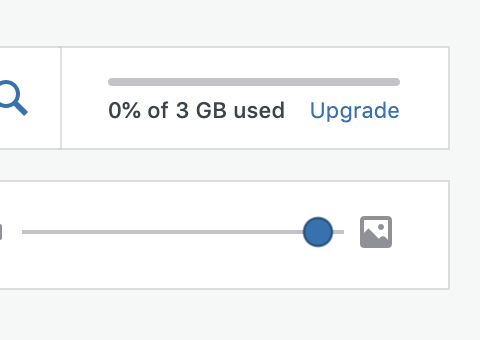
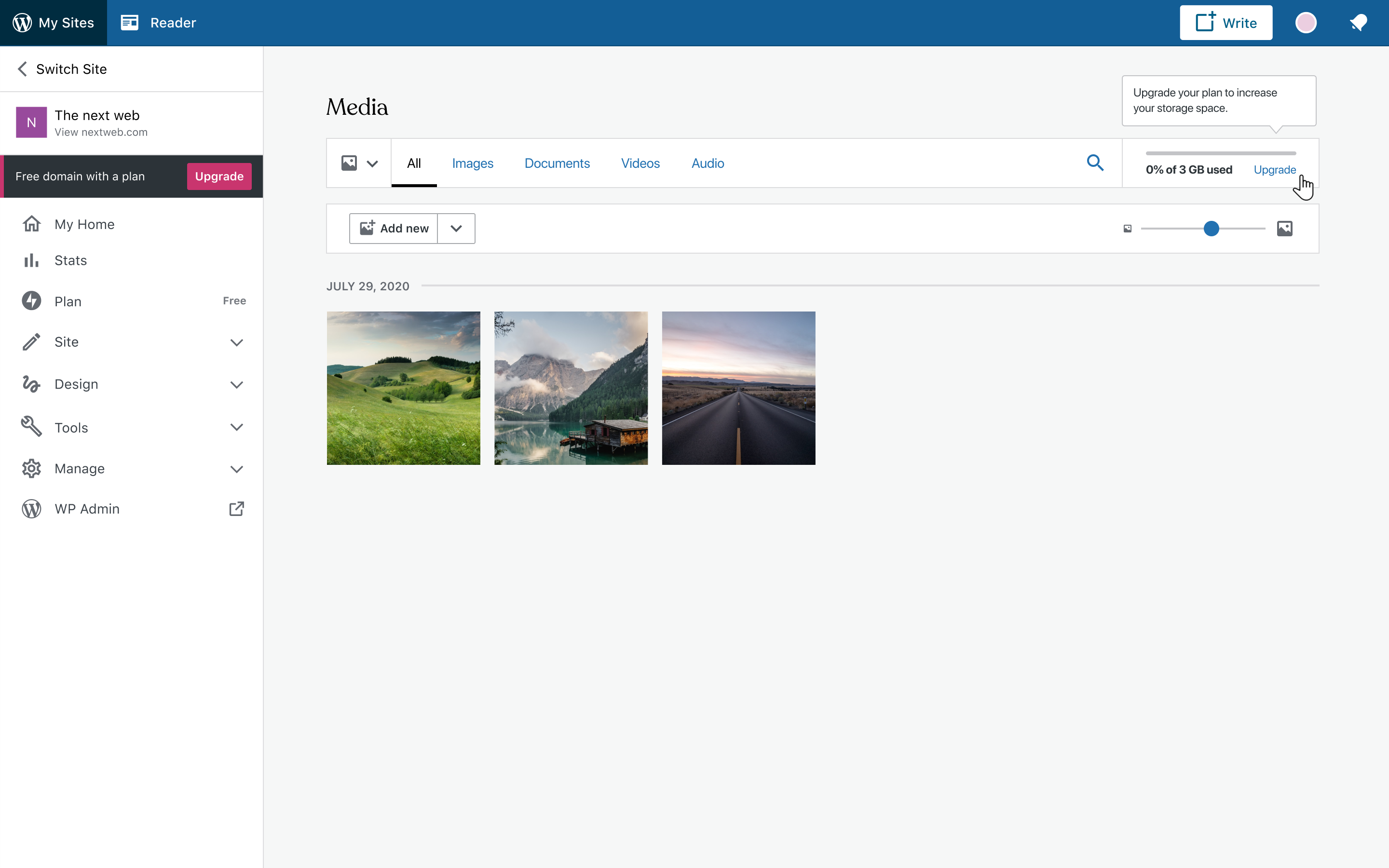
I updated the topic title and description to reflect the changes @sixhours has made in #44037. It looks like the remaining part here is to add a tooltip with storage options?
@sfougnier Do you think you'd have time for a mockup of what that should look like and what kind of data it should contain?
For the placement of the tooltip it's probably worth keeping in mind that the entire indicator is now an anchor. Easiest for the tooltip to appear would probably be outside of that box somewhere?
 obenland
on 13 Aug 2020
obenland
on 13 Aug 2020
On hover, a tooltip adds more context to the upgrade CTA.
 sfougnier
on 20 Aug 2020
sfougnier
on 20 Aug 2020
See paYJgx-WR-p2 for a11y considerations.
Let's review how the upgrade link displays in different plan tiers and how the Tooltip text would need to adjust for that, too.
obenland
on 24 Aug 2020
@sfougnier I think that simple tooltip works well and is a good mvp.
I'm also curious if there could be value in doing something like this down the line by creating a 'plans widget' that could be triggered from various links or upsell banners:
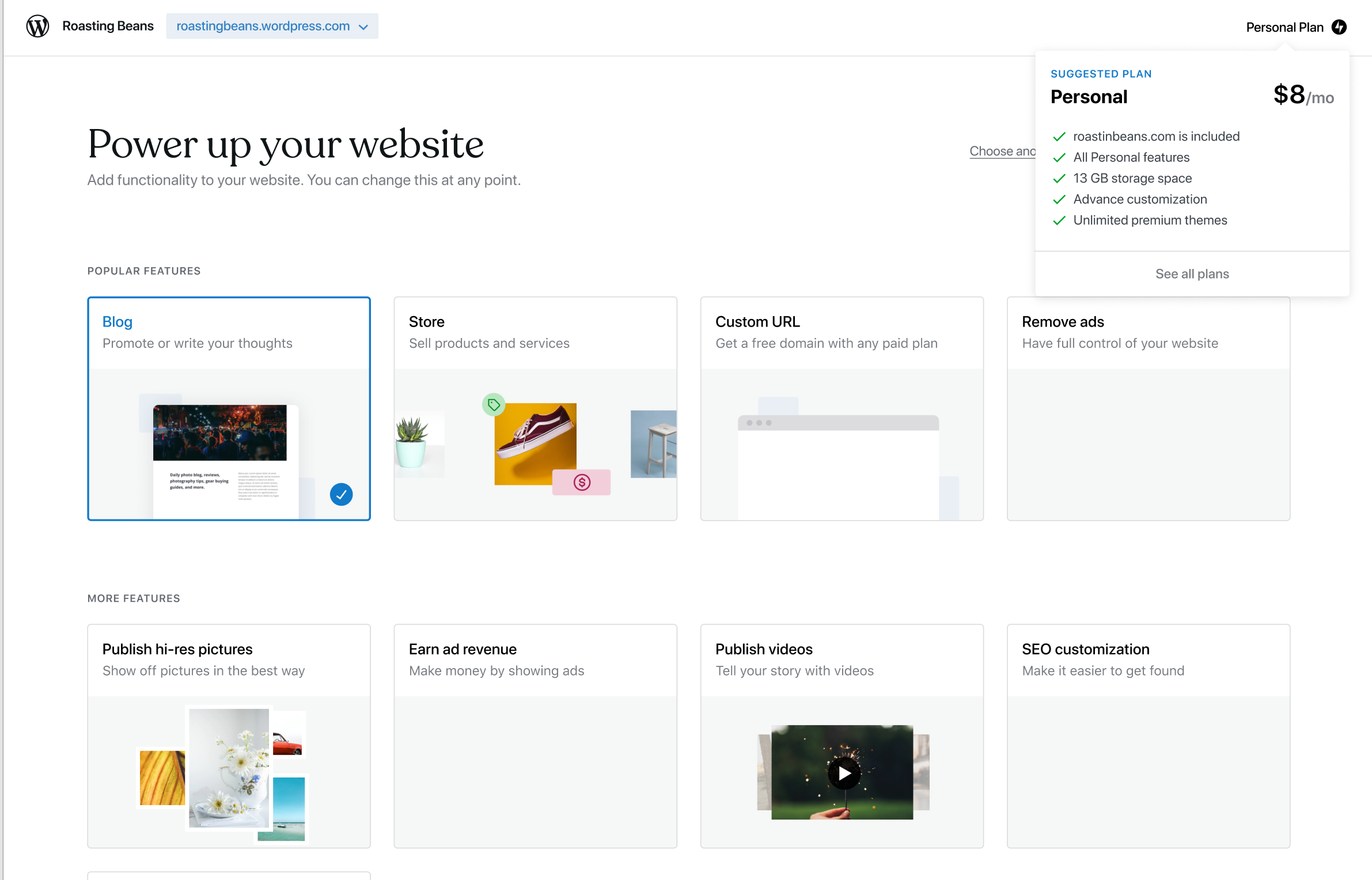
That might be something to explore for a future sprint.
rickybanister
on 24 Aug 2020
If we did something like a plan widget, it would make sense to highlight the important feature (in this case more storage) as the first item and give it special treatment. Showing the rest of the reasons to upgrade sweeten the deal.
rickybanister
on 24 Aug 2020
Related issues
 jeherve
·
3Comments
jeherve
·
3Comments
 spen
·
3Comments
spen
·
3Comments
 gedex
·
3Comments
gedex
·
3Comments
 ghost
·
3Comments
ghost
·
3Comments
 kellychoffman
·
3Comments
kellychoffman
·
3Comments