Wp-calypso: Login: make the top call to action on login page for "Continue as logged-in user" more intuitive
This issue describes a simple UI fix to make the "Continue as..." login option much more obvious to returning users.
Steps to repeat:
- When redirected from a Calypso URL with a site slug on the end, we offer a link to that site's frontend.
- However, if your login cookie is stale or non-existent, you might end up on a prompt to re-login again to create a fresh login cookie and start a new session.
- This means Calypso recognizes you, but you have to re-authenticate
The action we want users to take 99% of the time is click "Continue as me" in the small text below the header so they can skip login and continue as the current user.
That small text is easy to miss.
Technical note: I believe when 2FA is on for a user account you won't see this "Continue As" screen.
Screenshot
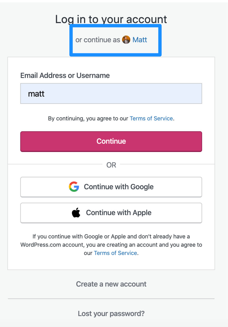
As 3rd party cookies behavior changes in Chrome and Safari, more people will this screen.
Suggested change
- Swap the title and the login link
- Result is "Continue as ..." is the primary option. Large header, all clickable as a big link.
- The "Log in to your account" below that is the smaller, secondary option.
Code reference
https://github.com/Automattic/wp-calypso/blob/master/client/blocks/login/ — look for continue-as-user.jsx and related stylesheet. Originally implemented at https://github.com/Automattic/wp-calypso/pull/35309
 lancewillett
All 12 comments
Here's a mock of the adjustments we should make:
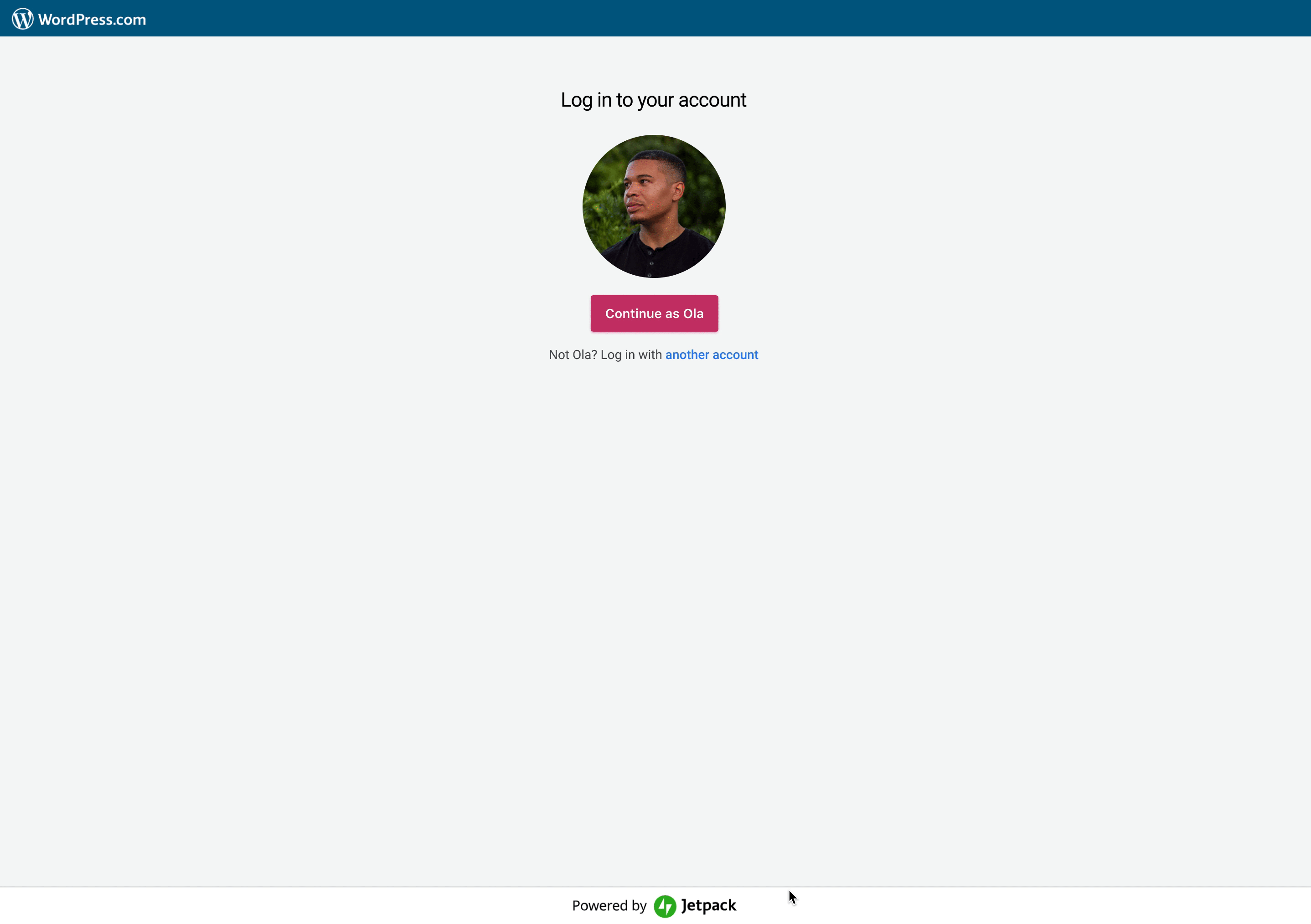
When we are aware of a persons existing account, let's hide _all the login stuff_ behind a link, increase the gravatar image, and focus on getting folks to continue as ...
The gravatar should be clickable.
If a person want to log in with a different account, we should provide that path, and then show all log in, sign up info.
 olaolusoga
on 9 Mar 2020
olaolusoga
on 9 Mar 2020
Like this solution, thanks @olaolusoga
 amamujee
on 10 Mar 2020
amamujee
on 10 Mar 2020
@johnHackworth do you know why we have username followed by password as two separate steps in login? Seems to mess with password managers.
amamujee
on 10 Mar 2020
do you know why we have username followed by password as two separate steps in login? Seems to mess with password managers.
I think that has something to do with users not remembering they can use social login buttons pbg9X-cqu-p2.
 simison
on 10 Mar 2020
simison
on 10 Mar 2020
@simison im not sure I understand why that would matter?
amamujee
on 10 Mar 2020
@amamujee I haven't dug deeper into question yet so I might miss details. If I understand correctly, social logins (Google, Apple) are _passwordless_. Hence, if user then comes and enters their Google/Apple email into the login field, we wouldn't show them the password field as a next step; we'd send them a login link via email instead. If they're regular user, we'd show the password field.
If we would show both username and password field by default, users would need to know press social login link and they might've forgotten that's how they signed up in first place and it would create a confusing experience.
I agree it's not optimal for password managers, although since Google uses a similar pattern I'd expect password managers to work on figuring this out (haven't checked tho).
simison
on 10 Mar 2020
Got it, this allows users to enter in their Google or Apple email and for us to detect this if they used social login vs. just showing those buttons and assuming they will click it.
amamujee
on 10 Mar 2020
Work still needed to wrap this up:
https://github.com/Automattic/wp-calypso/pull/40314#issuecomment-604543308
lancewillett
on 26 Mar 2020
Design feedback in-progress: #40125
lancewillett
on 30 Mar 2020
@supernovia Ran into an issue today with Chrome on an Android device where the password screen was hidden from view — I don't know if related to this change or not. Logging here in case more people can test and confirm that it's related to this change.
Edit: moved to https://github.com/Automattic/wp-calypso/issues/40589
lancewillett
on 30 Mar 2020
Note before closing this ticket: test a bit more to confirm the new UX appears as expected in all cases.
- Mobile browsers on both iOS and Android
- With private and non-private WordPress.com sites
lancewillett
on 30 Mar 2020
Design feedback from @olaolusoga finished with #40556
lancewillett
on 4 Apr 2020
Related issues
 rickybanister
·
3Comments
rickybanister
·
3Comments
 lamosty
·
3Comments
rickybanister
·
3Comments
lamosty
·
3Comments
rickybanister
·
3Comments
 gedex
·
3Comments
gedex
·
3Comments
 vparkhere
·
3Comments
vparkhere
·
3Comments
Most helpful comment
Here's a mock of the adjustments we should make:

When we are aware of a persons existing account, let's hide _all the login stuff_ behind a link, increase the gravatar image, and focus on getting folks to continue as ...
The gravatar should be clickable.
If a person want to log in with a different account, we should provide that path, and then show all log in, sign up info.