Wp-calypso: Stats: viewing historic stats messes up the bar graph in Day view
Steps to reproduce
- Starting at URL: https://wordpress.com/stats/day/{site-URL}
- Take note of how the bar graph displays
- Modify the URL to view the daily stats for a date that falls before the current range of the bar graph, e.g. by appending
?startDate=2019-06-23 - It doesn't happen consistently, so if nothing seems out of the ordinary, try switching to the Week view and back, and/or doing a hard refresh of the stats page after adding the date query.
What I expected
For the bar graph to show stats starting from that date, but not otherwise changing.
What happened instead
The bar graph greatly expanded the range, i.e. individual day-bars became much narrower, and in some cases the dates became completely jumbled up.
Browser / OS version
Replicated in Chrome and Firefox, on the user's site, my own site, and a Jetpack site.
Screenshot / Video
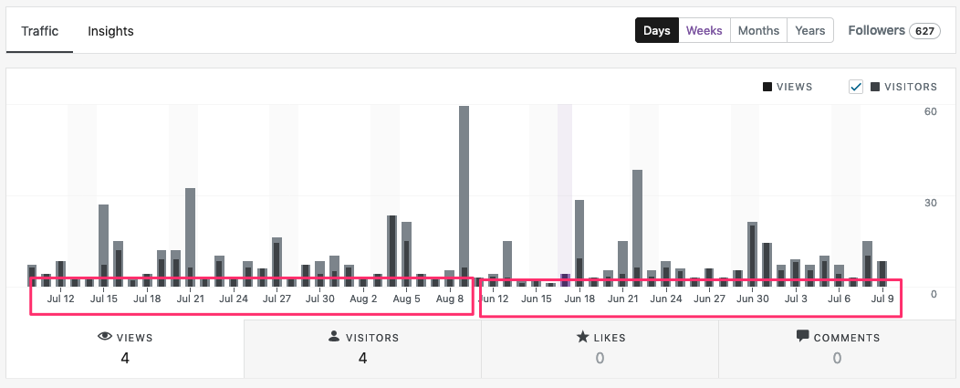
Stats page on initial load:
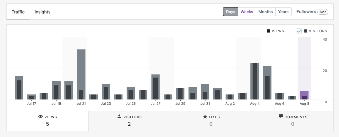
Stats page after reloading with the date query:
Context / Source
Reported via the support forums:
https://en.forums.wordpress.com/topic/stats-history-is-askew-i-e-not-in-order/
 KokkieH
All 8 comments
I have another report of this on a user's site. I am have also been able to reproduce the same issue as outlined above on my own Atomic site.
14750462-hc
2294839-zen
 joweber123
on 23 Aug 2019
joweber123
on 23 Aug 2019
We have another report of this in 2449437-zen. The user shared this screenshot that shows not only the months out of order, but also a very different "Days" view, here:
_Screenshot direct link:_ https://cld.wthms.co/AYFawu
Compare this to a screenshot I created after accessing the user's dashboard, here:
_Screenshot direct link:_ https://cld.wthms.co/h305UI
From this user's perspective there are two issues:
- The larger bars in the "Day" view that seem to change when the user refreshes their view (it's not clear if this is "resolved" consistently); and
- The broken date order of the stats in the stats graph.
The user is using Windows (looks like Windows 10 based on another version of their screenshot), and Firefox.
I tested in Firefox Developer Edition, v71.0b4 on macOS 10.14.6
 pauljacobson
on 30 Oct 2019
pauljacobson
on 30 Oct 2019
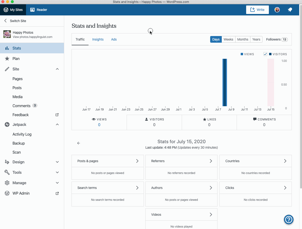
I have a similar report of this when navigating the Calypso navigation and the navigating back to Stats. Only one date is shown:
Image Link: https://d.pr/i/Vpgu2o
 chaselivingston
on 14 May 2020
chaselivingston
on 14 May 2020
I just ran into the same issue that @chaselivingston reported above. While testing the desktop app, and then testing in the browser, I found that the x-labels on the stats graphs disappear. It seems to be related to navigating quickly, before the stats graph fully loads (in my case, quickly navigating between the Days/Weeks/Months/Years graphs):
Tested in WPDesktop 6.0.1-beta2 and Chrome 83.0.4103.116 on macOS 10.15.5.
 rachelmcr
on 15 Jul 2020
rachelmcr
on 15 Jul 2020
Providing an update on the fix I'm working on -- there are a couple of issues here.
There's an initial race condition when we determine the size of the chart. When the size of the chart is calculated as zero, and those values are used after the actual size of the chart, the x-axis uses the zero width chart to calculate where to place the labels. This results in the missing x-axis labels that you see.
Regarding the second issue, there are cases where the data that is queried for gets appended to the existing data. I'm still working on resolving this, but this results in the out-of-order data that you see.
There's another issue here, where queried for data gets appended to the existing data. We use the incorrect data set and show that there's "No Activity This Period". I'm still working on resolving this as well.
 krymson24
on 29 Aug 2020
krymson24
on 29 Aug 2020
Thanks for the update, @krymson24! Feel free to open separate PRs for fixing the different issues. There is no need to fix them all in one single PR 🙂
 mmtr
on 31 Aug 2020
mmtr
on 31 Aug 2020
Thanks for the advice @mmtr! Taking your advice and spinning out a separate ticket for the other two issues.
krymson24
on 1 Sep 2020
Related issues
 samouri
·
3Comments
samouri
·
3Comments
 spen
·
3Comments
spen
·
3Comments
 hoverduck
·
3Comments
hoverduck
·
3Comments
 lamosty
·
3Comments
lamosty
·
3Comments
 rickybanister
·
3Comments
rickybanister
·
3Comments
Most helpful comment
Providing an update on the fix I'm working on -- there are a couple of issues here.
There's an initial race condition when we determine the size of the chart. When the size of the chart is calculated as zero, and those values are used after the actual size of the chart, the x-axis uses the zero width chart to calculate where to place the labels. This results in the missing x-axis labels that you see.
Regarding the second issue, there are cases where the data that is queried for gets appended to the existing data. I'm still working on resolving this, but this results in the out-of-order data that you see.
There's another issue here, where queried for data gets appended to the existing data. We use the incorrect data set and show that there's "No Activity This Period". I'm still working on resolving this as well.