Wp-calypso: (1P) FSE: Update size of template selector modal
Based on the thread in p1559239403099300-slack-ajax, adjust modal size to something smaller than full screen.
 obenland
All 3 comments
For me the issue is both the size and the background contrast, something with more space around it, and with a darker background behind makes it clearer:
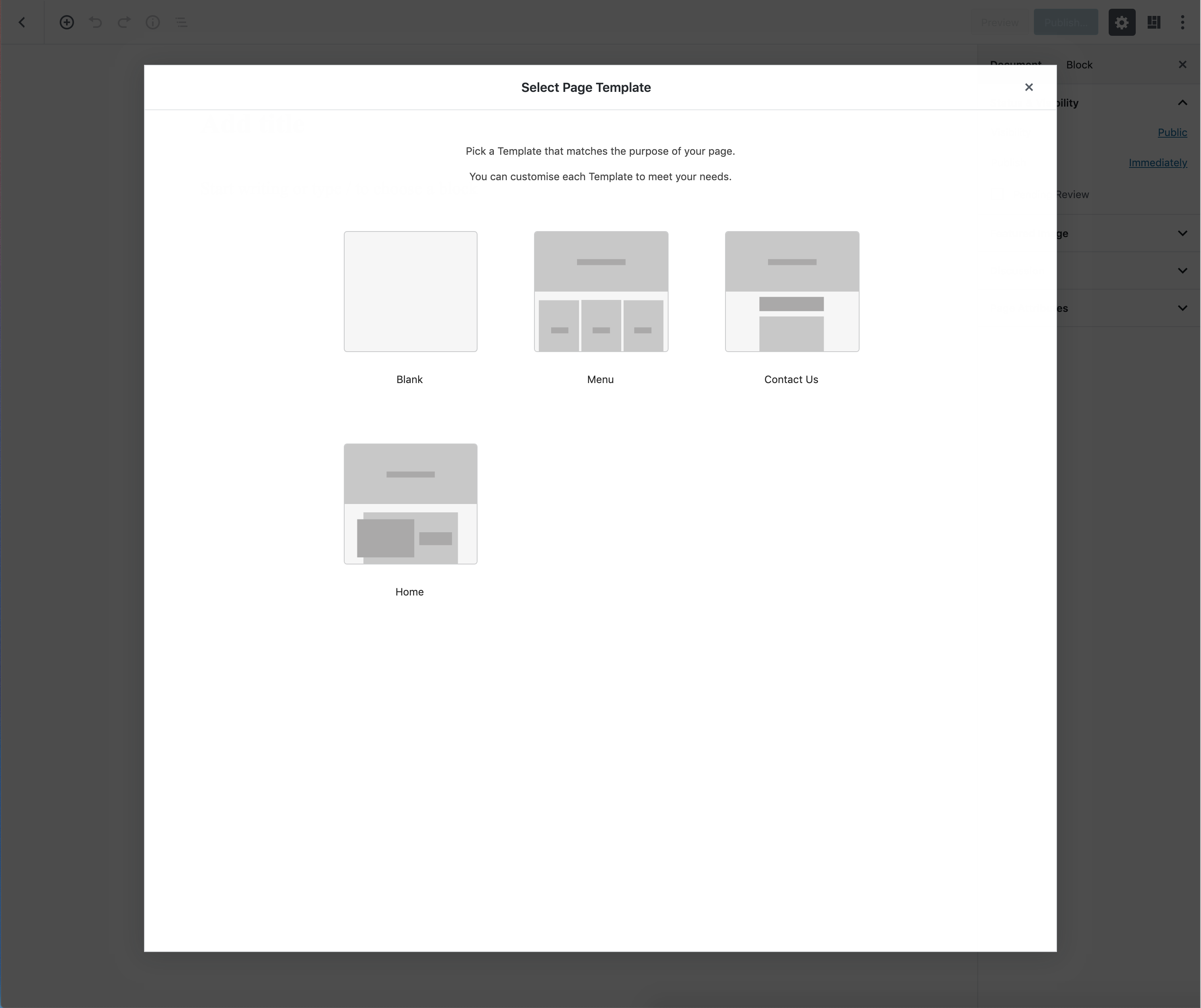
I would also remove the animation that slides and fades in the modal when the page first loads. That split second of seeing the editor behind the modal makes me feel more frustrated. More like a popup getting in the way, and less like an important decision point integrated with the editor.
 apeatling
on 3 Jun 2019
apeatling
on 3 Jun 2019
@iamtakashi Can you confirm you’re happy with the visual approach suggested here for the Modal?
 getdave
on 4 Jun 2019
getdave
on 4 Jun 2019
@getdave Yes, I like the darker backdrop that helps focus on the modal and smaller width like the media modal in Calypso (75%).
 iamtakashi
on 4 Jun 2019
iamtakashi
on 4 Jun 2019
Related issues
 aduth
·
3Comments
apeatling
·
3Comments
aduth
·
3Comments
apeatling
·
3Comments
 kellychoffman
·
3Comments
kellychoffman
·
3Comments
 rickybanister
·
3Comments
rickybanister
·
3Comments
 roccotripaldi
·
3Comments
roccotripaldi
·
3Comments
Most helpful comment
@getdave Yes, I like the darker backdrop that helps focus on the modal and smaller width like the media modal in Calypso (75%).