Wp-calypso: Login: 2FA Authenticator login text is misplaced and is missing styles
Steps to reproduce
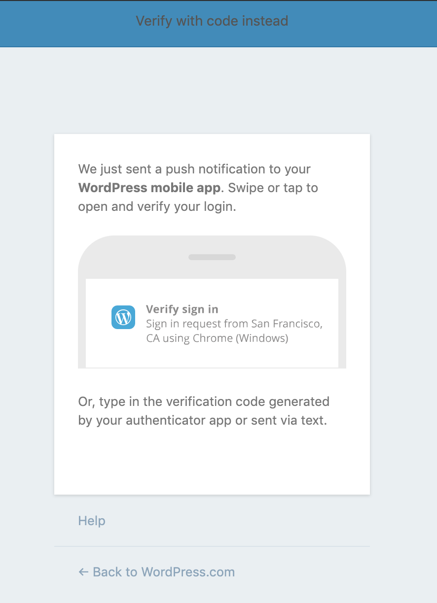
Not sure how to force the 2FA verification screen to show up, but notice the location of the "Verify with a code instead" link - it's on top against the blue bar, which makes it both hard to spot, and unreadable.
What I expected
For the link to be blue and to be placed within the content, below the "Or, type in the verification code..." paragraph.
dogfooding, #manual-testing, #automated-testing
 alaczek
All 6 comments
Also reported in 8146-wpcom
alaczek
on 30 May 2019
I started working on this, making it match Muriel button standards. See:
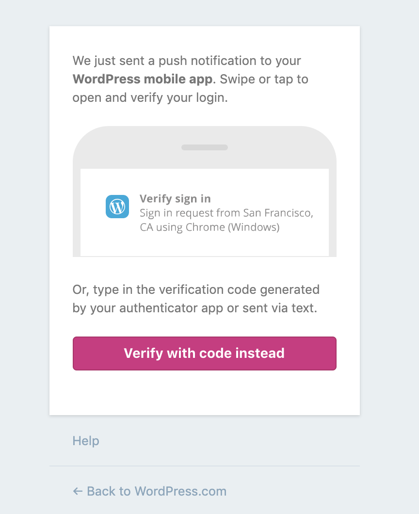
I'm not sure that's the best approach though because it appears this is in an older part of WordPress.com, not updated with our new branding colors. If you click that button, you get another button that's the old style blue. See:
What do you all think here? Go Muriel, or go old blue since this may require more work?
P.S. I have a patch ready for this as well.
 davidakennedy
on 14 Jun 2019
davidakennedy
on 14 Jun 2019
I would stick with the older styles, just to fix the most glaring issue, then we can revisit matching Muriel styles in a separate PR.
 sixhours
on 19 Jun 2019
sixhours
on 19 Jun 2019
Tested this on my sandbox and it works! 🚢
sixhours
on 19 Jun 2019
Thanks for the feedback, @sixhours!
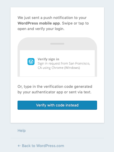
I've updated the patch to use older styles. See:
Related diff: D29574-code
Related Trac ticket: 8146-wpcom
davidakennedy
on 21 Jun 2019
Fixed in r193413-wpcom
davidakennedy
on 21 Jun 2019
Related issues
 ghost
·
3Comments
ghost
·
3Comments
 jeherve
·
3Comments
jeherve
·
3Comments
 rickybanister
·
3Comments
rickybanister
·
3Comments
 hoverduck
·
3Comments
hoverduck
·
3Comments
 samouri
·
3Comments
samouri
·
3Comments
Most helpful comment
Fixed in r193413-wpcom