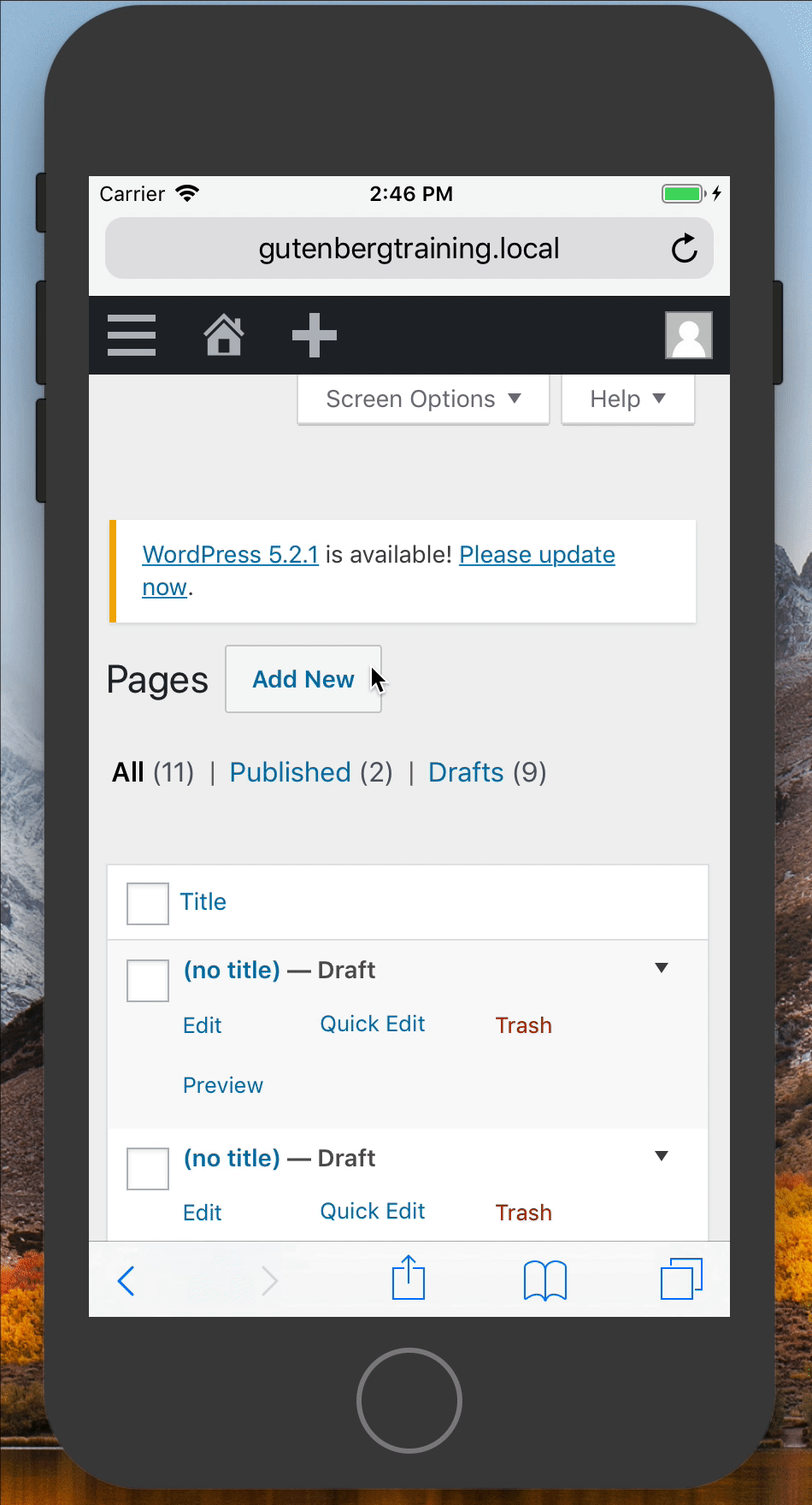
Wp-calypso: (3P) FSE: Test small screens, browsers other than Chrome
Test issues on existing UX and feedback to Takashi so these can be resolved early.
Still to do:
- [x] ~scrollable area is missing
-webkit-overflow-scrolling: touch;~ (this would require applying to thebodyand it's a webkit only feature. - [x] stress test layout/design with more/less Templates (esp. on mobile). Currently, idealised x3 Templates isn't sufficient
- [x] The buttons need to have their
appearancereset. There is currently a default browser inherited background on all the Template buttons on mobile devices.
 obenland
All 10 comments
Also, note these issues
https://github.com/Automattic/starter-page-templates/issues/16#issuecomment-494913017
 getdave
on 24 May 2019
getdave
on 24 May 2019
Issues
Template selection on mobile devices is difficult
- Scrolling within a modal on touch devices is not a nice experience
- Once selected you to have to scroll down to find the button to confirm
- Difficult to skip to "Blank Page" option - you have to scroll down
- Difficult to comprehend all the possible options
getdave
on 24 May 2019
Thanks for that screenshot!
With "Blank Page" becoming a selection itself, could we make all of these selectors button elements that close the modal? That would solve the scroll-to-confirm issue and save us a (unnecessary) click.
obenland
on 24 May 2019
Should "Blank Page" be the first option so it's easy on mobile to remove the modal without making a selection?
 frontdevde
on 24 May 2019
frontdevde
on 24 May 2019
Agreed.
The other point is still valid - we still need to scroll to see all the other Templates. It does feel like a nice experience...
getdave
on 24 May 2019
We could consider not to show preview screenshots on small screens
obenland
on 24 May 2019
Just for the record: My suggestions to most of the issue was here: https://github.com/Automattic/starter-page-templates/issues/16#issuecomment-494913017
We could consider not to show preview screenshots on small screens
This could be an option as the thumbnails won't be accurate representation of the pages for mobile. But they can just be smaller sizes so that like three templates in a row to reduce the scrolling.
 iamtakashi
on 24 May 2019
iamtakashi
on 24 May 2019
Judging from the recording above, the scrollable area is definitely missing -webkit-overflow-scrolling: touch;. Let's add it as part of other changes.
 marekhrabe
on 28 May 2019
marekhrabe
on 28 May 2019
This could be an option as the thumbnails won't be accurate representation of the pages for mobile.
If these were SVGs we could show hide portions of the graphic via CSS based on the active media query.
Alternatively, we could have separate images for smaller viewports.
In general, we should aim to retain content parity between all screen sizes.
getdave
on 29 May 2019
Closing in favour of more specific tasks.
getdave
on 3 Jul 2019
Related issues
 aduth
·
3Comments
aduth
·
3Comments
 hoverduck
·
3Comments
hoverduck
·
3Comments
 rickybanister
·
3Comments
rickybanister
·
3Comments
 samouri
·
3Comments
samouri
·
3Comments
 jjchrisdiehl
·
3Comments
jjchrisdiehl
·
3Comments