Wp-calypso: Post Checkout/Plans: Cards using green color in illustrations
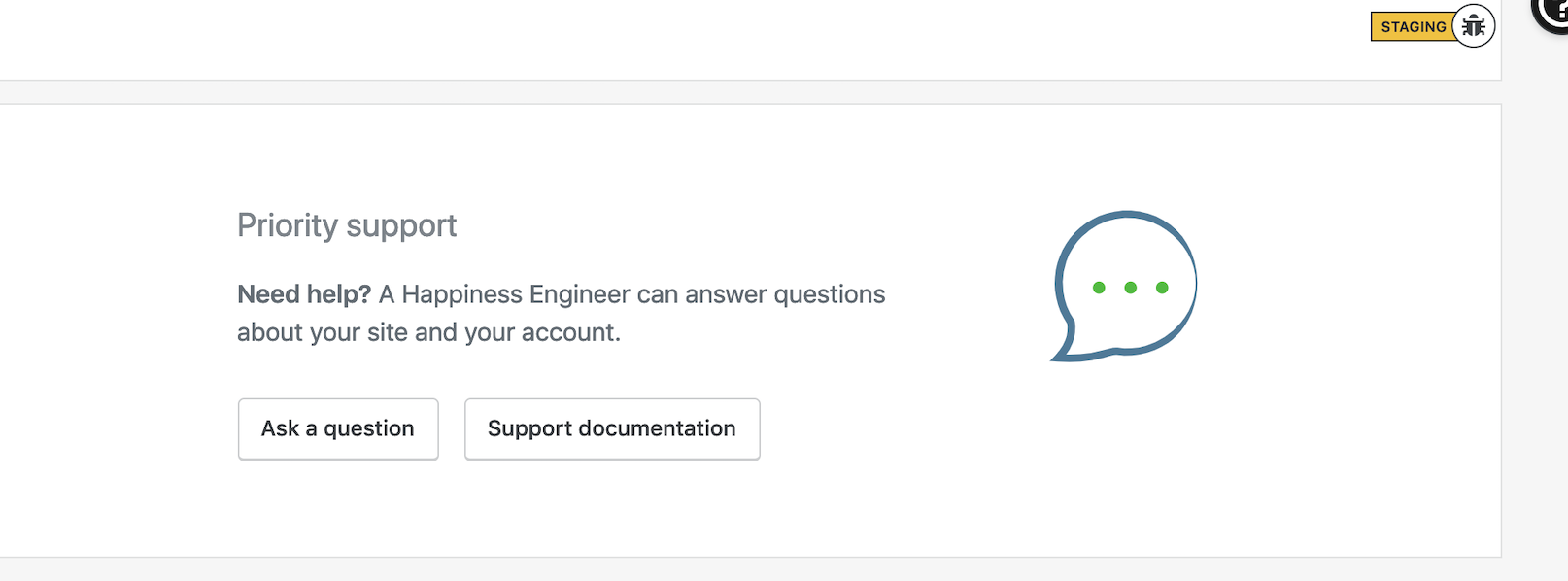
This site is a Simple site and for some reason, it's using Jetpack image. Notice the green.
Let's replace it with something that better represents priority support.
 sixhours
All 9 comments
Note, this block is also shown on the /plans page when a user has a non-free plan, and we use the same green in multiple illustrations on this page:
Updating this ticket to account for that, and flagging for Muriel since I believe we need to replace the green throughout, probably with a shade of blue.
sixhours
on 26 Apr 2019
This is messy. These were probably added for a Jetpack feature, and the context in which the images show wasn't tested.
In the context of WordPress.com, the green should be blue instead, but I'm unsure where else these images show up.
 davewhitley
on 30 Apr 2019
davewhitley
on 30 Apr 2019
I'd suggest renaming/repointing the SVGs so we have a set that we know is for WP.com purposes only; that way we won't break anything in Jetpack by changing the colors.
sixhours
on 30 Apr 2019
@drw158 Is there any particular blue I should use here, or should I experiment with different shades of blue from our color studio?
Decoupling these from Jetpack sounds like a good idea, let me see if I can do this without breaking other things :)
 alaczek
on 1 May 2019
alaczek
on 1 May 2019
Thanks @alaczek . Blue 500 is good (aka --color-primary or #016087)
davewhitley
on 1 May 2019
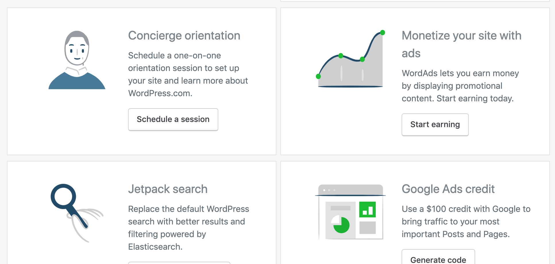
I gathered all the icons used on plans pages, and made the changes. In a few instances I had to use a lighter color, and for those I used Blue 300 (#6F93AD). Before I do a PR I have a preview here: https://cloudup.com/cuu1EsHuKaC
If these work, I'll go ahead with re-naming the files to remove jetpack- prefix. It will create a bit of redundancy, with two versions of the same icon (Jetpack using green accent, and wp.com using blue) - is this acceptable?
alaczek
on 3 May 2019
I started working on this one, but need some clarification. The plans page uses components to display specific features. Some of the components are used for both Jetpack and WordPress.com sites (for example support, activity, apps), while others are exclusive to Jetpack. My question is, should the plan page for Jetpack sites use the green or the blue illustrations? Not sure what logic applies here - use green because it's a Jetpack site, or use blue because the plans page is inside Calypso?
The page I'm talking about is https://wordpress.com/plans/my-plan/{site}
I would also love some advice on the naming convention. Initially I planned to remove the jetpack- prefix, so that jetpack-support.svg becomes support.svg but there are two cases where the name is already taken. In those cases (two total) I was thinking of applying a different prefix, for example dotcom-. How does that sound?
alaczek
on 8 May 2019
My question is, should the plan page for Jetpack sites use the green or the blue illustrations?
I personally think, since it's Calypso, we should use blue, regardless of whether they're a Jetpack site or not. @jeffgolenski do you (or others from Jetpack) have thoughts about that?
I would also love some advice on the naming convention. Initially I planned to remove the jetpack- prefix, so that jetpack-support.svg becomes support.svg but there are two cases where the name is already taken. In those cases (two total) I was thinking of applying a different prefix, for example dotcom-. How does that sound?
Good! I'd add the dotcom- prefix to everything for clarity and consistency if you can.
sixhours
on 15 May 2019
@sixhours @alaczek Totally agree - in calypso stick with the blue illustrations. Don't want the green competing with any proper CTAs. We're only using illos with green on jetpack.com I think.
 jeffgolenski
on 17 May 2019
jeffgolenski
on 17 May 2019
Related issues
 spen
·
3Comments
spen
·
3Comments
 roccotripaldi
·
3Comments
roccotripaldi
·
3Comments
 samouri
·
3Comments
samouri
·
3Comments
samouri
·
3Comments
samouri
·
3Comments
 ghost
·
3Comments
ghost
·
3Comments
Most helpful comment
I gathered all the icons used on plans pages, and made the changes. In a few instances I had to use a lighter color, and for those I used Blue 300 (#6F93AD). Before I do a PR I have a preview here: https://cloudup.com/cuu1EsHuKaC
If these work, I'll go ahead with re-naming the files to remove
jetpack-prefix. It will create a bit of redundancy, with two versions of the same icon (Jetpack using green accent, and wp.com using blue) - is this acceptable?