Wp-calypso: Sidebar Navigation: Width of Highlight
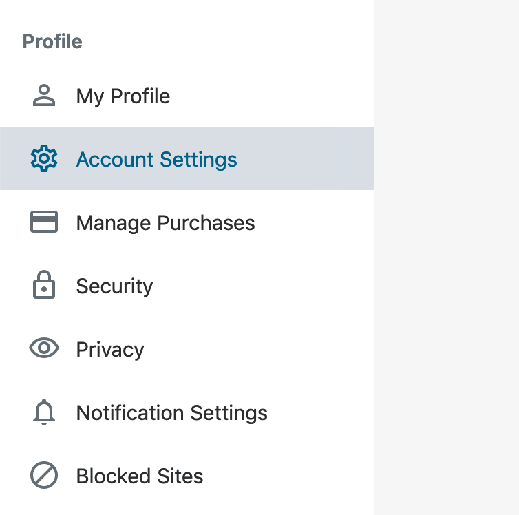
Right now, the accent colour of the sidebar navigation extends to most of the space, but there's a small primary border-like colour on the right.
This screenshot was taken on my tablet but it's especially noticeable on desktop devices. Note the pink right border:

Is this intentional? It feels pretty odd to me that it doesn't extend the whole way, and I've noticed it for a while, but never filed an issue until now. I personally think it feels more like a bug that it doesn't extend the whole way instead of an intentional design decision. :)
cc @drw158, @sixhours
 Aurorum
All 5 comments
This is a result of having a border on the entire sidebar that extends the entire length of the sidebar. I'm not sure if there is a solution here.
 davewhitley
on 12 Apr 2019
davewhitley
on 12 Apr 2019
Since we use a white or gray background in the content area, maybe using a light gray border color would make the border look like part of that content area rather than the sidebar.
 sixhours
on 12 Apr 2019
sixhours
on 12 Apr 2019
If there is a fix possible (not had the chance to take a look yet), it'd also probably be worth applying it to the promotional banner thingy that also has the sidebar border.

Aurorum
on 12 Apr 2019
I accidentally self-assigned this, sorry.
 dezzie
on 14 Jun 2019
dezzie
on 14 Jun 2019
I'm not sure this is a bug. To me, the border adds a nice visual separation between the sidebar and the main content area. Without it, the default 'Classic Bright' theme lacks enough contrast between these two regions:
Also, given that only ~2% of users change their theme, removing the border will affect a big chunk of users on 'Classic Bright'.
 enriquesanchez
on 14 Jun 2019
enriquesanchez
on 14 Jun 2019
Related issues
 spen
·
3Comments
spen
·
3Comments
 vparkhere
·
3Comments
vparkhere
·
3Comments
 rickybanister
·
3Comments
rickybanister
·
3Comments
 aduth
·
3Comments
aduth
·
3Comments
 roccotripaldi
·
3Comments
roccotripaldi
·
3Comments