Wp-calypso: Reader: Under Followed Sites, the header cake (Search, Recommended) needs design love
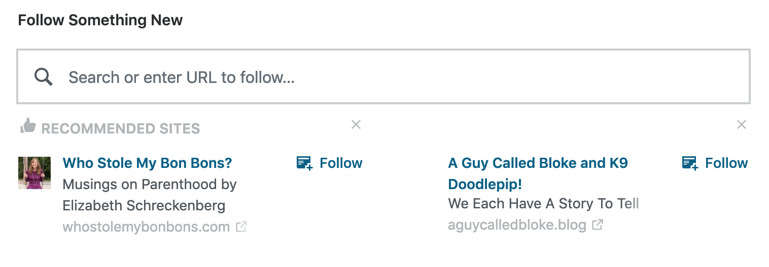
The placement of the "x" icons feels off here. They're floating away from the content and it's not clear what they belong to. Perhaps moving these underneath the Follow at the very bottom of the card would help.
 sixhours
All 12 comments
These do feel out of place indeed, and without hovering on the "x" I was wondering for a bit what does it do exactly in this context. If we pushed the action to the bottom, could we maybe make it a button that explicitly says "Dismiss this recommendation" (or just "Dismiss")?
 alaczek
on 12 Apr 2019
alaczek
on 12 Apr 2019
Moving @blowery's comment and closing the PR, since I think we need to re-think the approach:
This is something we struggled with in the original designs. How to make the rec's dismissable, but not overwhelm the little content . We tried to make the action subtle since it's not something folks typically do.
I think in this treatment, the dismiss button has too much visual weight and becomes too visible.
Perhaps instead, we could change the follow button (which doesn't get much use either) to be a dropdown menu, more like how Facebook and Twitter treat actions on the card? Then push follow and dismiss into the action menu.
alaczek
on 7 May 2019
Let me see what I can come up with.
 scalarbane2
on 21 May 2019
scalarbane2
on 21 May 2019
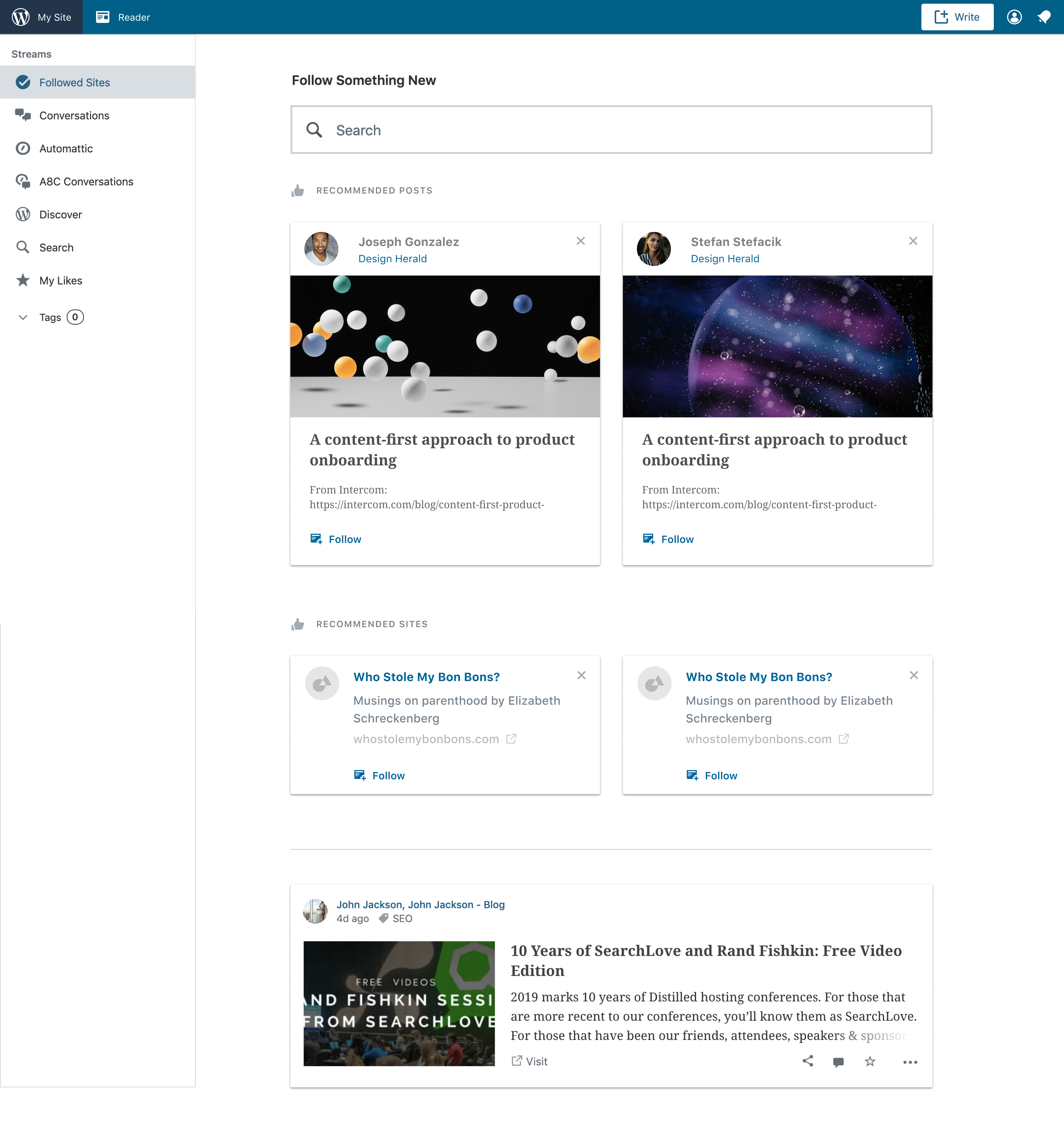
So I was thinking, can I use Muriel (Material) Design cards for that section?
scalarbane2
on 22 May 2019
Hello y'all! This is what I tried coming up with for the reader page. Let me know your thoughts @cburton4 @drw158 @blowery
scalarbane2
on 22 May 2019
Can't speak to the idea of using the Material Cards here, but I like how it really helps to tie the "x" to the specific piece of content in a non-confusing way. I still wonder though it needs further clarification, that "x" is a dismiss action. Maybe I'm overthinking it :)
alaczek
on 24 May 2019
Using the card component around recommended sites/posts helps give that X button a better sense of place/function. 👍 from me.
sixhours
on 24 May 2019
Is there a PR for this?
 donpark
on 28 May 2019
donpark
on 28 May 2019
Nope, so far we've been exploring design options. Sounds like both me and Caroline agree using cards is the good way to go, so we can now start looking into implementing.
alaczek
on 28 May 2019
I started working on a PR for this yesterday and made some slow progress; the Recommended Posts section of the reader is put together in an interesting way, so moving the Follow button and the Dismiss button is more of a refactor than I would have thought. I'll keep working on it! It's a fun puzzle. :D
sixhours
on 29 May 2019
It's a fun puzzle.
I know this and I remember it being quite confusing!
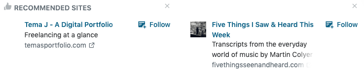
I don't remember having recommended sites in stream, but they do exist in /following/manage. I just wanted to note that site recommendations don't always end up having the same number of lines so adding the Follow button underneath the URL might be tricky (but it might also end up looking fine).
 jancavan
on 3 Jul 2019
jancavan
on 3 Jul 2019
Archiving this issue as we have a PR open.
 lcollette
on 5 Jul 2019
lcollette
on 5 Jul 2019
Related issues
 BrookeDot
·
3Comments
BrookeDot
·
3Comments
 spen
·
3Comments
spen
·
3Comments
 apeatling
·
3Comments
apeatling
·
3Comments
 hoverduck
·
3Comments
hoverduck
·
3Comments
 samouri
·
3Comments
samouri
·
3Comments
Most helpful comment
Nope, so far we've been exploring design options. Sounds like both me and Caroline agree using cards is the good way to go, so we can now start looking into implementing.