Wp-calypso: Jetpack Connect: Allow skipping of non-required steps
@lezama brought up an interesting question yesterday:
should we allow to skip some of the steps?
I think it's a good idea to discuss that. Do we want to allow users to skip any of those non-required steps (site type, site vertical, etc), or will they be always required?
 tyxla
tyxla
All 26 comments
cc @Automattic/jetpack-design @AnnaMag @johnHackworth
tyxla
on 28 Feb 2019
My $0.02: I like to think about those steps as required; otherwise most users will end up skipping them.
tyxla
on 28 Feb 2019
I share the same exact thoughts as you, @tyxla. These steps are an inseparable part of the product and should be fundamental to fill them out to get the most out of a Jetpack site.
Thoughts @jeffgolenski @joanrho @rickybanister ?
 keoshi
on 28 Feb 2019
keoshi
on 28 Feb 2019
I don't agree with this. Especially because, by the time the user is here, the product is essentially installed already. If we don't allow them to skip, and they don't move forward, they would end with a half-configured product.
I know that the site info will be required for the complete personalized NUX, but I think we need to always include a "by default" fork of the flow where we send the users who don't want to give this information.
 johnHackworth
on 1 Mar 2019
johnHackworth
on 1 Mar 2019
I won't weight in right now on the specific question, but I'd take a different angle that allows for a solution to move forward: introducing the _time_ variable.
- We ship with steps that can't be skipped
- We measure if there's a drop or not
- We also keep it running for enough time to get some baseline data
Even if we then decide to revert, we have baseline data and we can compare the difference. For example we might notice that most people that skip before chose a specific option, so the drop is mostly in one category, or we could see that it's equally distributed so skip doesn't affect the balance of the other values.
 folletto
on 1 Mar 2019
folletto
on 1 Mar 2019
Well, FWIW I don't mind creating skip buttons, I'm just concerned that everyone will just click "skip" on every step, without even reading. Skip button is always the most used button in wizards 😉
Anyway, if we decide to go ahead with this, can we decide how those buttons would look/work? cc @keoshi @jeffgolenski @joanrho
tyxla
on 1 Mar 2019
I think having a skip option is valuable to have to start, until we can provide a more tailored experience based on user inputs. E.g., customizing the presentation of our features and plans in a way that directly correlates to their site type, specified vertical, etc.
 joanrho
on 2 Mar 2019
joanrho
on 2 Mar 2019
Continuing a long with what's being said above. I agree with most everything said above. @keoshi and @tyxla I agree that we definitely want this data from people. but some people probably just dont want to share those details with us, and I think in the end, that's okay. a lot of people will and some people won't. I don't think we should force anyone to do anything.
I'd be a proponent for adding "skip personalized setup" or something similar.
Broadening the language a bit so we communicate to the customer that their input leads us to doing things for them. (we don't yet, but eventually).
That way they're free to skip if they really want to, but we let them know what we're doing for them a little more clearly. Letting them know it does / will benefit them. But if they don't want that, it's okay as well.
Thoughts?
 jeffgolenski
on 7 Mar 2019
jeffgolenski
on 7 Mar 2019
Seems like a quick solution is to just add a "skip" button to the "site type" and "site vertical" steps. Let's try that, and see how it goes.
tyxla
on 8 Mar 2019
31304 suggests adding a "skip" button - would appreciate a look when you folks get a chance.
tyxla
on 8 Mar 2019
I don't have a problem with giving people the ability to move forward if we pick good defaults for them. We recently ran some tests on WP.com with a skip button and found that it didn't have an impact on completion rates. Rather, people were picking up on the continue button being active on all our screens and being able to click that to move forward. I'd like to encourage us to move forward in that approach rather than adding more elements to the screen. More details here: p8Eqe3-xe-P2
 fditrapani
on 14 Mar 2019
fditrapani
on 14 Mar 2019
I've thought a lot about skip buttons in the signup flow. (I have no hobbies and lots of free time.)
Lets say we have a phone number step. Looking at our data, we notice that people are dropping out of the flow, or entering random nonsense to get past the phone number step. One solution would be to add a skip link. This might help reduce the drop-off numbers, and reduce the random nonsense, but its just a bandaid. The real problem is the step itself. Adding a skip link doesn't solve the issues with the step, it just lets people ignore the step.
The real solution would be to iterate on, or remove the step.
 shaunandrews
on 14 Mar 2019
shaunandrews
on 14 Mar 2019
I actually think that example and the data you got back work against your argument @shaunandrews. While virtually everyone might have a phone number, only a small percentage would want to expose that to the public — businesses, online stores, etc. What can we iterate on that step that is not a “skip” in essence?
The onboarding is a trickle down funnel, where we go from abstract steps (site type) to very concrete information (phone number), _and_ where the first ones directly influence the following ones. And while we're already doing some of this, I don't believe we'll ever get to a point where 100% of new customers feel like every single step is fundamental to their site set up.
@fditrapani Do you think it's worth running that test back once more with the disabled buttons, to see what we can learn?
keoshi
on 14 Mar 2019
I would be open for a test but if we were going in that direction, I'd like to see us test a more efficient UI. Something similar to what Shaun proposed here:
fditrapani
on 14 Mar 2019
I like that a lot @shaunandrews @fditrapani . @tyxla @keoshi at this point would it be a pain to modify our design pattern to fit what shaun has created above? (the skip button is the CTA before anything is selected).
jeffgolenski
on 14 Mar 2019
I think that's a quick change on our part, but also believe this comes from the shared component. Either way, I'm sure @tyxla would make that happen in no time.
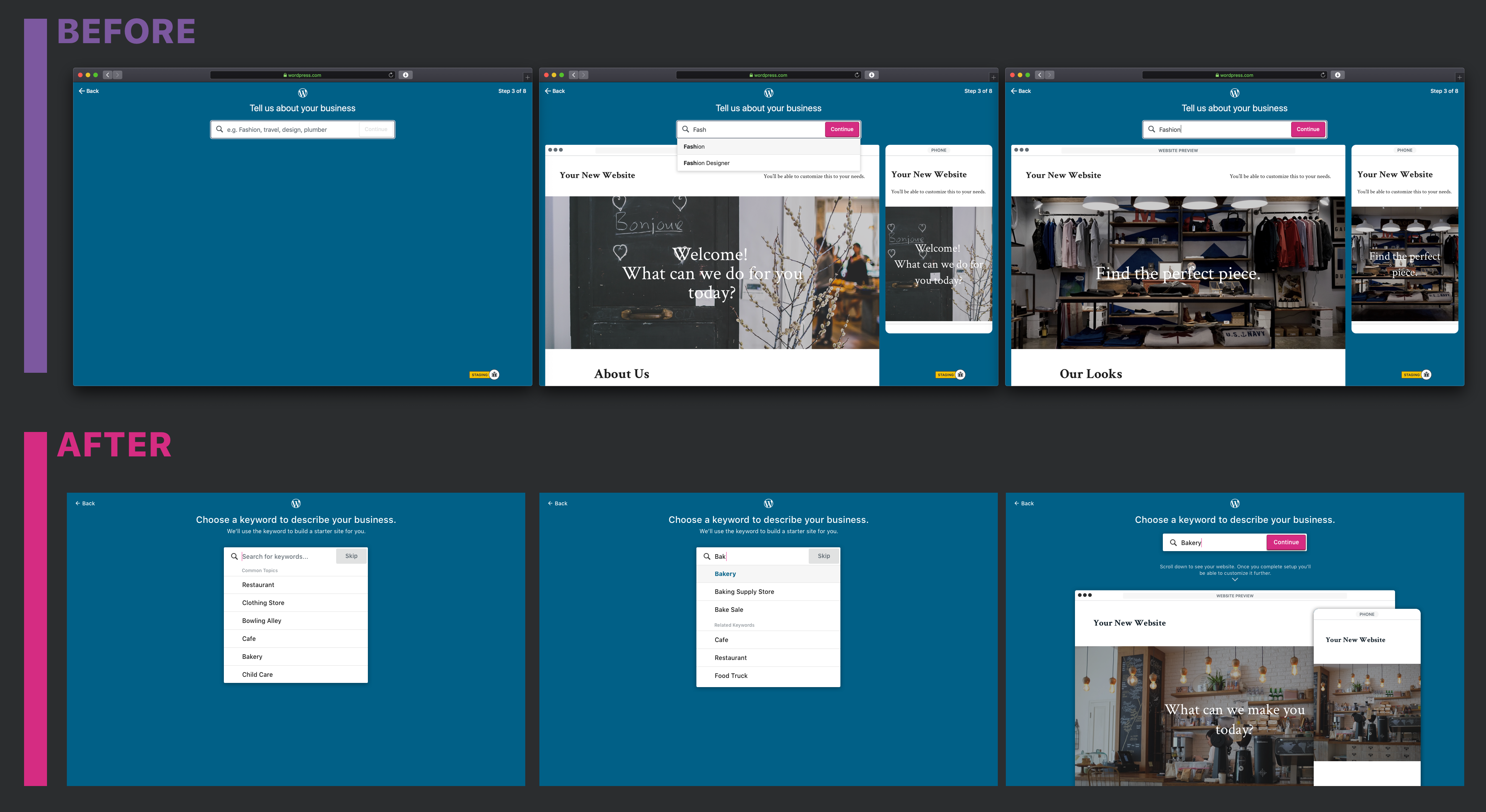
Just so I fully understand the mocks above, @shaunandrews: the Skip button is shown until someone selected a pre-defined vertical. Once that happens, the button changes to a Continue CTA — correct? What happens if I select Bakery but then delete the last y? Does it revert back to the Skip button? Is there a prototype available?
Thanks!
keoshi
on 14 Mar 2019
my two cents: I don’t think nesting the skip button within the verticals text entry field effectively communicates that the entire step can be skipped. Given the location of it within the text field, it almost seems to indicate that it will skip between the listed options in the dropdown rather than skip the entire step.
suggestion: let's move it either up top or down below the main content
joanrho
on 14 Mar 2019
I'm just going to pop in here and share that I really don't like the skip button placement in the text field. I am someone who would press that so fast and be very confused by what happened. I also think the state of the skip button is weird. For example how are you going to handle people who type something that isn't found in the list? If I run a unique business how are you going to detect that I'm done typing, not selecting anything from the list and then want to continue?
I think the skip button belongs under the dropdown and I'm fine with it being covered once the user engages and starts to make a decision.
Anyways this is my 2 cents :)
 jessefriedman
on 14 Mar 2019
jessefriedman
on 14 Mar 2019
Also, JPO used to force users into onboarding and it had really bad results. We ended up seeing a ton of deactivations and support tickets to Bluehost. Which is why we started with a question:
What kind of site can we help you build
_Business_ / _Personal_
_I don't need help_
I'm curious why we didn't replicate that but we can answer that in a different github issue. Just adding the importance of a skip button to those users, and we actually saw an increase in users going through the onboarding when we gave it to them as an option.
jessefriedman
on 14 Mar 2019
Also @johnHackworth has a great point here that I'll one thing to.
Right now the first question is "Describe your business". This is making the assumption that 100% of Jetpack users are setting up a business site. I agree that most are businesses but not 100%. So 40% of people are going to want a skip button right away based on that question.
jessefriedman
on 14 Mar 2019
I know we are still working out the details here but it's really important that we don't repeat these steps for users who are reconnecting, cycling their connections, etc...
Also are we showing this to additional users who are connecting? So if I connect and fill it out and then later someone else connects their account on the same site do they see it?
I think we also need to narrow the reach on this sooner rather than later. I'd advise only showing this to new connections on sites that are less than X weeks old. You'll still get a ton of data but won't be showing onboarding steps to well established sites. At least for now anyways
jessefriedman
on 14 Mar 2019
I don’t think nesting the skip button within the verticals text entry field effectively communicates that the entire step can be skipped.
That's fair @joanrho and @jessefriedman. I'd be open to seeing other options.
fditrapani
on 14 Mar 2019
the skip button is the CTA before anything is selected
I dislike this - it makes everything counterintuitive for me. Looks and feels like the old-school hacks we did with custom UI in the legacy wp-admin when we didn't want to build a new dashboard from scratch.
I'm fine to move it up top at the left, as @joanrho suggested. We already have that for /jetpack/new anyway, so it won't be a new thing for our flows. Let me know if you wish to adapt the PR with that.
What kind of site can we help you build
Business / Personal
I don't need helpI'm curious why we didn't replicate that but we can answer that in a different github issue.
cc @joanrho @jeffgolenski @keoshi on this 😉
Right now the first question is "Describe your business". This is making the assumption that 100% of Jetpack users are setting up a business site. I agree that most are businesses but not 100%. So 40% of people are going to want a skip button right away based on that question.
Not for the corresponding Jetpack step - we're kind of broader there and currently say "What kind of site do you have?" and "Tell us about your website", which should cover both business and non-business needs.
I know we are still working out the details here but it's really important that we don't repeat these steps for users who are reconnecting, cycling their connections, etc...
We're still figuring these out... what if someone wants to change something in those steps, but they never see the step again?
Also are we showing this to additional users who are connecting? So if I connect and fill it out and then later someone else connects their account on the same site do they see it?
It depends on their role. Admins will see them, but not authors or contributors.
I think we also need to narrow the reach on this sooner rather than later. I'd advise only showing this to new connections on sites that are less than X weeks old. You'll still get a ton of data but won't be showing onboarding steps to well established sites. At least for now anyways
Yeah, I'm happy to do any changes we decide there. FWIW, from Jetpack 7.2 on we'll start gathering the assumed site age. We can also use that - cc @johnHackworth @AnnaMag @joanrho @jeffgolenski @keoshi about this.
tyxla
on 15 Mar 2019
@tyxla We'll sync up early next week and chat about this and the color changes as well. I just want to make sure we're not releasing a bunch of stuff all at once. I think what we have build already is great to send out and we can iterate on it in the future if necessary
jeffgolenski
on 15 Mar 2019
What kind of site can we help you build
Business / Personal
I don't need help
I'd argue that this is essentially what we have on the site type step, and we can add a link to skip the entire flow if they haven't started yet, like @jeffgolenski suggested here. I think that's a solid idea that cover a _lot_ of use cases.
from Jetpack 7.2 on we'll start gathering the assumed site age
Yeah, that's an important data point that will allow us to look at all this with fresh perspectives. Let's chat more about all of this on monday then!
keoshi
on 15 Mar 2019
We've been talking about adding "a skip the entire flow" link too but haven't gotten around to it. I'm happy to run with what ever you all come up with. Please keep @shaunandrews in the loop for feedback.
fditrapani
on 15 Mar 2019
Related issues
 vparkhere
·
3Comments
vparkhere
·
3Comments
 apeatling
·
3Comments
apeatling
·
3Comments
 gedex
·
3Comments
gedex
·
3Comments
 kellychoffman
·
3Comments
kellychoffman
·
3Comments
 rickybanister
·
3Comments
rickybanister
·
3Comments
Most helpful comment
I don't agree with this. Especially because, by the time the user is here, the product is essentially installed already. If we don't allow them to skip, and they don't move forward, they would end with a half-configured product.
I know that the site info will be required for the complete personalized NUX, but I think we need to always include a "by default" fork of the flow where we send the users who don't want to give this information.