Wp-calypso: Slideshow: Outstanding issues
This issue is to keep track of and discuss the outstanding issues with the slideshow block.
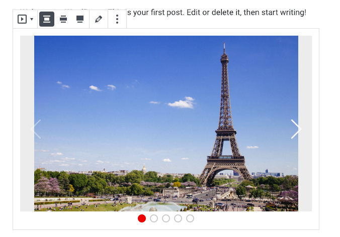
1) The appearance of the left/right arrows.
The main issue here is that on a while background they are impossible to see. To address this we should add a strong dark shadow beneath them.
2) The placement and appearance of the pagination dots.
I think these are fine as they are. The only change I'd make is to make the containing link a bit larger, so that I can click on them easier.
3) Placement and appearance of captions.
We could put the captions above the pagination dots. White text on a dark translucent background. Centrally aligned. The text would need to get smaller as the block shrunk.
4) How to handle captions that exceed 1 line in width.
I think they can just keep growing
5) The resizing "algorithm"
I think we can do a bit more work here. I added some images which all had the same aspect ratio, but there was still a bit of background showing through. In cases where all the images are the same size we should make the slideshow the same aspect ratio as the images. In cases where they aren't, can we crop the images to fit?
6) Background color behind images that don't fill the whole area.
Ideally the images would fill the whole area. Where this is not possible, can we made the background transparent, so that the theme's background shows through?
Keyboard navigation: Users should be able to navigate the slideshow using their keyboard. Left and right buttons make the most sense. (see https://www.w3.org/WAI/tutorials/carousels/)
Let me know if I can help with any of these changes.
cc @davidakennedy for an accessibility perspective
cc @thomasguillot as he always has something useful to say :)
 scruffian
All 13 comments
- The appearance of the left/right arrows.
The main issue here is that on a while background they are impossible to see. To address this we should add a strong dark shadow beneath them.
I would suggest to add a background-color to .wp-block-jetpack-slideshow .wp-block-jetpack-slideshow_button-prev, .wp-block-jetpack-slideshow .wp-block-jetpack-slideshow_button-next. Something like rgba(0, 0, 0, 0.5).
 thomasguillot
on 8 Feb 2019
thomasguillot
on 8 Feb 2019
The placement and appearance of the pagination dots.
I think these are fine as they are. The only change I'd make is to make the containing link a bit larger, so that I can click on them easier.
I'd be tempted to have them outside of the actual slider. I would also increase the size and tweak the style a bit. I think it'd be cool if we could customise the colour of the active bullet.
.swiper-pagination-bullet {
height: 16px;
width: 16px;
background: transparent;
border: 2px solid #000;
}
.swiper-pagination-white .swiper-pagination-bullet-active {
background: #000; // or whatever the user selects
border-color: #000; // or whatever the user selects -- 1 setting for the 2 rules
}
Background color behind images that don't fill the whole area.
Ideally, images should fill the whole area. If not I see a few solutions:
- Transparent background
- Very light background
rgba(0, 0, 0, 0.025); - Have a background-color setting and allow the user to select whatever they want
thomasguillot
on 8 Feb 2019
Placement and appearance of captions.
Move the caption into the actual slider. Similar to the arrows, white text with a dark background rgba(0, 0, 0, 0.5).
thomasguillot
on 8 Feb 2019
In cases where all the images are the same size we should make the slideshow the same aspect ratio as the images. In cases where they aren't, can we crop the images to fit?
Agree completely with the first part. This is what the resizing bit is supposed to be doing, and I'll look into problems with this as a bug. The caption change has already made this cleaner and I think we can get it perfect.
The second part is a bit more controversial. The block is designed to always show images in their entirety, never cropped, adjusting size and image placement to make this possible. I think you could make the case that Slideshows will often be collections of images where it's critical that they be shown unaltered, by contrast to blocks like Cover where visual impact is the main goal. Because of this, I'm hesitant to build the block to automatically crop images that don't match the size of the first one.
Swiper has a setting that will automatically resize the slideshow for each slide based on its size. I don't care for this approach because it causes the page to jump all over the place, and can be particularly jarring when combined with autoplay.
If we feel strongly that a cropped approach is needed, one possible way forward would be to offer a toggle between the two modes, but this would require a moderate amount of new work.
@scruffian, @thomasguillot, thoughts?
 jeffersonrabb
on 10 Feb 2019
jeffersonrabb
on 10 Feb 2019
I think it'd be cool if we could customise the colour of the active bullet.
I love this idea although this would be surprisingly tricky to implement. The problem is that the bullets are created and maintained by Swiper so we don't have an easy way to set style on them. The active bullet is styled by a class but if we wanted to make the color an attribute, we would need to generate the CSS dynamically via JS.
One easy way out would be to offer a handful of fixed colors to choose from and hard-code classes for each. Because most Gutenberg blocks use theme colors nowadays, this would probably feel insufficient and non-compliant.
If this feels like a critical feature, there are a couple of kind of hacky approaches I could explore. In one, we use Swiper's events to get a callback when slides change, and manually apply style to the correct bullet. In another, we explore CSS-in-JS but that's also a bit extreme.
jeffersonrabb
on 10 Feb 2019
Keyboard navigation: Users should be able to navigate the slideshow using their keyboard. Left and right buttons make the most sense.
I applied this in the front end and it works great.
In the editor it gets a little tricky since Gutenberg already uses arrow key events to switch from Block to Block. Currently, the two uses compete and I see some weird results where some arrow key presses switch blocks instead of slides. It _may_ be possible to block Gutenberg's key usage when Slideshow is selected, but this feels like an accessibility no-no.
jeffersonrabb
on 10 Feb 2019
The second part is a bit more controversial. The block is designed to always show images in their entirety, never cropped, adjusting size and image placement to make this possible. I think you could make the case that Slideshows will often be collections of images where it's critical that they be shown unaltered, by contrast to blocks like Cover where visual impact is the main goal. Because of this, I'm hesitant to build the block to automatically crop images that don't match the size of the first one.
Swiper has a setting that will automatically resize the slideshow for each slide based on its size. I don't care for this approach because it causes the page to jump all over the place, and can be particularly jarring when combined with autoplay.
If we feel strongly that a cropped approach is needed, one possible way forward would be to offer a toggle between the two modes, but this would require a moderate amount of new work.
I must say that I'm against cropping. Users are expecting their images to be the way they uploaded them.
thomasguillot
on 11 Feb 2019
I love this idea although this would be surprisingly tricky to implement. The problem is that the bullets are created and maintained by Swiper so we don't have an easy way to set
styleon them. The active bullet is styled by a class but if we wanted to make the color an attribute, we would need to generate the CSS dynamically via JS.
Ok no worries, I'm going to look at an alternative then.
thomasguillot
on 11 Feb 2019
Because of this, I'm hesitant to build the block to automatically crop images that don't match the size of the first one.
Good reasoning, I'm on board!
scruffian
on 11 Feb 2019
In the editor it gets a little tricky since Gutenberg already uses arrow key events to switch from Block to Block. Currently, the two uses compete and I see some weird results where some arrow key presses switch blocks instead of slides. It _may_ be possible to block Gutenberg's key usage when Slideshow is selected, but this feels like an accessibility no-no.
I think its ok for it to not work in the editor.
scruffian
on 11 Feb 2019
I love this idea although this would be surprisingly tricky to implement.
In this case we can punt to v2. Block styles might be an option in the future...
scruffian
on 11 Feb 2019
Good reasoning, I'm on board!
Great, I'm glad we're of one mind on the image fidelity question. Let's get https://github.com/Automattic/wp-calypso/pull/30687 done and shipped, then I'll open a new PR dedicated to making the sizing airtight.
jeffersonrabb
on 11 Feb 2019
Related issues
 gedex
·
3Comments
gedex
·
3Comments
 samouri
·
3Comments
samouri
·
3Comments
 kellychoffman
·
3Comments
kellychoffman
·
3Comments
 BrookeDot
·
3Comments
BrookeDot
·
3Comments
 rickybanister
·
3Comments
rickybanister
·
3Comments
Most helpful comment
Ok no worries, I'm going to look at an alternative then.